
“Design, unlike art, is not a means of self expression, but an attempt to solve a pre-determined problem in visual terms”
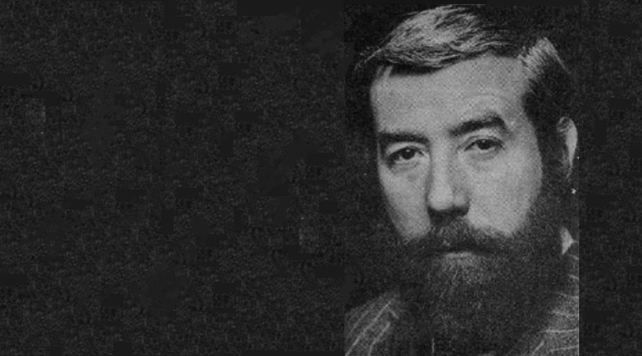
Norman Wilson (1931-1991), leading Manchester graphic designer of the 1970s, was the brains behind NBC’s corporate identity. Wilson had worked with the incoming NBC chair, Freddie Wood, since the early 1960s, and was responsible for creating a strong visual image for Croda International, the chemicals company at which Wood had been CEO. Wood believed that a uniform brand would help NBC to compete in the express coach market and unify the bus businesses. In the summer of 1971, before Wood had even taken up his new role as chair of the NBC Board, he called on Wilson to develop ideas for a comprehensive new identity. Wood’s vision appealed to Wilson, who favoured simple, bold modern design, with careful use of colour, lettering and imagery to create a strong impression.

In the reissued Manual, we’ll look at Wilson’s design thinking, influences and how he worked, drawing on discussions with some of the people who knew him best. Across an industry with strong local traditions, there was scepticism and even resistance. To explain the thinking behind the changes to NBC’s staff, Norman Wilson wrote a piece in a 1973 edition of NBC News.
With thanks to the Bus Archive, here is Wilson’s explanation of what a corporate identity is, and why it matters. Wilson’s article addresses his critics in the industry head-on, challenging them to think of how design helps to address the industry’s problems rather than reacting emotionally against something radically new.
Perhaps not surprisingly, his article has a slightly disparaging tone in places, reflecting his frustration with the industry’s traditionalists – including some at NBC Board level – who favoured much greater local autonomy on design, operational and commercial decisions. Having failed to prevent the adoption of the identity and more centralised planning of the national network, local company directors adopted delaying tactics instead in an attempt to win concessions to autonomy.
But by 1973, with a few minor compromises, the low-level battle between traditionalists and modernists on NBC’s image had swung decisively in Wood and Wilson’s favour.
You can read more about Norman Wilson and his influences here.
Please get in touch if you have recollections of the introduction of the NBC corporate identity, or of working with Norman Wilson and his design team. As with most documents of the era the wording is not exactly gender-neutral, so please make allowances.

Building an image, by Norman Wilson FSIAD
The adoption of a corporate identity at NBC must be the biggest event since, the company was formed. Certainly no other event has caused more comment, more change, more misunderstanding. Many readers have asked so many fundamental questions that we thought we would ask Norman Wilson to write this short article. Mr Wilson is the Manchester designer retained by NBC, who was responsible for the national coach livery, and the design of the symbol.

An individual’s personality is identified by his actions and appearance on first contact with another person, and images formed by his visual appearance. The clothes worn can, and usually do express his personality. One can distinguish the extrovert from the introvert, the trendy from the tramp, the conservative from the revolutionary.
Companies and service organisations have the same problem of identity as individual people. They act in a particular way, and their ‘dress’, ie, public visual appearance, should amplify their character, or intended character. This ‘dress’ will of course only enhance the actual image which exists in the public mind due to the actions of that company.
Superb icing will not make a stale cake edible, and the organisation with an efficient looking image, and inefficient actions will produce a bad effect. The medium size company originally, of course, did have the image of the managing director or chairman, who could control the design of the visual activities of the company. He had the time to be involved in the design of his vehicles, letterheads, packaging, signing, etc.
With the growth of the monolithic institution, the purchasing and design approval of items became fragmented. The stationery had the personality stamp of the accountant; livery expressed the transport chief’s ideas; advertising the trendy ad manager’s attitude. A state is reached eventually where the large company image is dissipated into the sum total of various ideas and expressions.
The need, therefore, arises to establish what the identity is or should be, and to establish how to convey it in terms which adequately reflect it through all visual activities. A cumulative effect is produced which is inter-related and consciously organised.

This is known as a corporate identity, and can be a complex problem which the size and rapid change of modern technology. The commercial artists of yesteryear, who was originally mainly concerned with illustrating an advertisement or poster, has now become more conversant with marketing, selling, accountancy methods, computers, product design, architecture and interiors, finding that he emerges no longer as an artist, but as a designer in the visual communications industry.
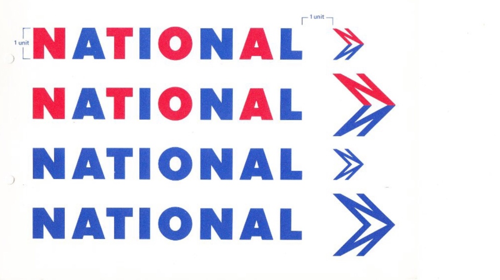
The basic problem to any identity is the brand name. This should be used in a consistent style and colour or colours, so that eventually it is recognisable at a glance, almost avoiding the necessity to read it. If it is desirable to connect differing named companies, a symbol may solve the problem coupled with the same style of lettering throughout; and again with related use of colour.
When these basic factors have been agreed, the next problem is implementing the design throughout the organisation and maintaining it. New stationery, signing, promotional literature etc, should look as though it is the result of an organised, efficient, and more economic design policy instead of many different decisions by various people who are often emotionally biased in design decision. They may not like particular colours or forms of lettering without considering whether it solves the problem in totality, rather than in the individual case.
The designer cannot afford to be emotional, or to have favourite colours if he is to be objective. Design, unlike art, is not a means of self expression, but an attempt to solve a pre-determined problem in visual terms.
Try considering design, not in terms of whether you like it, but try first to define the problem and then ask yourself whether the design solution answers that problem.
Norman Wilson FSIAD
Norman has practised from Manchester with three assistant designers for over 10 years [by 1973]. Previously, he had 10 years’ experience in advertising agencies.
A fellow of the Society of Industrial Artists and Designers, he is also a visiting lecturer in visual communication at Manchester Polytechnic, college assessor for the SIAD, and on the Advisory Committee at Bolton College of Art.
His work has appeared in various design journals and has been exhibited in Europe and the USA. He is chairman of Furness Vale Community Association, and New Mills Old Prize Brass Band. He likes wine making but prefers drinking it.

(Courtesy of Jean Horsfall)

14 replies on “Norman Wilson: building an image”
An interesting viewpoint and well done for saving it.
LikeLiked by 1 person
I worked for National Travel South West at the Shamrock and Rambler unit in Bournemouth during the late 1970s / early 1980s. Nearly all the senior managers had come from Royal Blue or were Shamrock and Rambler. The opinion widely held was that the adoption of the corporate white livery threw away decades of brand building and customer loyalty overnight. The white colour showed up grime and dirt far too easily and the white paint dulled very quickly. Passenger numbers dropped considerably from the mid 60s to 1980 (deregulation) though whilst many ascribed this to the dead hand of NBC in reality it was due to the growth of private car ownership and the motorway building programme. It is worth reading the excellent book on Grey Green (vol 2) by the late Tom McLachlan as the experiences of Grey Green and their coach operation match those of Shamrock and Rambler during the same period of time.
LikeLiked by 1 person
I think corporate identity was all the rage in the late 60’s and early 70’s i.e. British Rail. A need to modernise if not in vehicles and loco’s but at least with fresh paint and new logo’s and signage. Also a need to replace the some what old fashioned typefaces, crests, emblems and heraldic symbols aka British Railways. So a smart new uniform look was in, for NBC it was difficult to pull off with national and local services and to have a distinction between the two, within an agreed corporate look. Which in the main I think they got right, White for express coaches was a departure at the time, but it endured and still with us today!
LikeLiked by 1 person
I am so proud of my dad Norman. I followed his example and became a graphic designer. I learned so much from him.
LikeLike
My Dad worked for Norman. He always told me that the National Bus logo was drawn on the back of an envelope at our house after Norman had a flash of inspiration when visiting for dinner one evening.
LikeLike
Great Benjamin – I’ve spoken to people who saw him come into the office with the envelope in the morning, but don’t know how it was drawn up. Trying to piece the story together! Can you drop me a line at rp [@] larp.co please? Would be great to know a bit more!
LikeLike
[…] design studio in Manchester, England in 1960 and created the UK’s first corporate identity (https://nationalbusmanual.com/2021/06/24/norman-wilson-building-an-image/). My two older brothers, Stuart and Simon, followed in his footsteps, setting up in the 80’s what […]
LikeLike
[…] colour identified with the operating company, usually that adopted for local buses. See our previous blog article to read about Norman Wilson’s view of the key elements of corporate identity. Royal Blue’s ECW-bodied Bristol RE number 2387 is seen in Newbury in 1973. Instead of adopting […]
LikeLike
[…] we don’t have a copy of Norman Wilson’s remarks at the conference – though you can get a good idea of his thinking here. But, from the Bus Archive, we do have a full set of Fred Wood’s notes, setting out his views on […]
LikeLike
[…] will look in more detail in a future blog at Wilson’s design influences for applying the identity to buses, but it combined his three key elements: bold, uniform colours, […]
LikeLike
[…] more about how the modernist-inspired design of the NBC identity was shaped by Norman Wilson’s design influences, combining his three key elements: bold, uniform colours, his distinctive typeface, and a striking […]
LikeLike
[…] in September 2022’s edition (no 44) of the modernist; and you can read more about his work on the National Bus Company’s iconic corporate identity here, accompanied by a range of illustrations on […]
LikeLike
[…] more about how the modernist-inspired design of the NBC identity was shaped by Norman Wilson’s design influences, combining his three key elements: bold, uniform colours, his distinctive typeface, and a striking […]
LikeLike
[…] more about how the modernist-inspired design of the NBC identity was shaped by Norman Wilson’s design influences, combining his three key elements: bold, uniform colours, his distinctive typeface, and a striking […]
LikeLike