

Rapid roll-out of the new identity led to some odd compromises
Nearly a year passed between the introduction of the NBC corporate identity and the launch of Norman Wilson’s fully-fledged Corporate Identity Manual. Wilson had been clear-minded on the importance of consistency from the start. However NBC chairman Fred Wood saw advantages in getting staff and passengers to identify with the new uniformity of presentation and service to the public, as a way of beginning to change the culture and perception of the NBC and its subsidiaries.
Across publicity and advertising, and things like timetable leaflets, company names began to appear in Wilson’s new bespoke NBC typeface – with the words “Associated with the National Bus Company” added as a strapline. This needed to be matched by the main projection of NBC’s identity into the high streets and housing estates of England and Wales – the buses themselves.
The solution was to start applying the strikingly modern NBC logo and fleetnames ahead of making other changes. This could be done faster than waiting for a full repaint into the new colours of poppy red or leaf green with white, or even the halfway house of painting white bands over cream and black lining and using the existing base livery, for example the darker Tilling red or green. But a strange consequence was that the modern fleetnames were for a time applied in a more traditional cream colour, as part of the existing colour schemes, rather than the clean, modern white of the new corporate identity.

Hants & Dorset were quick to get into the spirit of the new corporate identity – if not its precise application. The picture below shows an attempt to match the bus to the new NBC identity shown on the bus’s advertising panel. The differences between advertising illustration and application are pretty obvious now, but probably weren’t to the casual observer, so the early brand application probably did the trick. By 1972, former Wilts & Dorset Lodekka KMR608, had been absorbed into the Hants & Dorset fleet as their no 401. It retained the Tilling red of Wilts & Dorset, which was extended over the black lining, and gained cream-coloured NBC-style fleetnames and double-N arrow to match its cream band.
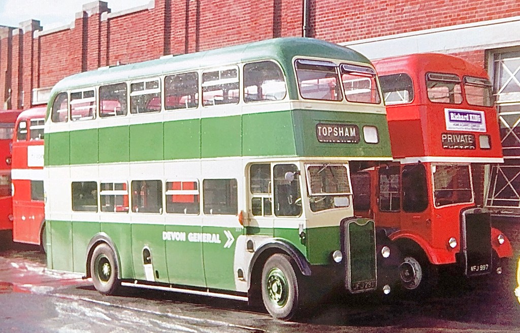
Devon General’s main livery was red, in spite of being a subsidiary of green-liveried Western National. In 1970 it took over the buses of Exeter Corporation Transport, and once the corporate identity was initiated in 1972 this Guy Arab retained its Exeter ‘green and magnolia’ livery but gained while NBC-style Devon General fleetnames. It contrasts with Exeter vehicles in the background which Devon General had already repainted into NBC poppy red and white.
Something has gone wrong with the rebranding of Western National’s no. 1923 seen here at Weymouth in 1973. 1923 retains Tilling green livery, and though the black lining has been painted over and cream replaced with white, the NBC-style fleetnames and logo have been applied in cream.


4 replies on “Cream on the side: the transition to the new identity”
RT? Surely thgey are Guy Arabs?
LikeLiked by 1 person
That, without a doubt, is a Guy Arab Kim. Post updated.
LikeLike
The green Guy Arab and red Leyland PD2 alongside came from Exeter Corporation after they sold out to Devon General in 1970. The Guy’s still in Exeter green which is of a rather different layout to classic Tilling green. As for Western National they were firmly wedded to Bristol for their double-decker choice, the only Guy Arabs bought new being seven lowbridge Northern Counties examples allocated to them in 1942/43 during the Second World War.
LikeLiked by 1 person
[…] NBC offered both symbol and fleetnames in the corporate identity standard white as well as a variant in cream to allow the new graphics to be applied – incongruously – to buses still in their […]
LikeLike