
Fifty years ago today, on 19 July 1972, NBC announced their plan to launch a new identity for local buses across England and Wales. Modernism was coming up your street.
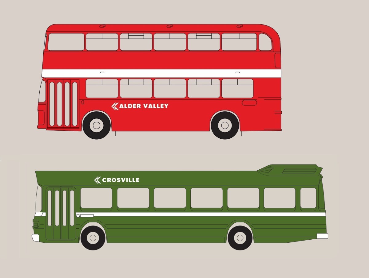
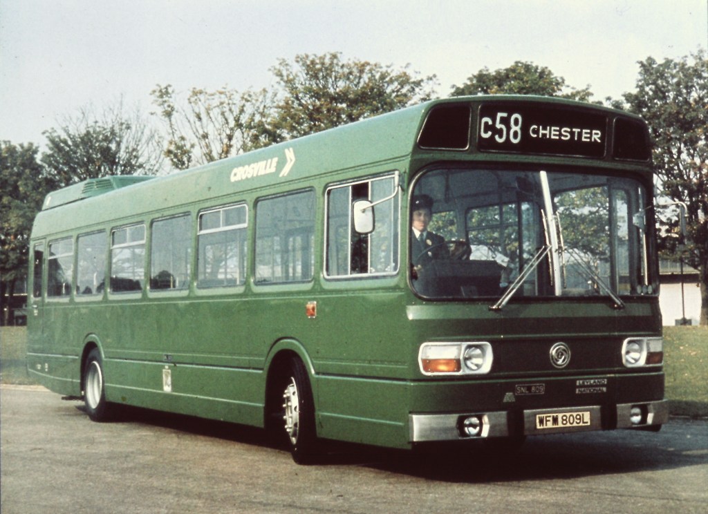
On this day, 19 July, in 1972, NBC decided on its approach to bus liveries. NBC HQ had been experimenting with different approaches and colours since April, when it was announced that Alder Valley and Crosville would be taking part in trials to identify new, standard colours for local buses across England and Wales.

This was not a complete surprise. In his speech, launching the corporate identity and its first application to express coaches, chairman Fred Wood told General Managers that: “the great bulk of our business (say 85%) is still in stage-carriage. We must therefore continue to maintain pressure in this main area. … The traditional liveries and names will continue although we expect to propose a linkage via a common emblem for all NBC companies. … The livery of the Express Coach which you will see shortly is only one expression of the new corporate identity programme which will eventually permeate all the visual aspects of NBC.”
Though the identity acknowledged the preponderance of reds and greens in bus companies across the country, Wood’s emphasis on ‘retaining traditional colours’ was rather misleading, and understated the form and radicalism of the emerging design.
Wood’s design adviser, Norman Wilson had been working on the design of the bus livery since the start of the year, and though the striking and commercially-important roll-out of the ‘white coach’ took precedence, the visible impact of the new identity for local buses across shopping streets, rural roads, factories and housing estates was to be much more pervasive.

We will look in more detail in a future blog at Wilson’s design influences for applying the identity to buses, but it combined his three key elements: bold, uniform colours, his distinctive typeface, and a striking monochrome version of his NBC symbol, wordlessly conveying the nature of the business, all drawn together in a grid-based layout which brought a sense of uniformity and modernity across disparate companies and an enormous variety of vehicle types.
The purpose, as well as reminding people of the scale of NBC itself, was to project the sense of a welcoming, modern and reliable service to users and staff alike. It was an attempt to arrest the large modal shift from the local bus to the private car, a trend which was accelerating in the late 1960s and early 1970s, eating into the company’s core business, and eroding the commercial viability of public transport.
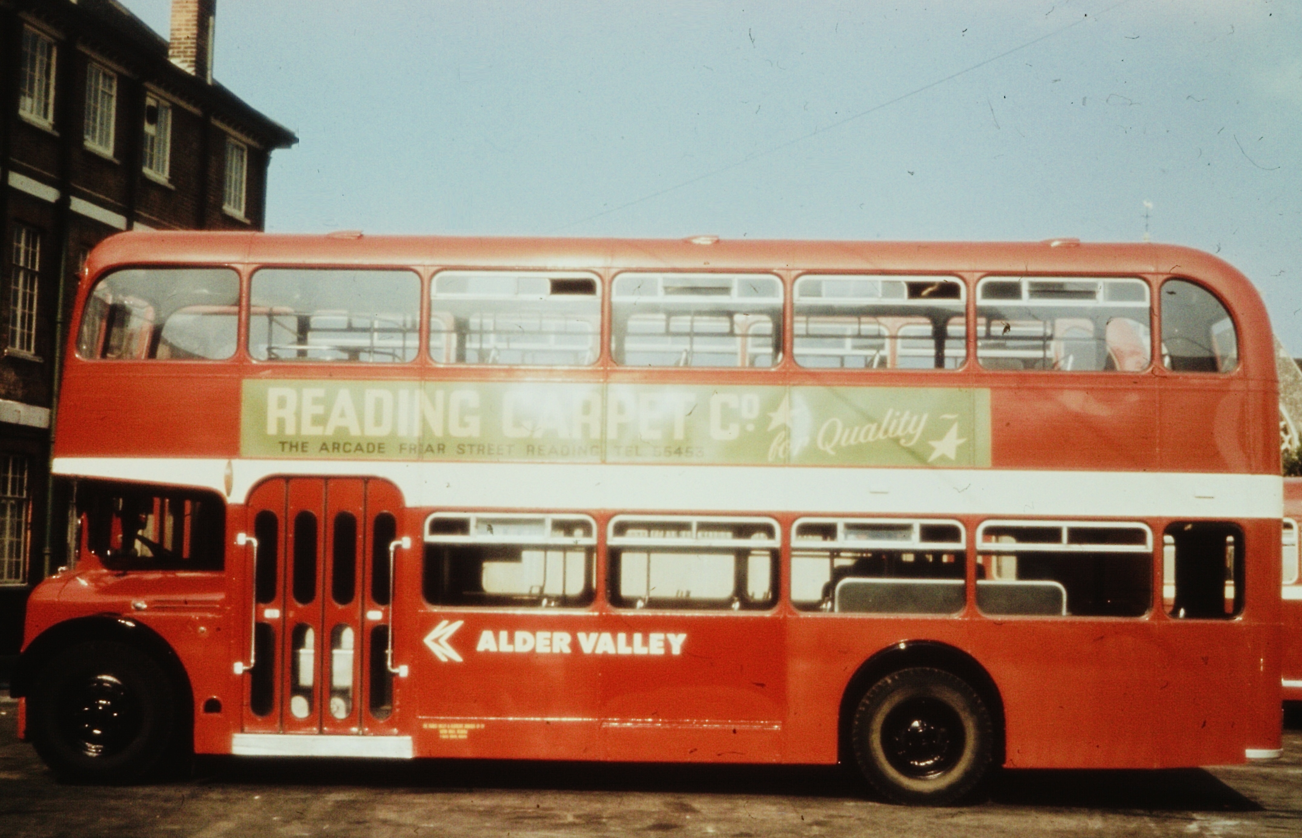
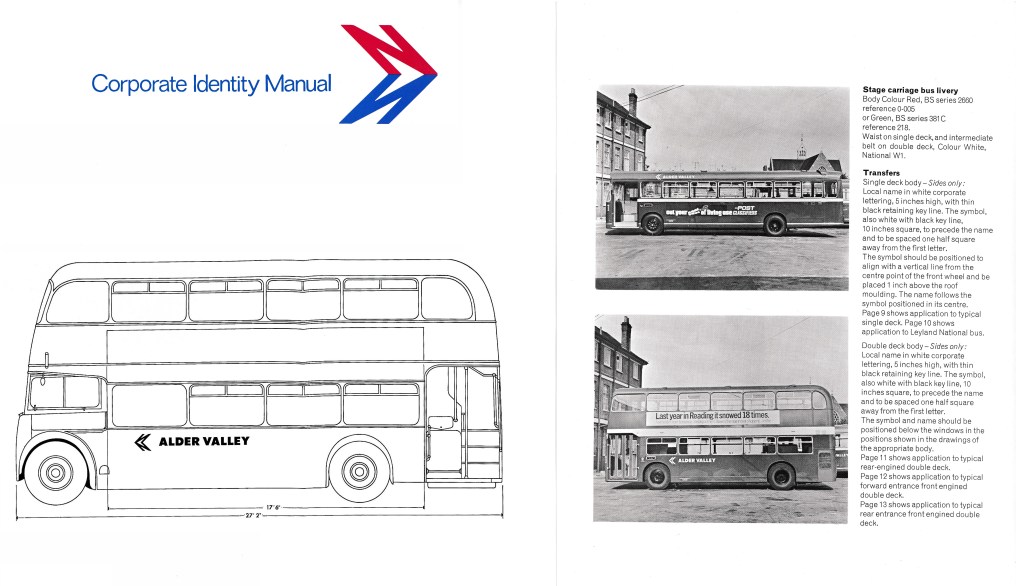
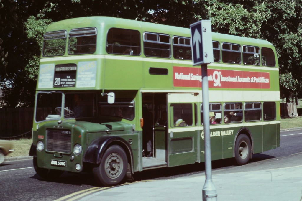
From May, Wilson lifted his experimental designs from the page and onto vehicles. Replacing the huge variety of traditional local colours, two new standard shades of red and green were adopted – each company generally adopting the new version of its previous colour for continuity – and minimal decoration in the form of bright white lines, with a common layout applied to buses across the country. Wilson and NBC HQ staff worked with Alder Valley’s Reading depot to trial the red livery; and with Crosville to experiment with the layout and different shades of green.
Though local company general managers had seen this coming, the move was highly controversial across the industry. Following the loss of the identity and management of their prestigious coach services, subsumed into the new ‘National’ express network of uniform white coaches, the extension of the new corporate identity would see the independent public profile of companies eroded further.

NBC’s Chief Marketing Officer Ron Whitehouse set out the approach in a letter from NBC HQ to General Managers on 19 July 1972:
“I write to advise you that, following discussion with regional directors, the Chairman and Chief Executive have decided upon a standard method of applying corporate identity to stage carriage buses together with rationalisation of livery colours.
“The corporate symbol and companies name (brief trading title) in corporate lettering is to be applied to buses in a common way throughout the group. Detailed specifications have been prepared and are in the course of printing. Copies will be sent to you shortly. Transfers are to be prepared centrally… There will be three livery colours only (with certain temporary exemptions) being – Red (BS series 2660 ref. 0-005); Green (BS series 381C, ref. 218), White (National W1) for relief (waistbands, symbols and titles). Creams will be discontinued.
“The exemptions for the time being may be ‘blue’ bus fleets, and Regional Directors will be talking with Chief General Managers regarding the future of this colour.
“Other exemptions might be the livery of fleets of vehicles operated in partnership with local authorities. However, all exemptions must be approved by Regional Director[s] in consultation with the Chief Executive.
“The desire is to see the symbol and corporate lettering applied to fleets within three months. Consequently, there has to be an interim application to existing deliveries of new transfers (in, say, cream to match current practice) followed by the adoption of standard colours at normal repaint stage. New bus intake will be painted in the new standard colours.”
This led to an interim phase in which Wilson’s new National lettering and NBC symbol were applied onto existing old-fashioned liveries. Though these generally appeared in white, in many cases the modern typography and symbol were applied in a cream colour to blend in with the existing cream relief decoration which had been applied traditionally by many companies. This blunted the modernising impact of the change, and was steadily phased out.
In future blogs we will look at Norman Wilson’s approach to designing the local bus identity, the curious decision to eliminate the existing corporate blue colour from the bus livery; and the challenges of a rapid roll-out.
If you have recollections of the roll-out of the new livery, how it was managed, or remember your initial reaction to it, please let us know. We’d be happy to include these in a future blog, and perhaps in the Manual book itself. Get in touch using the form on this page, or the contact page here: https://nationalbusmanual.com/contact/

6 replies on “A radical new look for local buses”
“each company generally adopting the new version of its previous colour for continuity” – Hants and Dorset changed from Tilling Green to Poppy Red.
LikeLiked by 1 person
Yes – hence the ‘generally’! There were a small number of swaps between red and green. The bigger story was probably the end of various shades of maroon and deep burgandy – debatable whether these were really ‘red’ – and the slow death of blue.
LikeLike
Yes. I wonder why they decided to have two colours rather than one or three? I just do not understand why they felt the need for a common livery aka national identity given that the vast majority of their customers would only ever use the local bus in the town / area they lived in. Surely they could have just adopted the national bus symbol on all the buses and standardised the typeface / front for any lettering etc? It seems to be a very expensive exercise in marketing and branding when all their other marketing activities could be described on the back of a beer mat.
LikeLiked by 1 person
You can read about Fred Wood’s thinking on this in the blog – link below. The rationale for the common National coach brand is certainly stronger, but he also gives reasons for a more visible identity for the group as a whole. It was certainly controversial within NBC at the time. See whether you think it stacks up! https://nationalbusmanual.com/2022/04/10/identity-shock-wood-and-wilson-show-their-hand/
LikeLike
[…] instructions and diagrams were sent to the local operating companies in June, the first pages of the new Corporate Identity Manual have been supplemented with detailed instructions on how to apply the new liveries, paint […]
LikeLike
[…] Identity Manual, developing the concept of the ‘white coach’ uniform national network. The approach to the identity for local buses, announced in July 1972, stretched Wilson’s disciplined colour scheme, adding green to the […]
LikeLike