Fifty years ago today, on 19 July 1972, NBC announced their plan to launch a new identity for local buses across England and Wales. Modernism was coming up your street.
On this day, 19 July, in 1972, NBC decided on its approach to bus liveries. NBC HQ had been experimenting with different approaches and colours since April, when it was announced that Alder Valley and Crosville would be taking part in trials to identify new, standard colours for local buses across England and Wales.
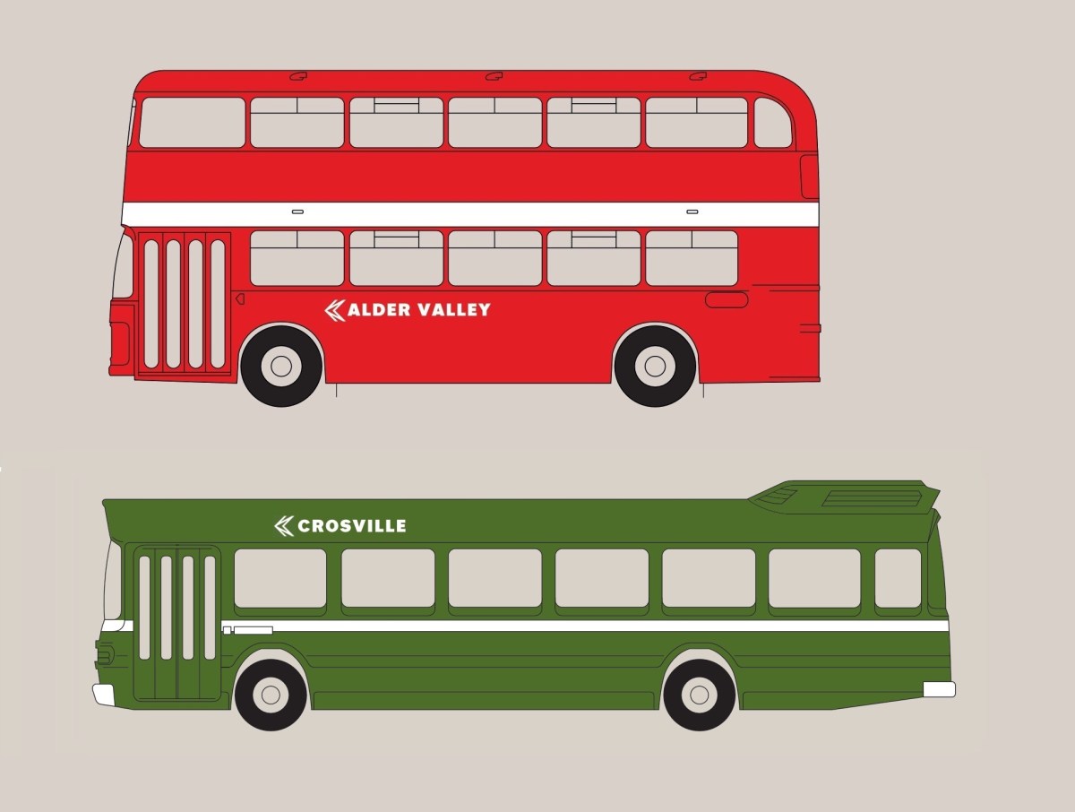
NBC’s red and green bus liveries, designed in 1972 by Norman Wilson, combined standardised bright shades of the ‘traditional’ bus colours, a striking monochrome version of Wilson’s NBC N-and-shadow arrow symbol, and local company names in his National lettering. The white band intended by Wilson was initially omitted on some types of vehicle, but widely adopted later. Picture: Martyn Cummins/Richard Price; typeface digitised by Nick Job.
This was not a complete surprise. In his speech, launching the corporate identity and its first application to express coaches, chairman Fred Wood told General Managers that: “the great bulk of our business (say 85%) is still in stage-carriage. We must therefore continue to maintain pressure in this main area. … The traditional liveries and names will continue although we expect to propose a linkage via a common emblem for all NBC companies. … The livery of the Express Coach which you will see shortly is only one expression of the new corporate identity programme which will eventually permeate all the visual aspects of NBC.”
Though the identity acknowledged the preponderance of reds and greens in bus companies across the country, Wood’s emphasis on ‘retaining traditional colours’ was rather misleading, and understated the form and radicalism of the emerging design.
Wood’s design adviser, Norman Wilson had been working on the design of the bus livery since the start of the year, and though the striking and commercially-important roll-out of the ‘white coach’ took precedence, the visible impact of the new identity for local buses across shopping streets, rural roads, factories and housing estates was to be much more pervasive.
Modernism coming up your street: Wilson’s identity drew inspiration from the Swiss school of graphic design and the earlier Bauhaus. Picture: Eastern Counties’ LN544 climbs Orford Hill in Norwich on its way to Eaton in 1974. Picture: Bernard Watkin, courtesy of the Eastern Transport Collection Society.
We will look in more detail in a future blog at Wilson’s design influences for applying the identity to buses, but it combined his three key elements: bold, uniform colours, his distinctive typeface, and a striking monochrome version of his NBC symbol, wordlessly conveying the nature of the business, all drawn together in a grid-based layout which brought a sense of uniformity and modernity across disparate companies and an enormous variety of vehicle types.
The purpose, as well as reminding people of the scale of NBC itself, was to project the sense of a welcoming, modern and reliable service to users and staff alike. It was an attempt to arrest the large modal shift from the local bus to the private car, a trend which was accelerating in the late 1960s and early 1970s, eating into the company’s core business, and eroding the commercial viability of public transport.
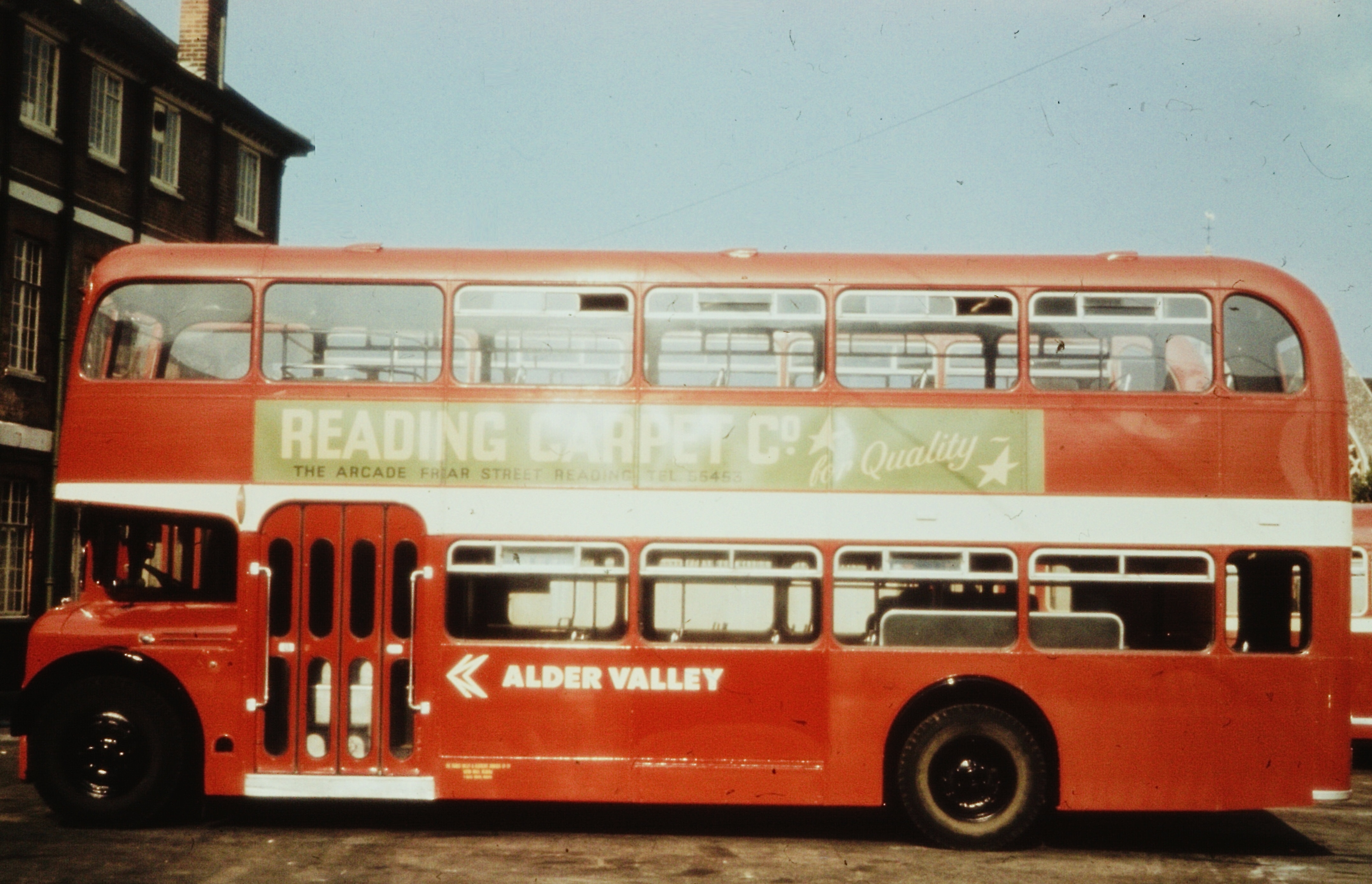
Norman Wilson and NBC’s commercial team trialled the red version of the new identity for local buses at subsidiary Alder Valley’s Reading depot, where variations were applied to a range of double- and single-deck buses. A bus in the earlier colours can just be seen in the background, illustrating the contrast with new ‘poppy red’. Picture: Norman Wilson, from the Manchester Metropolitan University Special Collections.
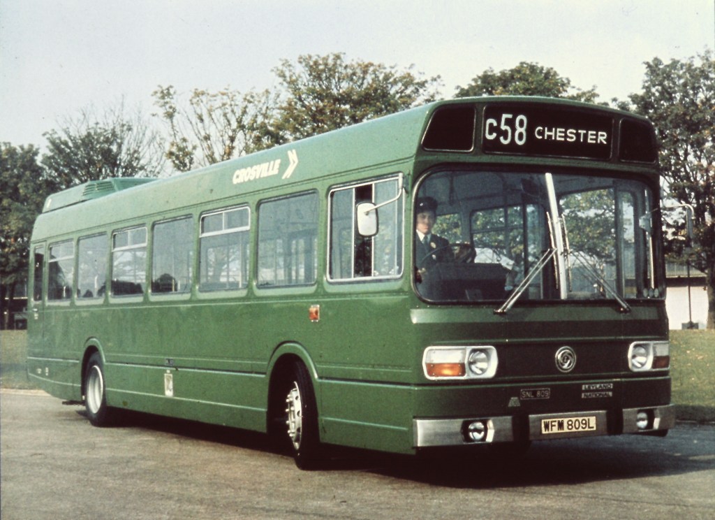
From May, Wilson lifted his experimental designs from the page and onto vehicles. Replacing the huge variety of traditional local colours, two new standard shades of red and green were adopted – each company generally adopting the new version of its previous colour for continuity – and minimal decoration in the form of bright white lines, with a common layout applied to buses across the country. Wilson and NBC HQ staff worked with Alder Valley’s Reading depot to trial the red livery; and with Crosville to experiment with the layout and different shades of green.
Though local company general managers had seen this coming, the move was highly controversial across the industry. Following the loss of the identity and management of their prestigious coach services, subsumed into the new ‘National’ express network of uniform white coaches, the extension of the new corporate identity would see the independent public profile of companies eroded further.
Experiments with the green version of the local bus identity were carried out in May and June 1972 with NBC’s subsidiary in north Wales and Merseyside, Crosville. In this picture, the identity has been applied to a new Leyland National in a darker green than was ultimately selected. Without the traditional body mouldings to guide coach-painters, it was decided initially not to apply a mid-height white relief line to this type of vehicle. The fact that the green illustrated here was much darker than the ‘leaf green’ ultimately chosen didn’t stop NBC’s publicity department from using this picture extensively in advertising in the following years. Picture: Norman Wilson, from the Manchester Metropolitan University Special Collections.Also at Alder Valley’s Reading depot, Wilson and team used this Bristol VR to test the bold red colour – the same as that used for the NBC symbol and National lettering. The position of the symbol and company name in National lettering was carefully specified for most vehicles, with an approach inspired by the graphic designer’s grid: for many double-deckers it was to be in line with the rear of the wheel arch, ensuring broadly consistent layout for most vehicles. This picture was used to illustrate the correct layout in the first edition of the Corporate Identity Manual. Picture: Norman Wilson, from the Manchester Metropolitan University Special Collections.
NBC’s Chief Marketing Officer Ron Whitehouse set out the approach in a letter from NBC HQ to General Managers on 19 July 1972:
“I write to advise you that, following discussion with regional directors, the Chairman and Chief Executive have decided upon a standard method of applying corporate identity to stage carriage buses together with rationalisation of livery colours.
“The corporate symbol and companies name (brief trading title) in corporate lettering is to be applied to buses in a common way throughout the group. Detailed specifications have been prepared and are in the course of printing. Copies will be sent to you shortly. Transfers are to be prepared centrally… There will be three livery colours only (with certain temporary exemptions) being – Red (BS series 2660 ref. 0-005); Green (BS series 381C, ref. 218), White (National W1) for relief (waistbands, symbols and titles). Creams will be discontinued.
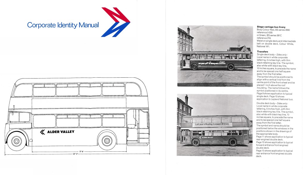
Pages from the first edition of the NBC corporate identity manual of 1972, issued shortly after the 19 July letter. Source: NBC/The Bus Archive.
“The exemptions for the time being may be ‘blue’ bus fleets, and Regional Directors will be talking with Chief General Managers regarding the future of this colour.
“Other exemptions might be the livery of fleets of vehicles operated in partnership with local authorities. However, all exemptions must be approved by Regional Director[s] in consultation with the Chief Executive.
“The desire is to see the symbol and corporate lettering applied to fleets within three months. Consequently, there has to be an interim application to existing deliveries of new transfers (in, say, cream to match current practice) followed by the adoption of standard colours at normal repaint stage. New bus intake will be painted in the new standard colours.”
This led to an interim phase in which Wilson’s new National lettering and NBC symbol were applied onto existing old-fashioned liveries. Though these generally appeared in white, in many cases the modern typography and symbol were applied in a cream colour to blend in with the existing cream relief decoration which had been applied traditionally by many companies. This blunted the modernising impact of the change, and was steadily phased out.
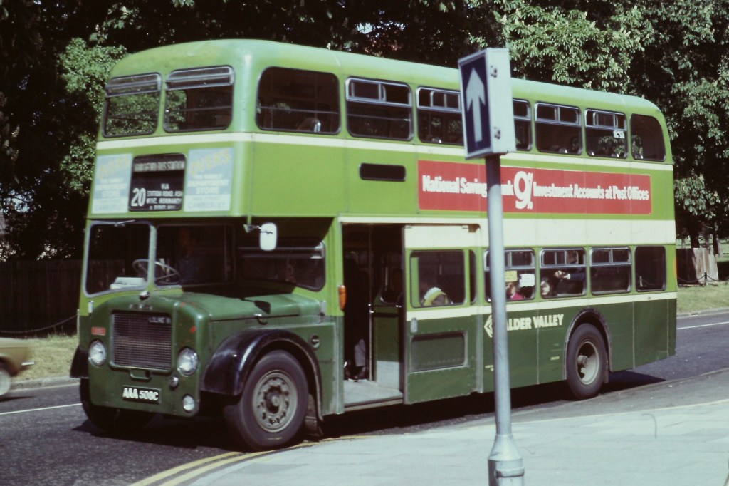
The application of the NBC and lettering in traditional cream to match the existing liveries undermined the modernising intent of the corporate identity, and was short-lived. Alder Valley’s Dennis Loline no 835 is in Aldershot in June 1974. Picture: Richard Price Collection.
In future blogs we will look at Norman Wilson’s approach to designing the local bus identity, the curious decision to eliminate the existing corporate blue colour from the bus livery; and the challenges of a rapid roll-out.
If you have recollections of the roll-out of the new livery, how it was managed, or remember your initial reaction to it, please let us know. We’d be happy to include these in a future blog, and perhaps in the Manual book itself. Get in touch using the form on this page, or the contact page here: https://nationalbusmanual.com/contact/
Vision, compromise and change in the first edition of the Corporate Identity Manual
The NBC Corporate Identity developed from a series of discussions between incoming NBC chair Freddie Wood, and leading graphic designer Norman Wilson. Wood had been chief executive of Croda International, and had employed Wilson for many years to modernise the company’s image, undertaking a comprehensive rebranding in a clean, modern style, encompassing the Croda’s symbol, marketing, packaging and vehicles. Wood was impressed with Wilson, and the two got on well.
NBC Chair Freddie Wood (left, later Sir Freddie); and design consultant Norman Wilson (right). Photo: NBC.
Wood had spent part of his early 20s in the United States, and the American way of doing business fascinated him. He was particularly struck by the extensive network of silver Greyhound coaches which he had used to criss-cross the US during his stay, offering a consistent reliable service and strong uniform branding. So when Wood was asked by the newly-elected Heath government in 1971 to take the role of chair of the relatively new National Bus Company, with the objective of making it a more commercial organisation, he was immediately struck by two thoughts. First, the Greyhound proposition of a uniform national coach network. And second, the need to ask for Wilson’s design advice in shifting the image of the long-distance coach, and the wider industry.
An iconic 1954 Scenicruiser, manufactured for Greyhound Lines by General Motors. Greyhound’s uniform branding created a strong image of a consistent and reliable national network across the United States. Photo: Greyhound Lines publicity department, in the Hemmings.com collection.Greyhound Lines’ publicity emphasised the consistency and reliability of a uniform national network for business and pleasure travel across the United States. Source: Greyhound Lines.
Wilson was actually brought on board by Wood in 1971, before his chairmanship had been formally agreed. It was in this period that Wilson had the epiphany of the ‘N-and-shadow’ arrow symbol. Once appointed, Wood wasted no time in formalising the appointment of Norman Wilson as corporate design adviser to the NBC Board. There was a formal pitch to the Board early in 1972 using design boards explaining the National symbol, graphics and the white coach in preliminary version of the corporate identity. These will form the basis of a section in the NBC Corporate Identity book. It is not clear whether other design businesses were invited to bid – but Wilson’s appointment was announced to the business and its operating companies in a letter from the company secretary to the General Managers of the local subsidiaries in February 1972, stating simply that NBC was appointing a design consultant “to advise on all matters relating to a corporate identity for the NBC Organisation” – and cautioning against overstocking on existing designs of stationery which might soon become redundant.
A public announcement was made in May 1972, with that month’s Design Journal reporting that “Norman Wilson, Manchester based design consultants, have been retained by the National Bus Company to design a visual identity programme for vehicles, signing, stationery and related graphics.”
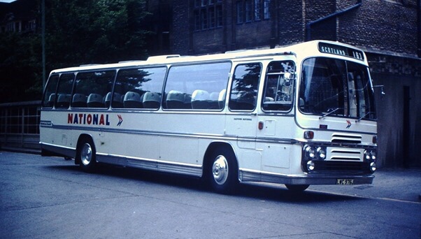
After being persuaded that – because of production techniques and climate – a silver coach in the style of Greyhound would not last well in Britain, Wilson and Wood wanted the coaches to be purely white, with the National branding of the NBC symbol and the NATIONAL logotype in red and blue. Operating companies were to be solely suppliers to NBC’s Central Activities Group, which took responsibility for the National coach network. Local company identities were not to appear on the white coaches at all, except in the tiny mandatory ‘legal lettering’ identifying the owner at the bottom of the bodyside There was a degree of scepticism, and even push-back against the idea of a uniform corporate identity, particularly from operating companies whose local liveries in some cases could be traced back to the start of motor coaches at the beginning of the 20th century.
From the 1972 Corporate Identity Manual: Wilson and Wood’s intended National White Coach livery. The branding is purely National, with no local company fleetname, to give the sense of a single uniform national entity. Tillings Transport’s PWC 341K was the second White Coach. In the original concept presented to the NBC board, the National symbol always pointed to the right: consequently it pointed backwards on the nearside of coaches. This was replicated in the first two trial applications to vehicles, with the result that this illustration made it into the first edition of the Manual. The coach also carries a fleet number plate – in red for Eastern National’s Southend Prittlewell depot which maintained a large part of the Tilling coach fleet. This too was inconsistent with the manual’s instructions to use steel-grey lettering, transfers of which were set in Futura and supplied to each operating company. Photo: NBC, The Bus Archive.
Wood was resolute in his determination to apply a uniform white livery. He had been dissuaded from adopting a silver livery, US-style, on the grounds that that bodysides would corrode. When operators next objected to all-over white on the grounds that they would show dirt, Wilson retorted, in characteristically blunt fashion, that “they’ll just have to wash them more often then, won’t they?”
With the overall colour beyond doubt, the use of local fleetnames became the next area of controversy and compromise. The first trial application of the NBC white livery, on an Eastern Counties coach at the Eastern Coach Works in Lowestoft, had omitted the local company’s fleetname, showing only the National brand. General Managers of NBC’s operating subsidiaries were horrified, complaining that their local identities and pride in the service would be lost, and that coach users would be confused by multiple identical-looking coaches and would find it harder to locate their service.
Norman Wilson, designer of the NBC Corporate Identity, applies his NATIONAL lettering to the very first ‘white coach’ at Eastern Coach Works (ECW), Lowestoft, April 1972. Consistent with the initial presentation to the NBC Board, his ‘double-N’ symbol is pointing to the rear on the nearside of the coach in this trial application of the new identity to Eastern Counties’ RE858. This was altered in the 1972 Corporate Identity Manual, which specified that it should point in the direction of travel on either side of the vehicle. Behind Wilson, assisting with the application, is ECW’s Alan ‘Casey’ Crisp, described by Eastern Counties’ Stephen Milne as “the best coach painter I ever knew – the best at lining-out and an excellent sign-writer.” Casey spent his entire working life at ECW, retiring at 65, three years before the Coachworks closed in 1987.Wilson’s first response to demands from operating companies’ General Managers that a local fleetname should be applied was perhaps deliberately obtuse. He added tiny light-grey lettering to first ‘white coach’ – Eastern Counties’ RE858 – at about the same size as the legal lettering and ‘fuel’, ‘oil’ labels, albeit in his heavier National lettering. This achieved his objective of interfering as little as possible with the uniformity of appearance which he and Freddie Wood sought – but with lettering so small as to be almost unreadable at any distance. General Managers were not placated. The picture shows Eastern Counties Bristol RE Plaxton-bodied coach RE858 at Cheltenham early in 1972. Photo: Richard Price collection.A similar experiment was conducted with Eastern National’s Plaxton-bodied Bristol RE number 425, seen here in Southend in 1972: a tiny fleetname in grey National Alphabet lettering was placed underneath the window behind the cab. Photo: Bernard Watkin, Eastern Transport Collection Society.
Wood and Wilson relented, marginally, in response to the latter argument and a compromise was attempted. First, a local fleetname was applied as a trial to the Eastern Counties coach used in the initial trial application of the identity, using Wilson’s bespoke National lettering, but at a height barely larger than the legal lettering and in a very light grey. It was almost invisible, and the General Managers were not placated.
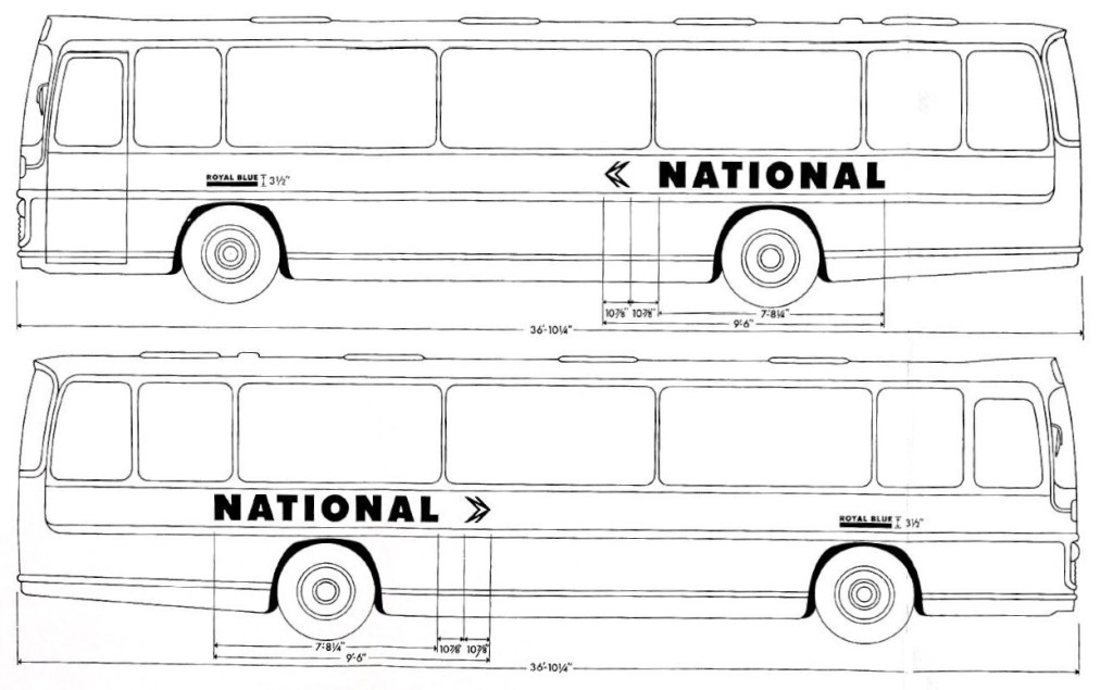
Wilson therefore adopted a different, more visible approach for the initial roll-out of the Corporate Identity. Local company fleetnames were applied on National coaches above the wheel arch, set in Wilson’s new National lettering, at the slightly larger letter height and in a more legible dark grey. They were further emphasised by a bold underlining, the line being the same height as the letters giving an overall height of 3½ inches, in the colour adopted by the local company for its buses. This was codified in the first edition of the Corporate Identity Manual of May 1972.
From the May 1972 Corporate Identity Manual, drawn up by Norman Wilson and colleagues, this diagram shows the ‘compromise’ initial NBC standard white coach livery, with small operating company fleetnames underlined in the company colour – in this case Royal Blue’s royal blue – with an overall height of 3½ inches. The vehicle used for illustration is a Plaxton Panarama Elite II. Source: NBC, The Bus Archive.Wilson’s design of fleetnames had a neat logic, consistent with his approach to corporate identity. It combined two of the main elements of the NBC identity, using the National Alphabet for the local company’s name, and at the same height as the lettering, a block of the NBC corporate colour identified with the operating company, usually that adopted for local buses. See our previous blog article to read about Norman Wilson’s view of the key elements of corporate identity.Royal Blue’s ECW-bodied Bristol RE number 2387 is seen in Newbury in 1973. Instead of adopting the green colour of its parent Western National, Royal Blue chose to underline its fleetname in blue – along with the National symbol and logotype, this is the only blue remaining of the company’s trademark livery. Photo: Richard Price Collection
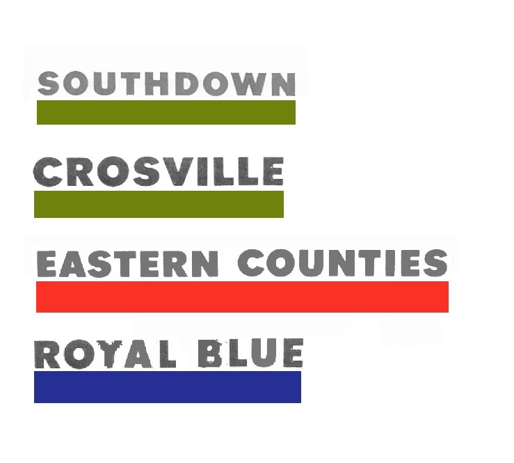
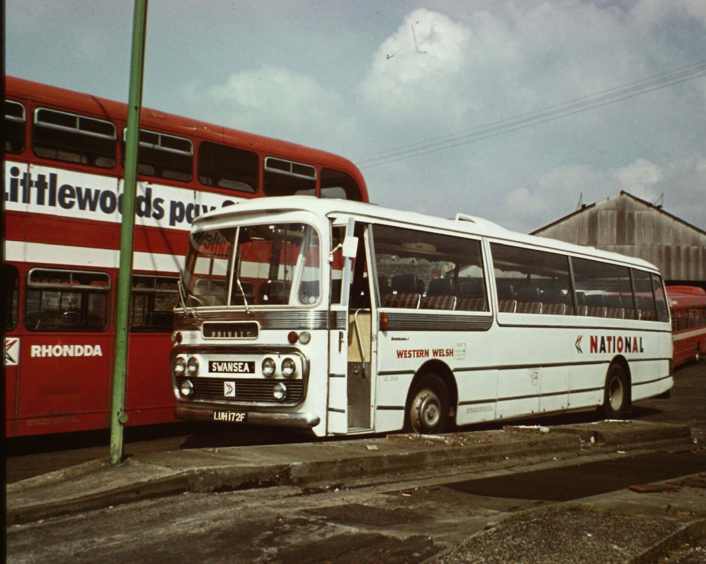
So Eastern Counties and United coaches had a small fleetname underlined in their corporate red; as did Standerwick, a coach-only business which adopted the bus colour of its parent company Ribble. Crossville, Southdown and Eastern National coaches meanwhile appeared with fleetnames underlined in green. Other non-bus coaching businesses were given latitude, so even though their historic colours were eliminated, Royal Blue used a blue line on their National coaches, while Black and White used black.
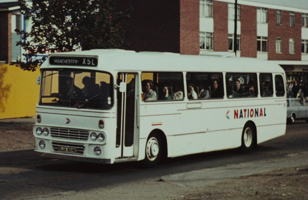
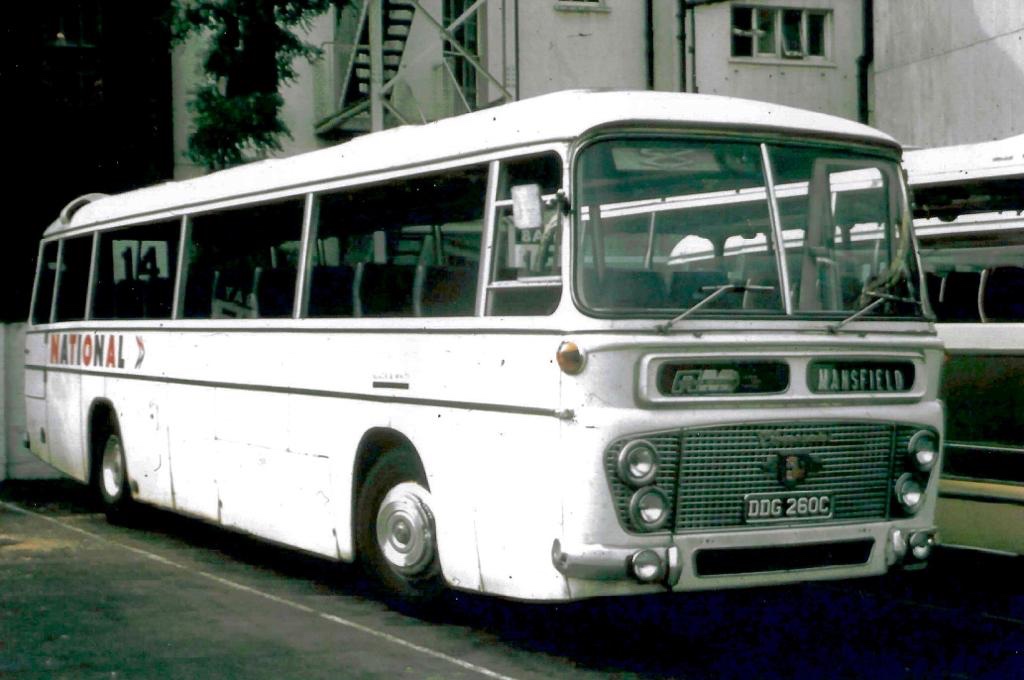
North Western’s Leyland Leopard SJA 404K is seen in Stockport in 1972 on an express service from London to Manchester via Birmingham, with a small fleetname underlined in National red.Eastern Counties’ CB845 – a Duple-bodied Bedford VAM70 at Great Yarmouth in 1972 – illustrating both the small operating company fleetname, underlined in poppy red, and displayed in the illuminated panel; and also the challenges of fitting the key elements of the new Corporate Identity around decorative chrome bodywork. Norman Wilson’s team were supplied by coachbuilders with hundreds of coach drawings as they tried to get a reasonably uniform application of the new identity across a huge variety of vehicles. (Photo: Bernard Watkin, Eastern Transport Collection Society).Uniquely, Black & White Motorways, having no standard bus colour, adopted black underlining for its fleetname. Here Black & White coach DDG 260C – a Duple Commander-bodied Leyland Leopard – shows off the early version of the white coach identity, in Cheltenham in 1973.Standerwick – the coaching branch of Ribble – operated the largest coaches of the era, a fleet of thirty Bristol VRLL double-decker coaches – providing an express service between Manchester, Birmingham and London making full use of the new national motorway network. Standerwick’s fleetname is underlined in the Ribble bus colour of poppy red, in a vast expanse of white. Photo: Tony Whitehouse, NBC Publicity.Southdown’s Leyland Leopard LCD 232F in February 1973, with a small fleetname underlined in National green, and a small ‘National’ logotype in the illuminated panel at the front. Photo: Richard Price Collection. Eastern Counties’ Bristol MW coach LS830 shown in April 1974 in the early National livery, with local fleetname underlined in poppy red. In the bus shortage of the early 1970s, front-line express coach LS830 has been pressed into service on a local Norwich city route. The clock tower of Norwich City Hall towers over the Bell Hotel in the background. (Photo: Bernard Watkin, Eastern Transport Collection Society).From the 1972 Corporate Identity Manual: these two illustrations show the appropriate positions of the NATIONAL logotype and the operating company fleetnames on two Bristol RE coaches with different decorative bodyside mouldings. Norman Wilson’s team worked through hundreds of coach body designs to work out how to get a consistent application of the new identity across a huge variety of different vehicles. Both United Counties and Crosville fleetnames would have been underlined with a bar in NBC green, the bus colour used by both companies. Source: NBC, The Bus Archive.
The result was a bit more colour and variation of appearance than Wilson had intended, and served to differentiate the coaches to some degree. It did not however last long. The small fleetnames and coloured bands were considered both untidy, and were too small to serve the purpose of making vehicles identifiable to customers. Wilson developed and implemented a tidier approach, more consistent with the uniform look he and Wood aimed for, while also going some way to placate the General Managers. From November 1972 a revised livery was adopted, overruling the instructions in the first Corporate Identity Manual issued in May, just a few months earlier. Regardless of the company colour, local operating company names were now to appear in National-red letters 3⁵/₈ inches tall without incorporating a coloured band, displayed more prominently between the wheel arch and the windows. A letter of 9 November 1972 to General Managers from Ron Whitehouse, NBC’s Group Public Relations Officer, formalised the change of approach: “a revision to the specification regarding the size of company name. The name of the operating company should appear over the front wheels in corporate style lettering 3⁵/₈ inches high in National red.”.
This gave much more prominence to the local businesses, but in a style which fitted more consistently with the overall uniformity of the National ‘white coach’. It was this look, rolled out widely through 1973, that was to become the standard for the next two decades, and which was reflected in the 1976 second edition of the NBC Corporate Identity Manual.
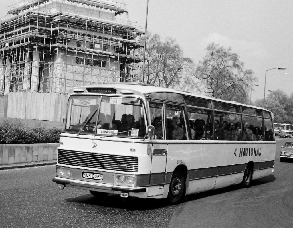
By the end of 1974, Eastern Counties had rebranded coach Bedford Duple-bodied CB845 to their Mascot National subsidiary by applying the new fleetname revised standard red 3⁵/₈ inch fleetname style, but without removing the 3½ inch Eastern Counties fleetname and band in the previous style. It is seen here on a relief service in Norwich in December 1974. Photo: Bernard Watkin, Eastern Transport Collection Society.Ron Whitehouse’s letter of November Sept 1972 specified a number of alternations to the initial white coach livery set out in the Corporate Identity Manual issued in May of that year. The revised operating company fleetnames – or ‘company identifiers’ – were enlarged to 3⁵/₈ inches, in Wilson’s National lettering, and were set in poppy red, regardless of the company colour. This gave a greater uniformity to the National coach fleet. Preserved Eastern Counties Bristol RE coach RLE747 illustrates the revised style of local company fleetname. Photo: Richard Price.Futura was the typeface used in Norman Wilson’s initial work on the NBC corporate identity late in 1971. A thickened version of a heavy weight of Futura was used in the mock-ups shown to the NBC Board at the start of 1972. Before the early trials on vehicles in April, however, Wilson had switched to Akzidenz-Grotesk, on which he based his National lettering, using a thickened version of a heavy weight as the base and incorporating elements of Futura. For most signage, standard Akzidenz-Grotesk was adopted and is specified in the 1972 Manual. Nevertheless, Futura was retained on vehicles throughout NBC for labelling, fleet numbers and the ‘legal lettering’ to show ownership, and is still widely used for these purposes today. Though the Manual specified only ‘lettering in steel-grey’, NBC supplied all companies with standard labels and lettering transfers set in Futura. Photo: Richard Price.In the revised white coach livery, with larger NBC-red operating company fleetnames: Western Welsh’s coach 172, a Plaxton Panorama-bodied Leyland Leopard, at subsidiary Rhondda Transport’s Porth depot in April 1978. This standard version of the NBC livery endured for more than a decade. Photo: Richard Price Collection.Uniformity was not quite achieved with the new approach. Interpretation was often needed to reflect the different shapes and mouldings of coach bodysides. The revised instructions were ambiguous on the precise positioning of the company name ‘above the wheel arch’ and local discretion was applied, bringing the occasional reprimand from NBC headquarters. This Everall Ford R226, seen at Marble Arch in 1976, unusually has the company name almost touching the wheel arch. Photo: Richard Price Collection.
At the start of 1972, in the early development of the Corporate Identity, Wood and Wilson focussed largely on the design and implementation of the white coach as the iconic representation of NBC on the roads, and the most urgent commercial challenge to address. Thoughts turned only later in the year to the application of the identity and roll-out to local buses and mixed-use coaches. In the next Corporate Identity Blog, we will look at the early implementation of the Corporate Identity to local buses, how this was described in the first Manual, teething troubles and oddities in the early roll-out.
Photographs from the Bernard Watkin collection appear by kind permission of the Eastern Transport Collection Society. Many thanks to The Bus Archive for access to NBC records and correspondence. This article draws on conversations with Jean Horsfall, John Oldfield and Anthony Dawson – to whom many thanks.
Did you experience the early years of the NBC Corporate Identity? Please post any comments or suggestions using the box below.
Local companies adapted the NBC corporate identity to service vehicles, producing some interesting (and occasionally wild) innovations.
Michael Hitchen, author of the leading book on the subject (see links at the end), presents a guest blog on the way NBC’s corporate identity guidelines were adapted (and widely ignored!) for local companies’ service vehicles.
Although the National Bus Company had existed since 1969 it would not be until 1972 that detailed Corporate identity instruction were issued. These included every facet of the organisation activities, including livery instruction on the Service Fleet, a mixed range of vehicles from vans, lorries, recovery vehicles, trainer vehicles and a range of miscellaneous types.
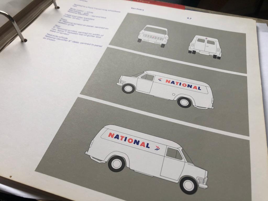
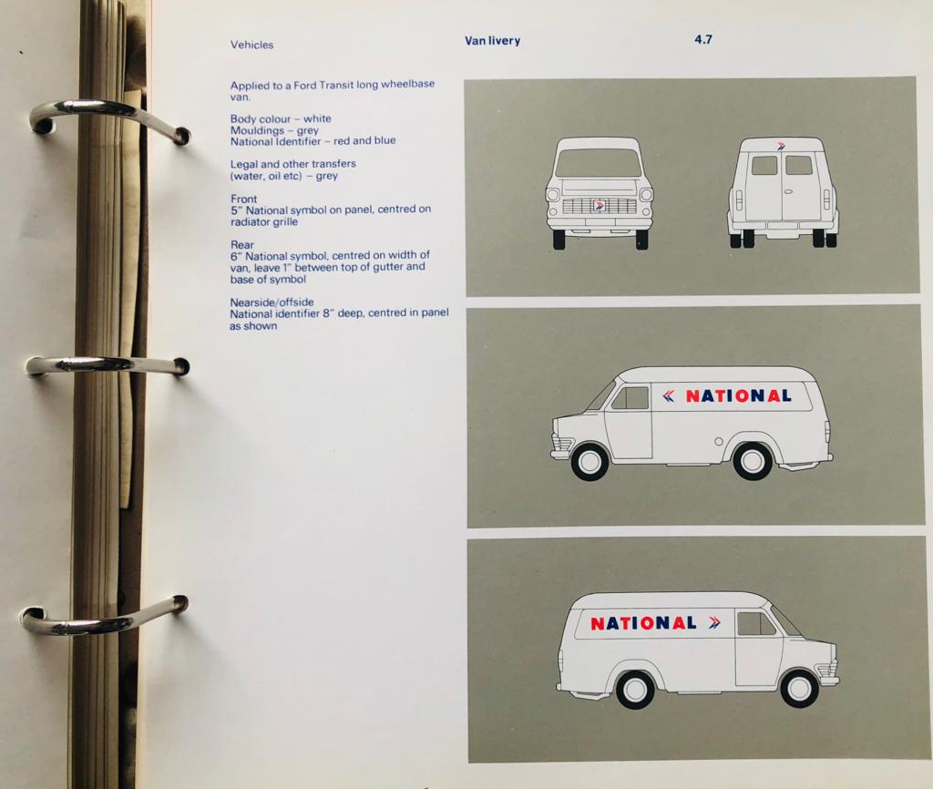
The 1975 NBC manual had only this to say on applying the corporate identity to service vehicles. Local company identities were not envisaged.
Reference to the appropriate page shows a medium size van as an example for the prescribed application. Unlike PSV vehicles where interpretation was relatively restricted, the Service Fleet was far more varied and the NBC allowed this one illustration to guide all other types of vehicle. This should have been straightforward as basically it was a variation on the Central Activities Group (CAG) coach livery, all-over white with red/blue NATIONAL lettering. Oddly, apart from the small legal lettering, there was no advice for the fleetname, which for CAG coaches initially had been a very small ‘company identifier’ underlined in the local company’s bus fleet colour, so if followed as per the manual, these vehicles would have been left anonymous across the NBC fleet.
Image 1 Trent A30 AEC Militant, as per corporate guidance, apart from the inclusion of Trent in red.
While that was the official guidance, in practice each fleet choose its own interpretation. A few did follow guidelines to a certain extent: Trent was a good example of compliance, with white applied to most of its ancillary fleet apart from its tree-lopper, which received all over yellow.
Image 2 Trent A55, again in the mid-1970s Trent followed the manual closely. A55 was a Bristol LD Driver training vehicle.
Ribble followed for its Trainers and some Breakdown lorries. East Kent and Alder Valley also had white vans, though Alder Valley replaced NATIONAL with its fleet name, as did Oxford South Midland.
The rest of the fleet contained a huge variety, rule of thumb was the use of the fleets base colour, ie Grass Green or Poppy Red, though I have no evidence of NBC Blue being used on Service Vehicles.
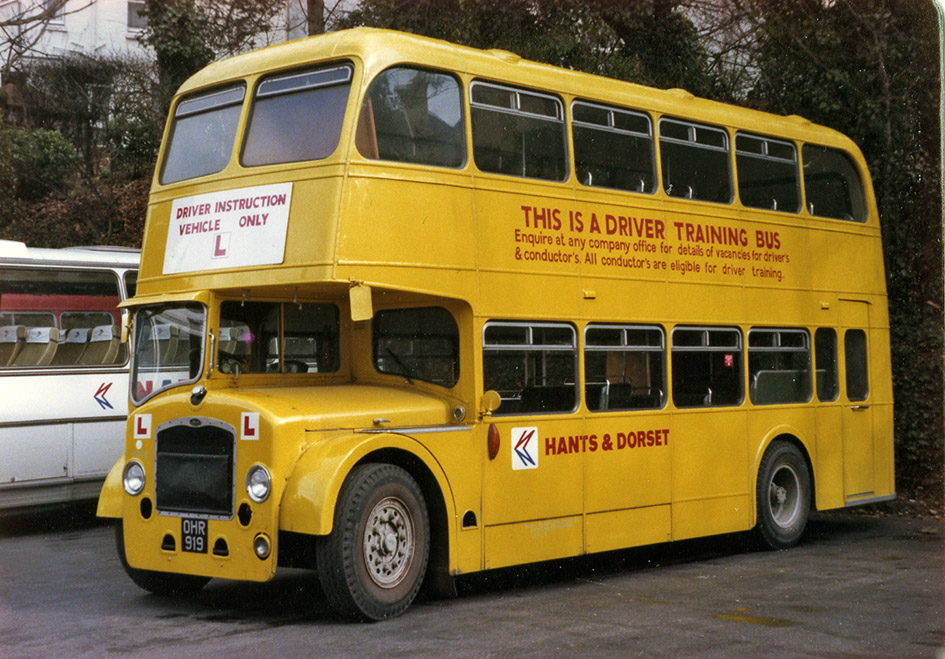
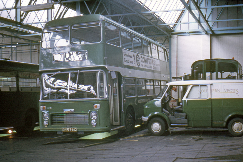
Image 3 Hants & Dorset 9092, apart from the corporate fleet name, Hants & Dorset applied carried this livery over in 1972, with a recruitment message along with the lettering stating the bus’s use.
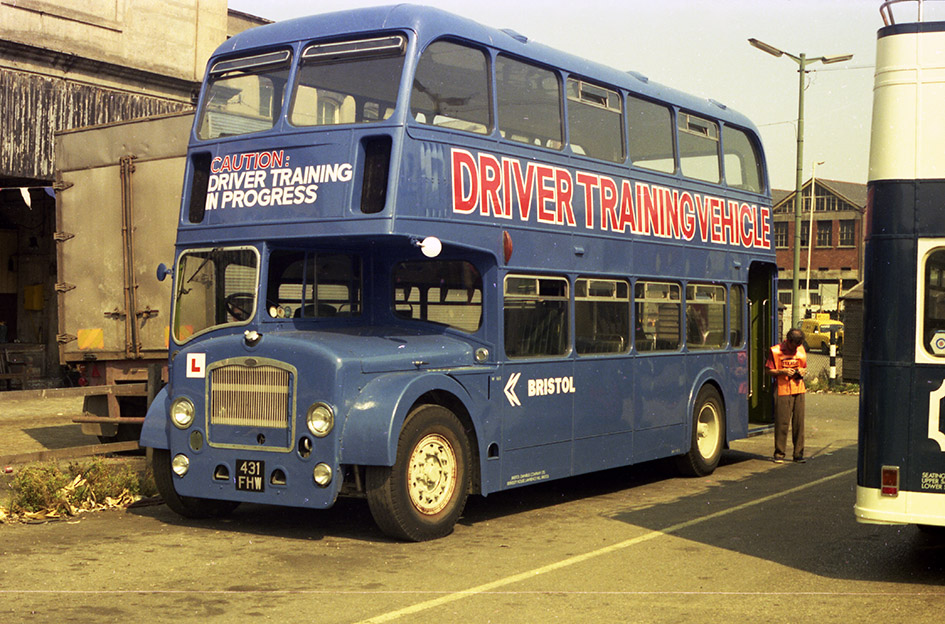
Variation of this application depended on the company, Crosville choose unrelieved Green on its vans and lorries and a dual-purpose livery for its recovery vehicles including it impressive AEC Matador Heavy Recovery Vehicle. National Welsh treated its vans in dual-purpose red/white but used yellow for its Recovery and training vehicles. South Wales often used red or yellow but with no fleet name. With these vehicles, variation was the running theme across the corporate NBC! The livery of Training vehicles depended on the fleet, Western National, Maidstone, Hants & Dorset, Eastern Counties use all over yellow, with variations on lettering; Eastern National and latterly Bristol, had used all over dark blue, Crosville applied a broad white band between the decks, as did Lincolnshire.
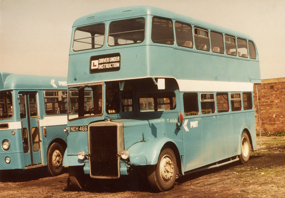
Image 4 Bristol W160, after years of using cream with an orange band, Bristol adopted the same livery for trainers as Eastern National. Image 5 PMT T466. Potteries trainer T466 display the unique non-standard blue in use in the mid-1970s, letter it used yellow.
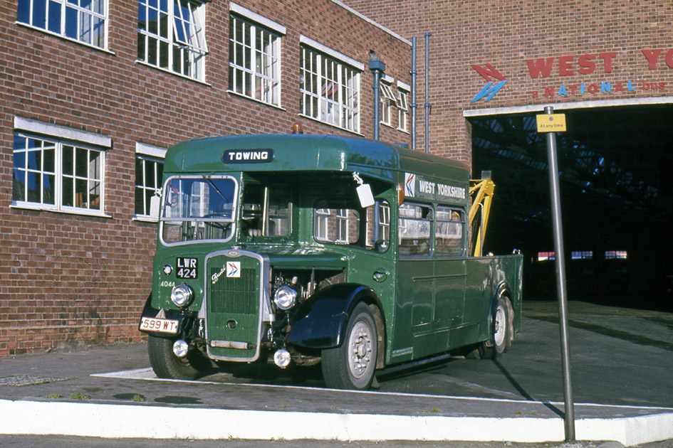
Occasionally this lack of strict abidance would see the discreet way of continuing pre-corporate practices, initially Bristol applied Orange/Cream to much of its SV fleet, Southern Vectis applied underlined gold serif fleet names on its dual-purpose liveried van for a time and West Yorkshire perpetuated its use of non-standard green to the majority of it service fleet (apart from Trainers) throughout the 1970s!
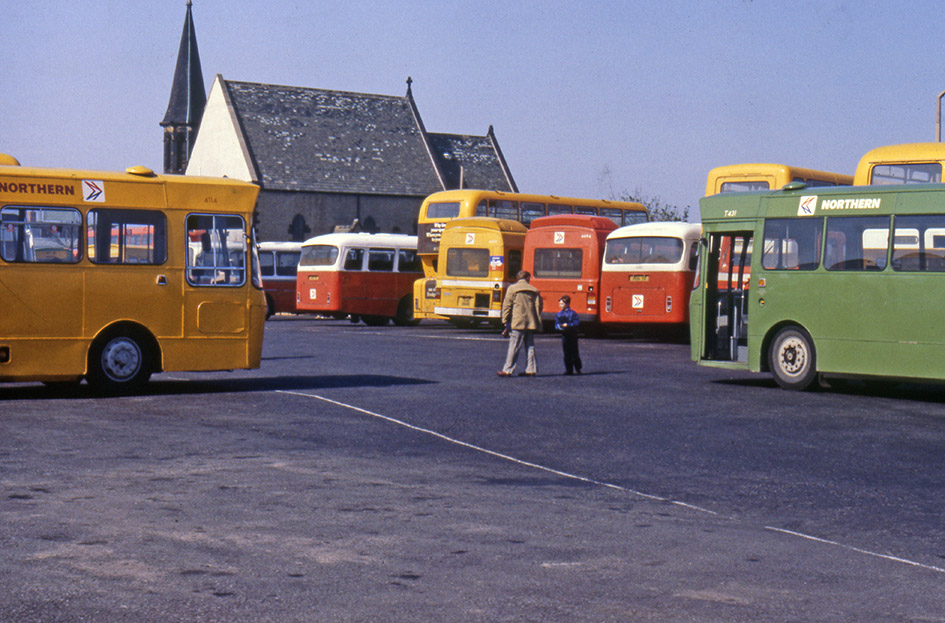
Image 6 East Midlands T2. For its small fleet of trainers East Midland was another company to adopt a unique non-standard livery, this time a shade of dark red Image 7 Northern T431. Northern General was unique with the NBC in using yellow for its service buses, where they were in cooperation with Tyne & Wear PTE, therefore it changed to green for it Training vehicles, to avoid confusion with its buses. This photo illustrates the reasoning for this colour!
It would not be possible to list the huge variety of interpretation that companies used, many changing within the corporate period! As time progressed particularly into the 1980s livery guidance changed as well, yellow became the standard livery for Heavy Recovery lorries, possibly because of legislation, vans could be seen carrying adverts to promote commercial activities, and vans could be seen in standard factory colours, possibly a cost saving measure, or just white as they where meant to be from the start!
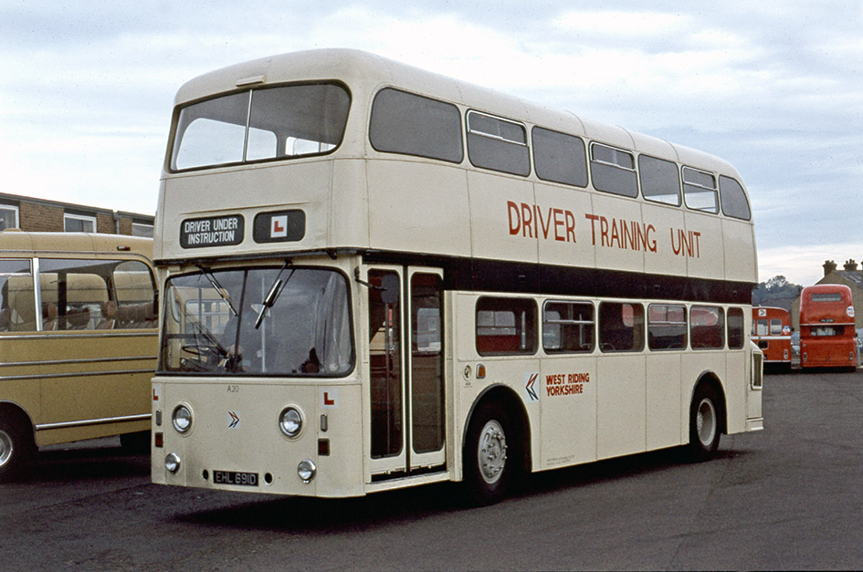
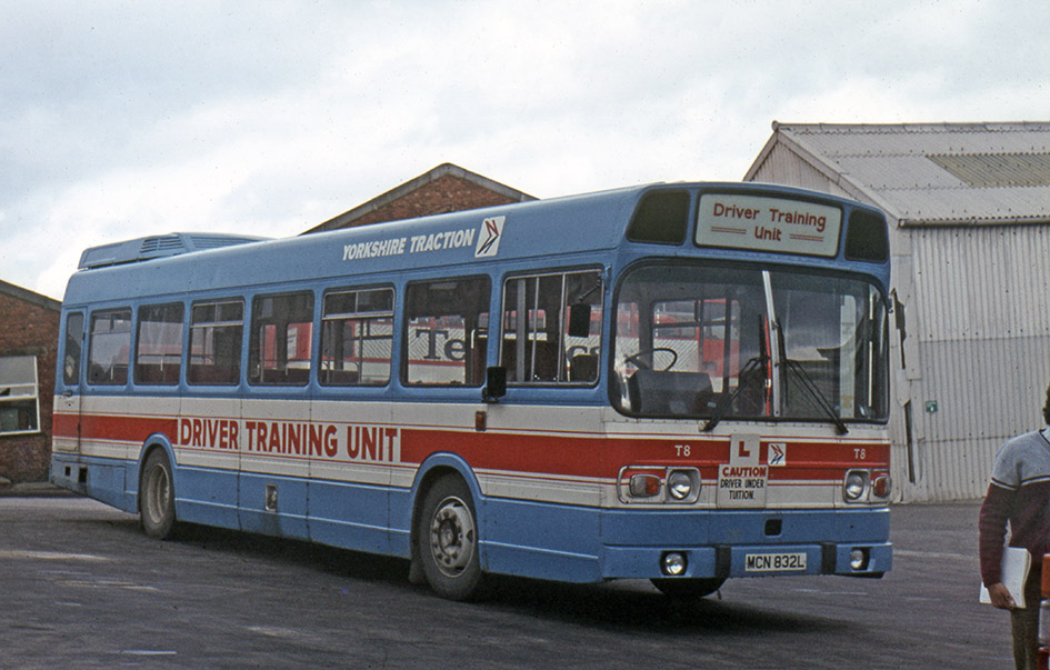
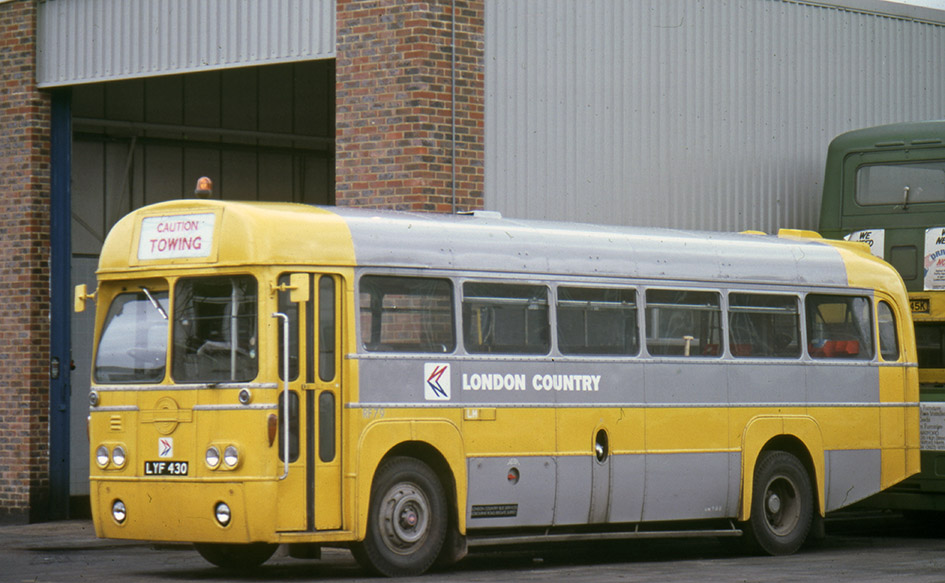
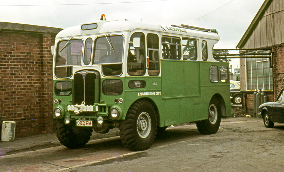
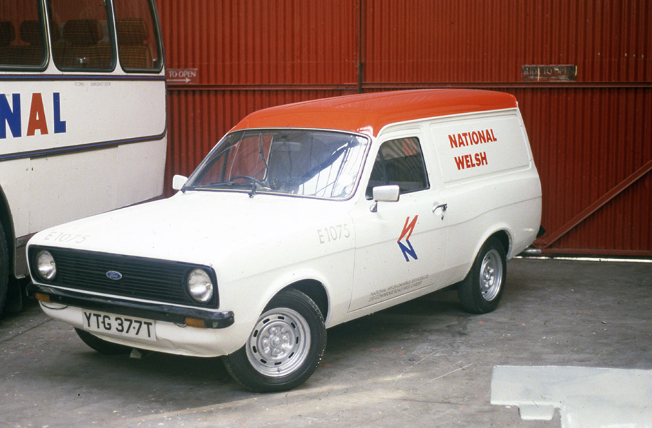
Image 8 West Riding A20. West Riding applied cream and black to its trainers, along with some bespoke signwriting which would have attracted the disapproval of NBC’s central projects team. Yorkshire Traction did also use similar livery for some of its training fleet. Image 9 Yorkshire Traction T8, in the mid-1970s YTC changed to this distinct Red, White and Blue livery for its driver trainers, latterly this livery could be found on some West Riding/Yorkshire trainers. Image 10 National Welsh E8. The Western Welsh group favoured all over yellow for its recovery and training fleet from 1972 onwards, Bristol MW E8 is typical of its application. Image 11 Bristol W144. Bristol had used Orange/Cream prior to 1972 and perpetuated this into the corporate era for a number of service vehicles, though this Bristol MW conversion has white in place of the cream. Image 12 West Yorkshire 4044. West Yorkshire a Poppy Red company continued using green for the majority of its service fleet throughout the 1970s. Bradford’s’ attractive recovery vehicle 4044 survives in preservation in this livery. Image 13 London Country RF79. LCBS converted three AEC RFs into Towing vehicles, all receiving variations on the yellow and grey livery. LCBS was formerly part of London Transport, which used grey for many service vehicles. Image 14 Crosville 59A. After 1972 Crosville used only NBC green (some with white) for all its service vehicle, only in the 1980s did other colours appear, AEC Matador 59A, seen here, eventually received all over yellow. Image 15. Western National RV8. Western National group, including Devon General, used all-over yellow from 1972 for all its heavy recovery lorries, AEC Matador RV8, looks superb with its company-built bodywork. Image 16. Southern Vectis 011. Southern Vectis Bedford CF van number 011 clearly show the use of pre-corporate lettering applied to the fleet’s vans in the 1970s. Image 17. National Welsh E1075. Yet more variety, Ford Escort Mk2 van carries white with a red roof. Later the company painted its small vans in a version of dual-purpose livery. Image 18. Crosville G759. For other duties companies adopted bespoke liveries, Crosville’s Information bus G759 a Seddon Pennine, gained and orange and red stripe to the NBC green, other companies ‘MAP’ buses received a range of bespoke liveries.
Many thanks to Michael Hitchen for providing this guest blog, including the photographs from his own collection. Michael is an authority on NBC’s liveries, and his book on NBC’s service vehicles is available from Amberley Books here: National Bus Company Service Vehicles 1972-1986 – Amberley Publishing ; and also from Amazon in hard copy or Kindle format.


![National Bus Company Service Vehicles 1972-1986 by [Michael Hitchen]](https://m.media-amazon.com/images/I/51LhcK7sOzL.jpg)
