

Red, white and blue was at the core of NBC’s modern corporate identity. So why was the company strangely reluctant to use blue across its huge fleet of buses and coaches?
In June 1972, the planning of NBC’s ambitious corporate identity programme was proceeding apace. Norman Wilson’s modern identity, inspired by Swiss design thinking and the Bauhaus, combined three elements – a striking geometric symbol; distinctive modern lettering; and the disciplined use of a narrow palette of bold colours to create a strikingly modern impression of the business and the industry. Red, white and blue were chosen as the ‘company colours’ for NBC as a whole and for the National express coach network. Red and blue lettering adorned the company’s trademark ‘white coach’, inspired by the extensive Greyhound network of silver coaches in the United States, and designed to be just as iconic.
Red, white and blue seemed a logical choice for a company branding itself as ‘National’. And it worked well, capturing the public’s attention through advertising campaigns to introduce the network, and through the sheer physical presence of the white coaches on the roads.

Developing a way to extend this approach to local bus services – making extensive striking use of the corporate colours – ought to have been easy. Indeed it seems that the original concept for the corporate identity was that buses would appear in one of two standard NBC colours: red, or blue. But there was a catch. Wilson and corporate identity champion, NBC chair Freddie Wood, ran into a groundswell of opposition from the NBC local subsidiaries’ General Managers who, fearful of a negative reaction from traditionalist staff, favoured incorporating another colour, green, into the corporate identity, reflecting strong industry traditions and the extensive use of green in local company liveries across England and Wales.
Wilson and Wood were modernisers, but they were pragmatists too. They relented in the interests of retaining the goodwill of the 50-or-so General Managers of NBC’s subsidiaries, an important part of the leadership on whom Wood depended to drive change through the business.
So the preponderance of green and red liveries led to an anomaly. In the interests of simple modern image, Wilson’s scheme restricted local buses to one of two colours. With the intervention of General Managers, green was added as an option, and companies chose red of green to reflect their previous traditions, using standardised shades specified in the Corporate Identity Manual.
There was a price to pay: the adoption of green effectively displaced the proposed use of blue as a standard colour, even though it had been championed by Wood and Wilson. Indeed the NBC identity was already based on red, white and blue, and a handful of existing bus fleets used blue as their livery colour. Wilson stuck to his guns on reducing the number of colour options to two, even though his design judgement was that green was at odds with the modern image of the identity.
So the experiments with design and early vehicle trials at Alder Valley and Crosville used red and green liveries. Norman Wilson did not like having to compromise on matters of design, particularly when he was convinced of the right answer. It is notable though that Wilson did not include a single green vehicle among the illustrations for the Manual: all of the vehicles in the Corporate Identity Manual are illustrated in red. (We will put this right when the Manual is reproduced by adding a few new pages.)
In the NBC collection at the Bus Archives, there are references to the work of the Corporate Identity Committee, attended by Norman Wilson. In the spring and summer of 1972, the committee had its hands full with the roll-out of and publicity for the ‘white coach’ network. They were also turning to consider Wilson’s proposals – within parameters already agreed by Wood – for applying the new bus liveries in green and red. The biggest challenge, as the operating companies’ General Managers saw it – was to address the logistics of getting this done quickly and consistently across 40-50 independently-minded subsidiaries. Faced with practical challenges such as how to paint over existing colours to get a consistent effect, how to apply the identity to existing colour schemes, and how to remove existing decoration and adornments, there was much lobbying from across the business for local exceptions and compromise. With Wood’s backing, and his characteristic bluntness, Wilson was having none of this, and saw little need to compromise on his designs and their rigorous application.
But reports from a meeting of the committee in July 1972 point to ongoing dithering on the question of blue buses.
Tony Whitehead, NBC HQ’s corporate communications manager, remembers that among the HQ Corporate Identity team, “the traditional blues were seen as being a bit dull – dark and old-fashioned”. But the advocates of blue were not easily silenced, particularly as they saw that the principle of blue as a corporate colour had already been established.
This led to an uncharacteristic fudge, reflected in a letter from Ron Whitehouse at NBC HQ to General Managers on 19 July 1972, summarising the outcome of the Corporate Identity Committee’s deliberations and subsequent management discussions:
“I write to advise you that, following discussion with regional directors, the Chairman and Chief Executive have decided upon a standard method of applying corporate identity to stage carriage buses together with rationalisation of livery colours…
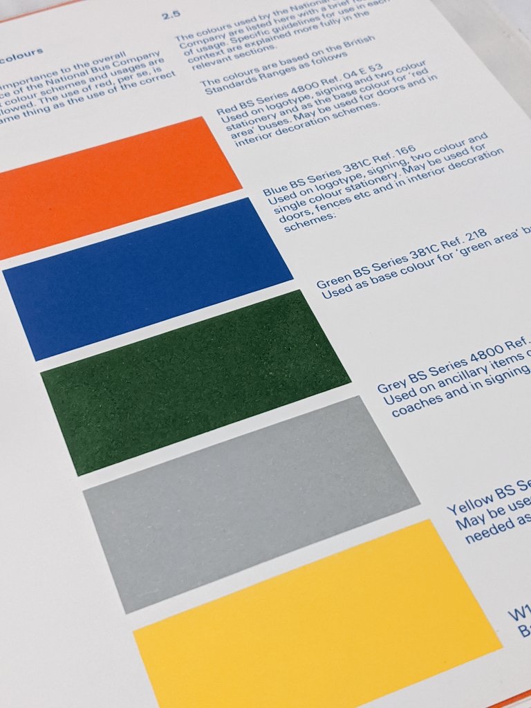
“There will be three livery colours only (with certain temporary exemptions) being – Red (BS series 2660 ref. 0-005); Green (BS series 381C, ref. 218), White (National W1) for relief (waistbands, symbols and titles). Creams will be discontinued.
“The exemptions for the time being may be ‘blue’ bus fleets, and Regional Directors will be talking with Chief General Managers regarding the future of this colour.”

These changes to local liveries involved a sweeping away tradition to produce a striking visual impact, but it was common for staff and managers of the local companies to regret the changes, particularly where a radical departure from established colours was involved.
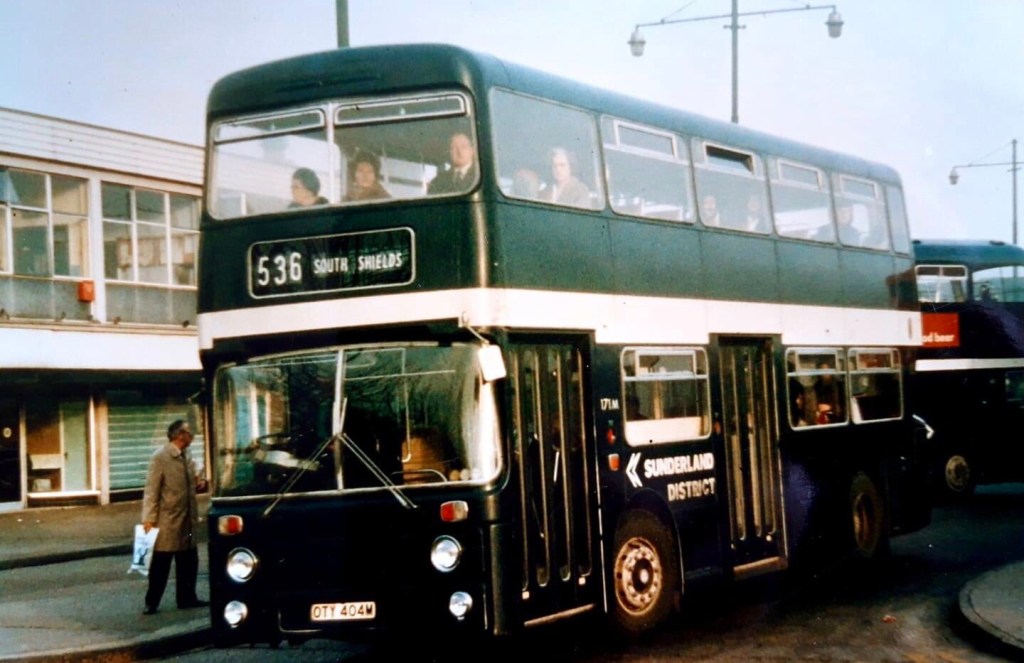
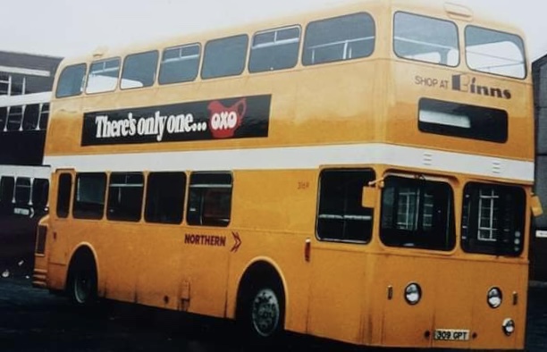
We don’t have records of all of the regional discussions, but at a meeting of the Eastern Regional Management Committee on 26 July 1972, Regional Director C D F Rawlinson asked his Chief General Managers “to recommend whether or not the existing blue liveries should be retained at Sunderland District, East Yorkshire and Midland General, and whether there would be any difficulty in changing the livery of Venture (Newcastle) to Standard Red (from yellow).”

Following this up in a memo to General Managers J W Lawrence, Chief General Manager for the Midlands, asked “Can we give consideration to the Yorkshire Woollen District and East Midland fleet taking the National Red colour and eventually the Midland General fleet taking the in the National Red which would be the Trent colour. I know there may be difficulties and objections in certain areas to this, but I think we should examine this very closely.” Though it was hardly differentiated in a sea of red companies across the north, we know that Yorkshire Woollen resisted a switch to green. Meanwhile Midland General – although combined with Trent as a single business entity from 1972 under General Manager L Waller, retained its blue identity.

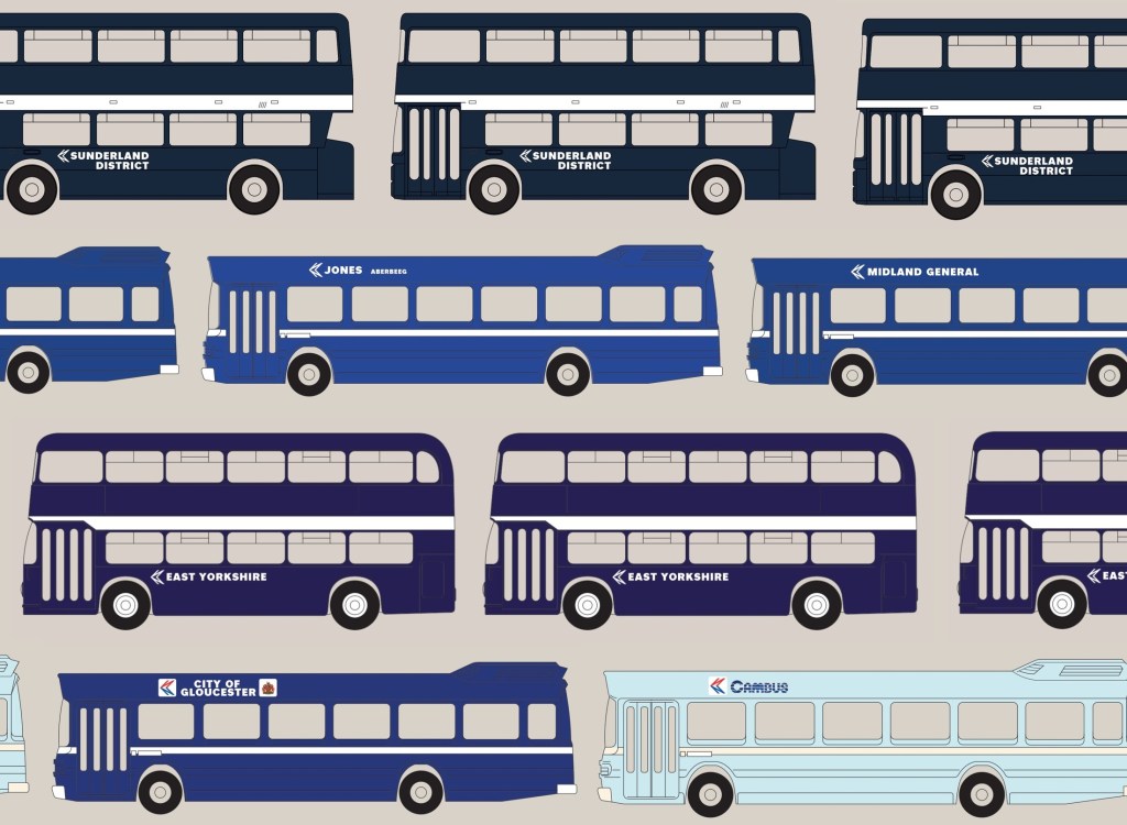
It’s not clear exactly what discussions occurred elsewhere between Regional Directors and Chief General Managers, but what is clear is that a blue persisted. It was applied in Corporate Identity form in Sunderland District, East Yorkshire, Midland General and at Jones of Aberbeeg. And though a colour code for standard blue was specified in the manual, the lack of clarity on how it related to vehicle liveries meant that no single shade of blue was adopted across NBC’s subsidiaries, with big variations between companies as they continued to use their existing supplies of paint. However, as these companies’ areas did not adjoin one another, these local differences were rarely noticeable in practice.
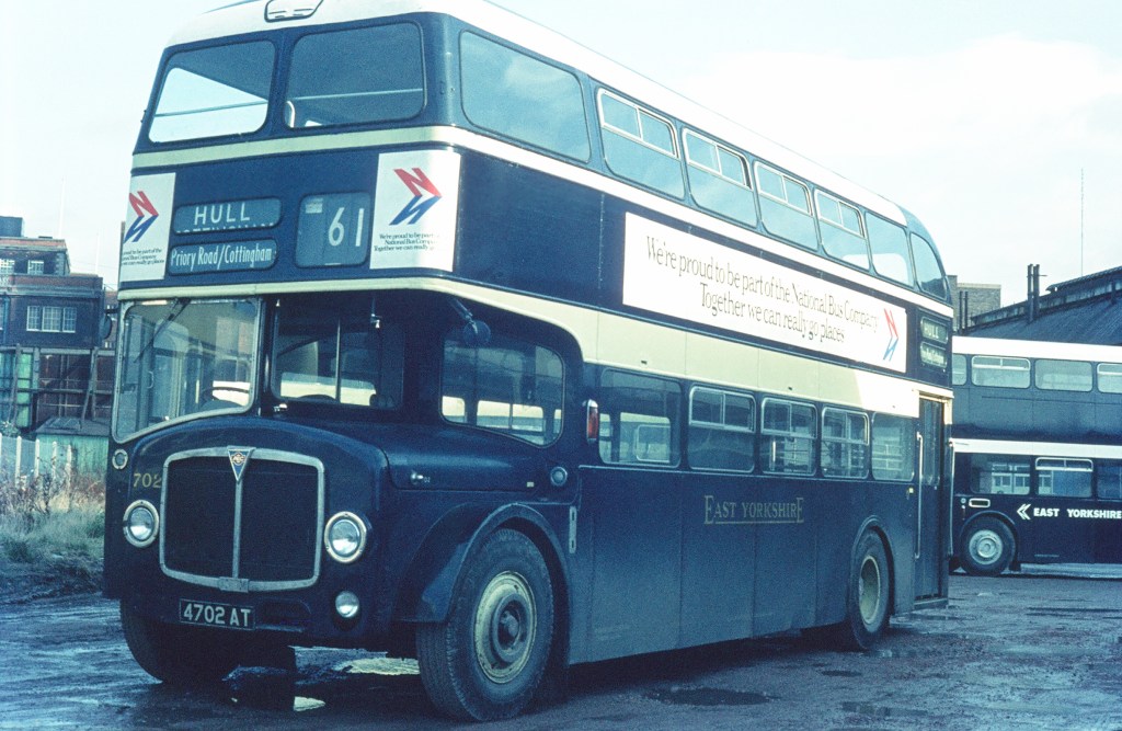

So East Yorkshire retained their previous dark ‘indigo’ blue livery, though their primrose banding was lost in favour of the more modern-looking standard white. Unlike their buses, East Yorkshire’s coaches and semi-coaches had used a different, lighter shade called Riviera blue to relieve the primary colour of ‘buttermilk’ cream. While the company’s coaches went National white, Riviera blue was carried over into East Yorkshire’s version of NBC dual-purpose/semi-coach livery.[1]
Sunderland also continued to apply their own shade of ‘midnight blue’, initially simply adding the NBC symbol and white lettering to the existing livery with a broad white band. Midland General used a mid-shade of blue, slightly darker than the version specified for the NBC symbol and National logotype, and looking particularly dark when applied to an entire vehicle rather than just the lettering.
Another letter from Ron Whitehouse of 9 November 1972 put an end to another residual piece of blue livery, when Western National coaching subsidiary Royal Blue lost its blue fleetname underlining and – with the rest of the National White Coach fleet, adopted the new standard larger fleetname in red NBC lettering, without a bar representing the company colour.

In Wales, Jones of Aberbeeg was purchased by NBC in 1969, initially coming under the management of Red and White Services Ltd, but retaining its own identity and working practices as a separate depot unit, managed by a Jones family member. The Jones identity persisted into the 1980s as a result of local fare agreements: Jones typically offered lower fares than Red and White or Western Welsh, and the Traffic Commissioners insisted these fare advantages should be retained after Jones became part of the larger group. The company initially kept its blue-and-ivory livery as part of this arrangement, and this was applied to a number of Red and White buses transferred to Jones. Once the NBC Corporate Identity was introduced by NBC across the country, corporate blue was adopted for Jones of Aberbeeg. Quite quickly, Wilson’s rules for the layout of colours and bands, NBC fleetnames and symbols were applied. So NBC standard blue joined the range of existing shades already in use.


Richard Morgan of the Cardiff Transport Preservation Group (CTPG) in Barry recalls that new Leyland Nationals for Jones were all delivered in poppy red, and had to be repainted in corporate blue before entering service. Tudor Thomas, former Advertising and Promotions Manager for National Welsh and now an active CTPG member, remembers that repainting into blue was done at Red and White’s Bulwark works near Chepstow, “probably one of the country’s best bus works – never a hint of anything slap-dash”. Colour variations emerged depending on how the painting was done, too. Inconsistencies could emerge if blue was applied directly onto a red base to get buses into traffic quickly, while others had blue primer applied before the final coat. For Jones’ new Leyland Nationals, Bulwark Works almost certainly adopted the latter approach.

Tudor recalls that “when buses eventually had the blue and red version of the ‘flying N’ symbol [from 1976] the blue shade in the symbol was exactly the same as the blue of the bus… this tends to support the theory that the basic blue paint [used for Jones’ buses] was the official blue version: certainly the blue in the symbol was not lighter.” So in the array of different shades, Jones’ Leyland Nationals from that era probably gave the clearest idea of what a Corporate Identity-compliant blue livery should have looked like. Two were painted in a smart blue version of the dual-purpose livery, for express services along the A48.
NBC HQ tightened the rules through the autumn of 1973, and on 2 January, Ron Whitehouse wrote to all subsidiaries’ General Managers reminding them that “stage carriage busses generally are to be painted either standard red or green, depending on the traditions of the company. There are some exceptions, usually where we are involved in working closely with local authorities and PTEs, but each such exception must have the approval of the Chief Executive, such approval being sought through the Regional Director.”

By this stage blue was already on the way out in the north east. Under pressure from NBC HQ and regional management, East Yorkshire abandoned its traditional dark blue in October 1973 and switched to red. Many of its vehicles went straight from their traditional livery to NBC red, without an intermediate spell in NBC blue. Sunderland District held out a bit longer. Its parent company Northern General adopted red as its main colour, but as we’ve seen it also made extensive use of NBC yellow, reflecting its work in partnership with the Tyne and Wear Passenger Transport Executive. With transitions to both red and yellow going on , Sunderland blue persisted for a while in the new Corporate Identity format, but was gradually phased out along with the separate identities of Northern’s constituent companies in 1975. It was gone before the 1976 amendments to the Corporate Identity, which saw among other things the monochrome NBC symbol replaced by a red and blue version on a white panel.
Michael Mccalla recalls several months or repainting blue Sunderland vehicles into NBC yellow – widely used by parent company Northern to reflect the role of the Tyne and Wear Passenger Transport Executive in planning and funding services. As well as repainting the first bus from Sunderland’s midnight blue to yellow (see picture and caption), Michael recalls that spray-painting had to be used to get the right coverall effect, making sure that the strong underlying blue colour did not affect the tone of the yellow.
As we have seen, the Midland General blue identity was initially retained, though it was steadily replaced with red through the mid-1970s, the last blue bus leaving service in 1978 when the company was finally fully merged into Trent.[2]

The funding arrangements with local government meant that Jones managed to retain its identity and blue livery a little longer – well into National Welsh ownership, during which the new red-and-blue NBC symbols were applied in 1976 to bring the blue livery into the new instructions from NBC HQ. Jones was eventually subsumed into National Welsh in 1980. [3]
Blue would however make a small revival in Gloucester. A resurgence of local identities following NBC’s Market Analysis Project, which among other things launched new local networks with their own identities. Most subsidiaries applied route or local sub-brands, but the Bristol Omnibus Company chose to launch local semi-independent and separately-branded operations based on towns and cities in its area, and in 1983 split off its services covering Cheltenham, Gloucester, Stroud and Swindon into the separate Cheltenham and Gloucester Omnibus Company in readiness for privatisation.

Asserting its newly independent identity, the new company switched from Bristol’s green to adopt NBC red as its standard colour; but within a few months began applying new colours to distinguish its local operations. For its City of Gloucester network, it switched to blue, adopting a rich, dark shade known as ‘Gloucester Aircraft Blue’ in reference to the City’s aviation history.[4] Stroud Valleys meanwhile retained Bristol’s green colour.
In the east, in contrast, a much lighter shade – Cambridge blue – was adopted by Cambus, a new NBC subsidiary formed in 1984 by splitting off parts of Eastern Counties’ western area in preparation for privatisation, under the leadership of MD Paul Merryweather. Initially applying the company’s new logotype, believed to have been designed by Cambridge designer Antonia Galloway and departed from Wilson’s National lettering, with the NBC symbol onto its share of Eastern Counties’ red buses, Cambus rapidly applied its new local livery. Initially this was a straightforward application of a Cambridge light-blue and cream version of the livery configuration specified in the Corporate Identity manual. A two-tone light and dark blue ‘venetian blind’ striped livery was adopted for dual-purpose buses used on long-distance routes. Finally, a two-tone blue and white livery was adopted on privatisation, combing Cambridge blue and Aircraft blue.

If you can add to the story of the blues, have any recollections of the abolition or adoption of NBC’s shades of blue, or own one of the restored examples in reservation, please get in touch!

If you have recollections of the roll-out of the corporate identity, how it was managed, or remember your initial reaction to it, please let us know. Comments and corrections are also very welcome. We’d be happy to include these in a future blog, and perhaps in the Manual book itself. Get in touch using the form on this page, or the contact page here: https://nationalbusmanual.com/contact/
Sources and references
[1] Many thanks to Stephen Allcroft and Philip Rushworth for information on East Yorkshire’s coaching colours.
[2] History – Midland General Omnibus Company (weebly.com)
[3] The early NBC era (nwostins.co.uk) – Nigel Frampton’s National Welsh Omnibus Services pages
[4] Rob McCaffery: Gloucestershire 1986, in Transport Illustrated. Transport Illustrated: Gloucestershire 1986 (transport-illustrated.blogspot.com)

21 replies on “The story of the blues”
A lot of United vehicles were in the yellow Tyne and Wear livery too and unlike Northern often didn’t have the company name displayed on the bus.These Tyne and Wear United and Northern buses generally only worked in the Tyne and Wear PTE area but occasionally you’d see them as far down as Middlesbrough but I’m guessing that they must have occasionally covered pretty long distances on United runs to Carlisle and Berwick if no red bus was available.
LikeLiked by 1 person
Thanks Kevan, I need to add this to the Poppy Yellow page: https://nationalbusmanual.com/poppy-yellow/
LikeLike
You refer to East Yorkshire’s “indigo-blue” livery in the photograph of Leyland Leopard 881. East Yorkshire used two shades of blue, “indigo-blue” for buses, and a lighter pale-blue for dual-purpose vehicles and coaches – this distinction was continued into the years of NBC corporate application, and 881 is, in fact, sporting the lighter-blue livery as appropriate.
LikeLiked by 1 person
Thanks Philip – I meant to change that. In some pictures the lighter blue looks like NBC standard blue – is that right or is it a lighter shade pre-dating the corporate identity?
LikeLike
The blue used by East Yorkshire for dual purpose vehicles in the early NBC corporate era, before NBC red was adopted, was the pale-blue used for dual purpose vehicles and coaches during the BET and pre-corporate NBC years. It was somewhat lighter than NBC blue, a sort of darkish sky-blue – the difference would be quite distinct side-by-side.
The problem with vehicle colours – even before one starts to consider the effects of different makes of photographic film and various degradation of film and photographs over time and digital restorations – are the effects of over-painting previous colours (as someone who unwisely agreed to his teenage daughter having her bedroom painted purple, and is now [trying] to repaint it a pastel shade, this is something of which I’m only too aware), the variations in shade between different manufacturers, and variations in shade between different batches from the same manufacturer; the eight ECW-bodied Bristol VRTs delivered to East Yorkshire in 1973 wore a particularly dark indigo-blue NBC livery, to the extent that there was discussion in the enthusiast publications of the time as to whether they had been delivered in black (incidentally, these eight vehicles, although not contoured for Beverley Bar, did sport the white roof flash on their NBC indigo-blue livery).
LikeLiked by 1 person
Brilliant. Thanks. I’ll make some changes to the text to reflect this. You’ll see Michael Mccalla’s comments about overpainting blue with yellow at Northern, too. And in a previous blog, Eastern Counties’ challenges in painting red over blue, after one of its ex-Scottish VRs was accidentally painted blue.
LikeLike
The reference to Yorkshire Woollen is interesting, l wondered why in a Yorkshire of red, sister company West Riding which had been green, was not retained for it and Woollen district?
LikeLiked by 1 person
I wondered that too. This blog has solved a few mysteries (for me anyway!) and opened up more. On West Riding – a quick investigation reveals that their trams in and around Wakefield were red, and when buses took over the ex-tram routes used red buses, and everything else was green. However in practice quite a large proportion of vehicles were red, as they operated routes which -would- have become part of an expanded tram network which was never built (the ‘statutory’ network defined by an act of Parliament in 1904). That continued more or less up to the corporate identity era, when they standardised on red. Logically I agree, green might have made more sense!
LikeLike
Sorry, but I have to correct you here: only buses on routes which replaced tram routes (Wakefield-Ossett, Wakefield-Leeds, and Rothwell-Leeds were painted red – to indicate that they charged lower fares, and on the Leeds services carried passengers within the Leeds City Transport area without protective conditions (unlike other West Riding services running into Leeds). As such, only a minority of the West Riding fleet ever wore red, and this red livery had been discontinued by the time the NBC was formed.
When the “West Riding Group” of Hebble/West Riding/Yorkshire was formed under NBC the GM of Yorkshire, Fred Dark, was made group GM but the senior management team based themselves in West Riding’s premises at Belle Isle in Wakefield, which were more extensive than those of Yorkshire in Savile Town, Dewsbury. This – together with a proposal that Yorkshire adopt the fleetname YORKSHIRE WD – made the Yorkshire men “uneasy”, so to placate them it was decided that West Riding and Yorkshire would adopt NBC red, despite West Riding being the larger company (Hebble being coaching only at this point would be white) to reflect the Yorkshire heritage.
LikeLiked by 1 person
Philip – that’s a great clarification. Very happy to be corrected. The perils of internet-based research. Thank you very much.
LikeLike
I think what you’re doing is fantastic, and I look forwards eagerly to being able to purchase the finished product. I’m not looking to nit-pick on bits-and-pieces, but if I can provide further detail – and I think that what I’ve provided with regard to East Yorkshire and Yorkshire/West Riding is probably it – I’d hate not to share it.
Incidentally – returning to NBC blues – Ribble painted one its Standerwick VRLL coaches in a NATIONAL white livery relieved with (NBC-standard?) blue window surrounds; this may have been pictured in Classic Bus magazine, but its certainly been featured on the “Sct61” website . . .
LikeLiked by 1 person
Thanks Philip – please keep the comments coming! I have a copy of the Standerwick VRLL experiment somewhere – I’ll dig it out.
LikeLike
First of all, thanks for your acknowledgement of my website as a source of information. However, for the benefit of future readers, can I point out that the link you have provided is to a development version, and the live page is at:-
https://nwostins.co.uk/the-nbc-era/
I found your article from a reference to it in the “Public Transport Experience” blog, and I have added a comment there with my thoughts on the subject of the blue Jones of Aberbeeg livery in the NBC era, as follows:-
Jones of Aberbeeg retained their blue livery for a period of ten years from the acquisition of the company by NBC, and this is generally understood to have been a condition of the sale. A member of the Jones family also remained with the company in a management position for several years after the sale. I am also reasonably sure that the shade of blue used in the NBC era was the same as had been used in the pre-NBC era. The layout of the colours was different, and the colour reproduction on those now quite old photos is probably not entirely accurate.
For Philip R, who commented above – here in Germany, it is quite common to cover the walls of a room with wood chip wallpaper (raufasertapete) and then paint over it. Maybe a solution for your daughter’s bedroom?
LikeLiked by 1 person
Thanks Nigel – I’ll update the link. Your pages are superb, so thank you both for posting them and for making contact. On Jones, former National Welsh staff recall that the company’s absorption by WW/R&W – both former competitors- was agreed by the Traffic Commissioners with the condition that the company’s (generlly cheaper) fare structure and separate operations were retained, so bus users weren’t worse off. So it was indeed a condition of the sale, but not in the way I first thought. I also think you’re right that initially the lighter Jones blue was used, but fairly quickly replaced by NBC blue, with repaints done largely at R&W’s central works. As for the perils of both ‘painting over’ and photographic reproduction of blue – I couldn’t agree more! It makes this whole subject both fraught and fascinating. Thanks again for getting in touch.
LikeLike
History in general, and archives in particular, are frustrating, because they are places of absences. With regards to Jones blue, it’s more than likely that initially existing stocks of paint were used up, but after that from where did Red & White/National Welsh source paint? – did they use the same supplier or change to their own supplier if different, and was that supplier able to supply the same shade (and even “same shades” vary between manufacturers) or something approximating to the Jones shade? if they couldn’t supply the Jones shade then perhaps it was decided to use NBC blue (the two must have been very similar given the “did-they-didn’t-they” nature of the discussion”) and as Jones did continue with a blue livery long after the other blue companies (they must have been the only blue company to apply the revised red-and-blue-on-white double-N?) perhaps they did later change to NBC standard blue. Unless there are records of this, and at the time none of it would have been regarded as significant and particularly worthy – or in the case of telephone or other verbal discussions, capable – of recording, and any records might well have been destroyed. looking back at variously degraded/restored old photographs taken on different makes of film under different lighting conditions of vehicles painted in possibly the same/possibly different, but very similar, shades of blue from God-knows-which manufacturer isn’t really going to lead to any sort of definitive answer. I think that where Jones is concerned the only answer is admit uncertainty: that its not clear – because the shades of blue were so similar, conflicting recollections, and lack of documentary evidence whether Jones continued with Jones blue to the end of their existence, or whether it adopted NBC blue at some point.
Whilst on the subject of Jones, two other points come to mind: firstly, I’m sure that Jones white coaches carried the 3″ JONES name in blue, rather than red; secondly the JONES ABERBEEG fleetname, used on buses, but not coaches, was unique in rendering Aberbeeg in 3″ lettering – why did R&W/NBC feel it necessary to include this appendage to the Jones fleet-name, when prior to the introduction of NBC corporate livery “Jones” alone had been fine?
And finally, to Sunderland District. Like East Yorkshire, in pre-corporate Sunderland District used a lighter blue for coaches and dual-purpose vehicles . . but the only vehicles I’ve seen in NBC corporate livery have been buses in the darker blue – so, did Sunderland District not repaint any dual purpose vehicles before it was wound-up or were dual purpose vehicles repainted in the darker blue livery (as buses or dual-purpose style)?
Imagine what fun we would have had if County, Stratford Blue, and Thomas Bros had survived under NBC long enough to enter the corporate livery era!
(Oh! and in the original posting you write about consideration being given to Yorkshire and East Midland adopting NBC RED, in the context of the section I think you might have meant NBC GREEN . . .)
LikeLiked by 1 person
Philip – A Jones of Aberbeeg coach with the small blue fleetnames can be seen here:-
https://thetransportlibrary.co.uk/index.php?route=product/product&product_id=174304&search=Jones+aberbeeg+RELH
I don’t know why NBC chose to append “Aberbeeg” to the Jones fleetname, but you probably won’t be surprised that there were several operators named Jones in South Wales! I did also think that the inclusion of “Aberbeeg” in smaller letters was unique, but it wasn’t – Oxford added “South Midland” to the fleetnames of some vehicles:-
https://thetransportlibrary.co.uk/index.php?route=product/product&product_id=206150&search=Oxford&category_id=475&page=7
I see that the author of the post says that the Jones blue/white dual purpose livery looked good on RD4872 in the photograph. Unfortunately, that layout of the colours was not compliant, since the waistband should have been blue – as in this photo of a later vehicle (sorry about the long link, but if you go to the actual page, the visitor has to log in):-
https://www.google.com/imgres?imgurl=https%3A%2F%2Fbuspast.zenfolio.com%2Fimg%2Fs%2Fv-10%2Fp791361575-4.jpg&tbnid=B_39F3plUWXQ6M&vet=12ahUKEwjgrOTEzuj9AhVRkicCHaxwDhMQMygPegQIARBL..i&imgrefurl=http%3A%2F%2Fbuspast.zenfolio.com%2Fp150301468&docid=6iX4oqBpX5PsfM&w=800&h=538&q=cwo297k&client=ubuntu-sn&ved=2ahUKEwjgrOTEzuj9AhVRkicCHaxwDhMQMygPegQIARBL
However it seems to have retained the white band even when it was repainted red after the closure of Jones:-
The comment about East Midland is a quotation, but EM did select NBC green, despite having been dark red in the later BET era. One wonders if that was an acknowledgement to Mansfield District, in the same way that Hants & Dorset’s adoption of poppy red was to Wilts & Dorset (based on contemporary reports). The difference is that the Mansfield District name was retained, whereas “Wilts & Dorset” disappeared in 1972 – but then, the W&D name was a geographical misnomer, since the company had two major depots in Hampshire, but just one small depot in Dorset (using the county boundaries current in 1972)!
LikeLike
C:\Users\Paul R Rowden\Pictures\EYMS\925.JPG 925 the first ECW Bristol VR bus in the EYMS fleet sporting the white roof band also had the NBC seat moquette 930 from the 2nd batch of ECW Bristol VR
LikeLike
It’s interesting that blue would have been considered appropriate for the NBC as an English and Welsh operator anyway given that colour is seen to represent Scotland in a UK context. Perhaps they should have gone the whole hog and replaced blue with green (to represent Wales) on coaches as well in a similar fashion to the short lived post NBC “London Express” livery?
LikeLiked by 1 person
It’s a good question Philip – a future blog will also look at NBC’s TrawsCambria identity, which worked well in red and green, as a joint venture between Crosville and National Welsh.
LikeLike
Blue for Bristol would have been justified on historical grounds, as the livery for the Bristol Tramways and Carriage Company was blue and white prior to World War 2. I couldn’t tell you which shade, but I suspect it was the same as the Gloucester aircraft blue.
LikeLiked by 1 person
[…] Blue, meanwhile, was used by relatively few local companies, so though it would have been a better fit with the National identity, it was argued that adopting it nationally would have required more upheaval. In practice, of course, the introduction of the new identity required all vehicles to be repainted in the new colours anyway, so whether switching to blue would have been more challenging logistically is a moot point. Norman Wilson appears to have resented the compromise to include green in the corporate identity so fiercely that the colour green does not appear on a single vehicle illustration in his otherwise comprehensive Corporate Identity Manual, even illustrating liveries for ‘green’ companies in red. (The reprint of the Manual will add in some green illustrations as ‘extra’ pages.) […]
LikeLike