
The designs for the NBC corporate identity were a hit in Czechoslovakia in 1978.
NBC’s corporate identity went global in 1978. Norman Wilson’s work had a history of gaining international recognition, one of the highlights being awarded a certificate of merit at the pathbreaking Typomundus 20 exhibition in 1966 for his graphic designs for Croda, playing with a creative combination of photography and type.
A decade later, Wilson was asked by NBC to refresh his original 1972 corporate identity designs, making more use of the two-colour version of his N-and-shadow symbol; expanding its coverage to uniforms, built environment and signage. The whole thing was consolidated into a sturdy ring-bound folder, which would be added to over time, and would be more durable in garages and workshops than the slim-bound A4 sheets released as the original Corporate Identity Manual in 1972.
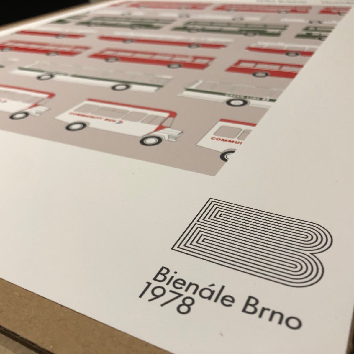
It was this more substantial Corporate Identity Manual which Wilson decided to submit for exhibition at another international festival of graphic design, the Brno Biennale, in 1978. Sponsored by the Ministry of Culture of the Czechoslovak Socialist Republic, the Biennale had been launched in 1963, holding lively events every two years with an exhibition at the Moravian Gallery in Brno, and by the mid-70s had established itself as a prestigious fixture on the graphic design calendar. At the time it was a rare cultural event, attracting interest and exhibitors from both sides of the iron curtain.

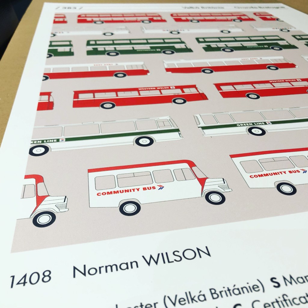
Wilson submitted the NBC manual, which was accepted as one of the leading examples of recent British design. The illustration used for the catalogue showed a selection of livery diagrams, some of which also appeared in different forms in the manual. A smaller version was used for the cover of the 1976 NBC Annual Report.
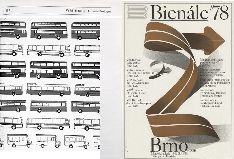
It shows a selection of typical NBC vehicles in different colours, showing the variety of services the company provided, and to emphasise its national coverage, fleetnames included Northern for the north, Southdown for the south, East Kent representing the east, Western Welsh for the west and Wales, and Midland Red for the centre.

The catalogue pages were produced in black and white, but after 44 years we’ve reproduced it as a colour poster, probably a bit crisper than the original. It’s available to order now via e-bay, in A2 and A3 sizes. Please allow around 7 days for delivery. Follow this link for more details and to order. Click here if you want A3 size.
Huge thanks to Jean Horsfall, Martyn Cummins and Nick Job for their enormous help with this reproduction.
Save the Brno Bienále!
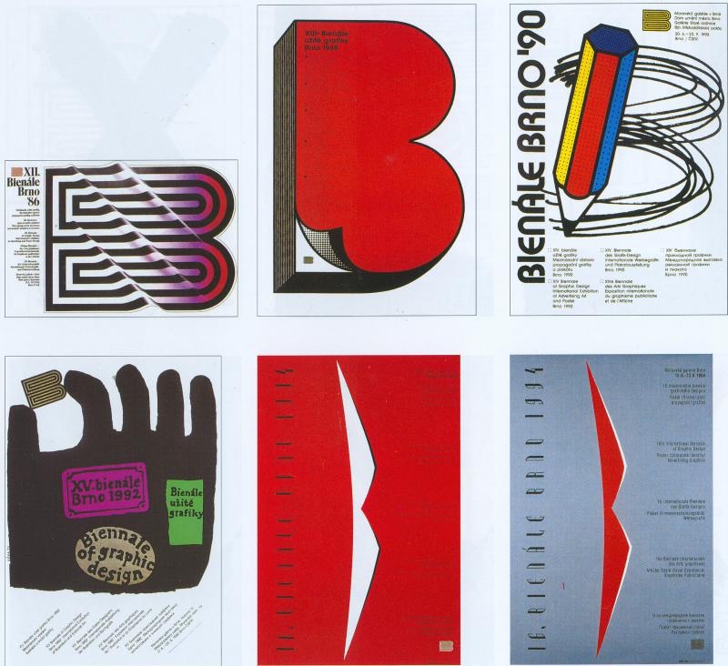
Launched in 1963 as a cultural bridge between east and west Europe, the Brno International Biennial of Graphic Design has provided a major international platform for exhibitions, discussions, and educational programmes in graphic design for the last six decades.
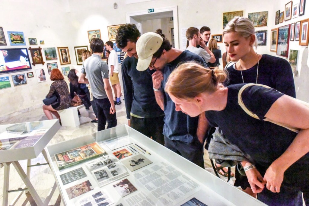
Until now, the Biennial has continued to run every two years, attracting designers and visitors from all over the world helping to influence and inspire whole generations of graphic designers.
The Biennial is now under threat, as the Moravian Gallery which hosts it is investigating an alternative online forum which would dispense with the in-person exhibitions and events. Find out more here, and help to save the Brno Biennial by signing the petition to the Moravian Gallery and the Czech Ministry of Culture here.
Read more about how the modernist-inspired design of the NBC identity was shaped by Norman Wilson’s design influences, combining his three key elements: bold, uniform colours, his distinctive typeface, and a striking monochrome version of his NBC symbol, wordlessly conveying the nature of the business, all drawn together in a grid-based layout which brought a sense of uniformity and modernity across disparate companies and an enormous variety of vehicle types.
If you have recollections of the roll-out of the new livery, how it was managed, or remember your initial reaction to it, please let us know. We’d be happy to include these in a future blog, and perhaps in the Manual book itself. Get in touch using the form on this page, or the contact page here: https://nationalbusmanual.com/contact/
