The NBC Corporate Identity came as a surprise to London Country, in more ways than one.
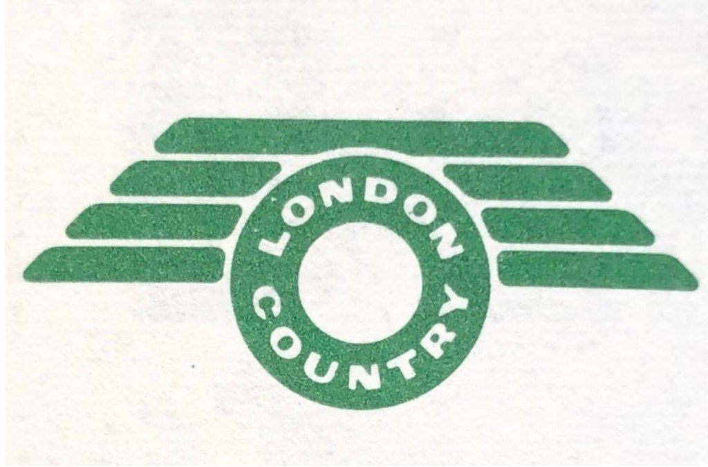
London Country joined the National Bus Company from London Transport (LT) on 1 January 1970, forming NBC’s biggest subsidiary. On its departure from LT the company introduced its own new identity. Buses and coaches took on a new version of LT’s country-area green livery and a new fleet name. LT’s iconic roundel and Johnston lettering were replaced by a new symbol, nicknamed the ‘flying polo’, representing the shape of the new business’s operating area, which was effectively a ring around London itself. London Country had put a lot of effort into rebranding its services, publicity and buildings across the large part of the south-east of England that the company served.
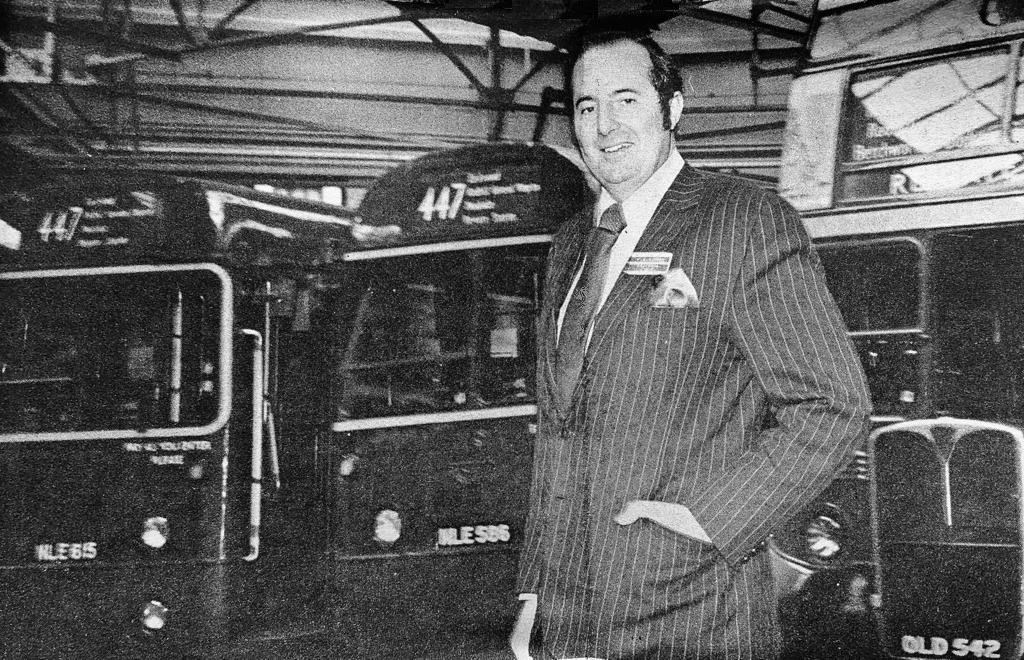

Having invested heavily in the new company brand there was frustration at the requirement, after just two years, to replace it wholesale with the new NBC corporate identity in 1972. “Another change so soon was not really welcomed, particularly as the time it took to repaint the fleet meant that several liveries were being carried at the same time” recalls Bernard Davis, who at the time was Commercial Manager responsible for publicity and public relations in the Traffic Department, and is now a volunteer at the Bus Archive. Bernard was at the centre of both phases of rebranding: “It meant that things looked messy, as well as giving the impression that we didn’t know what we were doing. All this at a time when reliability was declining because of staff shortages and the economic crisis of the 1970s.”
Some lamented the end of London Country’s short-lived independent identity. As a contributor to the London Country staff magazine, Bernard himself captured the sense of disappointment – a move which was frowned upon at the time by NBC headquarters and senior management.

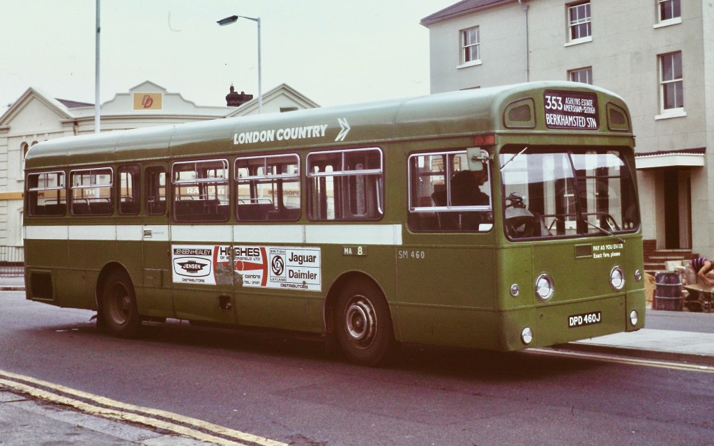
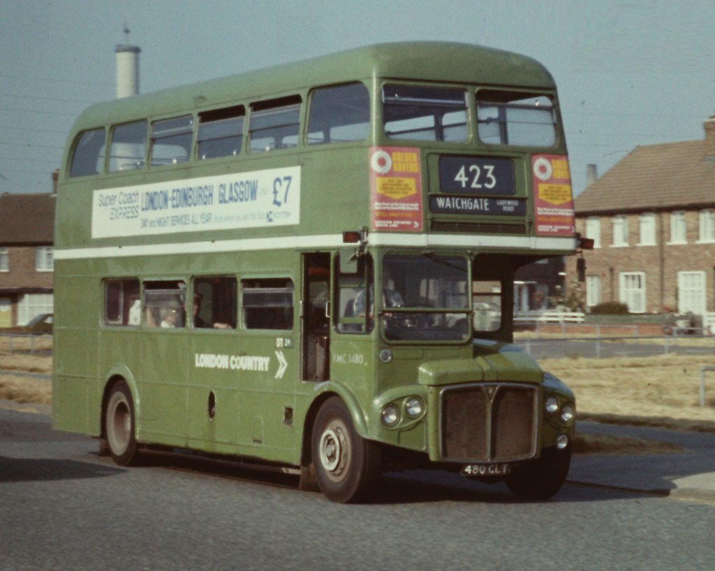
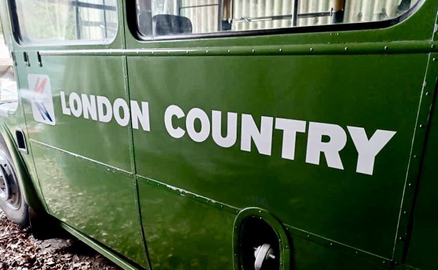
The adoption of a new livery was the biggest and most striking change. The previous dark London Transport country-area green and the green/yellow London Country identity was replaced by the much lighter shade of National green, with white NBC symbol, fleetnames and relief stripe. Out went the familiar London Transport Johnston typeface, replaced on vehicles by Norman Wilson’s chunky modern National lettering with detailed labelling in Futura. This was not, in Bernard’s view, an improvement. “The shade of green chosen seemed to be very insipid compared with the older colour. Moreover it faded very badly over time, giving an inconsistent pale blue-green shade. This eventually improved as better-quality paints were sourced by NBC.”
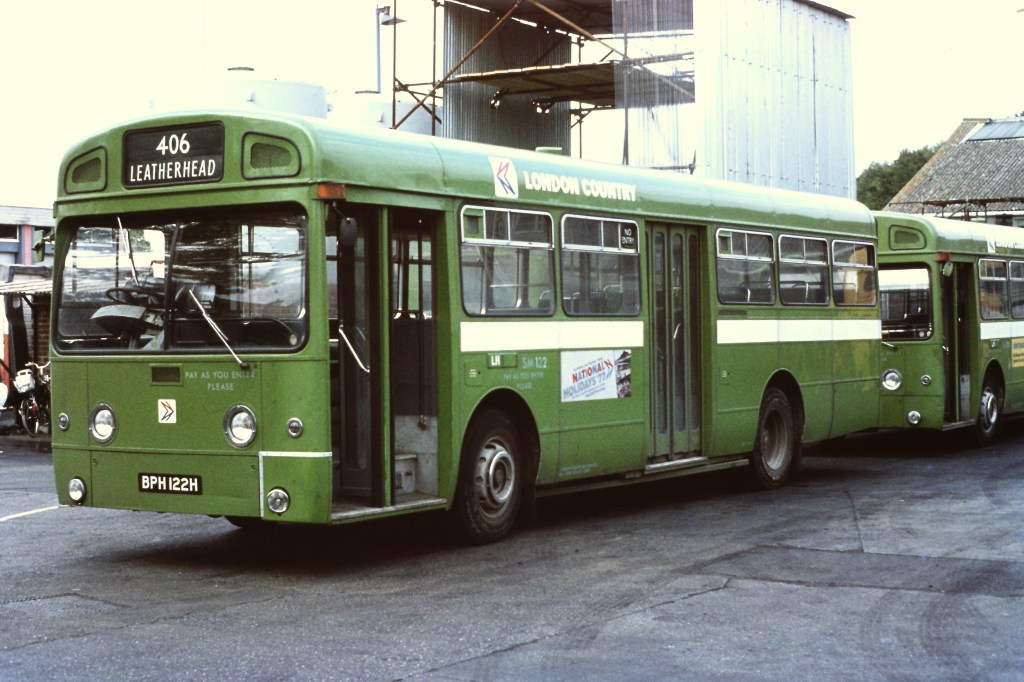
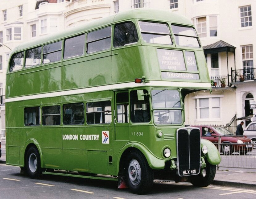
There was a significant gap in the early thinking on the new NBC identity. “At first, the importance of regional long-distance coaches was not understood by NBC and its designers” Bernard recalls. “’Just paint them green’ they said. But regional coaches needed to be distinguished from local bus services – they were a very different proposition for customers.” The need for a distinctive appearance for what NBC called ‘semi-coach’ or ‘dual-purpose’ livery was largely overlooked until later in 1972 – well into the roll-out of the new coach and bus liveries. Indeed, the use of those terms – rather than ‘regional coach’ – perhaps reveals a lack of appreciation of the importance of regional express services both for customers and commercially.
For London Country, its Green Line coaches represented a significant part of the business. The company lobbied hard for an approach which differentiated these services. There were increasingly anxious requests for guidance on what to do from several NBC operating companies through 1972, as instructions emanated from headquarters to accelerate the roll-out of the new liveries in all-over white, green or red – but without acknowledging the regional coach category.

Some companies proposed to use the white livery with a thin mid-height band in red or green; or to use all-over white with the local operating company name. London Country was influential in the development of the approach eventually adopted by NBC – with ‘semi-coaches’ using a variant of the local bus livery, but with the upper half painted white above a lower half in National green or red – and in London Country’s case, Green Line branding.
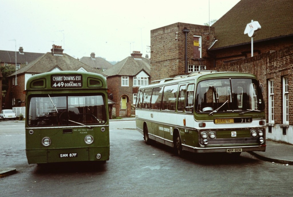
In the late 1970s, London Country was influential in a further re-branding, for a re-launch of its Green Line coach network. The company got special dispensation from NBC headquarters for a new regional coach livery – a white coach with a broad green band incorporating the red and blue National symbol on a white background, and Green Line branding in large white National Alphabet lettering. Similar designs for regional coach services were later adopted by other NBC subsidiaries – for example, Eastern Counties’ ‘Eastline’ network in the early 1980s.


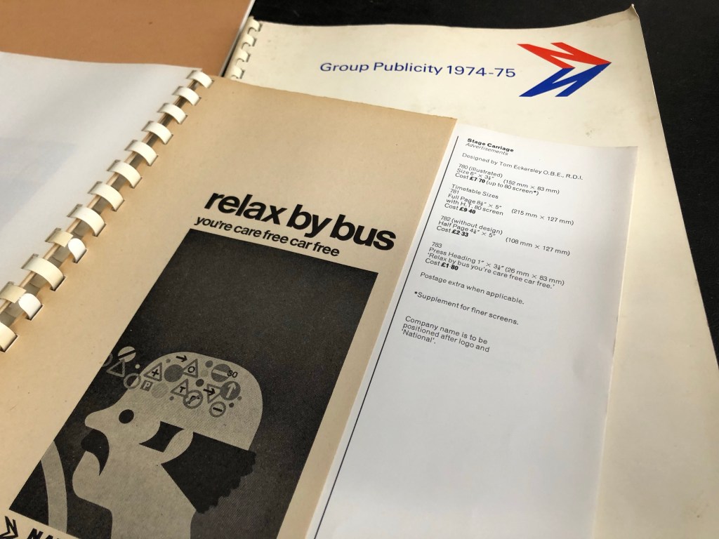
As the manager responsible for producing all of the company’s publicity material, Bernard found the corporate identity’s guidelines on publicity helpful. “The new identity – the symbol, typefaces and so on – was helpful in many ways as it provided a good framework for our own creativity. NBC, like the Tilling Group before it, had a central publicity department in the 1970s which was there to help companies with material and design, but they never dictated what was used. At the time I poked fun at the new concept, but I embraced its value in virtually everything we produced.”

NBC produced a catalogue of standard advertisements and graphics each year which could be used locally in press, leaflets and bus-side advertisements, but operating companies were free to adapt them for local circumstances. “There was no real pressure or constraint on local publicity” Bernard recalls. “While the use of advertising for National services was totally standardised, there were few rules for local advertising – other than the use of the NBC symbol and typeface for company names, and a few specific rules such as the size and format of local bus timetables.
Bernard was party to a strange incident at the very start of the roll-out of the new identity. As for all NBC companies, photographic negatives of the NBC symbol and the company’s fleetname in the new National lettering were sent to London Country, so that they could be faithfully produced on stationary, publicity and signage without anomalies. (The vehicle transfers were supplied centrally by NBC for the same reason.) “Ours arrived, and I had to get straight on the phone to NBC headquarters.” Bernard remembers. “I rang up and asked if they had decided to rename the company.” In slight disbelief, Bernard found that the negatives he has been sent for use across the entire company read not ‘London Country’ – but ‘London Counties’. A few moments of horror followed at the other end of the telephone line. After rapid consultation, the instruction from NBC headquarters was: “Destroy it!”. Happily for posterity, this stern instruction somehow slipped Bernard’s mind, and the negative is still in his possession. For this project – and for the first time in nearly 50 years – Bernard used the negative as intended to give a faithful reproduction of an exceptionally short-lived official NBC fleetname: LONDON COUNTIES.

Many thanks to Bernard Davies for talking to us about his experiences at London Country and for sharing items from his collection; to the Bus Archive for access to the NBC publicity catalogues and to Michael Ellis of the Purley Transport Preservation Group and John Atkinson, for the photographs of RT604.

2 replies on “The counties of London Country”
Fascinating!.
LikeLiked by 1 person
The London Country Reliance featured above was bus seated and this is a variation in the bus livery with an overly large white stripe.
LikeLiked by 1 person