Some companies found practical reasons to take a different approach to applying Norman Wilson’s carefully-crafted designs.

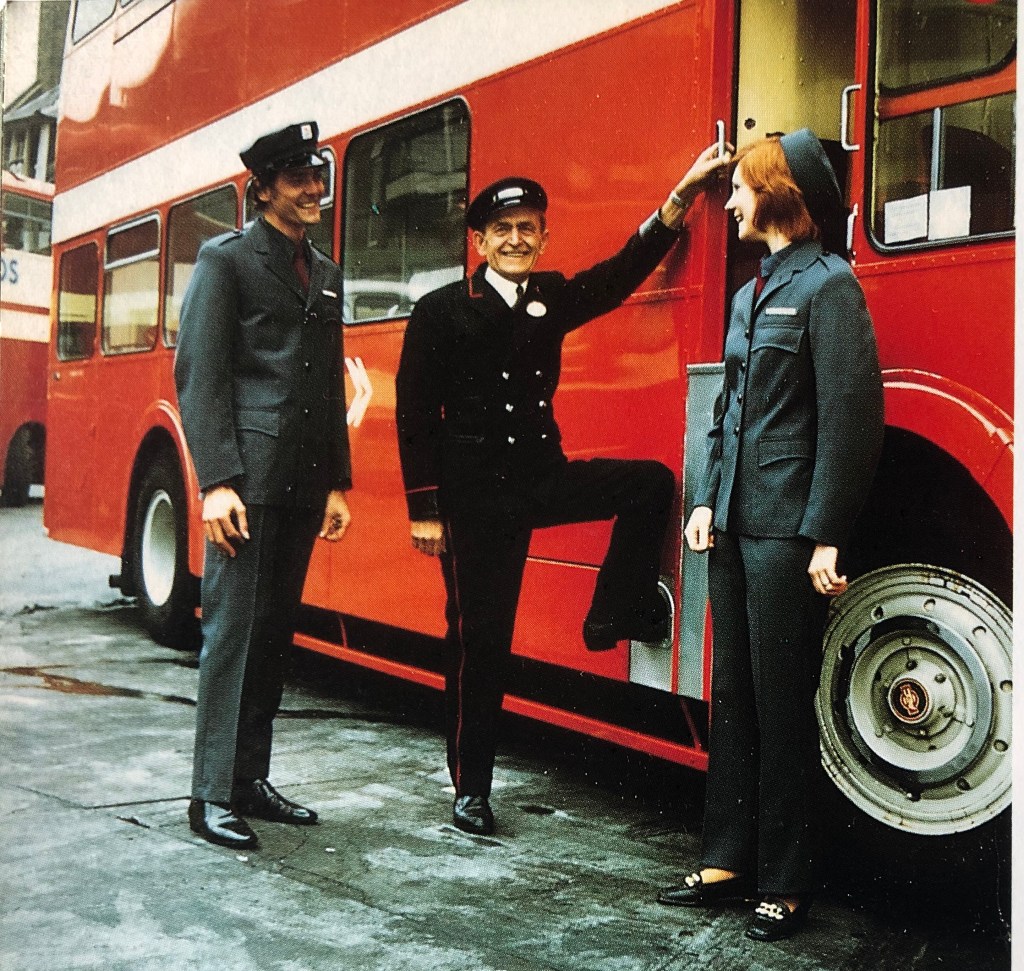
In the spring of 1972 a handful of NBC’s local operating companies were actively involved in trialling the new identity for the company’s buses. Notably, Crosville experimented with the green version, while Alder Valley’s Reading depot provided vehicles as the testbed for Norman Wilson’s proposed layout and the use of the new corporate shade of poppy red.
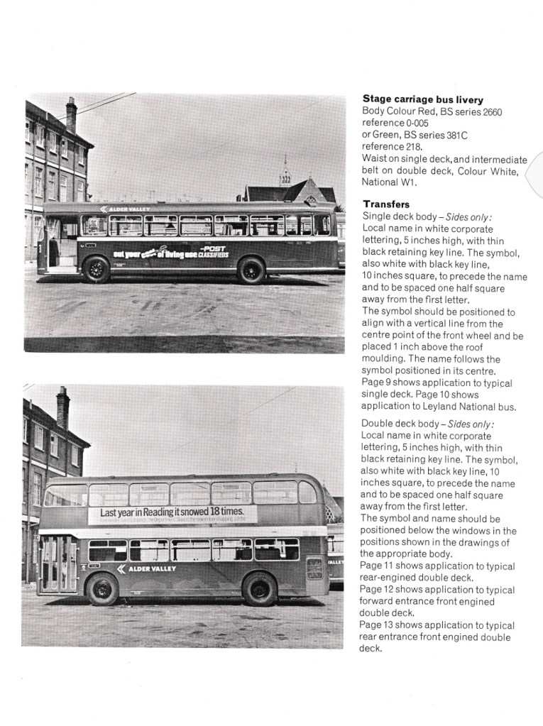
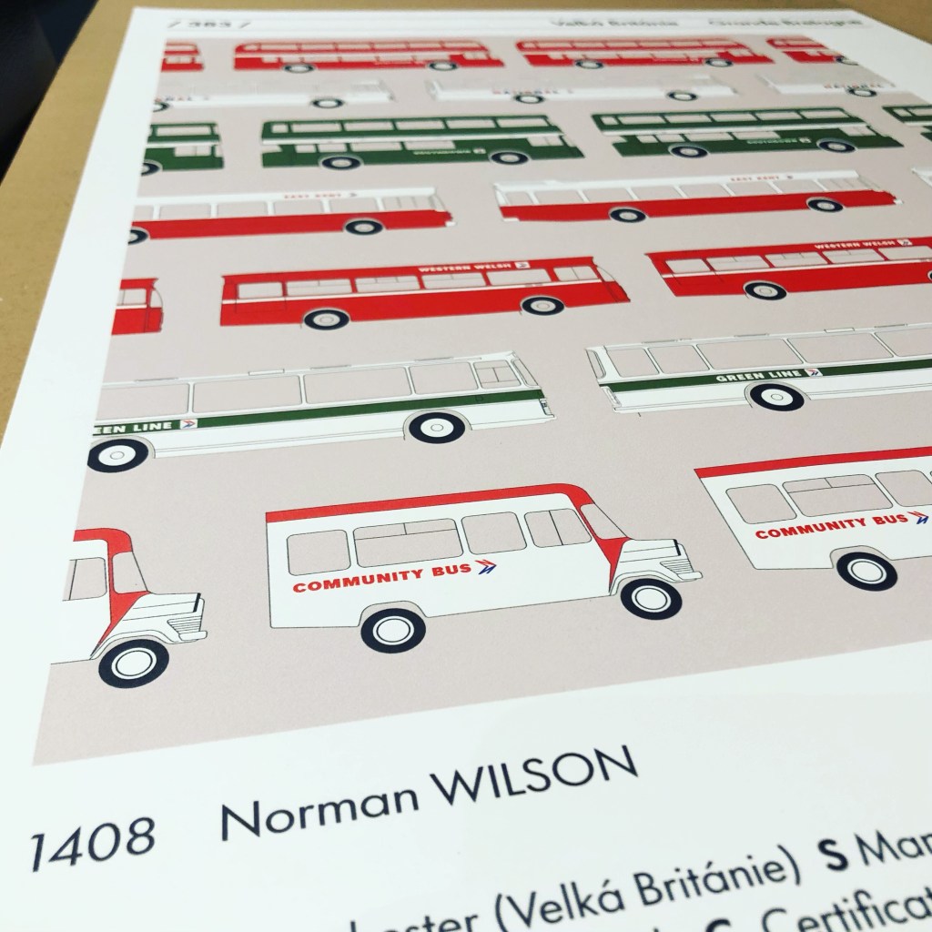
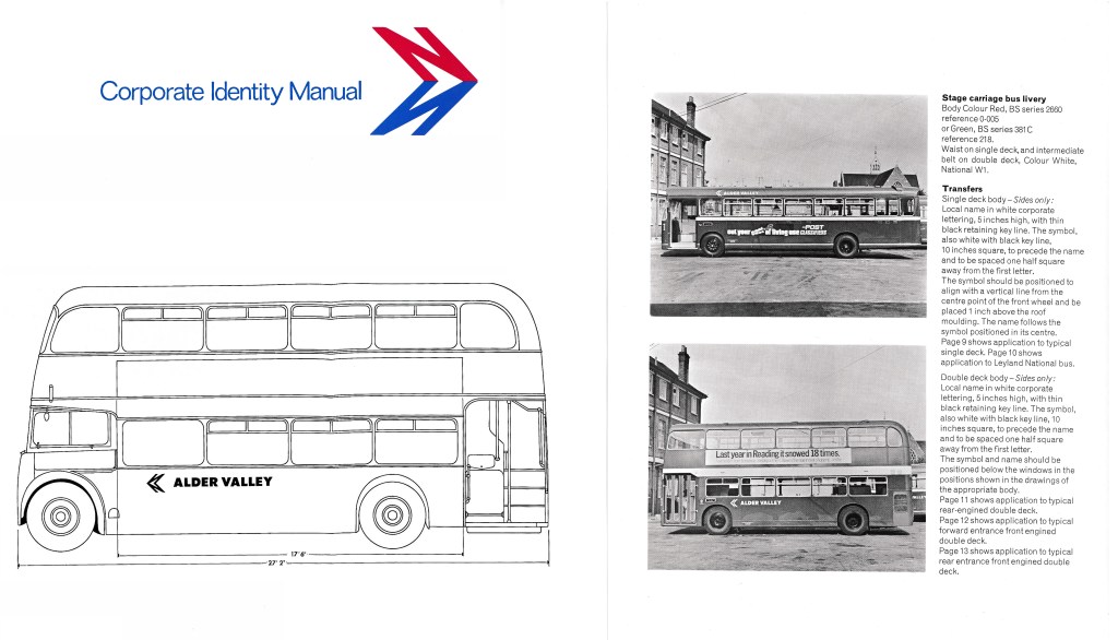
Consequently the first version of Wilson’s Corporate Identity Manual, developed in the spring in close partnership with NBC Group Public Relations Officer Ron Whitehouse, features detailed illustrations using photographs of Alder Valley’s double- and single-deckers in the new local bus identity.
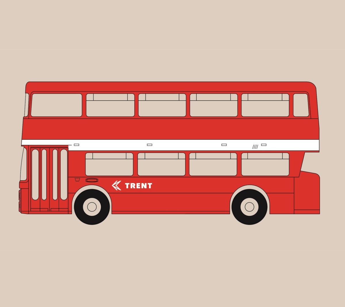
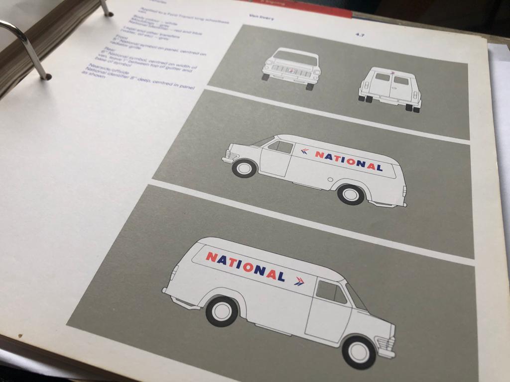
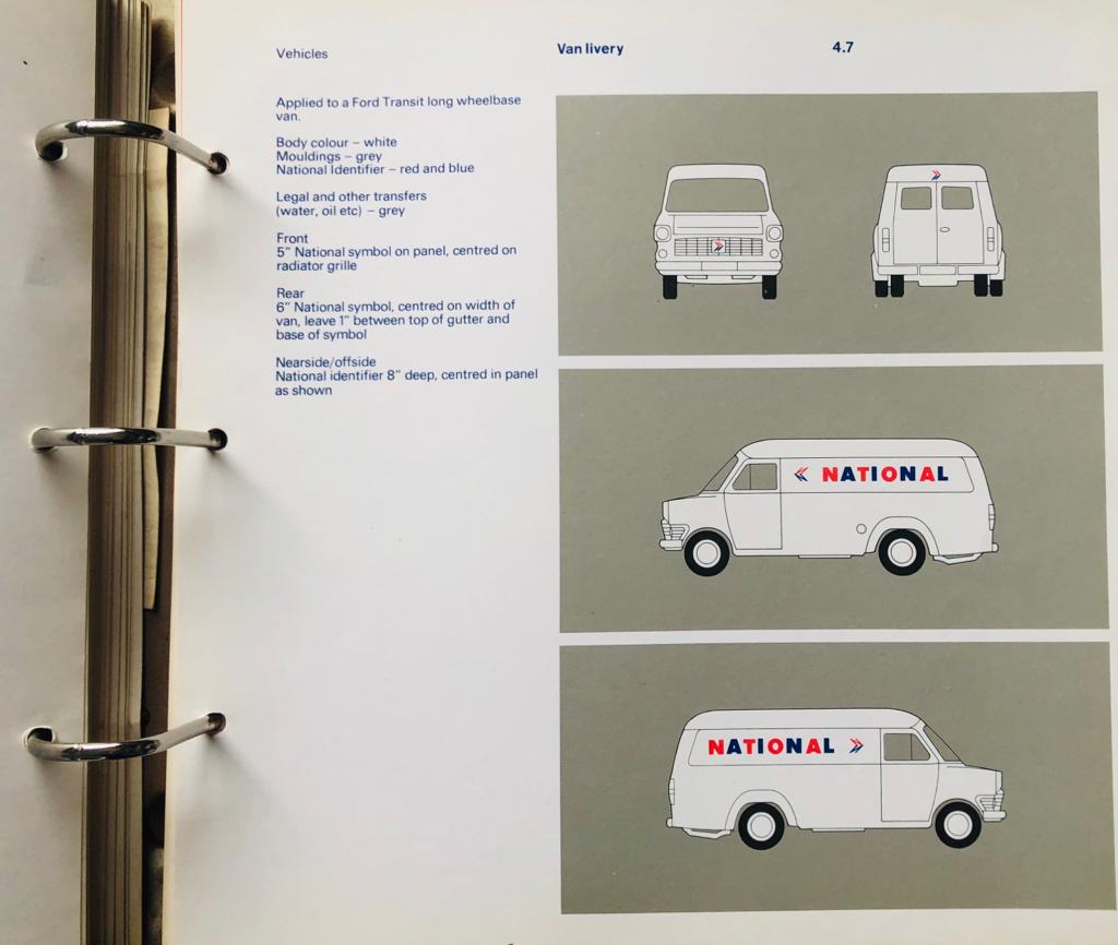
In mid-Summer, and following up on the instructions already issued for the White Coach livery, on 11 August Ron Whitehouse wrote to the General Managers of NBC’s subsidiary companies to provide the first in a series of drawings showing how the new identity should be applied to buses. This included the precise position of the new symbol and lettering across a range of typical vehicles, from venerable double-deckers to the brand-new single-deck Leyland National, designed and manufactured as a joint venture between NBC and Leyland Vehicles, and styled by the legendary Italian designer Giovanni Michelotti.
Through the summer months Norman Wilson’s team were kept busy, working with Ron Whitehouse and his NBC publicity staff to develop a uniform approach across a huge variety of vehicles. “It took forever to draw all the coaches and buses” remembers Antony Dawson, who with Rodney Morris was Wilson’s design associate working on the project to finalise and roll out the identity in 1972. “NBC managed to give us most of the drawings for their fleet, but then we had to go back to the coach builders to get their drawings for the rest. We had to devise something that worked across multiple buses.” New pages and illustrations were issued and sent to the local companies to be added into the loose-leaf A4 Corporate Identity Manual. The A4 pack of instructions and diagrams became a reference guide for companies as they made the rapid switch to the new identity.

The tight specification however was not to everyone’s liking. East Kent’s works in Canterbury seemed determined to do their own thing. Canterbury took advantage of the lack of instructions on how the identity was to be applied to local coaches to experiment, using a large version of the National lettering to spell out the company’s name, using East Kent’s traditional coach colours dark red bands on a grey or cream body, usually with the NBC symbol, but sometimes omitting it altogether.
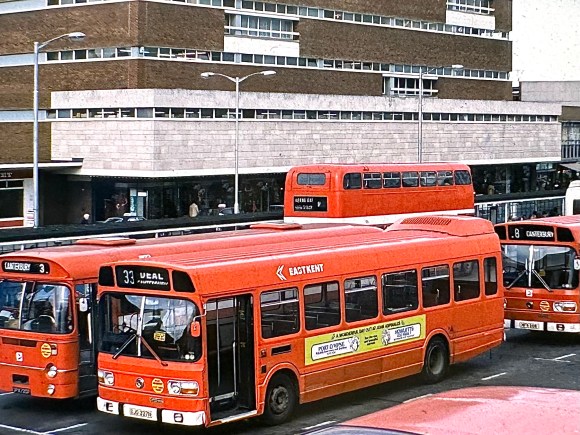
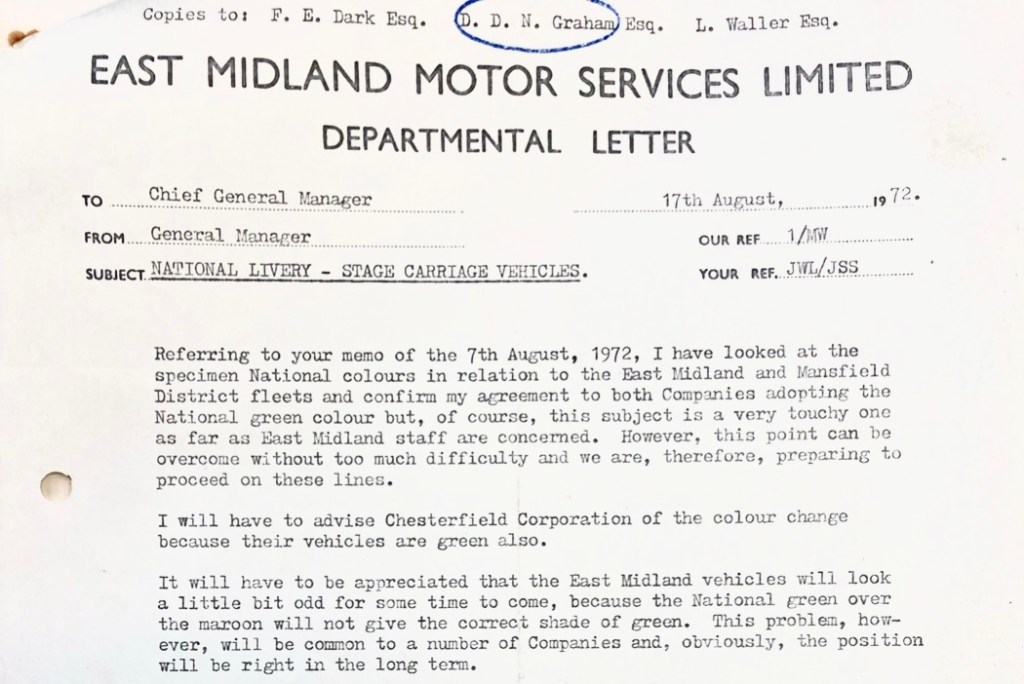
Meanwhile there was a determined effort to brand the company as EASTKENT, leaving out the gap when applying fleetnames in the new National lettering. The instructions from NBC HQ were to spell out both words with a gap, and East Kent’s publicity consistently followed did so. But the company’s vehicle engineers had other ideas. This was all pretty ironic as the company’s former General Manager, Jim Skyrme, had just been appointed chief executive of the whole of NBC. This effectively made him Fred Wood’s man with the task, among other things, of policing implementation of the new identity. Being close to London, it wasn’t difficult for HQ staff to spot the ‘mistake’ and stamp it out. But – perhaps as in protest at this extension of central control – East Kent buses for years after had an exaggerated gap between the ‘East’ and the ‘Kent’.

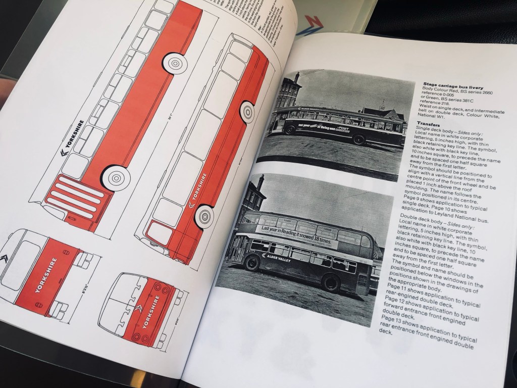
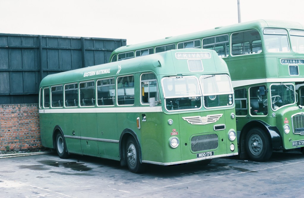
Other companies got in on the act too. In Chelmsford, Rodney Hawkins took a long look at the new centrally-supplied Eagle Quik-Fix transfers for the new lettering and the NBC symbol. He took a second careful look at the instructions in the Corporate Identity Manual: “The symbol should be positioned to align with a vertical line from the centre point of the front wheel and be placed 1 inch above the roof moulding. The name follows the symbol positioned in its centre.” And for double-deck buses “The symbol… 10 inches square, to precede the name and to be spaced one half square away from the first letter. The symbol and name should be positioned below the windows in the positions shown in the drawings of the appropriate body.” Studying the photographs and diagrams, Rodney frowned.
Rodney was the Chief Engineer for the Eastern National Omnibus Company. He knew his vehicles, and he knew where the panel joints were. “That’s no good” he muttered to himself, thinking how the flimsy transfers would look at the joints after a few runs through the vehicle washer. He issued instructions to his coach painters to apply and space the symbol and the two words of the company name to avoid fixing the new transfers across panel joints and rivets, countering the instructions from NBC HQ and leading to some idiosyncratic layouts and extra spacing. This was particularly true for the new Leyland National. With its interchangeable, easily removable bodyside panels, some joked that it was largely made from rivets.

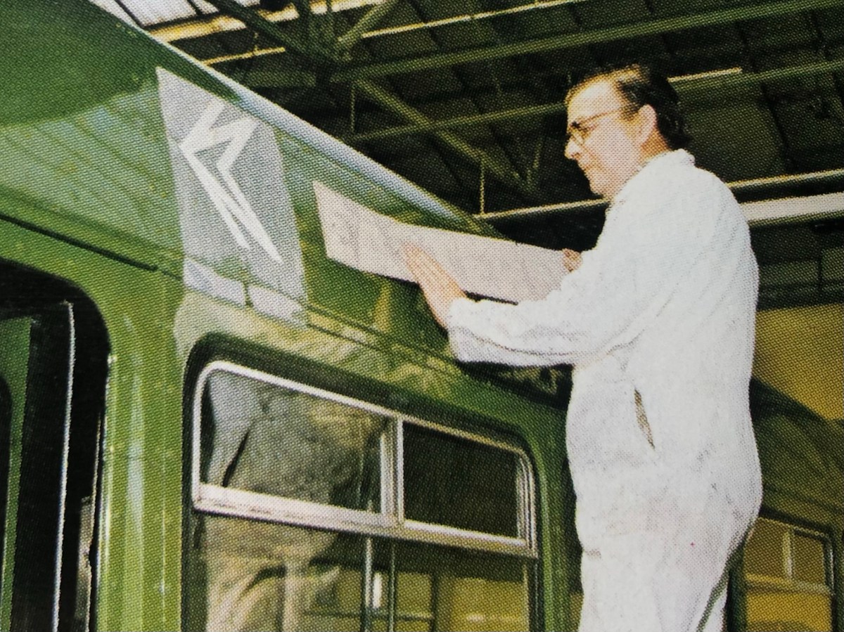
Frank Brewster, in the paint shop, was a skilled coach painter. In the photograph Frank is seen at Chelmsford central works applying the NBC symbol and Eastern National lettering to a new Leyland National in 1973. His former colleagues remember Frank as a skilled and kind man. They also remember difficulties in applying the transfers. “I hated that job with the Eagle Quik-Fix transfers” remembers Chris Critchett, formerly of Eastern National: “I often used to cock it up somehow”.

The result was a variety of layouts on the sides of buses where the position and spacing of the symbol and fleetname was different from what the Manual specified. Being close to London, Eastern National saw closer attention from the publicity team responsible for the corporate identity, and so more edicts to management requiring the company to toe the line. Judging by pictures from the 1970s though, it seems that Rodney Hawkin’s coachpainters managed to do their own thing for quite a while!
With Fred Wood personally regarding the new identity as a key part of his commercial recovery plan for NBC, variations were heavily frowned upon by HQ. It was far from unusual for company general managers to get disapproving memos from Ron Whitehouse’s team instructing them to follow the carefully-crafted instructions in the manual. Local managers of the time still speak of visits from the ‘identity police’ and the occasional sharp exchange. Family members recall Norman Wilson himself cursing loudly at passing vehicles bearing incorrectly-applied liveries and graphics as he drove across the country on family holidays.

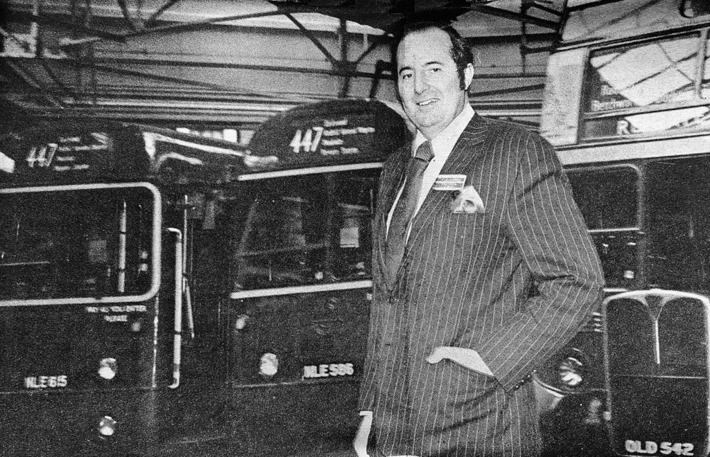
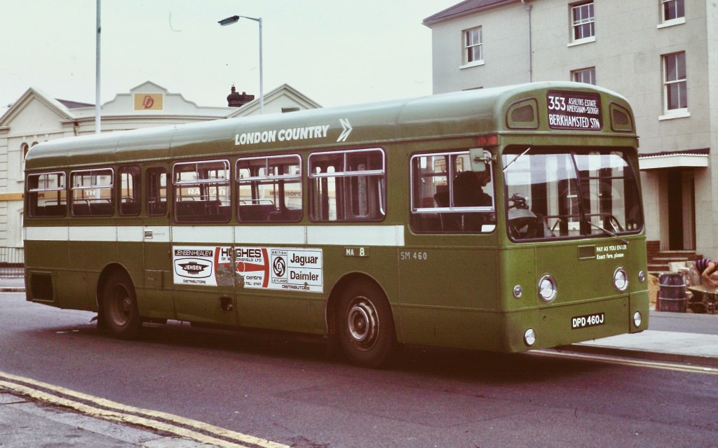
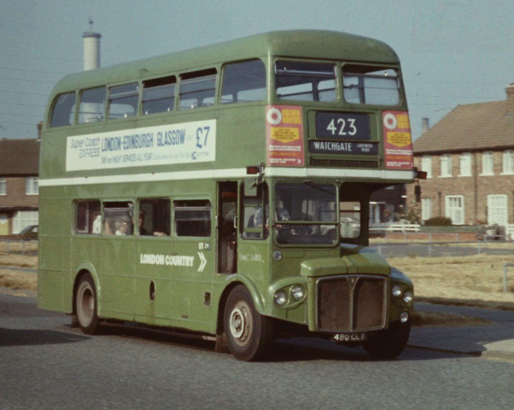
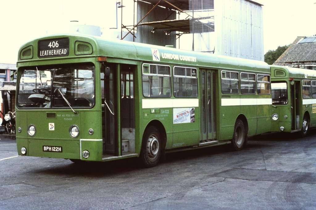
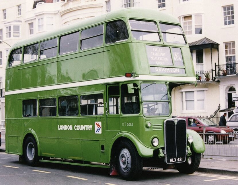
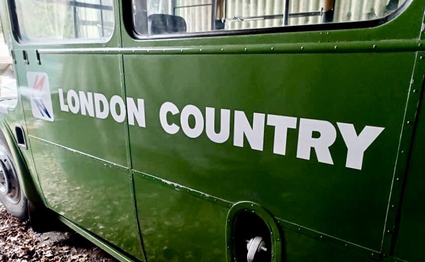
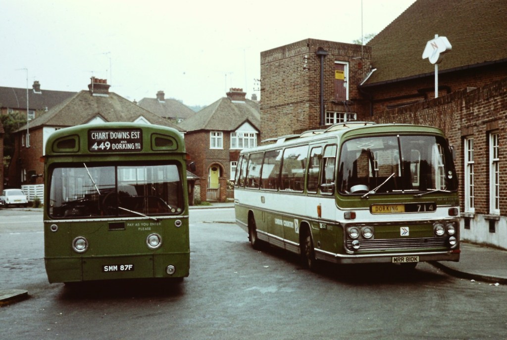
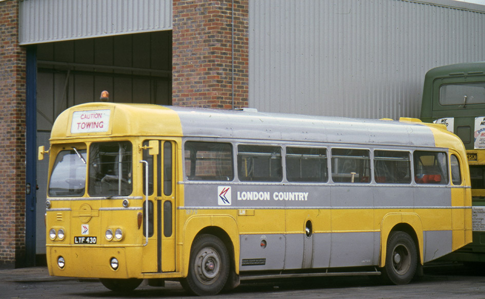
Bernard Davis, Commercial Manager at London Country, remembers regular visits from NBC head office to check on the application of the identity, and missives to London Country’s bosses when things weren’t done to spec. “Being nearer to London meant we were watched hawkishly” he recalls. “Companies further away got away with all kinds of things. We got special permission for our ‘Green Line’ coach livery, which other companies adopted later. But there was very little flexibility on vehicle liveries – headquarters expected the manual to be followed precisely”.
Read more about how the modernist-inspired design of the NBC identity was shaped by Norman Wilson’s design influences, combining his three key elements: bold, uniform colours, his distinctive typeface, and a striking monochrome version of his NBC symbol, wordlessly conveying the nature of the business, all drawn together in a grid-based layout which brought a sense of uniformity and modernity across disparate companies and an enormous variety of vehicle types.
If you have recollections of the roll-out of the new livery, how it was managed, or remember your initial reaction to it, please let us know. We’d be happy to include these in a future blog, and perhaps in the Manual book itself. Get in touch using the form on this page, or the contact page here: https://nationalbusmanual.com/contact/


![National Bus Company Service Vehicles 1972-1986 by [Michael Hitchen]](https://m.media-amazon.com/images/I/51LhcK7sOzL.jpg)