Categories
Advertising and publicity Applying the identity Buses Coaches Green Line London Country

The counties of London Country

The NBC Corporate Identity came as a surprise to London Country, in more ways than one.

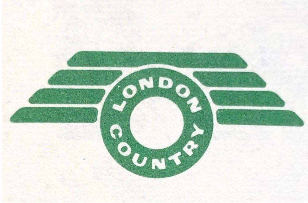
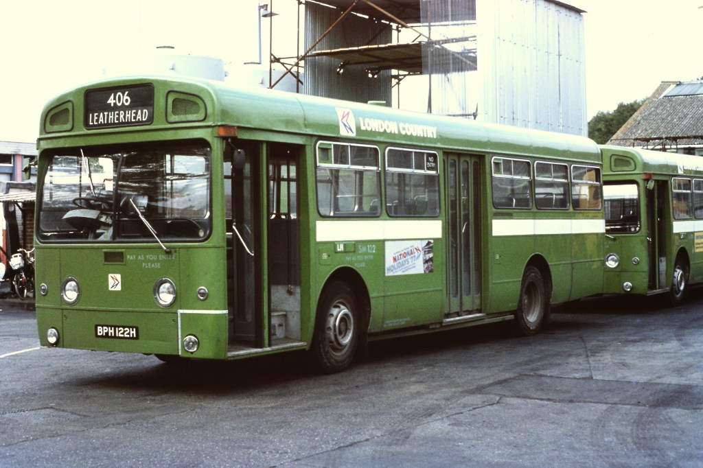
London Country joined the National Bus Company from London Transport (LT) on 1 January 1970, forming NBC’s biggest subsidiary. On its departure from LT the company introduced its own new identity. Buses and coaches took on a new version of LT’s country-area green livery and a new fleet name. LT’s iconic roundel and Johnston lettering were replaced by a new symbol, nicknamed the ‘flying polo’, representing the shape of the new business’s operating area, which was effectively a ring around London itself. London Country had put a lot of effort into rebranding its services, publicity and buildings across the large part of the south-east of England that the company served.

National Bus Company chair Freddie Wood – instigator of the NBC corporate identity ­- visits London Country’s Reigate depot in April 1972, with an array of vehicles in London Country’s own dark-green livery in the background. Photo: Tony Whitehead, NBC.
A picture containing text

Description automatically generated
London Country’s short-lived ‘flying polo’ logo, in use from 1970 to 1972.
London Country’s post-LT local bus livery. National Bus Company

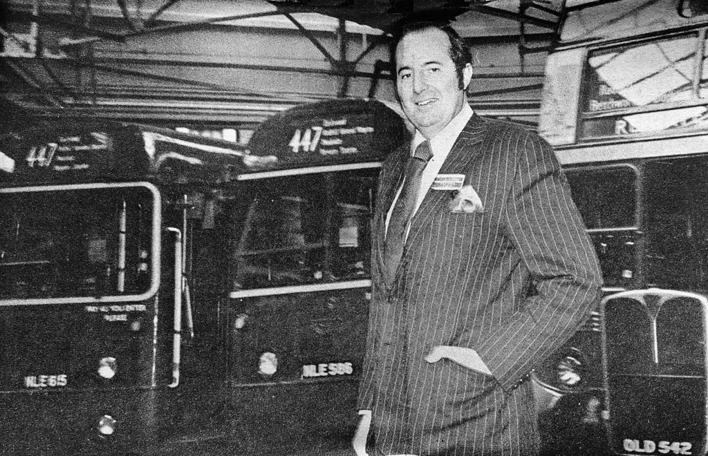
Having invested heavily in the new company brand there was frustration at the requirement, after just two years, to replace it wholesale with the new NBC corporate identity in 1972. “Another change so soon was not really welcomed, particularly as the time it took to repaint the fleet meant that several liveries were being carried at the same time” recalls Bernard Davis, who at the time was Commercial Manager responsible for publicity and public relations in the Traffic Department, and is now a volunteer at the Bus Archive. Bernard was at the centre of both phases of rebranding: “It meant that things looked messy, as well as giving the impression that we didn’t know what we were doing. All this at a time when reliability was declining because of staff shortages and the economic crisis of the 1970s.”

Some lamented the end of London Country’s short-lived independent identity. As a contributor to the London Country staff magazine, Bernard himself captured the sense of disappointment – a move which was frowned upon at the time by NBC headquarters and senior management.

Symbolic?  Bernard Davis’ cartoon depicting the demise of London Country’s independent identity – frowned upon by NBC management at the time.  London Country Magazine, Christmas 1972 edition. Source: Bernard Davis
A green bus with a crane on top

Description automatically generated with low confidence
A London Country bus in the original NBC green livery adopted in 1972: AEC Swift DPD460J at Berkhamsted August 1974. Photo: I T Langhorn. 
A classic London bus in NBC’s corporate green: former London Transport Routemaster coach RMC1480, converted for use on local stage services, on the outskirts of Dartford in the early 1970s.  Richard Price Collection.

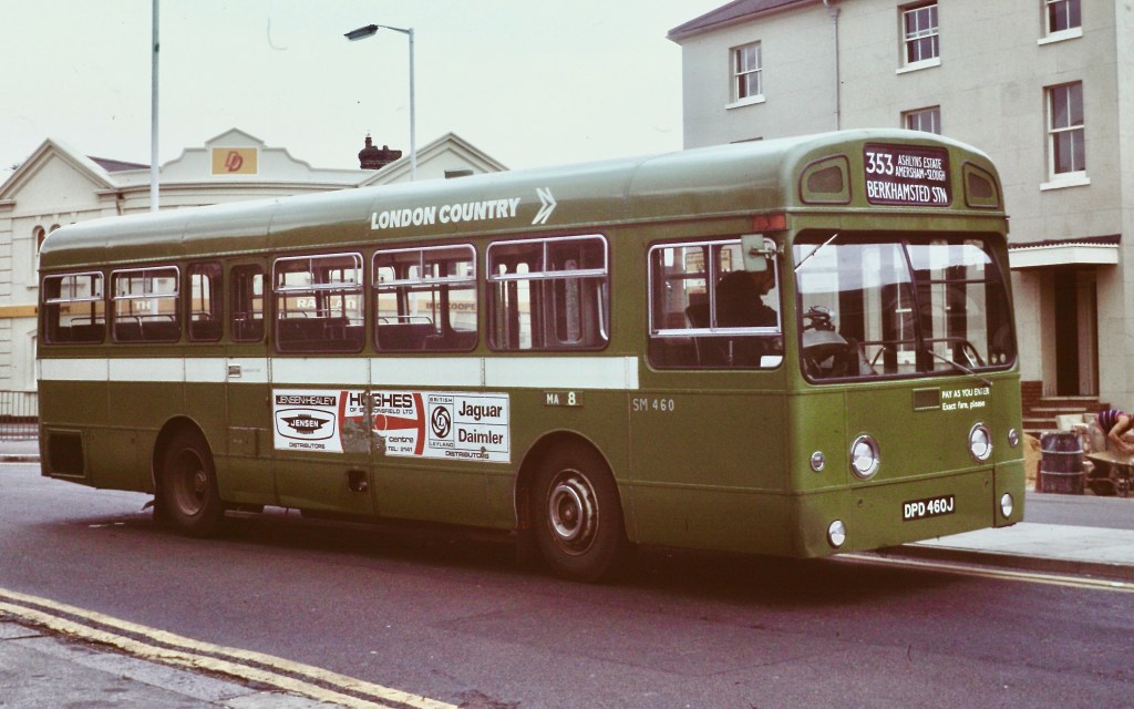
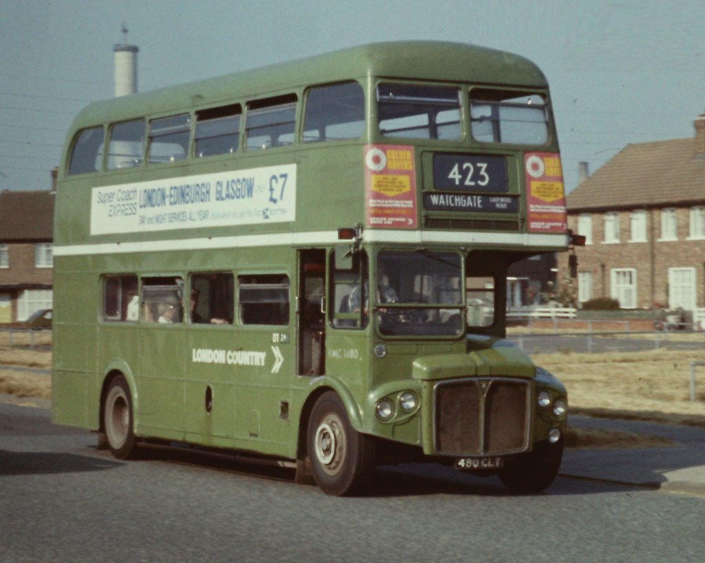
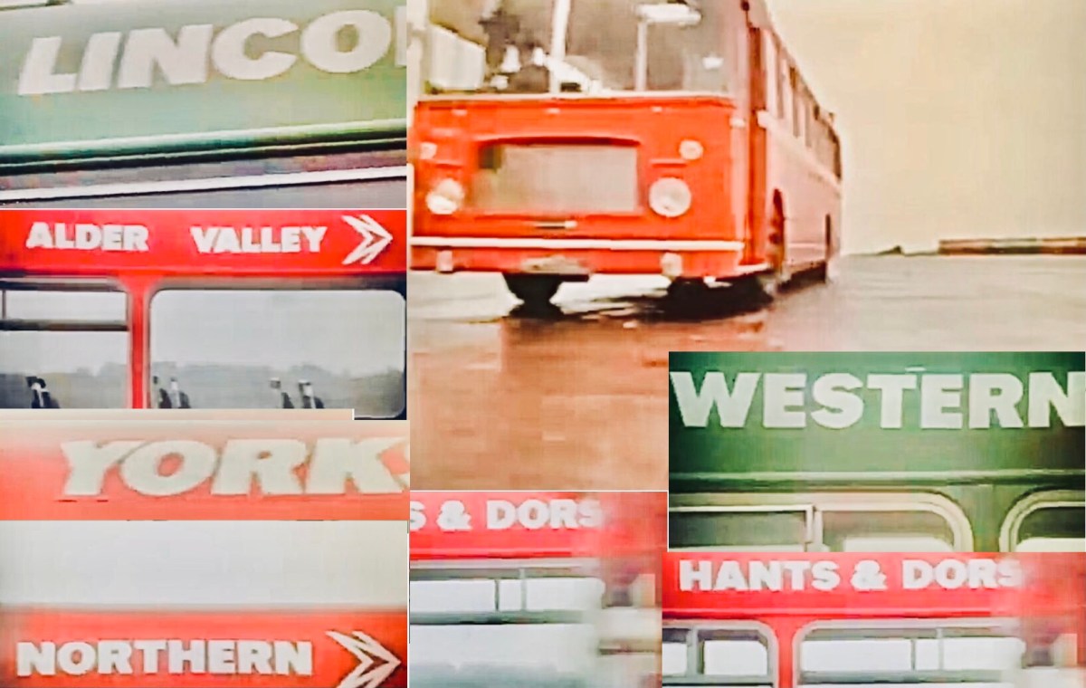
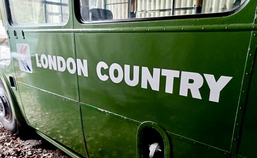
The adoption of a new livery was the biggest and most striking change. The previous dark London Transport country-area green and the green/yellow London Country identity was replaced by the much lighter shade of National green, with white NBC symbol, fleetnames and relief stripe. Out went the familiar London Transport Johnston typeface, replaced on vehicles by Norman Wilson’s chunky modern National lettering with detailed labelling in Futura. This was not, in Bernard’s view, an improvement. “The shade of green chosen seemed to be very insipid compared with the older colour. Moreover it faded very badly over time, giving an inconsistent pale blue-green shade. This eventually improved as better-quality paints were sourced by NBC.”

In the revised post-1976 bus livery, with the two-colour version of the NBC symbol. AEC Swift BPH 122H waits at Leatherhead in September 1977. Richard Price Collection
A touch of modernist design gave a new lease of life to many of NBC’s older vehicles. The adoption of leaf green was unpopular in many parts of the industry, particularly in the London area where it replaced London Transport’s long-established country-area dark green. It generally had its intended effect of giving even the oldest vehicles a modern(ist) look and projecting a progressive, confident image to users. Immaculately-preserved RT, RT604, new in July 1948 and seen here at a rally in Brighton, illustrates the effect well. Picture: Michael Ellis, Purley Transport Preservation Group
London Country’s ‘company identifier’, as the Manual described fleetnames, set in Norman Wilson’s National lettering. RT604 carried the revised NBC livery for a year before it was withdrawn and preserved in 1977. Photo: Michael Ellis.

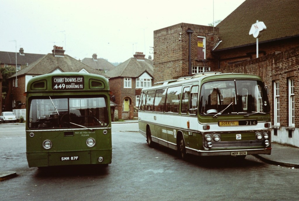
There was a significant gap in the early thinking on the new NBC identity. “At first, the importance of regional long-distance coaches was not understood by NBC and its designers” Bernard recalls. “’Just paint them green’ they said. But regional coaches needed to be distinguished from local bus services – they were a very different proposition for customers.” The need for a distinctive appearance for what NBC called ‘semi-coach’ or ‘dual-purpose’ livery was largely overlooked until later in 1972 – well into the roll-out of the new coach and bus liveries. Indeed, the use of those terms – rather than ‘regional coach’ – perhaps reveals a lack of appreciation of the importance of regional express services both for customers and commercially.

For London Country, its Green Line coaches represented a significant part of the business. The company lobbied hard for an approach which differentiated these services. There were increasingly anxious requests for guidance on what to do from several NBC operating companies through 1972, as instructions emanated from headquarters to accelerate the roll-out of the new liveries in all-over white, green or red – but without acknowledging the regional coach category.

A group of buses parked next to each other

Description automatically generated with low confidence
With its Green Line network, regional express services represented a large and important part of London Country’s businesses. Along with other operators. The company was instrumental in pressing NBC to develop a colour scheme to distinguish these services from normal stage bus routes. NBC called this its ‘dual purpose’ livery, though in many cases the vehicles used, equipped with coach seating, were dedicated to express services and not dual purpose at all. In February 1973, soon after the new livery was adopted, newly-repainted Green Line AEC Reliance CUV65C is seen at Aldgate on route 723. Richard Price Collection

Some companies proposed to use the white livery with a thin mid-height band in red or green; or to use all-over white with the local operating company name. London Country was influential in the development of the approach eventually adopted by NBC – with ‘semi-coaches’ using a variant of the local bus livery, but with the upper half painted white above a lower half in National green or red – and in London Country’s case, Green Line branding.

A London Country Merlin single-decker in NBC green with AEC Reliance coach in a version of London Country’s regional coach livery, at Dorking bus station in June 1979. The bus station’s ‘winged polo’ sign – part of London Country’s 1970 identity – has been altered to incorporate the NBC symbol. Photo: Jeff Jones.

In the late 1970s, London Country was influential in a further re-branding, for a re-launch of its Green Line coach network. The company got special dispensation from NBC headquarters for a new regional coach livery – a white coach with a broad green band incorporating the red and blue National symbol on a white background, and Green Line branding in large white National Alphabet lettering. Similar designs for regional coach services were later adopted by other NBC subsidiaries – for example, Eastern Counties’ ‘Eastline’ network in the early 1980s.

Green Line’s LNC45 in the NBC regional coach/dual purpose livery at Ilford in 1974. Tony Whitehead/National Bus Company.
An updated version of Green Line’s regional coach livery: Leyland Tiger WPH 130Y in 1982. Richard Price Collection.

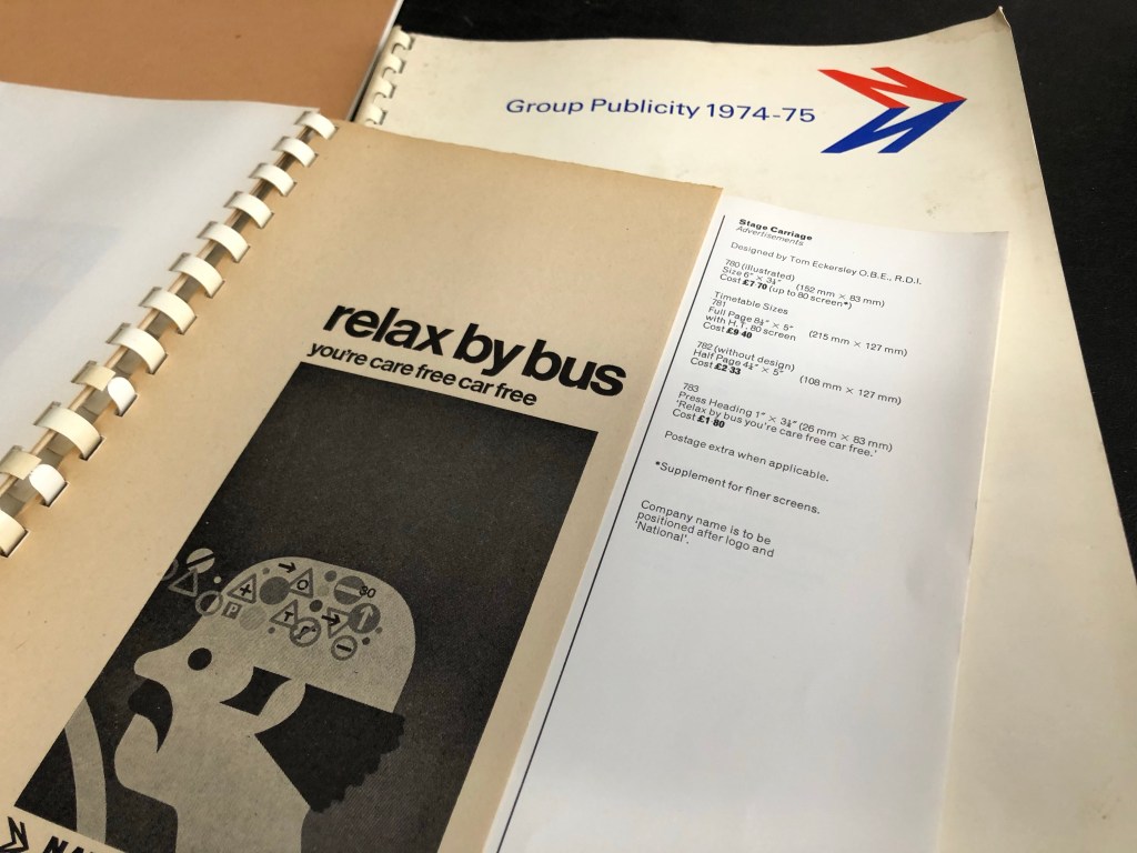
As the manager responsible for producing all of the company’s publicity material, Bernard found the corporate identity’s guidelines on publicity helpful. “The new identity – the symbol, typefaces and so on – was helpful in many ways as it provided a good framework for our own creativity. NBC, like the Tilling Group before it, had a central publicity department in the 1970s which was there to help companies with material and design, but they never dictated what was used. At the time I poked fun at the new concept, but I embraced its value in virtually everything we produced.”

London Country timetables using local artwork to an NBC design template, 1978.

NBC produced a catalogue of standard advertisements and graphics each year which could be used locally in press, leaflets and bus-side advertisements, but operating companies were free to adapt them for local circumstances. “There was no real pressure or constraint on local publicity” Bernard recalls. “While the use of advertising for National services was totally standardised, there were few rules for local advertising – other than the use of the NBC symbol and typeface for company names, and a few specific rules such as the size and format of local bus timetables.

Pages from the NBC Group Publicity catalogue for 1974-75, showing various sizes of an advertising poster using designer Tom Eckersley’s fine ‘relax by bus’ illustration. The poster uses Helvetica, rather than Norman Wilson’s preferred Akzidenz-Grotesk, which was specified in the manual for use on signage. Photo: Richard Price/Bus Archive

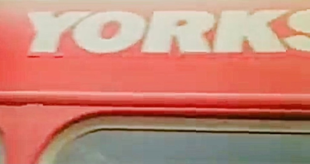
Bernard was party to a strange incident at the very start of the roll-out of the new identity. As for all NBC companies, photographic negatives of the NBC symbol and the company’s fleetname in the new National lettering were sent to London Country, so that they could be faithfully produced on stationary, publicity and signage without anomalies. (The vehicle transfers were supplied centrally by NBC for the same reason.)  “Ours arrived, and I had to get straight on the phone to NBC headquarters.” Bernard remembers.  “I rang up and asked if they had decided to rename the company.”  In slight disbelief, Bernard found that the negatives he has been sent for use across the entire company read not ‘London Country’ – but ‘London Counties’.  A few moments of horror followed at the other end of the telephone line. After rapid consultation, the instruction from NBC headquarters was: “Destroy it!”.  Happily for posterity, this stern instruction somehow slipped Bernard’s mind, and the negative is still in his possession.  For this project – and for the first time in nearly 50 years – Bernard used the negative as intended to give a faithful reproduction of an exceptionally short-lived official NBC fleetname: LONDON COUNTIES. 

‘London Counties’ company identifier, from the original negative mistakenly issued by NBC headquarters in 1972 for London Country’s use. Source: Bernard Davis.

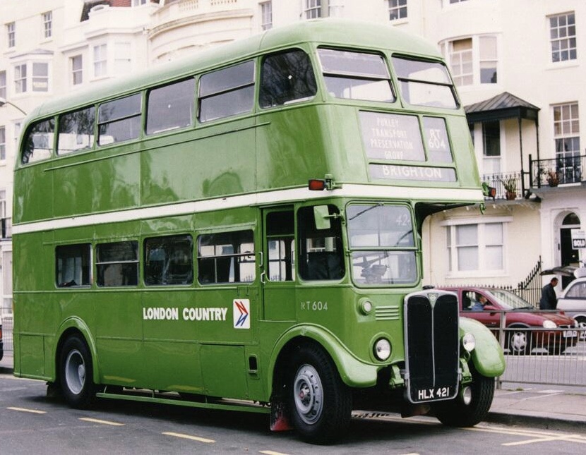
Many thanks to Bernard Davies for talking to us about his experiences at London Country and for sharing items from his collection; to the Bus Archive for access to the NBC publicity catalogues and to Michael Ellis of the Purley Transport Preservation Group and John Atkinson, for the photographs of RT604.

Categories
Advertising and publicity Eastern Counties Eastern National Lincolnshire

Imposters in poppy red and leaf green

NBC’s televised corporate identity spectacular for Norwich Union left a bus fleet in disguise

In 1974, NBC did their insurers a favour. Following their contract negotiation to insure vehicles across the whole company, NBC agreed to help Norwich Union to stage a spectacular advert for television. Produced by advertising agency McCann-Erickson, it featured buses from across the company’s local subsidiaries, showing off the new corporate identity green and red bus liveries, and then forming up into the outline of the insurer’s logo, based on the shape of Norwich cathedral. It’s not clear whose idea the advert was, so perhaps it was just a coincidence that the underwriters for the NBC’s policy occupied part of Norwich Union’s headquarters building with a perfect aerial view of Norwich’s busy Surrey Street Bus Station.

Our tidied-up version of NBC’s advert for Norwich Union, filmed on Sunday, 6 October 1974 at Norwich Airport.

David Slater tracked down a reference to the event in Buses magazine: “Several Bristol RLs, LHs and Leyland Nationals were used for filming a Norwich Union advert at Norwich Airport on 6 October 1974. A total of 50 buses were used, some of which were disguised as members of other NBC fleets such as Alder Valley, Hants and Dorset, United”. In fact, 39 vehicles are visible in the film, 20 red and 19 green. Eastern Counties provided the red buses, while neighbouring Lincolnshire and Eastern National supplied the green vehicles.

We recently tidied up the advert to restore the colours, sharpen it up, and provide a more contemporary (1971!) soundtrack. Taking a closer look at the sharper images, some of the red bus fleetnames show signs of having been stuck over something else. Look at the ‘Yorkshire’ illustration for example, where on close inspection the join is pretty clear.

Several members of the Eastern Transport Collection Society have memories of Eastern Counties’ supplying the red buses for the event. Norman Steels remembers that a number of Norwich drivers including Clive Sansby were involved in ferrying vehicles to the airport, and then in the elaborately choreographed bus manoeuvres for the advert itself. All drivers were required to wear their newly-issued NBC corporate identity uniforms for the occasion, and you can make out the octagonal drivers’ hats in the interior shots.

Eastern Counties drivers sporting brand new corporate identity uniforms, with Bristol LHS LH696. On the left is Peter Fish of Cromer depot, Norwich’s Tony Tate is third from the left, and to his right, Tony Frost and Micky Dogget. Photo courtesy of Tony Tate, possibly taken by Clive Sansby.

As well as six Norwich drivers, Eastern Counties drew in drivers on Sunday extra-overtime rates from Cromer, King’s Lynn and Ipswich, and having driven them across the Fens, Lincolnshire drivers took charge of many of the green buses. Eastern National’s Alan Tebbit remembers that their Chelmsford depot provided six Leyland Nationals, with Bristol REs from Colchester, Clacton, Harwich and Kelvedon, meeting up outside Colchester before travelling in convoy to Norwich, led by Alan in a Leyland National.

Tony Tate, who joined Eastern Counties as a conductor in 1962, was the driver of the lead vehicle, a red Bristol RE, in the advert. Under and arrangement with the Transport and General Workers’ Union, Tony remembers that all of the ‘performing’ drivers participating in the film were compelled to join Equity, the actors’ union, for the day.

The film shaping up into the Norwich Union logo was actually done backwards. An article located by Adrian Tupper in his archive of National Bus News explains that “good as the National drivers are, it would have been asking too much to expect them to tear around the airfield and form themselves into a perfect shape. So the crucial part of the action was shot in reverse. In other words, the symbol was built first, and the buses driven out of it, one by one.”

Tony’s role was certainly hair-raising. “There was a cameraman laying on the runway with his camera, and I was told to drive straight at him” he recalls. “The director told me ‘drive straight at the camera’, and not to turn until he waved his arm. I had to drive at speed, and I must have been only 10 feet away when he waved for me to turn. You can see in the film, I had to pull hard on the steering, and that was a real sharp turn to avoid him!”

Tony recalls a long day at the airport, though crews were well looked after with first class catering, a substantial cooked breakfast and a big roast lunch. As National Bus News put it: “Two days’ shooting… fifty buses… a full crew and a helicopter. It all adds up to thirty seconds of TV film. It’s not easy. But if you’ve seen the end result, we think you’ll agree that it was worth it.”

Chris Dugdell recalls that it was much talked about at the time – and that ironically, even though the company’s RL734 is one of two buses actually identifiable in the film (along with Lincolnshire’s brand new LH 1033), the name ‘Eastern Counties’ does not actually appear in the advert at all!

Article in National Bus News, March 1975, courtesy of Adrian Tupper.