The designs for the NBC corporate identity were a hit in Czechoslovakia in 1978.
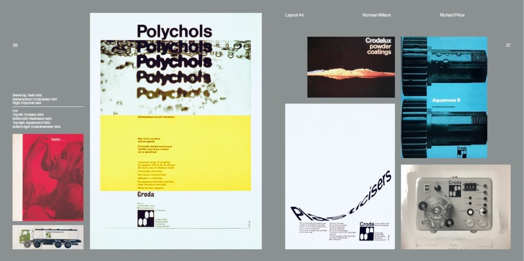
NBC’s corporate identity went global in 1978. Norman Wilson’s work had a history of gaining international recognition, one of the highlights being awarded a certificate of merit at the pathbreaking Typomundus 20 exhibition in 1966 for his graphic designs for Croda, playing with a creative combination of photography and type.
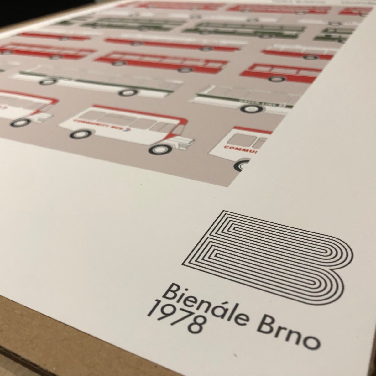
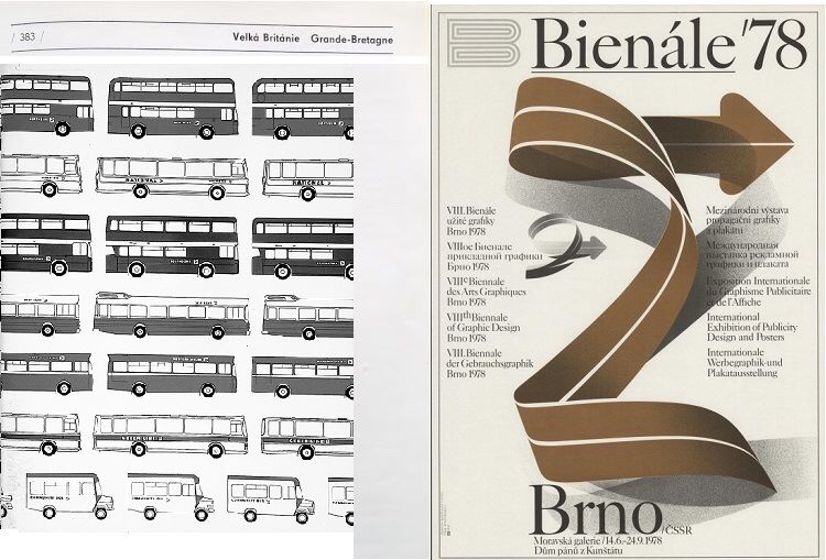
Norman Wilson’s catalogue page from the 1978 Brno Biennial, reproduced in colour for this project.
A decade later, Wilson was asked by NBC to refresh his original 1972 corporate identity designs, making more use of the two-colour version of his N-and-shadow symbol; expanding its coverage to uniforms, built environment and signage. The whole thing was consolidated into a sturdy ring-bound folder, which would be added to over time, and would be more durable in garages and workshops than the slim-bound A4 sheets released as the original Corporate Identity Manual in 1972.
It was this more substantial Corporate Identity Manual which Wilson decided to submit for exhibition at another international festival of graphic design, the Brno Biennale, in 1978. Sponsored by the Ministry of Culture of the Czechoslovak Socialist Republic, the Biennale had been launched in 1963, holding lively events every two years with an exhibition at the Moravian Gallery in Brno, and by the mid-70s had established itself as a prestigious fixture on the graphic design calendar. At the time it was a rare cultural event, attracting interest and exhibitors from both sides of the iron curtain.
The 1976, ring-bound edition of the NBC Corporate Identity Manual, the contents of which were exhibited in Brno in 1978.
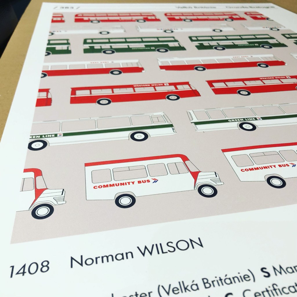
Wilson submitted the NBC manual, which was accepted as one of the leading examples of recent British design. The illustration used for the catalogue showed a selection of livery diagrams, some of which also appeared in different forms in the manual. A smaller version was used for the cover of the 1976 NBC Annual Report.
The original page and cover of the 1978 Brno Biennial catalogue.
It shows a selection of typical NBC vehicles in different colours, showing the variety of services the company provided, and to emphasise its national coverage, fleetnames included Northern for the north, Southdown for the south, East Kent representing the east, Western Welsh for the west and Wales, and Midland Red for the centre.
The recreated Brno catalogue page, now available to order.
The catalogue pages were produced in black and white, but after 44 years we’ve reproduced it as a colour poster, probably a bit crisper than the original. It’s available to order now via e-bay, in A2 and A3 sizes. Please allow around 7 days for delivery. Follow this link for more details and to order.Click here if you want A3 size.
Huge thanks to Jean Horsfall, Martyn Cummins and Nick Job for their enormous help with this reproduction.
Save the Brno Bienále!
Launched in 1963 as a cultural bridge between east and west Europe, the Brno International Biennial of Graphic Design has provided a major international platform for exhibitions, discussions, and educational programmes in graphic design for the last six decades.
Brno Bienale, Moravian Gallery, 2018, photo: arttalk.cz
Until now, the Biennial has continued to run every two years, attracting designers and visitors from all over the world helping to influence and inspire whole generations of graphic designers.
Brno Bienale, Moravian Gallery, 2018, photo: 28.bienalebrno.org.
Read more about how the modernist-inspired design of the NBC identity was shaped by Norman Wilson’s design influences, combining his three key elements: bold, uniform colours, his distinctive typeface, and a striking monochrome version of his NBC symbol, wordlessly conveying the nature of the business, all drawn together in a grid-based layout which brought a sense of uniformity and modernity across disparate companies and an enormous variety of vehicle types.
If you have recollections of the roll-out of the new livery, how it was managed, or remember your initial reaction to it, please let us know. We’d be happy to include these in a future blog, and perhaps in the Manual book itself. Get in touch using the form on this page, or the contact page here: https://nationalbusmanual.com/contact/
Norman Wilson’s pioneering Manchester design practice brought striking modernist graphics to industrial Britain – including the once-ubiquitous NBC Corporate Identity
Just published…. issue 44 of The Modernist magazine includes an article by Richard Price on the career, influences and graphic design work of Norman Wilson. Wilson’s work for Croda International drew him to the attention of Sir Fred Wood who, on his appointment as NBC chair in 1971, appointed Wilson to develop a new corporate identity.
Norman Wilson’s designs for the National Bus Company corporate identity, in the modernist 44.
Unlike the development of British Rail’s corporate identity, remarkably little is documented on Wilson, his business Norman Wilson Associates, their influences or the creative process. This article and the research behind it help to correct that.
It is Wilson’s NBC Corporate Identity Manual of 1972 and 1976, which formalised the identity he developed over the course of 1971-72, that this project has been launched to reissue.
Norman Wilson’s work for Croda International, from the modernist 44 ‘LAYOUT’, September 2022.
Wilson’s work extended beyond the bus industry. The article looks at how his designs brought modernism to parts of industrial Britain – for the chemicals industry, the relaunch of famous northern restaurant chain UCP, and his work teaching and inspiring a new generation of commercial graphic designers. Much of his work demonstrates his skill for creatively combining colour, striking photography and innovative letterforms to produce a visually-striking design. Edward Pond, a friend and collaborator (and later the founder of the Paperchase chain) described Wilson as “a typographer in the true sense of the word”.
Were you involved, or did you work with Norman Wilson, or know of Norman Wilson Associates’ work for NBC or elsewhere? If so, please do get in touch with us using our contact form.
Fifty years ago today, on 10 April 1972, Fred Wood, in his 100th day as NBC Chair, took the General Managers’ annual conference by storm. Revealing his vision and plan to revive the fortunes of the bus and coach industry, he put the business’s new identity stage-centre – along with its creator, Norman Wilson.
It’s 100 days since Frederick Wood took up his appointment as chair of NBC, and this evening, at the annual conference of the General Managers of the local subsidiary companies, he will set out his approach for reviving NBC’s commercial fortunes.
Frederick Wood, NBC Chairman appointed on 1 January 1972, described himself as a ‘corporate identity man’. On his desk is the NBC symbol perspex box, handed out by Norman Wilson to each Board member in an effort to win them over. (Photo: NBC, The Bus Archive)
At 4-5pm, the delegates begin to arrive at the conference centre at a Leicester hotel, which will be the venue for three days of discussions and planning. And at 5:30pm, Wood is due to give his opening address. Mysteriously, ahead of everything else on the following day’s agenda – planning, marketing, cost and operations management – pride of place on the opening evening is given to a talk on something called “CORPORATE IDENTITY”, led by an outsider to the group – Mr N Wilson, a design consultant.
The original agenda for the 1972 General Managers’ conference: after the Chair’s introduction, the key address on the opening evening is Norman Wilson on ‘corporate identity’. (Source: Bus Archive)
The mystery doesn’t last long once Fred Wood is on his feet. He sees a bright future for NBC and its subsidiaries – but only if they can improve and manage the costs and reliability of bus services (around 85 per cent of the business), and develop a profitable national coach network based on express services, tours and holidays, car rental – and anything else to which NBC’s resources and talent can be profitably deployed.
A national network requires a national identity. Wood argues that developing ‘a sound constructive ‘National’ image is central to successfully marketing a national product; drawing attention to NBC’s progress and performance; and to raising staff morale and commitment.
“I must here declare an interest and say frankly that I have been a lifetime “image” man. I was therefore a bit disturbed on my entry on the N.B.C. scene, to find the existence of a policy of virtual anonymity… . this cannot apply now in the light of our proposed policies and in fact this conference is being conducted under as large a glare of publicity as we can generate as a first move of the N.B.C. out of its chrysalis into the broad light of public view.
“We are convinced that the only way of maximising return on activities like Express is to operate a National system and in consequence we must develop as rapidly as possible a sound constructive ‘National’ image.
“The livery of the Express Coach which you will see shortly is only one expression of the new corporate identity programme which will eventually permeate all the visual aspects of N.B.C. such as uniform, literature, tickets, public signs and booking offices.
Norman Wilson, design consultant to the NBC Board, was the graphic designer responsible for all elements of the new corporate identity, working closely with Fred Wood as he had previously at Croda. (Photo: NBC)
It is left to Norman Wilson himself, speaking at 6pm, to set out the logic, the symbol, and the new National identity he has developed in concert with Wood. In line with Wood’s vision of operating companies acting solely as contractors to a new Central Activities Group, which is to run the new coach network, the names and brands of the operating companies will disappear entirely from their own vehicles. Whatever the merits of a National brand, it is this that grates with the General Managers of the operating companies in the room.
NBC General Managers in around 1970. (Source: NBC/The Bus Archive)
Norman Wilson’s session is billed as leading to a ‘discussion’ – but in the end this is not what happens. Instead, the General Managers are led from the room, through the lobby and outside onto the hotel forecourt – where the prototype White Coach is waiting for them to inspect -in full National livery with the red and blue symbol and logotype. And – with no local company name. The evening continues with dinner. There is enthusiasm for Wood’s bold optimistic vision and sense of purpose in reviving the fortunes of an industry in trouble. But as for the loss of local identities from the industry’s flagship project – there will be murmurs over the next two days of the General Managers’ conference, plotting, and opposition.
This is the first prototype ‘white coach’ prepared by Norman Wilson at Lowestoft‘s Eastern Coach Works in the week before the General Managers’ Conference in Leicester. It was revealed to General Managers Conference on the forecourt their hotel on 10 April, and was shown to the press two days later. The coach is Eastern Counties’ RE858. (Photo: NBC)
Sadly we don’t have a copy of Norman Wilson’s remarks at the conference – though you can get a good idea of his thinking here. But, from the Bus Archive, we do have a full set of Fred Wood’s notes, setting out his views on the business’s commercial prospects, the way ahead for stage bus services, and his vision for expansion of the express coach and holiday travel businesses. Throughout, it is clear that the corporate identity was central to his model of how to progress. The fact that he gave the most prominent speaking slot at his first conference with his General Managers to Norman Wilson is testament to that.
Here in full is Fred Wood’s speech setting a new course and ambition for NBC, and spelling out why corporate identity is central to it.
Frederick A S Wood, Chairman, National Bus Company: opening address to NBC General Managers’ Conference, Leicester, 10 April 1972.
Some of you may have felt a sense of dismay when you heard last summer of the intended appointment of another non-busman as Chairman of NBC. You may have wondered why the Minister should decide to nominate an unqualified businessman who has made his career in the chemical industry to succeed a chartered accountant who had spent most of his working life in the electrical industry. And, if there was this feeling of dismay, I sympathise. I have in the past often stoutly maintained that the best businesses are run by full-time professionals. However, as you might imagine in this case, I have to suggest that there may well be special factors which modify the general rule and make a team of part-time Chairman and full-time Chief Executive the best one to cope with the job at hand.
Fred Wood, NBC Chair, 1972-1978. (Photo: NBC)
Suffice it to say that I commenced in office on 1st January and on the same day Jim Skyrme took over from Tony Gailey as Chief Executive. I was glad to have been able to contribute to the selection process from which Jim emerged as the unanimous choice and I know it has given general satisfaction that we selected not only a life-time busman, but also a leading executive from N.B.C. itself.
In January, the new partnership of myself and Jim Skyrme began, supported by a reconstituted Board and the first one hundred days of the new regime expired at midnight last night.
The first hundred days smacks of a definite programme in the Kennedy, or even Wilson, tradition and I must therefore make clear that I do not believe in quick off-the-cuff solutions to major problems. When I discussed my appointment with John Peyton, I asked for and was specifically granted a five-year term instead of the more normal three years, because in my view three years is not a long enough period to accomplish the task of getting N.B.C. firmly on the road to long term viability. With these points in mind, you will not expect me to produce a list of definite objectives accomplished in this period. Rather we have been contenting ourselves specifically with reorganising and restructuring N.B.C. so that the company will be in the best possible shape to achieve the objectives that we have set.
You will by now be familiar with most of the details of the restructuring, but here are a few of the salient points.
1. We have taken steps to break down the schism between the part-time N.B.C. Board members and full-time management and also to allow Board members to contribute more to the work of N.B.C.
2. We have reduced the number of regions to three and modified; the regional structure so as to develop a more direct and dynamic chain of responsibility running from Chief Executive through Regional Director (and Executive) to Chief General Manager and then to General Manager.
3. We have introduced major new executive functions for vital areas such as Central Activities, (of which I shall speak more later), and Property.
As I have said, these and other changes are all designed to move N.B.C. as a whole into a better shape to tackle the very real problems and to enable us to fulfil our objective.
Before going any further, I must therefore give you my idea of what I see is our object. I have done my best to put this simply in one sentence and this is the result.
MY OBJECTIVE FOR N.B.C IS THAT WE SHOULD BE ABLE CONTINUOUSLY TO PROVIDE THOSE MEMBERS OF THE PUBLIC WHO WANT IT A GOOD RELIABLE PUBLIC ROAD TRANSPORT SERVICE AND MAKE A PROFIT FOR THE NATION IN DOING SO.
Now if this was a free-for-all instead of being the well-behaved gathering that it is, half the audience would be on its feet shouting me down and providing better alternatives as to what they consider our aims should be. I can hear the ghostly voices now:
“Who said you are supposed to make a profit? The 1968 Act says such and such…”
“Everyone knows that buses cannot be run out of the fare-box.”
“You should cut routes and services back relentlessly.”
“Jam up the fares so that every route pays.”
However, my view is that the only reasonable course open to us is to settle for a straightforward aim of service with profit and to get on with the job.
Before going on to say how I think we can achieve this aim, I should mention some of the background factors, good and bad, that I have taken into account in planning our strategy.
1. The major minus factor which faces us quite clearly is the persistent decline in stage-carriage passengers as a result of the public’s obstinate insistence on the delights of the private motor car.
2. Another is a serious erosion in the standard of performance, particularly as regards return on capital, in some parts of the company.
This can partly be attributed to the sometimes inevitable institutionalisation which often accompanies being part of a large group, whether nationalised or not. One of the great dangers of national ownership is that it removes the final sanction of bankruptcy. I feel reasonably sure that the results of some of the companies in the Group over the last three years would have been considerably different if they had been privately owned.
3. Despite the fact that most of the companies have been grouped together for years before the formation of N.B.C. in 1968, the degree of standardisation in vehicle and engine purchasing achieved to date cannot be regarded as satisfactory. Computer development has similarly been on a completely decentralised basis and even now we cannot decide whether it is best to brush or spray paint a vehicle.
“Even now we cannot decide whether it is best to brush or spray paint a vehicle.” A still from the NBC television advert “The colour’s changing”. (NBC, from Tony Pattison’s collection.)
4. I suggest that the industry at large has become far too complacent and used to citing the manifest difficulties that surround bus operations as reasons for indifferent results. An example of this feeling is the general attitude to the poor results of 1970. These are dismissed as being exceptional, when in fact it might be argued that any poor result for whatever reason arises at least in part out of some error or omission of management and that the disaster of 1970 could have been foreseen and partly if not completely averted.
5. Bus companies are controlled and to a considerable extent hamstrung by local authorities, traffic commissioners and government departments. Changes in government policy, regional planning and city development all affect us strongly.
All public services, and the bus is no exception, tend often to become very convenient political footballs and N.B.C. suffers from this at the local and national level.
On the plus side:
1. The bus remains throughout the world the most flexible and adaptable means of moving people about in bulk. Railways, mono-rails and similar devices must have a track, which in this century usually proves to be prohibitively expensive. Air travel is ineffective inside the U.K. as a means of public transport. And as campaigns by successive government against the private car proceed, the bus must eventually come into its own.
2. We have a monopoly or quasi-monopolistic position in many areas and however you like it that must have good points. Furthermore most of our companies are household names in their particular locality.
3. There is a prodigious amount of talent (not all of it fully used) in N.B.C. Our human resources in terms of management and labour are very real and very considerable.
4. We have excellent engineering facilities, maintenance centres, bus depots and much real estate capable of considerable development.
5. We are adequately capitalised for our needs (if we accept the rather quaint debt structure in which we work under the Exchequer).
Having outlined our main aim and listed plus and minus factors, I propose to explain to you our planned strategy to achieve our objective.
The strategy is two-pronged.
STAGE-CARRIAGE STILL CONSTITUTES THE VAST BULK OF OUR TRAFFIC AND EARNINGS. WE PROPOSE TO MAINTAIN AND IMPROVE OUR SERVICE IN THIS AREA BY WHATEVER MEANS·IS AT OUR DISPOSAL, SPECIFICALLY INCLUDING VITAL AND ENERGETIC MANAGEMENT AND METHODS, MARKETING, ECONOMIES AND RATIONALISATION.
WE INTEND VIGOROUSLY TO DEVELOP ALL OTHER LEGITIMATE AREAS OF GROWTH IN PUBLIC TRANSPORT TO WHICH OUR ASSETS IN HUMAN RESOURCES AND EQUIPMENT CAN BE APPLIED. SPECIFICALLY WE WILL EXPAND ON A NATIONAL BASIS INTER-CITY SERVICES, EXTENDED TOURS AND POSSIBLY DEVELOP INTO SELF-DRIVE CAR HIRE, TRAVEL AGENCY AND OTHER ALLIED ACTIVITIES.
Now to explain these.
As I have said, the great bulk of our business (say 85%) is still in stage-carriage. We must therefore continue to maintain pressure in this main area. It will, for the time being at least, continue· to be operated on a company basis, although of course, we shall continue the policy of merging companies where appropriate. The traditional liveries and names will continue although we expect to propose a linkage via a common emblem for all N.B.C. companies.
We must ceaselessly pursue all possible avenues of profitable service in this area. We must examine bus and mini-bus franchise schemes for country areas. We must consider jointly with the Post Office and National Freight a return to the village carrier for some areas. In every possible way we must seek out what the customer wants and try to fulfil his requirements at a profit.
I believe that in a few years, enough pressure from governments here and abroad will bring counter-legislation against the car which will bring the bus into its own, but we shall be realistic and assume that that is not going to happen for the next few years and that in that period the car will continue its relentless progress.
In which case, we may well be faced with further declines in passengers on stage-fare business however hard we try to fulfil the public’s requirements. If that is the case, how do we tackle the problem? The classic answer often thrown at us is (a) increase fares and (b) reduce service.
It always seems to me that this is advanced by those without hard business experience, who completely fail to understand the unique problems and disadvantages of a declining market. Raising prices may cope with inflation but when applied to a diminishing volume of business, the effect is to produce nasty side-effect of driving away even more customers. Eliminating routes leaves existing overheads with less business to service them and valuable facilities only partly used. I believe if we were to try and solve the problems of N.B.C. by increased fares and reduced routes alone that we might well be out of business before my term is up.
What is the answer?
You must, of course, increase fares and reduce routes as circumstances dictate, but I believe the key to the problem is to find profitable growth areas for all these resources of human talent and physical facilities to be used on as the decline in stage-carriage proceeds, so that the slack may be taken up.
This reasoning lies behind the establishment of the Central Activities Group, about which I now propose to speak in some detail.
As you will know, we have set up the Central Activities Group and the Chief Executive has nominated David Glassborow as the Director in charge. This Group will have a growing number of divisions. The first two of these will be (1) Inter-City Express Operations and (2) Extended Tours.
As far as Express is concerned, I believe that this is an area where we can improve on a necessary and popular service to part of the public to a very real extent. This can be a growth area and one in which we can work profitably. I visited Greyhound in the States last year and some of my thinking on Express has been influenced by their experience. At any rate, we propose to follow very broadly the recommendations of the Garratt report, which run briefly as follows:-
(a) All Express operations of N.B.C. companies will be run as one service under one management as a division of the Central Activities Group.
(b) There will be a common livery for all the coaches concerned and naturally common working systems, tickets and general conditions.
(c) Those companies concerned only with coaching will be absorbed into the Central Activities Group.
(d) Those stage carriage companies that presently run Express Services will continue to own, operate and maintain the vehicles under a leasing arrangement with the Express Division.
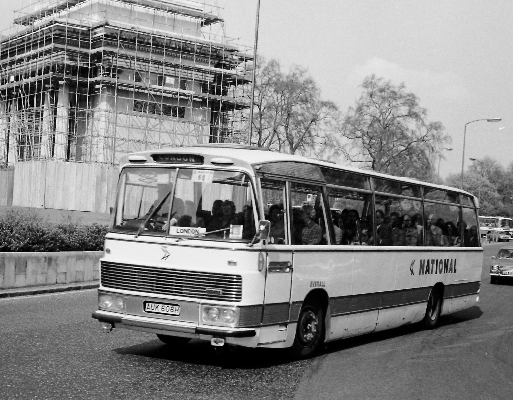
The National identity was rapidly applied to inter-city express coaches and tour vehicles, managed by NBC’s Central Activities Group. Initially te identity of the local operating company was to be lost entirely (Photo: Richard Price
Next we shall consider Extended Tours. This again is a potentially profitable area which we shall operate in future as a centrally-controlled function.
Self-drive hire cars present a growth area in transport to which some of our facilities may be usefully applied. Our network of booking offices suggests that there may be good grounds for us considering a national chain of travel agencies and there are other areas that we shall be exploring as the months pass.
In addition to the Central Activities Group, we shall strive to maximise our return from our substantial property interests and to this end a Property Department has been set up under the direction of Mr. Womar.
Broadly speaking therefore our policy is to continue to press the traditional stage-carriage business through the three new regional groups and to apply new and strong effort on our centralised activities.
So far I have told you of our reconstruction, told you of our main aim, listed a few plus and minus factors and explained our principal strategy.
Before I conclude I would like to deal with a number of specific points which may help you to understand the thinking behind some of the more obvious tangible aspects of this policy.
I must first give you my views on corporate identity or if you prefer, image. I must here declare an interest and say frankly that I have been a lifetime “image” man. I was therefore a bit disturbed on my entry on the N.B.C. scene, to find the existence of a policy of virtual anonymity. Tony Gailey and others explained all this to me and I accept that in the past, with all activities being conducted by the companies, there was an active disincentive to a central image. However that was in the past, it cannot apply now in the light of our proposed policies and in fact this conference is being conducted under as large a glare of publicity as we can generate as a first move of the N.B.C. out of its chrysalis into the broad light of public view.
“N-and-shadow”… and shadow. The NBC symbol perspex box, handed out by Norman Wilson to each Board member in an effort to win them over. (Photo: John Oldfield)
We are convinced that the only way of maximising return on activities like Express is to operate a National system and in consequence we must develop as rapidly as possible a sound constructive ‘National’ image.
A concern for the outward image always brings with it the accusation that one is more concerned with window-dressing than making real progress. I strongly refute this, however, and will list a few specific reasons why I believe in a strong corporate identity programme.
It is obviously absolutely necessary to the successful marketing of a national product.
To focus public attention on oneself is to provide a constant and irremovable goad towards progress, better performance and growth.
Internal morale at all levels is automatically stimulated and inspired.
The livery of the Express Coach which you will see shortly is only one expression of the new corporate identity programme which will eventually permeate all the visual aspects of N.B.C. such as uniform, literature, tickets, public signs and booking offices.
The second specific subject I wish to refer to is performance.
As I briefly mentioned, it is my view that the performance of many companies has been extremely poor particularly in terms of return on capital. Although we are owned by the Government, we are a commercial concern and we must be judged and judge ourselves on performance. High performance is the goal-scoring of commercial football. It is the tangible sign of all those virtues which make the good businessman and which when employed make the good business.
We must reduce and contain expense, not only operating expenses but also any form of unnecessary expense or expenditure. We must maximise returns by marketing, hard selling, persuasion or whatever means are at our disposal. However we do it, the criteria must be success.
Finally I would like to answer the hypothetical question – Is there a good future for the N.B.C. and for management in the N.B.C.?
For the last twenty years I have followed the commercial fortunes of many ventures of all shapes and kinds in the U.K. and elsewhere and from this accumulated experience I drew the firm conclusion that despite the many obvious difficulties that confront us the National Bus Company and its subsidiaries have not only every chance of viability, but that we can, if we really harness all our resources., become one of the nationally-owned enterprises that regularly provides a good service and makes money at the same time.
My vision for the National Bus Company for 1976 runs as follows:-
We will be a leaner, tougher organisation than now in terms of men and vehicles. Attitudes will have changed so that performance and profit will be key factors.
Our capital employed will be much the same as to-day, but we will be making a substantially better return. Say £20,000,000 before tax and interest.
60% of our revenue will arise from stage-carriage traffic, which will conducted by fewer companies, still working under many of the old names but clearly linked together as part of a national service. The other 40% of the business will be in Express, tours and the other central activities which will all be working under a by then familiar ‘National’ image.
N.B.C. will be able to claim simply that it is as efficient and as profitable as commercial concerns of comparable size in similar industries.
I believe that a vital performance-orientated exercise of the sort I have described must offer enough posts of challenge and responsibility to all those in the industry who wish to strive for them. My vision of 1976 may not be exactly to everyone’s taste, but I hope it will commend itself to you. I invite you to join Jim Skyrme and me and the whole Board and management of the National Bus Company in turning this vision into a reality.
——
There’s more to follow on the design and launch of the NBC Corporate Identity. Do you have memories of the adoption and roll-out of the NBC Corporate Identity? If so get in touch using the form on this page, or the contact page here: https://nationalbusmanual.com/contact/
The NBC Corporate Identity was launched fifty years ago in 1972. It was the product of a series of political, commercial and design decisions. In this post, we look at the timeline of events and the context which gave the Identity its purpose.
25 October 1968
Barbara Castle’s Transport Act gets Royal Assent, legislating to set up the National Bus Company, instead of her original plan for regional transport corporations. Taking advantage of an unexpected opportunity to bring the bulk of the English and Welsh bus industry into public ownership, the creation of NBC offered a relatively straightforward route to establishing a national body to help to coordinate public transport.
1 January 1969
National Bus Company formed, merging the bus and coach businesses of the nationalised Transport Holding Company and British Electric Traction.
1969-1970
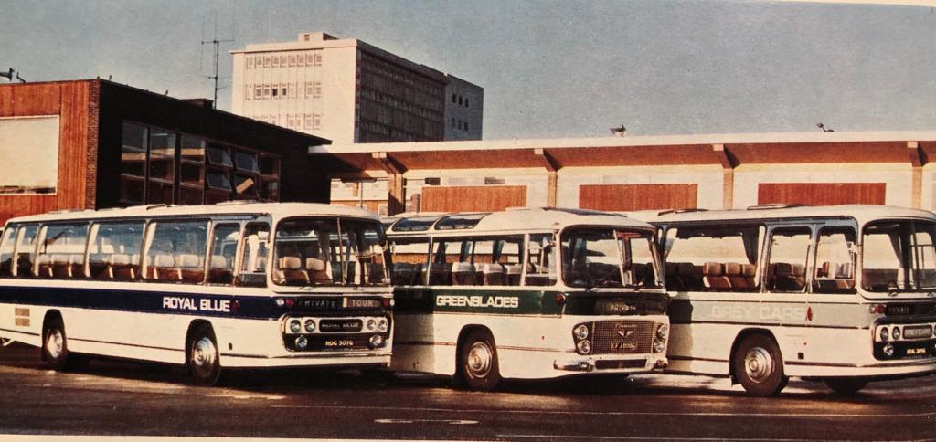
NBC makes attempts to adopt common marketing and a house style for coach liveries and publicity, using the modern-looking Microgramma typeface.
National Bus Company coaches from subsidiaries Royal Blue, Greenslades and Grey Cars in the 1969 ‘house style’, using a band of colour as the background to the fleetname set in the typeface Microgramma. Photo: Tony Whitehead, NBC.
19 June 1970
Heath government elected, determined to make NBC a commercial body, rather than the coordinating public authority envisaged by Castle. John Peyton appointed Minister of Transport.
Summer 1971
Peyton approaches Frederick Wood, chair of chemicals business Croda International, to become NBC’s chair. Wood accepts.
Autumn 1971
Wood asks designer Norman Wilson, architect of Croda’s corporate identity, to work with him to develop a corporate identity vision for NBC.
Winter 1971
Wilson – with his talent for letterforms – draws the iconic ‘N-and-shadow’ National arrow symbol one evening over dinner and formalises it into an 8×8 grid. With Wood’s approval and vision of a uniform national ‘silver coach’ express service, Wilson expands on the symbol to develop a framework for the identity.
1 January 1972
Wood takes up the Chair of NBC, along with a new Board. Outlines his thinking on the express network and NBC’s identity, inspired by the silver coaches of Greyhound’s iconic brand in the US. Dissuaded from a plain-chrome livery for practical reasons, the idea of the White Coach is born.
January 1972
Wilson is invited to set out his thoughts to the NBC Board, using display boards to set out the concept of the National symbol, the white/red/blue corporate colours, the white coach and consistent typography. Wilson is appointed design consultant to the Board.
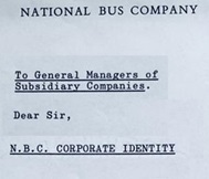
3 February 1972
The Corporate Identity project is announced internally in a letter to General Managers – “NBC has asked a Design Consultant to advise on all matters relating to a corporate identity for the N.B.C Organisation” suggesting it will be rolled out within six months.
February 1972
Wood decides to mark the end of his first 100 days at April’s annual General Managers’ conference for the bosses of NBC’s subsidiary companies, at which he will outline his plans.
First week April, 1972
With preparations for the General Managers’ conference going down to the wire, at the start of April 1972 Wilson makes the trek from Manchester to Lowestoft, in a car packed with red & blue vinyls. He prepares the ‘prototype’ White Coach at the Eastern Coach Works, assisted by respected ECW coachpainter Alan ‘Casey’ Crisp.
More to follow. Do you have memories of the adoption and roll-out of the NBC Corporate Identity? If so get in touch using the form on this page, or the contact page here: https://nationalbusmanual.com/contact/
Portraits of Frederick Wood and Norman Wilson: NBC. Portrait of John Peyton: National Portrait Gallery. Extracts from NBC correspondence and photograph of NBC’s General Managers in 1969 courtesy of The Bus Archive.
Vision, compromise and change in the first edition of the Corporate Identity Manual
The NBC Corporate Identity developed from a series of discussions between incoming NBC chair Freddie Wood, and leading graphic designer Norman Wilson. Wood had been chief executive of Croda International, and had employed Wilson for many years to modernise the company’s image, undertaking a comprehensive rebranding in a clean, modern style, encompassing the Croda’s symbol, marketing, packaging and vehicles. Wood was impressed with Wilson, and the two got on well.
NBC Chair Freddie Wood (left, later Sir Freddie); and design consultant Norman Wilson (right). Photo: NBC.
Wood had spent part of his early 20s in the United States, and the American way of doing business fascinated him. He was particularly struck by the extensive network of silver Greyhound coaches which he had used to criss-cross the US during his stay, offering a consistent reliable service and strong uniform branding. So when Wood was asked by the newly-elected Heath government in 1971 to take the role of chair of the relatively new National Bus Company, with the objective of making it a more commercial organisation, he was immediately struck by two thoughts. First, the Greyhound proposition of a uniform national coach network. And second, the need to ask for Wilson’s design advice in shifting the image of the long-distance coach, and the wider industry.
An iconic 1954 Scenicruiser, manufactured for Greyhound Lines by General Motors. Greyhound’s uniform branding created a strong image of a consistent and reliable national network across the United States. Photo: Greyhound Lines publicity department, in the Hemmings.com collection.Greyhound Lines’ publicity emphasised the consistency and reliability of a uniform national network for business and pleasure travel across the United States. Source: Greyhound Lines.
Wilson was actually brought on board by Wood in 1971, before his chairmanship had been formally agreed. It was in this period that Wilson had the epiphany of the ‘N-and-shadow’ arrow symbol. Once appointed, Wood wasted no time in formalising the appointment of Norman Wilson as corporate design adviser to the NBC Board. There was a formal pitch to the Board early in 1972 using design boards explaining the National symbol, graphics and the white coach in preliminary version of the corporate identity. These will form the basis of a section in the NBC Corporate Identity book. It is not clear whether other design businesses were invited to bid – but Wilson’s appointment was announced to the business and its operating companies in a letter from the company secretary to the General Managers of the local subsidiaries in February 1972, stating simply that NBC was appointing a design consultant “to advise on all matters relating to a corporate identity for the NBC Organisation” – and cautioning against overstocking on existing designs of stationery which might soon become redundant.
A public announcement was made in May 1972, with that month’s Design Journal reporting that “Norman Wilson, Manchester based design consultants, have been retained by the National Bus Company to design a visual identity programme for vehicles, signing, stationery and related graphics.”
After being persuaded that – because of production techniques and climate – a silver coach in the style of Greyhound would not last well in Britain, Wilson and Wood wanted the coaches to be purely white, with the National branding of the NBC symbol and the NATIONAL logotype in red and blue. Operating companies were to be solely suppliers to NBC’s Central Activities Group, which took responsibility for the National coach network. Local company identities were not to appear on the white coaches at all, except in the tiny mandatory ‘legal lettering’ identifying the owner at the bottom of the bodyside There was a degree of scepticism, and even push-back against the idea of a uniform corporate identity, particularly from operating companies whose local liveries in some cases could be traced back to the start of motor coaches at the beginning of the 20th century.
From the 1972 Corporate Identity Manual: Wilson and Wood’s intended National White Coach livery. The branding is purely National, with no local company fleetname, to give the sense of a single uniform national entity. Tillings Transport’s PWC 341K was the second White Coach. In the original concept presented to the NBC board, the National symbol always pointed to the right: consequently it pointed backwards on the nearside of coaches. This was replicated in the first two trial applications to vehicles, with the result that this illustration made it into the first edition of the Manual. The coach also carries a fleet number plate – in red for Eastern National’s Southend Prittlewell depot which maintained a large part of the Tilling coach fleet. This too was inconsistent with the manual’s instructions to use steel-grey lettering, transfers of which were set in Futura and supplied to each operating company. Photo: NBC, The Bus Archive.
Wood was resolute in his determination to apply a uniform white livery. He had been dissuaded from adopting a silver livery, US-style, on the grounds that that bodysides would corrode. When operators next objected to all-over white on the grounds that they would show dirt, Wilson retorted, in characteristically blunt fashion, that “they’ll just have to wash them more often then, won’t they?”
With the overall colour beyond doubt, the use of local fleetnames became the next area of controversy and compromise. The first trial application of the NBC white livery, on an Eastern Counties coach at the Eastern Coach Works in Lowestoft, had omitted the local company’s fleetname, showing only the National brand. General Managers of NBC’s operating subsidiaries were horrified, complaining that their local identities and pride in the service would be lost, and that coach users would be confused by multiple identical-looking coaches and would find it harder to locate their service.
Norman Wilson, designer of the NBC Corporate Identity, applies his NATIONAL lettering to the very first ‘white coach’ at Eastern Coach Works (ECW), Lowestoft, April 1972. Consistent with the initial presentation to the NBC Board, his ‘double-N’ symbol is pointing to the rear on the nearside of the coach in this trial application of the new identity to Eastern Counties’ RE858. This was altered in the 1972 Corporate Identity Manual, which specified that it should point in the direction of travel on either side of the vehicle. Behind Wilson, assisting with the application, is ECW’s Alan ‘Casey’ Crisp, described by Eastern Counties’ Stephen Milne as “the best coach painter I ever knew – the best at lining-out and an excellent sign-writer.” Casey spent his entire working life at ECW, retiring at 65, three years before the Coachworks closed in 1987.Wilson’s first response to demands from operating companies’ General Managers that a local fleetname should be applied was perhaps deliberately obtuse. He added tiny light-grey lettering to first ‘white coach’ – Eastern Counties’ RE858 – at about the same size as the legal lettering and ‘fuel’, ‘oil’ labels, albeit in his heavier National lettering. This achieved his objective of interfering as little as possible with the uniformity of appearance which he and Freddie Wood sought – but with lettering so small as to be almost unreadable at any distance. General Managers were not placated. The picture shows Eastern Counties Bristol RE Plaxton-bodied coach RE858 at Cheltenham early in 1972. Photo: Richard Price collection.A similar experiment was conducted with Eastern National’s Plaxton-bodied Bristol RE number 425, seen here in Southend in 1972: a tiny fleetname in grey National Alphabet lettering was placed underneath the window behind the cab. Photo: Bernard Watkin, Eastern Transport Collection Society.
Wood and Wilson relented, marginally, in response to the latter argument and a compromise was attempted. First, a local fleetname was applied as a trial to the Eastern Counties coach used in the initial trial application of the identity, using Wilson’s bespoke National lettering, but at a height barely larger than the legal lettering and in a very light grey. It was almost invisible, and the General Managers were not placated.
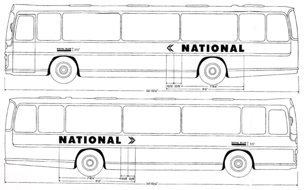
Wilson therefore adopted a different, more visible approach for the initial roll-out of the Corporate Identity. Local company fleetnames were applied on National coaches above the wheel arch, set in Wilson’s new National lettering, at the slightly larger letter height and in a more legible dark grey. They were further emphasised by a bold underlining, the line being the same height as the letters giving an overall height of 3½ inches, in the colour adopted by the local company for its buses. This was codified in the first edition of the Corporate Identity Manual of May 1972.
From the May 1972 Corporate Identity Manual, drawn up by Norman Wilson and colleagues, this diagram shows the ‘compromise’ initial NBC standard white coach livery, with small operating company fleetnames underlined in the company colour – in this case Royal Blue’s royal blue – with an overall height of 3½ inches. The vehicle used for illustration is a Plaxton Panarama Elite II. Source: NBC, The Bus Archive.Wilson’s design of fleetnames had a neat logic, consistent with his approach to corporate identity. It combined two of the main elements of the NBC identity, using the National Alphabet for the local company’s name, and at the same height as the lettering, a block of the NBC corporate colour identified with the operating company, usually that adopted for local buses. See our previous blog article to read about Norman Wilson’s view of the key elements of corporate identity.Royal Blue’s ECW-bodied Bristol RE number 2387 is seen in Newbury in 1973. Instead of adopting the green colour of its parent Western National, Royal Blue chose to underline its fleetname in blue – along with the National symbol and logotype, this is the only blue remaining of the company’s trademark livery. Photo: Richard Price Collection
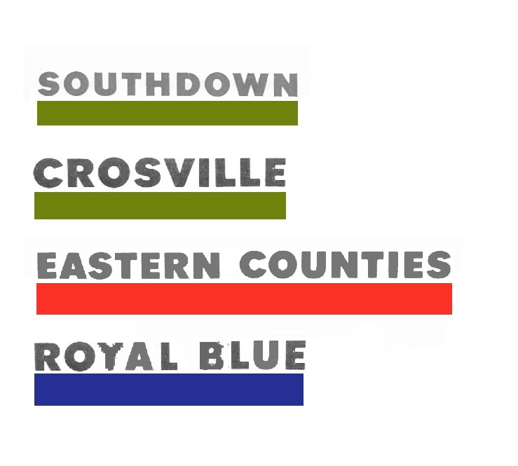
So Eastern Counties and United coaches had a small fleetname underlined in their corporate red; as did Standerwick, a coach-only business which adopted the bus colour of its parent company Ribble. Crossville, Southdown and Eastern National coaches meanwhile appeared with fleetnames underlined in green. Other non-bus coaching businesses were given latitude, so even though their historic colours were eliminated, Royal Blue used a blue line on their National coaches, while Black and White used black.
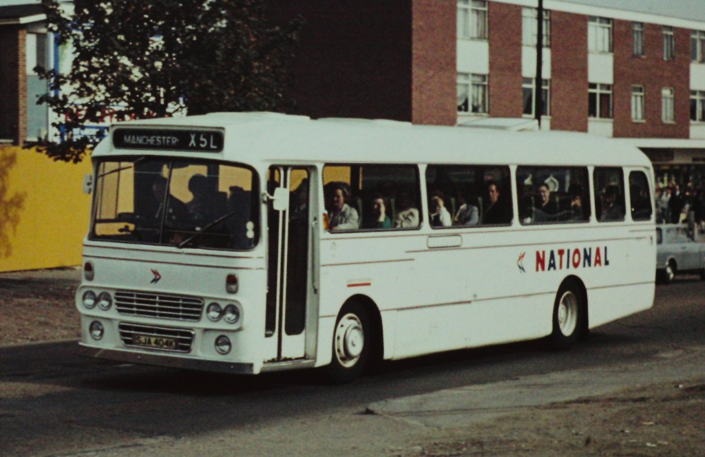
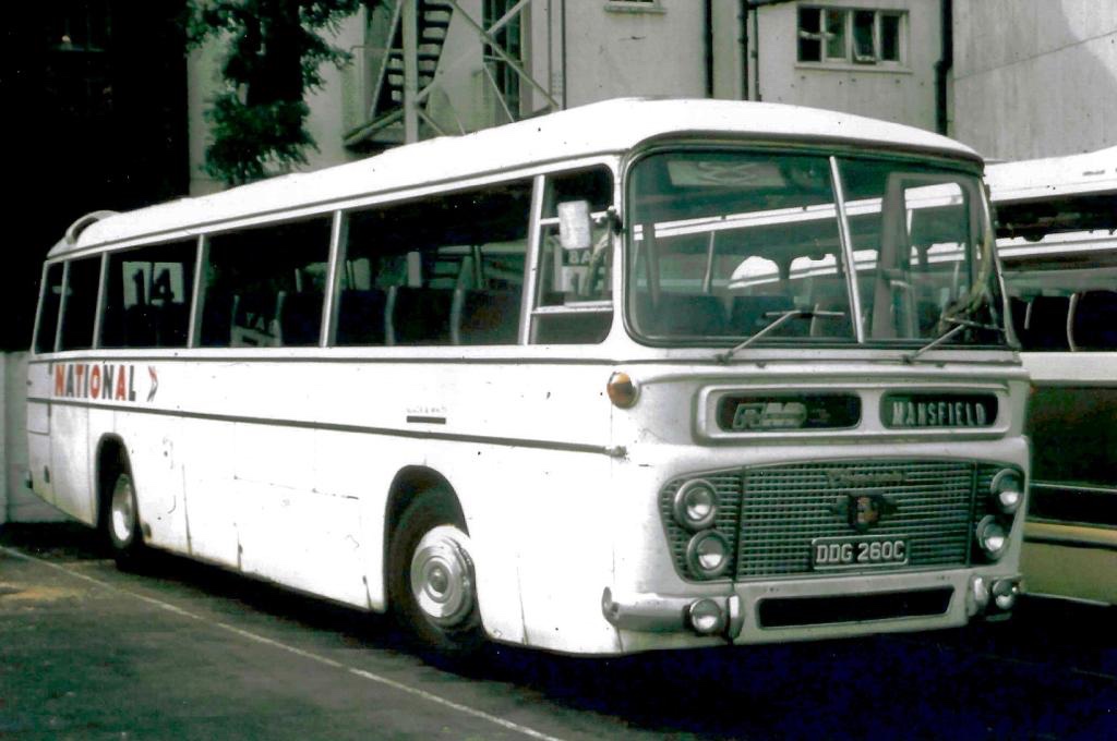
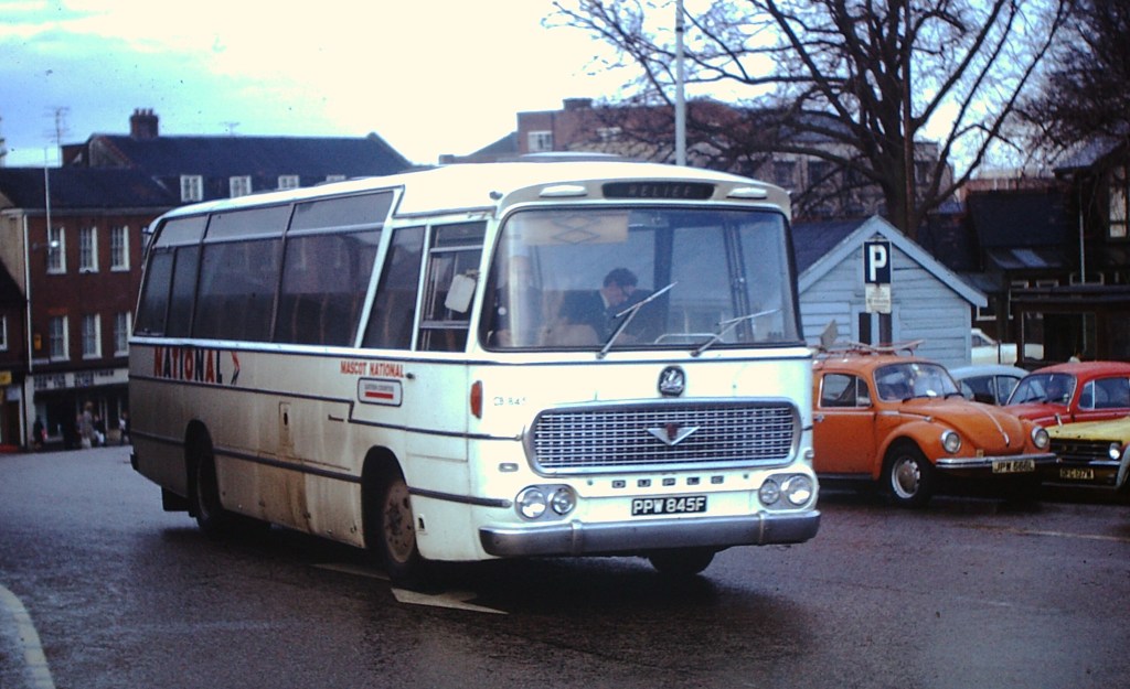
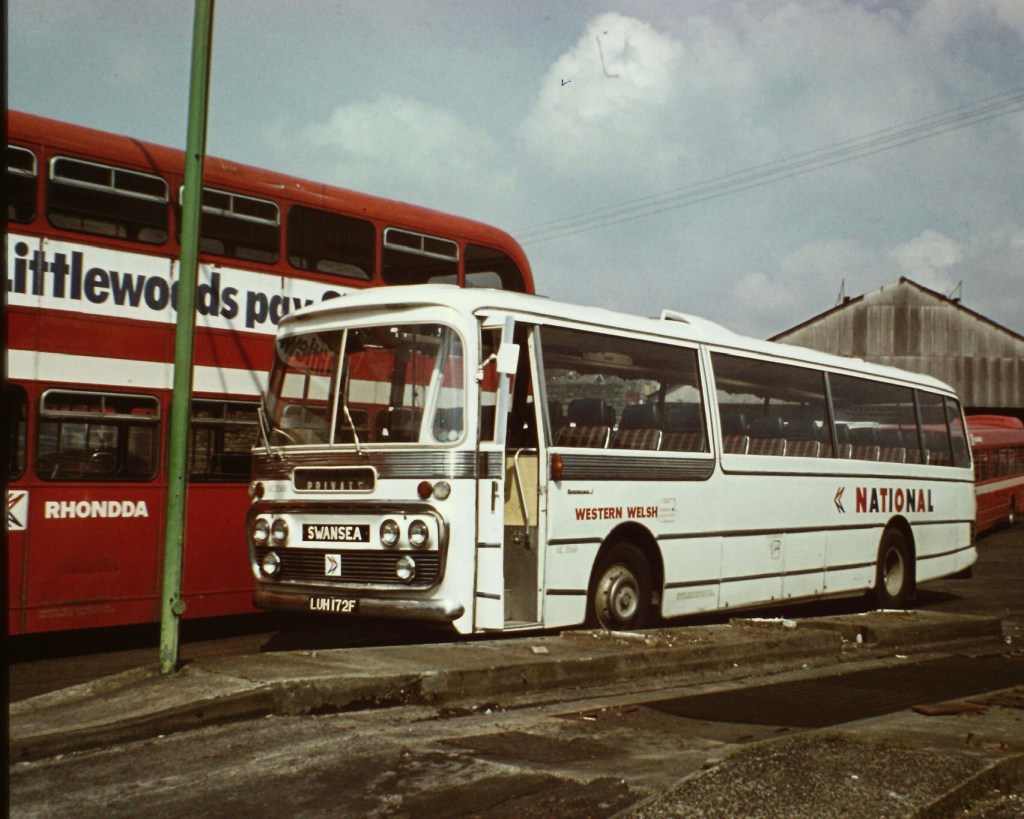
North Western’s Leyland Leopard SJA 404K is seen in Stockport in 1972 on an express service from London to Manchester via Birmingham, with a small fleetname underlined in National red.Eastern Counties’ CB845 – a Duple-bodied Bedford VAM70 at Great Yarmouth in 1972 – illustrating both the small operating company fleetname, underlined in poppy red, and displayed in the illuminated panel; and also the challenges of fitting the key elements of the new Corporate Identity around decorative chrome bodywork. Norman Wilson’s team were supplied by coachbuilders with hundreds of coach drawings as they tried to get a reasonably uniform application of the new identity across a huge variety of vehicles. (Photo: Bernard Watkin, Eastern Transport Collection Society).Uniquely, Black & White Motorways, having no standard bus colour, adopted black underlining for its fleetname. Here Black & White coach DDG 260C – a Duple Commander-bodied Leyland Leopard – shows off the early version of the white coach identity, in Cheltenham in 1973.Standerwick – the coaching branch of Ribble – operated the largest coaches of the era, a fleet of thirty Bristol VRLL double-decker coaches – providing an express service between Manchester, Birmingham and London making full use of the new national motorway network. Standerwick’s fleetname is underlined in the Ribble bus colour of poppy red, in a vast expanse of white. Photo: Tony Whitehouse, NBC Publicity.Southdown’s Leyland Leopard LCD 232F in February 1973, with a small fleetname underlined in National green, and a small ‘National’ logotype in the illuminated panel at the front. Photo: Richard Price Collection. Eastern Counties’ Bristol MW coach LS830 shown in April 1974 in the early National livery, with local fleetname underlined in poppy red. In the bus shortage of the early 1970s, front-line express coach LS830 has been pressed into service on a local Norwich city route. The clock tower of Norwich City Hall towers over the Bell Hotel in the background. (Photo: Bernard Watkin, Eastern Transport Collection Society).From the 1972 Corporate Identity Manual: these two illustrations show the appropriate positions of the NATIONAL logotype and the operating company fleetnames on two Bristol RE coaches with different decorative bodyside mouldings. Norman Wilson’s team worked through hundreds of coach body designs to work out how to get a consistent application of the new identity across a huge variety of different vehicles. Both United Counties and Crosville fleetnames would have been underlined with a bar in NBC green, the bus colour used by both companies. Source: NBC, The Bus Archive.
The result was a bit more colour and variation of appearance than Wilson had intended, and served to differentiate the coaches to some degree. It did not however last long. The small fleetnames and coloured bands were considered both untidy, and were too small to serve the purpose of making vehicles identifiable to customers. Wilson developed and implemented a tidier approach, more consistent with the uniform look he and Wood aimed for, while also going some way to placate the General Managers. From November 1972 a revised livery was adopted, overruling the instructions in the first Corporate Identity Manual issued in May, just a few months earlier. Regardless of the company colour, local operating company names were now to appear in National-red letters 3⁵/₈ inches tall without incorporating a coloured band, displayed more prominently between the wheel arch and the windows. A letter of 9 November 1972 to General Managers from Ron Whitehouse, NBC’s Group Public Relations Officer, formalised the change of approach: “a revision to the specification regarding the size of company name. The name of the operating company should appear over the front wheels in corporate style lettering 3⁵/₈ inches high in National red.”.
This gave much more prominence to the local businesses, but in a style which fitted more consistently with the overall uniformity of the National ‘white coach’. It was this look, rolled out widely through 1973, that was to become the standard for the next two decades, and which was reflected in the 1976 second edition of the NBC Corporate Identity Manual.
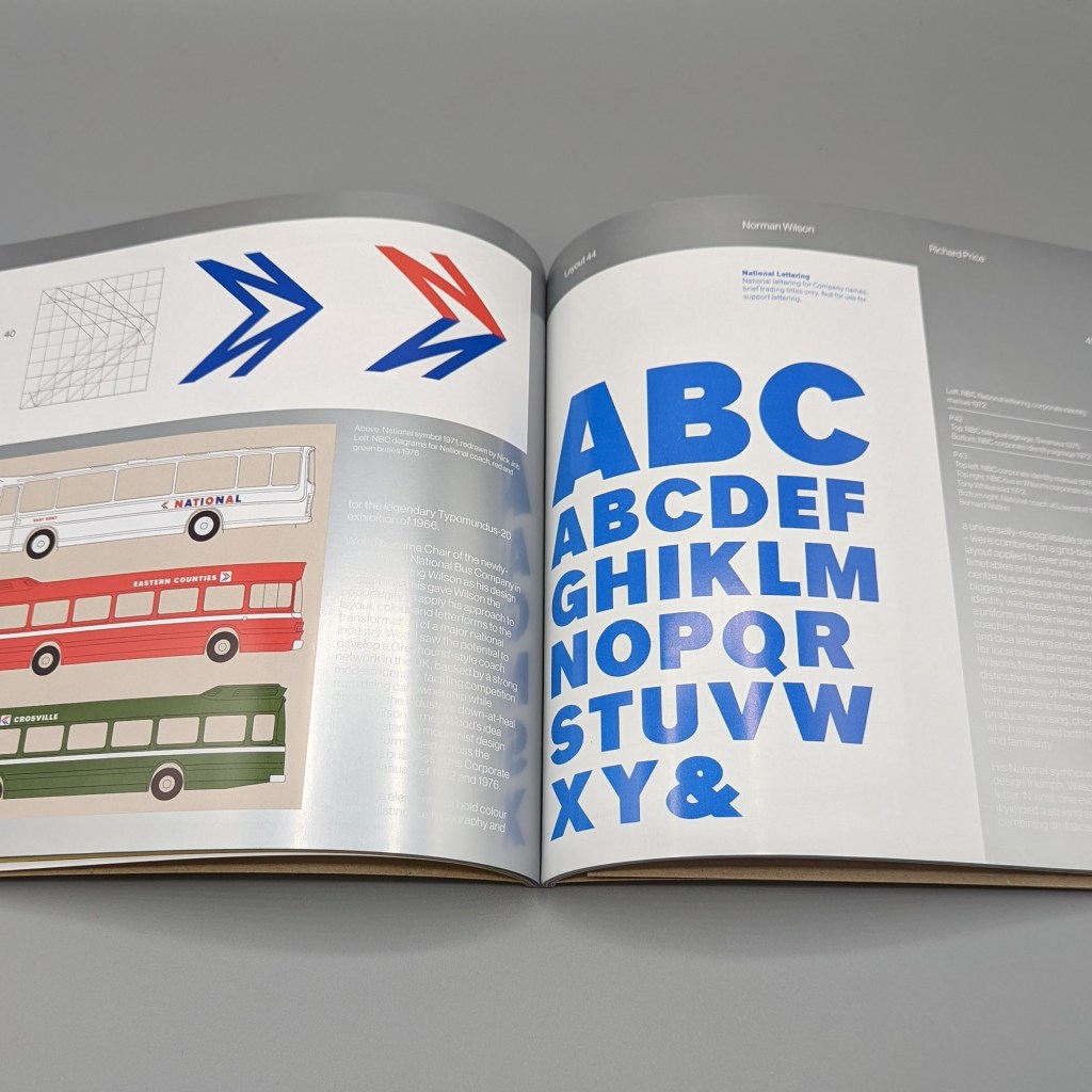
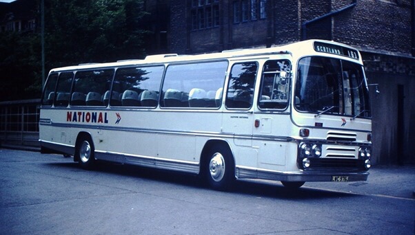
By the end of 1974, Eastern Counties had rebranded coach Bedford Duple-bodied CB845 to their Mascot National subsidiary by applying the new fleetname revised standard red 3⁵/₈ inch fleetname style, but without removing the 3½ inch Eastern Counties fleetname and band in the previous style. It is seen here on a relief service in Norwich in December 1974. Photo: Bernard Watkin, Eastern Transport Collection Society.Ron Whitehouse’s letter of November Sept 1972 specified a number of alternations to the initial white coach livery set out in the Corporate Identity Manual issued in May of that year. The revised operating company fleetnames – or ‘company identifiers’ – were enlarged to 3⁵/₈ inches, in Wilson’s National lettering, and were set in poppy red, regardless of the company colour. This gave a greater uniformity to the National coach fleet. Preserved Eastern Counties Bristol RE coach RLE747 illustrates the revised style of local company fleetname. Photo: Richard Price.Futura was the typeface used in Norman Wilson’s initial work on the NBC corporate identity late in 1971. A thickened version of a heavy weight of Futura was used in the mock-ups shown to the NBC Board at the start of 1972. Before the early trials on vehicles in April, however, Wilson had switched to Akzidenz-Grotesk, on which he based his National lettering, using a thickened version of a heavy weight as the base and incorporating elements of Futura. For most signage, standard Akzidenz-Grotesk was adopted and is specified in the 1972 Manual. Nevertheless, Futura was retained on vehicles throughout NBC for labelling, fleet numbers and the ‘legal lettering’ to show ownership, and is still widely used for these purposes today. Though the Manual specified only ‘lettering in steel-grey’, NBC supplied all companies with standard labels and lettering transfers set in Futura. Photo: Richard Price.In the revised white coach livery, with larger NBC-red operating company fleetnames: Western Welsh’s coach 172, a Plaxton Panorama-bodied Leyland Leopard, at subsidiary Rhondda Transport’s Porth depot in April 1978. This standard version of the NBC livery endured for more than a decade. Photo: Richard Price Collection.Uniformity was not quite achieved with the new approach. Interpretation was often needed to reflect the different shapes and mouldings of coach bodysides. The revised instructions were ambiguous on the precise positioning of the company name ‘above the wheel arch’ and local discretion was applied, bringing the occasional reprimand from NBC headquarters. This Everall Ford R226, seen at Marble Arch in 1976, unusually has the company name almost touching the wheel arch. Photo: Richard Price Collection.
At the start of 1972, in the early development of the Corporate Identity, Wood and Wilson focussed largely on the design and implementation of the white coach as the iconic representation of NBC on the roads, and the most urgent commercial challenge to address. Thoughts turned only later in the year to the application of the identity and roll-out to local buses and mixed-use coaches. In the next Corporate Identity Blog, we will look at the early implementation of the Corporate Identity to local buses, how this was described in the first Manual, teething troubles and oddities in the early roll-out.
Photographs from the Bernard Watkin collection appear by kind permission of the Eastern Transport Collection Society. Many thanks to The Bus Archive for access to NBC records and correspondence. This article draws on conversations with Jean Horsfall, John Oldfield and Anthony Dawson – to whom many thanks.
Did you experience the early years of the NBC Corporate Identity? Please post any comments or suggestions using the box below.
“Design, unlike art, is not a means of self expression, but an attempt to solve a pre-determined problem in visual terms”
Norman Wilson (1931-1991), leading Manchester graphic designer of the 1970s, was the brains behind NBC’s corporate identity. Wilson had worked with the incoming NBC chair, Freddie Wood, since the early 1960s, and was responsible for creating a strong visual image for Croda International, the chemicals company at which Wood had been CEO. Wood believed that a uniform brand would help NBC to compete in the express coach market and unify the bus businesses. In the summer of 1971, before Wood had even taken up his new role as chair of the NBC Board, he called on Wilson to develop ideas for a comprehensive new identity. Wood’s vision appealed to Wilson, who favoured simple, bold modern design, with careful use of colour, lettering and imagery to create a strong impression.
From the Corporate Identity Manual, Norman Wilson’s design for the National ‘white coach’, at the heart of his NBC identity, prominently featuring his NBC symbol and logotype.
In the reissued Manual, we’ll look at Wilson’s design thinking, influences and how he worked, drawing on discussions with some of the people who knew him best. Across an industry with strong local traditions, there was scepticism and even resistance. To explain the thinking behind the changes to NBC’s staff, Norman Wilson wrote a piece in a 1973 edition of NBC News.
With thanks to the Bus Archive, here is Wilson’s explanation of what a corporate identity is, and why it matters. Wilson’s article addresses his critics in the industry head-on, challenging them to think of how design helps to address the industry’s problems rather than reacting emotionally against something radically new.
Perhaps not surprisingly, his article has a slightly disparaging tone in places, reflecting his frustration with the industry’s traditionalists – including some at NBC Board level – who favoured much greater local autonomy on design, operational and commercial decisions. Having failed to prevent the adoption of the identity and more centralised planning of the national network, local company directors adopted delaying tactics instead in an attempt to win concessions to autonomy.
But by 1973, with a few minor compromises, the low-level battle between traditionalists and modernists on NBC’s image had swung decisively in Wood and Wilson’s favour.
Please get in touch if you have recollections of the introduction of the NBC corporate identity, or of working with Norman Wilson and his design team. As with most documents of the era the wording is not exactly gender-neutral, so please make allowances.
Building an image, by Norman Wilson FSIAD
The adoption of a corporate identity at NBC must be the biggest event since, the company was formed. Certainly no other event has caused more comment, more change, more misunderstanding. Many readers have asked so many fundamental questions that we thought we would ask Norman Wilson to write this short article. Mr Wilson is the Manchester designer retained by NBC, who was responsible for the national coach livery, and the design of the symbol.
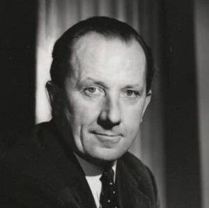
Designer Norman Wilson in 1973 (Source: NBC/Bus Archive)
An individual’s personality is identified by his actions and appearance on first contact with another person, and images formed by his visual appearance. The clothes worn can, and usually do express his personality. One can distinguish the extrovert from the introvert, the trendy from the tramp, the conservative from the revolutionary.
Companies and service organisations have the same problem of identity as individual people. They act in a particular way, and their ‘dress’, ie, public visual appearance, should amplify their character, or intended character. This ‘dress’ will of course only enhance the actual image which exists in the public mind due to the actions of that company.
Superb icing will not make a stale cake edible, and the organisation with an efficient looking image, and inefficient actions will produce a bad effect. The medium size company originally, of course, did have the image of the managing director or chairman, who could control the design of the visual activities of the company. He had the time to be involved in the design of his vehicles, letterheads, packaging, signing, etc.
With the growth of the monolithic institution, the purchasing and design approval of items became fragmented. The stationery had the personality stamp of the accountant; livery expressed the transport chief’s ideas; advertising the trendy ad manager’s attitude. A state is reached eventually where the large company image is dissipated into the sum total of various ideas and expressions.
The need, therefore, arises to establish what the identity is or should be, and to establish how to convey it in terms which adequately reflect it through all visual activities. A cumulative effect is produced which is inter-related and consciously organised.
From a 1974 NBC brochure, showcasing the bold, modern image Wilson developed for local seervices, based on the symbol, his distinctive lettering, and uniform use of a tightly controlled colour palette. (Source: NBC/Richard Price Collection)
This is known as a corporate identity, and can be a complex problem which the size and rapid change of modern technology. The commercial artists of yesteryear, who was originally mainly concerned with illustrating an advertisement or poster, has now become more conversant with marketing, selling, accountancy methods, computers, product design, architecture and interiors, finding that he emerges no longer as an artist, but as a designer in the visual communications industry.
The basic problem to any identity is the brand name. This should be used in a consistent style and colour or colours, so that eventually it is recognisable at a glance, almost avoiding the necessity to read it. If it is desirable to connect differing named companies, a symbol may solve the problem coupled with the same style of lettering throughout; and again with related use of colour.
When these basic factors have been agreed, the next problem is implementing the design throughout the organisation and maintaining it. New stationery, signing, promotional literature etc, should look as though it is the result of an organised, efficient, and more economic design policy instead of many different decisions by various people who are often emotionally biased in design decision. They may not like particular colours or forms of lettering without considering whether it solves the problem in totality, rather than in the individual case.
The designer cannot afford to be emotional, or to have favourite colours if he is to be objective. Design, unlike art, is not a means of self expression, but an attempt to solve a pre-determined problem in visual terms.
Try considering design, not in terms of whether you like it, but try first to define the problem and then ask yourself whether the design solution answers that problem.
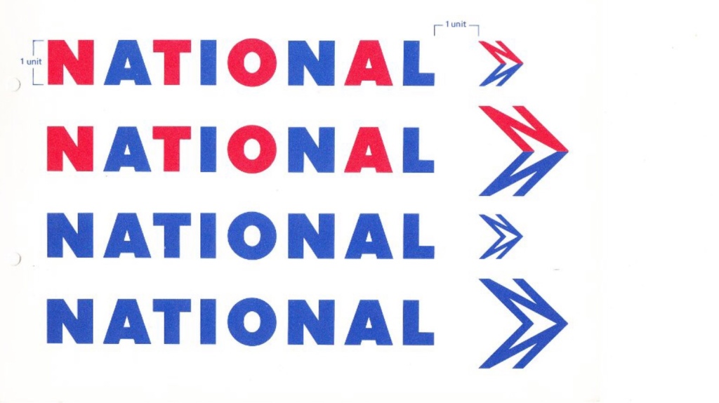
From the Graphic Standards section of the Manual, Wilson’s NBC symbol and lettering, making up the logotype, originally designed in 1971.
Norman Wilson FSIAD
Norman has practised from Manchester with three assistant designers for over 10 years [by 1973]. Previously, he had 10 years’ experience in advertising agencies.
A fellow of the Society of Industrial Artists and Designers, he is also a visiting lecturer in visual communication at Manchester Polytechnic, college assessor for the SIAD, and on the Advisory Committee at Bolton College of Art.
His work has appeared in various design journals and has been exhibited in Europe and the USA. He is chairman of Furness Vale Community Association, and New Mills Old Prize Brass Band. He likes wine making but prefers drinking it.
Norman Wilson’s business card. (Courtesy of Jean Horsfall)
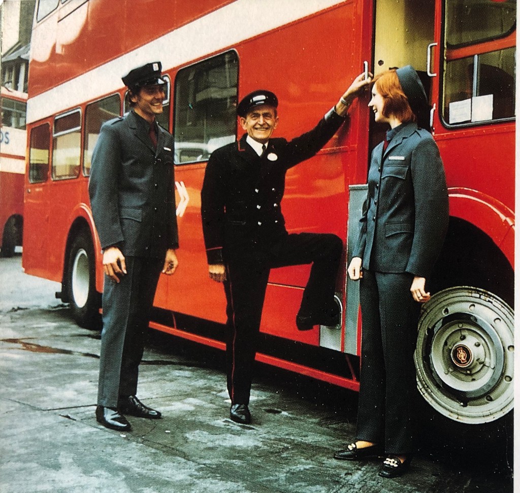
As part of its comprehensive rebranding, NBC’s corporate identity extended to what its staff wore.
The NBC Corporate Identity Manual is best known for its uniform bus and coach liveries. But it was also intended to address standardisation of a wide range of other aspects of NBC’s presentation to its customers, including clothing and uniforms.
NBCs constituent companies had started experimenting with uniforms as part of their coach branding – in this example, East Kent adopted bright orange uniforms for coach hostesses with a cut and cap reflecting fashions of the era during the late 1960s. The driver on the other hand sports a contrasting very traditional uniform.
Section 7 of the NBC Corporate Identity Manual dealt with “uniforms and related items” such as cap and jacket badges. But there is some mystery over section 7. We believe it was drafted – indeed NBC put a lot of work into uniform design – but may not have been issued: curiously the copies of the Manual we have seen omit it. We’ll be digging deeper into this over the coming months to make sure that a reissued corporate identity manual includes as much of the issued material as we can source. Please get in touch if you can help.
NBC’s constituent companies inevitably had a variety of styles, many unchanged since the 1950s. With a few exceptions – notably innovations in the coach market to reflect the speed and modernity of the emerging national motorway network – uniforms tended to be very traditional with heavy wear-resistant fabrics in black or dark blues, round peaked caps and occasionally traditional braid to indicate seniority. Coach crews often sported light-coloured overalls and matching caps. But – as with liveries – there tended to be substantial variation between local companies.
NBC’s corporate identity sought to do away with all that, and to introduce a standard look for crews and bus station staff. Crews and staff were to be the human face of the business, so their attire needed to reflect the modernity the business aimed to project. NBC and Norman Wilson’s team wanted staff to project the company’s modern image as much as the vehicles, and investigated overseas practice as well as drawing inspiration from constituent companies’ innovations in the coach market.
Bus crew uniforms saw a radical change. Adopting a much more modern look, Wilson and his team adopted a sleek modern-cut in a blue-grey serge, with a similar lightweight version for summer. The cut of the uniform for women was very similar, but with a simpler cap. In this NBC publicity shot at London’s Victoria Coach Station, models Ray Rhodes and Judy Neale show off the new look, contrasting with driver Alf Vassey, of East Kent’s Dover depot, who wears the company’s very smart traditional uniform. They pose with an East Kent AEC Regent in the new corporate colours
Out went dark colours, and in came lighter blue-grey suits with a relatively modern cut, greater comfort and incorporating larger pockets to assist with carrying paperwork. Out went the traditional round peaked caps and in came a modern, Germanic-looking octagonal cap in the same shade of blue-grey, sporting a smart metal ‘double-N’ arrow badge.
In new NBC uniforms with London Country badges, Ray Rhodes and a fellow professional model pose for a publicity shoot in 1972. The uniform for men incorporated a radically different octagonal cap design, almost unseen in Britain but more common in northern mainland Europe. For women, a cleaner-cut pillbox hat was adopted.
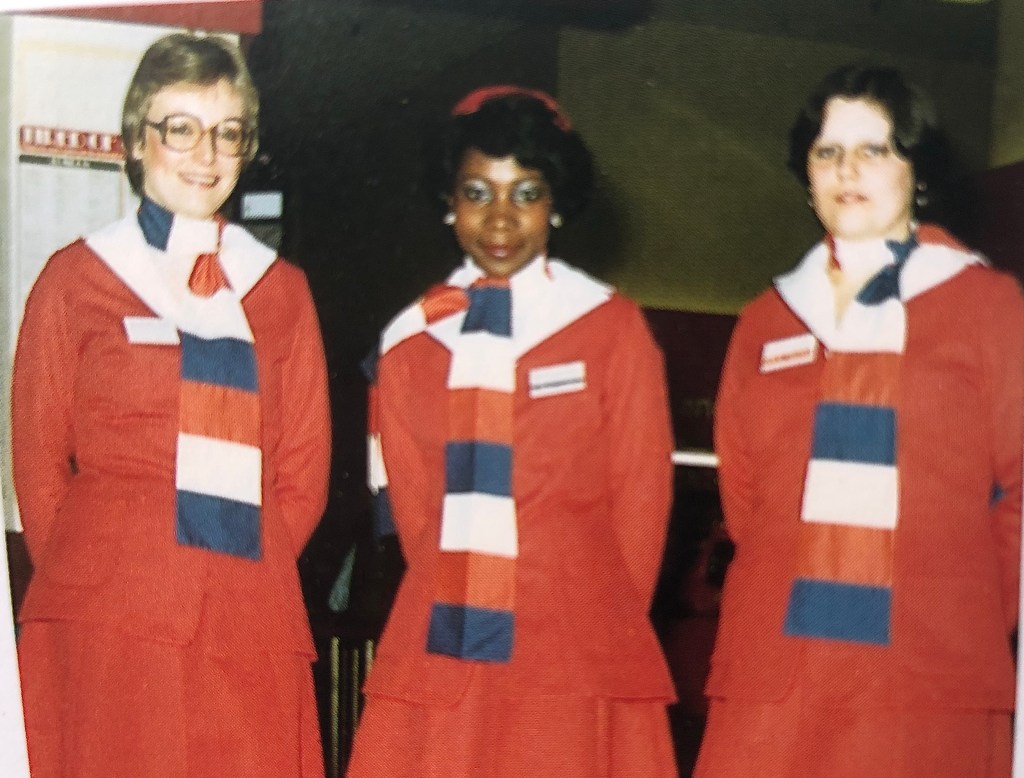
Office and counter staff at bus stations counted among them many more women than the drivers and crews. Various uniforms were created for women over the years, typically in brighter hues of the corporate colours, with styles evolving with fashion more than the men’s uniforms.
A Bristol Omnibus Company driver wears his octagonal crew cap, during a driving demonstration for the NBC training film ‘They don’t grow on trees’, made in 1979.The women’s coach uniform came used various combinations of the corporate colours – here is an early variant in corporate blue and lined in red.
Whereas the changes in bus liveries are well documented, pictures of the changing uniforms through the NBC period are relatively few and far between. If you have any photos you’d be happy for us to use to illustrate the evolving staff attire for bus and coach crews and for bus station staff, do let us know. We’ll add any photos and stories in the coming weeks.
NBC’s corporate identity picked up on the best of its constituents’ designs – shown here, an early coach hostess uniform, similar to the East Kent National Travel version above, but in the NBC colours.While the men’s uniform changed relatively little until the 1980s, women’s uniforms were more regularly updated as styles changed. This version shows a variant of the bus station staff uniform from the early 1980s.Coach staff saw more change during the NBC period than their bus counterparts. Here we see the male and female uniforms adopted in the early 1980s for National Express drivers and crew.
Can you help us to tell the story of Norman Wilson and the NBC Corporate Identity?
In 1972, Sir Fred Wood was appointed chair of the National Bus Company, with a mandate to take a more commercial approach to the corporation’s management, with a business-oriented focus on halting the decline in NBC’s market share and financial performance in both coach and bus markets. Wood had been impressed by his experience of Greyhound Coaches during his time in the US, with its consistent ‘pan-continental’ branding. As part of his new approach to turning around NBC’s fortunes, he called for a root-and-branch rebranding of coach and bus operations.
Before even taking up his role as NBC Chair, late in 1971 Fred Wood approached Manchester-based designer Norman Wilson – who had worked with him at his family business, Croda – to develop a new corporate identity. It is Wilson’s NBC Corporate Identity Manual, which formalised the identity he developed over the course of 1971-72, that this project has been launched to reissue.
Norman Wilson, designer of the NBC Corporate Identity, applies his NATIONAL lettering to the very first ‘white coach’ at Eastern Coach Works (ECW), Lowestoft, April 1972. His ‘double-N’ arrow seems to be pointing in the wrong direction in this trial application of the new identity to Eastern Counties’ RE858: normally it would point in the direction of travel on either side of the vehicle. Behind Wilson, assisting with the application, is ECW’s Alan ‘Casey’ Crisp, described by Eastern Counties’ Stephen Milne as “the best coach painter I ever knew – the best at lining-out and an excellent sign-writer.” Casey spent his entire working life at ECW, retiring at 65, three years before the Coachworks closed in 1987.
But unlike the development of British Rail’s corporate identity, remarkably little is documented on Wilson, his business Norman Wilson Associates, their influences or the creative process.
Can you help us to fill the gap? Were you involved, or did you work with Norman Wilson, or know of Norman Wilson Associates’ work for NBC or elsewhere? If so, please do get in touch with us using our contact form.