

The Corporate Identity adopted bold, modern shades of the industry’s traditional green and red for local services. We crunch the numbers on the adoption of the new colours across the country.
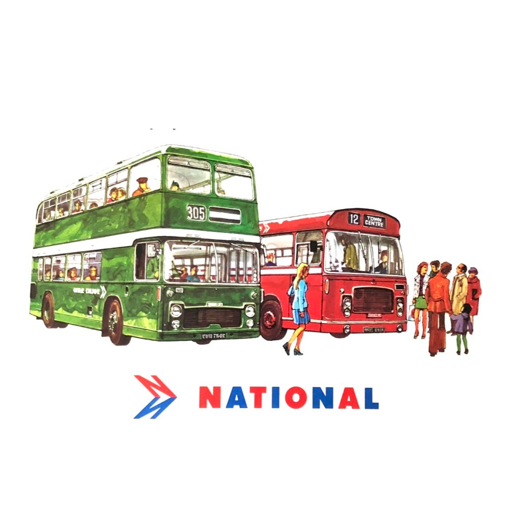
In 1972, the National Bus Company adopted Norman Wilson’s recommendation to standardise on two colours for its buses. Wilson had argued for a thorough reworking of NBC’s corporate identity, adopting the three key elements of a distinctive symbol (his ‘N’-and-shadow-arrow), distinctive typography (his bespoke National lettering), and disciplined use of bold corporate colours.
Red, blue and white had been chosen for the initial National branding early in 1972, reflected in that year’s first edition of the Corporate Identity Manual, developing the concept of the ‘white coach’ uniform national network. The approach to the identity for local buses, announced in July 1972, stretched Wilson’s disciplined colour scheme, adding green to the corporate palette.
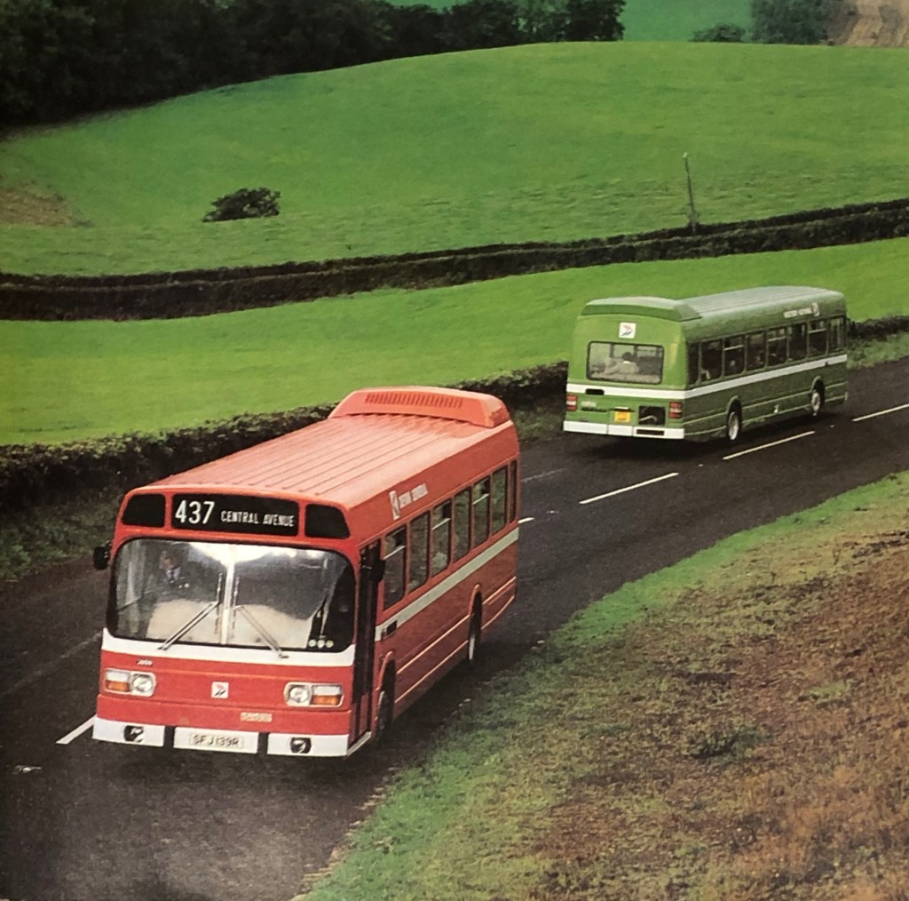
Though the vibrant shades of red and green chosen were intended to signal a move towards a modern industry and away from the from the ‘drab’ darker colours previously used by local bus companies, green was retained as a nod to the companies’ traditions, intended to retain an element of pride and goodwill from staff and passengers alike. Adopting a single bus colour was thought to be too disruptive, and possibly confusing for passengers in parts of the country where NBC subsidiaries overlapped and provided services on different routes.
Blue, meanwhile, was used by relatively few local companies, so though it would have been a better fit with the National identity, it was argued that adopting it nationally would have required more upheaval. In practice, of course, the introduction of the new identity required all vehicles to be repainted in the new colours anyway, so whether switching to blue would have been more challenging logistically is a moot point.
Norman Wilson appears to have disapproved of the compromise to include green in the corporate identity so fiercely that the colour green does not appear on a single vehicle illustration in his otherwise comprehensive Corporate Identity Manual, even illustrating liveries for ‘green’ companies in red. (The reprint of the Manual will add in some green illustrations as extra pages.)

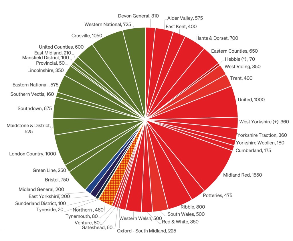
What proportions of NBC’s fleets went leaf green, and how many buses ended up in red? How many local fleets adopted other colours?
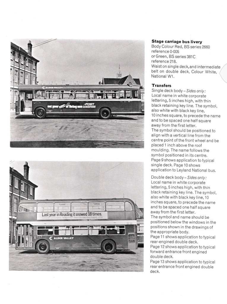
To answer this question we accessed the initial tenders for fleet name transfers in Wilson’s new National lettering, filed away in The Bus Archive. The tender calls for printed transfers for around 18,000 vehicles, consisting of 5” high fleet names and monochrome versions of the NBC symbol. The NBC symbol was ordered in a single version, as the monochrome version could be rotated to point left or right. The later 1976 colour panel bearing the NBC symbol had to be printed with separate versions facing left or right – each having the red ‘N’ on the top, and its shadow in blue below.

Initially NBC offered both symbol and fleetnames in the corporate identity standard white as well as a variant in cream to allow the new graphics to be applied – incongruously – to buses still in their traditional colours with lining in cream, without having to wait for a repaint. In practice few companies took up the cream option, preferring to adopt the new standard straight away.

These early tender documents from July 1972 indicate the numbers of fleet name transfers needed by each company, asking suppliers to quote for the transfers in either cream or white, but do not show which local bus companies have asked for the cream version, nor how many. The tender invitation also refers to the symbol and fleet name lettering “with black outline”. Originally Norman Wilson and colleagues thought that a thin black ‘keyline’ would be needed to allow a crisp edge to the graphics, and this was reflected in the Corporate Identity Manual of June 1972. However testing proved that the method of applying transfers to painted vehicles gave a sharp enough look, so in September a simplifying modification sheet was added in the Manual, stating that ‘transfers of name and symbol [will be] in one colour only. Contrary to page 8 the “thin black retaining key line” is deleted.’

The numbers shown in the chart don’t precisely match the fleet lists of the time, as there was some over-ordering of transfers (the breakdown for Northern’s subsidiaries uses the PSV Circle’s fleet listings for 1972). By halving the order numbers, we have an approximate number of local buses (stage and dual-purpose) in use in each local fleet in mid-1972, as the corporate identity was being rolled out.
These show that, on adoption of the corporate identity in 1972:
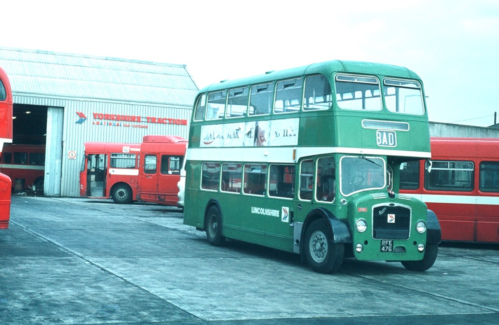
⁃ of 42 local bus companies, 24 adopted red as standard, and 14 green, while 3 retained one of the several shades of blue. Northern and its subsidiaries operated a mix of red and yellow fleets from the early 1970s, though on adoption of the new identity red was used except in Sunderland District which retained its ‘midnight blue’.
⁃ around 55% of buses were adopted the new poppy red, a bit less than 40% leaf green. Less than 3% retained blue, while large parts of Northern General’s fleet of around 500 vehicles, together with a smaller number of buses from Northern subsidiaries Tyneside and Tynemouth, later turned out in NBC yellow, complementing the cadmium yellow adopted by Tyne and Wear Passenger Transport Executive for its own buses.
Incidentally, the labels ‘poppy red’ and ‘leaf green’ – widely used by designers, enthusiasts, preservationists and staff across the industry – do not appear anywhere in the company’s documents, including the Manuals! The new colours are referred to simply as National red and green.

Read more about how the modernist-inspired design of the NBC identity was shaped by Norman Wilson’s design influences, combining his three key elements: bold, uniform colours, his distinctive typeface, and a striking monochrome version of his NBC symbol, wordlessly conveying the nature of the business, all drawn together in a grid-based layout which brought a sense of uniformity and modernity across disparate companies and an enormous variety of vehicle types.
If you have recollections of the roll-out of the new livery, how it was managed, or remember your initial reaction to it, please let us know. We’d be happy to include these in a future blog, and perhaps in the Manual book itself. Get in touch using the form on this page, or the contact page here: https://nationalbusmanual.com/contact/

5 replies on “NBC’s true colours? Modern shades of red and green”
Hebble did not become part of West Yorkshire in 1971 – and by 1972 it had lost all of its stage carriage routes. In early 1971 its stage carriage operations were split between Halifax JOC, Yorkshire, and West Yorkshire (towards the end of 1970 Hebble’s Bradford depot – shared with Yorkshire – had closed and operations moved to West Yorkshire’s premises) – whilst it then took on the coaching operations of both Yorkshire and West Riding, operating out of the former Yorkshire depot at Liversedge after that closed in the major service revisions/reductions that Yorkshire undertook in August 1971. The plan was that Hebble would become the coaching arm of the West Riding Group (West Riding/Yorkshire/Hebble) operating under the fleet-name Yorkshire – Hebble, it was also planned to refurbish the (quite literally Victorian) office/residential accommodation at Liversedge to act as a training suite for the group. Subsequently, of course, Hebble and SUT were merged to form National Travel (North East), which assumed control of Liversedge depot.
It is interesting that the fleet-name for Yorkshire seems to have been proposed as Yorkshire Woollen – I have read elsewhere that Yorkshire WD was proposed. Whatever, it seems that staff wanted to remain just plain Yorkshire, and Fred Dark – the former Yorkshire and Hebble GM – who had assumed command of the combined West Riding group managed to keep Yorkshire as the fleetname. Seemingly, it was Fred Dark’s history with the Yorkshire company that led him to choosing red as the livery for the West Riding and Yorkshire fleets when faced with the choice of going red or green.
LikeLiked by 1 person
The statement that Northern, Tyneside, and United adopted a yellow livery. United did not adopt yellow – and it was essentially T&WPTE livery – until the 1980s. Northern group vehicles based at depots within the then Tyneside and subsequently T&W PTE area did adopt a yellow version of the NBC livery: this was a portion of the Northern fleet, but the whole of the Gateshead, Tynemouth, and Tyneside, subsidiaries – the Gateshead and Tynemouth segments of the pie-chart need to join Tyneside by turning yellow.
LikeLike
Eastern National never used cream NBC fleetnames and quickly adapted the existing Tilling green livery by painting the main cream band white, painting the black lining out green and on double deck vehicles with two cream bands the top band was painted green. NBC white fleetnames were added although not positioned as per the manual in order to avoid panel straps etc.
LikeLike
Green did not get that far North, stopping at East Midland and Crosville.
Red not only made it to Hadrian’s Wall but called poppy red and partnered with a deep turquoise called peacock blue became the new livery of Highland Omnibuses.
LikeLiked by 1 person
Well… it turns out that Tyneside was briefly the sole outpost of NBC-ish green in the north! Slightly surprisingly. I’ll update the blog when I get a chance.
LikeLike