Some companies found practical reasons to take a different approach to applying Norman Wilson’s carefully-crafted designs.
In the spring of 1972 a handful of NBC’s local operating companies were actively involved in trialling the new identity for the company’s buses. Notably, Crosville experimented with the green version, while Alder Valley’s Reading depot provided vehicles as the testbed for Norman Wilson’s proposed layout and the use of the new corporate shade of poppy red.
Consequently the first version of Wilson’s Corporate Identity Manual, developed in the spring in close partnership with NBC Group Public Relations Officer Ron Whitehouse, features detailed illustrations using photographs of Alder Valley’s double- and single-deckers in the new local bus identity.
In mid-Summer, and following up on the instructions already issued for the White Coach livery, on 11 August Ron Whitehouse wrote to the General Managers of NBC’s subsidiary companies to provide the first in a series of drawings showing how the new identity should be applied to buses. This included the precise position of the new symbol and lettering across a range of typical vehicles, from venerable double-deckers to the brand-new single-deck Leyland National, designed and manufactured as a joint venture between NBC and Leyland Vehicles, and styled by the legendary Italian designer Giovanni Michelotti.
Livery instructions and illustrations from the 1972 Corporate Identity Manual. The page of photographs, taken at Alder Valley’s Reading depot by NBC photographer Tony Whitehead, shows the correct position of the symbol and lettering on standard buses, and was issued in August 1972. The page on the left, illustrating the semi-coach livery, was issued later for insertion into the manual.
Through the summer months Norman Wilson’s team were kept busy, working with Ron Whitehouse and his NBC publicity staff to develop a uniform approach across a huge variety of vehicles. “It took forever to draw all the coaches and buses” remembers Antony Dawson, who with Rodney Morris was Wilson’s design associate working on the project to finalise and roll out the identity in 1972. “NBC managed to give us most of the drawings for their fleet, but then we had to go back to the coach builders to get their drawings for the rest. We had to devise something that worked across multiple buses.” New pages and illustrations were issued and sent to the local companies to be added into the loose-leaf A4 Corporate Identity Manual. The A4 pack of instructions and diagrams became a reference guide for companies as they made the rapid switch to the new identity.
In 1973, East Kent’s AEC Reliance Plaxton number 37 waits in the sun at Cheltenham coach station. It has been painted into a bespoke ‘semi-coach’ livery, reflecting East Kent’s historic deep red colour, and using the new National lettering to form ‘EASTKENT’, without so much as a hint of the National symbol. Photo: Richard Price collection.
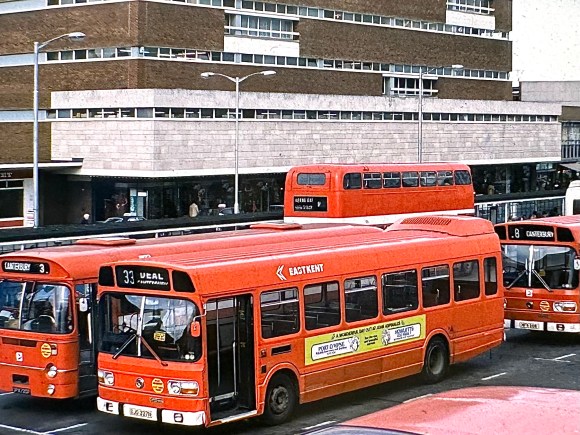
The tight specification however was not to everyone’s liking. East Kent’s works in Canterbury seemed determined to do their own thing. Canterbury took advantage of the lack of instructions on how the identity was to be applied to local coaches to experiment, using a large version of the National lettering to spell out the company’s name, using East Kent’s traditional coach colours dark red bands on a grey or cream body, usually with the NBC symbol, but sometimes omitting it altogether.
East Kent’s Leyland National 1337 in the early version of the NBC identity – with the company’s unauthorised EASTKENT branding – at Canterbury Bus Station in 1976. Picture: Richard Price Collection.
Meanwhile there was a determined effort to brand the company as EASTKENT, leaving out the gap when applying fleetnames in the new National lettering. The instructions from NBC HQ were to spell out both words with a gap, and East Kent’s publicity consistently followed did so. But the company’s vehicle engineers had other ideas. This was all pretty ironic as the company’s former General Manager, Jim Skyrme, had just been appointed chief executive of the whole of NBC. This effectively made him Fred Wood’s man with the task, among other things, of policing implementation of the new identity. Being close to London, it wasn’t difficult for HQ staff to spot the ‘mistake’ and stamp it out. But – perhaps as in protest at this extension of central control – East Kent buses for years after had an exaggerated gap between the ‘East’ and the ‘Kent’.
In response to NBC HQ’s clampdown on its unilateral branding, East Kent made sure they couldn’t be accused of omitting the gap. Leyland National number 1513 at Canterbury Bus Station in 1986, showing the exaggerated gap between ‘East’ and ‘Kent’, visible on the Bristol VR in the background too.
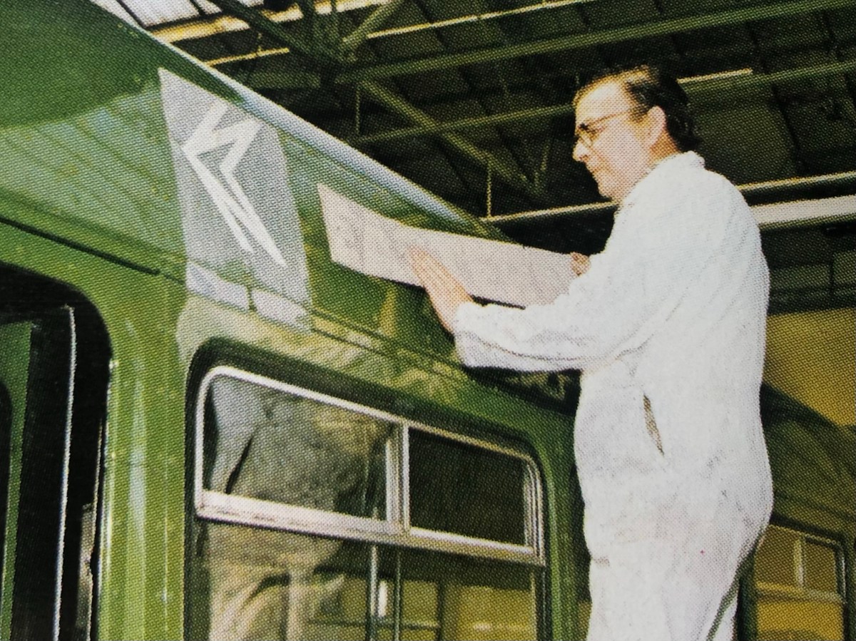
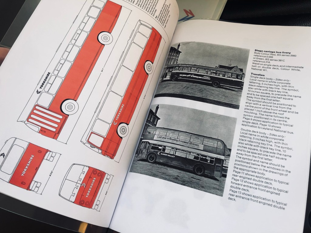
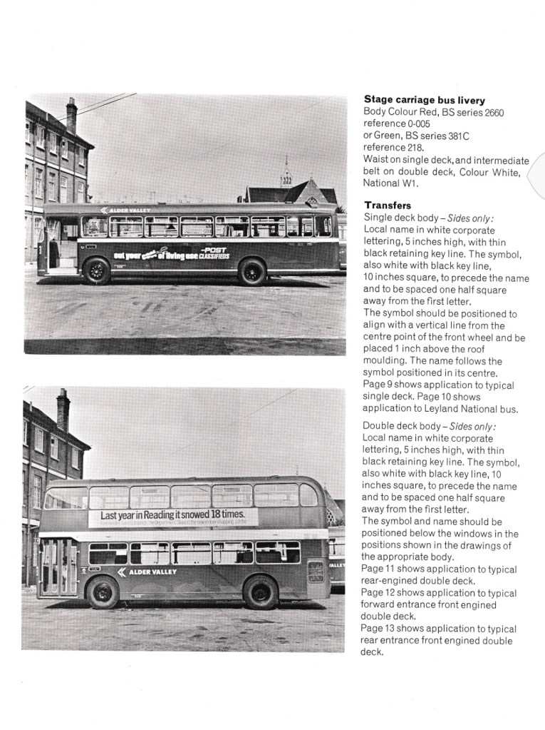
Other companies got in on the act too. In Chelmsford, Rodney Hawkins took a long look at the new centrally-supplied Eagle Quik-Fix transfers for the new lettering and the NBC symbol. He took a second careful look at the instructions in the Corporate Identity Manual: “The symbol should be positioned to align with a vertical line from the centre point of the front wheel and be placed 1 inch above the roof moulding. The name follows the symbol positioned in its centre.” And for double-deck buses “The symbol… 10 inches square, to precede the name and to be spaced one half square away from the first letter. The symbol and name should be positioned below the windows in the positions shown in the drawings of the appropriate body.” Studying the photographs and diagrams, Rodney frowned.
Rodney was the Chief Engineer for the Eastern National Omnibus Company. He knew his vehicles, and he knew where the panel joints were. “That’s no good” he muttered to himself, thinking how the flimsy transfers would look at the joints after a few runs through the vehicle washer. He issued instructions to his coach painters to apply and space the symbol and the two words of the company name to avoid fixing the new transfers across panel joints and rivets, countering the instructions from NBC HQ and leading to some idiosyncratic layouts and extra spacing. This was particularly true for the new Leyland National. With its interchangeable, easily removable bodyside panels, some joked that it was largely made from rivets.
At Eastern National’s Chelmsford works, Fred Brewster undertakes the fiddly task of applying corporate identity lettering and symbol transfers to a new Leyland National in 1973. Under Rodney Hawkins’ instructions, he is placing the symbol further forward than the manual specified, so that he can squeeze the word ‘Eastern’ into the same panel, without crossing a break or any rivets which might make the transfers come loose in the washing plant. In practice this was only rarely a problem. This act of disobedience wasn’t initially spotted by NBC HQ, however – who included this photo in their 1973 Annual Report to illustrate progress with implementing the corporate identity. Picture: Tony Whitehead/NBC.
Frank Brewster, in the paint shop, was a skilled coach painter. In the photograph Frank is seen at Chelmsford central works applying the NBC symbol and Eastern National lettering to a new Leyland National in 1973. His former colleagues remember Frank as a skilled and kind man. They also remember difficulties in applying the transfers. “I hated that job with the Eagle Quik-Fix transfers” remembers Chris Critchett, formerly of Eastern National: “I often used to cock it up somehow”.
Eastern National’s idiosyncratic approach to placing the symbol and lettering continued into the 1980s. Leyland National no 1999 picks up passengers on a local service in Chelmsford in March 1980, showing its symbol and ‘National’ squeezed into the second body panel, with ‘Eastern’ in the next panel, positioned to avoid applying transfers over the panel-end rivets. The Wilson designs, in contrast, required the symbol to be positioned so that the point of the arrow is parallel with the centre of the wheel arch, and spaced to avoid the appearance of symbol and lettering crammed together.. Picture: Richard Price Collection.
The result was a variety of layouts on the sides of buses where the position and spacing of the symbol and fleetname was different from what the Manual specified. Being close to London, Eastern National saw closer attention from the publicity team responsible for the corporate identity, and so more edicts to management requiring the company to toe the line. Judging by pictures from the 1970s though, it seems that Rodney Hawkin’s coachpainters managed to do their own thing for quite a while!
With Fred Wood personally regarding the new identity as a key part of his commercial recovery plan for NBC, variations were heavily frowned upon by HQ. It was far from unusual for company general managers to get disapproving memos from Ron Whitehouse’s team instructing them to follow the carefully-crafted instructions in the manual. Local managers of the time still speak of visits from the ‘identity police’ and the occasional sharp exchange. Family members recall Norman Wilson himself cursing loudly at passing vehicles bearing incorrectly-applied liveries and graphics as he drove across the country on family holidays.
Happily, on a Lodekka double-decker it was possible to avoid body panel joints and follow the rules. Eastern National’s 2775 waits at Southend Bus Station in February 1977. Picture: Richard Price Collection.
Bernard Davis, Commercial Manager at London Country, remembers regular visits from NBC head office to check on the application of the identity, and missives to London Country’s bosses when things weren’t done to spec. “Being nearer to London meant we were watched hawkishly” he recalls. “Companies further away got away with all kinds of things. We got special permission for our ‘Green Line’ coach livery, which other companies adopted later. But there was very little flexibility on vehicle liveries – headquarters expected the manual to be followed precisely”.
Read more about how the modernist-inspired design of the NBC identity was shaped by Norman Wilson’s design influences, combining his three key elements: bold, uniform colours, his distinctive typeface, and a striking monochrome version of his NBC symbol, wordlessly conveying the nature of the business, all drawn together in a grid-based layout which brought a sense of uniformity and modernity across disparate companies and an enormous variety of vehicle types.
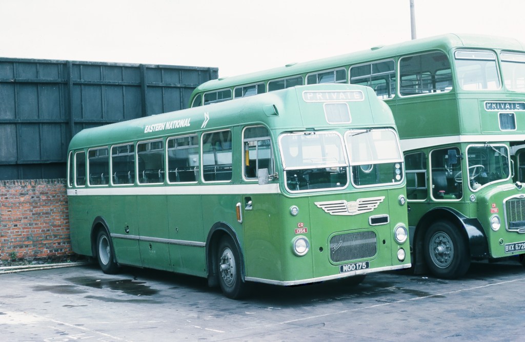
Eastern National’s Bristol MW 1354 illustrates another distinctively-disjointed application of NBC symbol and fleetname, at Colchester depot in around 1975. Picture: Richard Price Collection.
If you have recollections of the roll-out of the new livery, how it was managed, or remember your initial reaction to it, please let us know. We’d be happy to include these in a future blog, and perhaps in the Manual book itself. Get in touch using the form on this page, or the contact page here: https://nationalbusmanual.com/contact/
Vision, compromise and change in the first edition of the Corporate Identity Manual
The NBC Corporate Identity developed from a series of discussions between incoming NBC chair Freddie Wood, and leading graphic designer Norman Wilson. Wood had been chief executive of Croda International, and had employed Wilson for many years to modernise the company’s image, undertaking a comprehensive rebranding in a clean, modern style, encompassing the Croda’s symbol, marketing, packaging and vehicles. Wood was impressed with Wilson, and the two got on well.
NBC Chair Freddie Wood (left, later Sir Freddie); and design consultant Norman Wilson (right). Photo: NBC.
Wood had spent part of his early 20s in the United States, and the American way of doing business fascinated him. He was particularly struck by the extensive network of silver Greyhound coaches which he had used to criss-cross the US during his stay, offering a consistent reliable service and strong uniform branding. So when Wood was asked by the newly-elected Heath government in 1971 to take the role of chair of the relatively new National Bus Company, with the objective of making it a more commercial organisation, he was immediately struck by two thoughts. First, the Greyhound proposition of a uniform national coach network. And second, the need to ask for Wilson’s design advice in shifting the image of the long-distance coach, and the wider industry.
An iconic 1954 Scenicruiser, manufactured for Greyhound Lines by General Motors. Greyhound’s uniform branding created a strong image of a consistent and reliable national network across the United States. Photo: Greyhound Lines publicity department, in the Hemmings.com collection.Greyhound Lines’ publicity emphasised the consistency and reliability of a uniform national network for business and pleasure travel across the United States. Source: Greyhound Lines.
Wilson was actually brought on board by Wood in 1971, before his chairmanship had been formally agreed. It was in this period that Wilson had the epiphany of the ‘N-and-shadow’ arrow symbol. Once appointed, Wood wasted no time in formalising the appointment of Norman Wilson as corporate design adviser to the NBC Board. There was a formal pitch to the Board early in 1972 using design boards explaining the National symbol, graphics and the white coach in preliminary version of the corporate identity. These will form the basis of a section in the NBC Corporate Identity book. It is not clear whether other design businesses were invited to bid – but Wilson’s appointment was announced to the business and its operating companies in a letter from the company secretary to the General Managers of the local subsidiaries in February 1972, stating simply that NBC was appointing a design consultant “to advise on all matters relating to a corporate identity for the NBC Organisation” – and cautioning against overstocking on existing designs of stationery which might soon become redundant.
A public announcement was made in May 1972, with that month’s Design Journal reporting that “Norman Wilson, Manchester based design consultants, have been retained by the National Bus Company to design a visual identity programme for vehicles, signing, stationery and related graphics.”
After being persuaded that – because of production techniques and climate – a silver coach in the style of Greyhound would not last well in Britain, Wilson and Wood wanted the coaches to be purely white, with the National branding of the NBC symbol and the NATIONAL logotype in red and blue. Operating companies were to be solely suppliers to NBC’s Central Activities Group, which took responsibility for the National coach network. Local company identities were not to appear on the white coaches at all, except in the tiny mandatory ‘legal lettering’ identifying the owner at the bottom of the bodyside There was a degree of scepticism, and even push-back against the idea of a uniform corporate identity, particularly from operating companies whose local liveries in some cases could be traced back to the start of motor coaches at the beginning of the 20th century.
From the 1972 Corporate Identity Manual: Wilson and Wood’s intended National White Coach livery. The branding is purely National, with no local company fleetname, to give the sense of a single uniform national entity. Tillings Transport’s PWC 341K was the second White Coach. In the original concept presented to the NBC board, the National symbol always pointed to the right: consequently it pointed backwards on the nearside of coaches. This was replicated in the first two trial applications to vehicles, with the result that this illustration made it into the first edition of the Manual. The coach also carries a fleet number plate – in red for Eastern National’s Southend Prittlewell depot which maintained a large part of the Tilling coach fleet. This too was inconsistent with the manual’s instructions to use steel-grey lettering, transfers of which were set in Futura and supplied to each operating company. Photo: NBC, The Bus Archive.
Wood was resolute in his determination to apply a uniform white livery. He had been dissuaded from adopting a silver livery, US-style, on the grounds that that bodysides would corrode. When operators next objected to all-over white on the grounds that they would show dirt, Wilson retorted, in characteristically blunt fashion, that “they’ll just have to wash them more often then, won’t they?”
With the overall colour beyond doubt, the use of local fleetnames became the next area of controversy and compromise. The first trial application of the NBC white livery, on an Eastern Counties coach at the Eastern Coach Works in Lowestoft, had omitted the local company’s fleetname, showing only the National brand. General Managers of NBC’s operating subsidiaries were horrified, complaining that their local identities and pride in the service would be lost, and that coach users would be confused by multiple identical-looking coaches and would find it harder to locate their service.
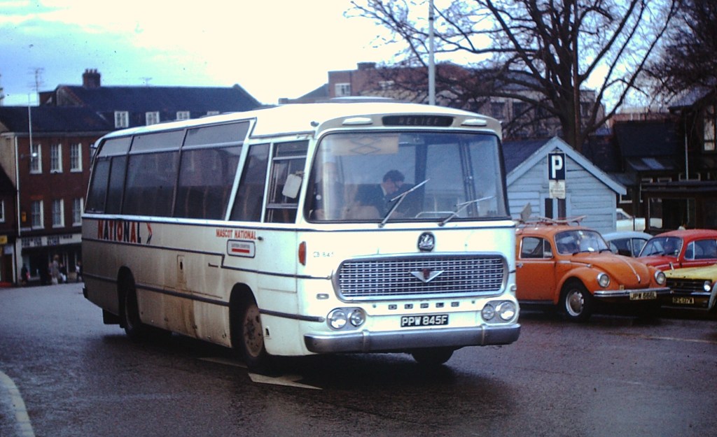
Norman Wilson, designer of the NBC Corporate Identity, applies his NATIONAL lettering to the very first ‘white coach’ at Eastern Coach Works (ECW), Lowestoft, April 1972. Consistent with the initial presentation to the NBC Board, his ‘double-N’ symbol is pointing to the rear on the nearside of the coach in this trial application of the new identity to Eastern Counties’ RE858. This was altered in the 1972 Corporate Identity Manual, which specified that it should point in the direction of travel on either side of the vehicle. Behind Wilson, assisting with the application, is ECW’s Alan ‘Casey’ Crisp, described by Eastern Counties’ Stephen Milne as “the best coach painter I ever knew – the best at lining-out and an excellent sign-writer.” Casey spent his entire working life at ECW, retiring at 65, three years before the Coachworks closed in 1987.Wilson’s first response to demands from operating companies’ General Managers that a local fleetname should be applied was perhaps deliberately obtuse. He added tiny light-grey lettering to first ‘white coach’ – Eastern Counties’ RE858 – at about the same size as the legal lettering and ‘fuel’, ‘oil’ labels, albeit in his heavier National lettering. This achieved his objective of interfering as little as possible with the uniformity of appearance which he and Freddie Wood sought – but with lettering so small as to be almost unreadable at any distance. General Managers were not placated. The picture shows Eastern Counties Bristol RE Plaxton-bodied coach RE858 at Cheltenham early in 1972. Photo: Richard Price collection.A similar experiment was conducted with Eastern National’s Plaxton-bodied Bristol RE number 425, seen here in Southend in 1972: a tiny fleetname in grey National Alphabet lettering was placed underneath the window behind the cab. Photo: Bernard Watkin, Eastern Transport Collection Society.
Wood and Wilson relented, marginally, in response to the latter argument and a compromise was attempted. First, a local fleetname was applied as a trial to the Eastern Counties coach used in the initial trial application of the identity, using Wilson’s bespoke National lettering, but at a height barely larger than the legal lettering and in a very light grey. It was almost invisible, and the General Managers were not placated.
Wilson therefore adopted a different, more visible approach for the initial roll-out of the Corporate Identity. Local company fleetnames were applied on National coaches above the wheel arch, set in Wilson’s new National lettering, at the slightly larger letter height and in a more legible dark grey. They were further emphasised by a bold underlining, the line being the same height as the letters giving an overall height of 3½ inches, in the colour adopted by the local company for its buses. This was codified in the first edition of the Corporate Identity Manual of May 1972.
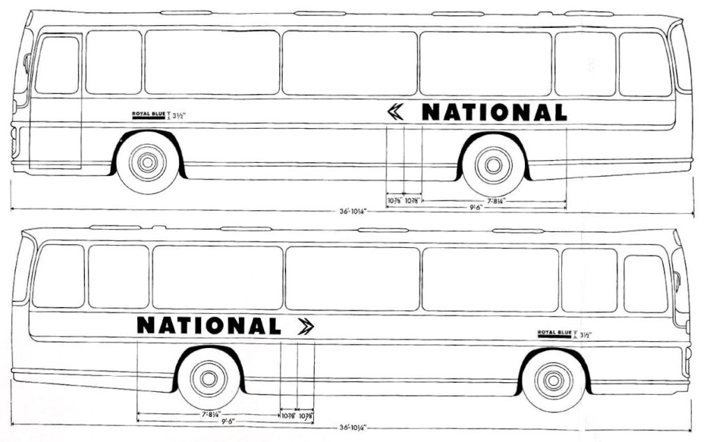
From the May 1972 Corporate Identity Manual, drawn up by Norman Wilson and colleagues, this diagram shows the ‘compromise’ initial NBC standard white coach livery, with small operating company fleetnames underlined in the company colour – in this case Royal Blue’s royal blue – with an overall height of 3½ inches. The vehicle used for illustration is a Plaxton Panarama Elite II. Source: NBC, The Bus Archive.Wilson’s design of fleetnames had a neat logic, consistent with his approach to corporate identity. It combined two of the main elements of the NBC identity, using the National Alphabet for the local company’s name, and at the same height as the lettering, a block of the NBC corporate colour identified with the operating company, usually that adopted for local buses. See our previous blog article to read about Norman Wilson’s view of the key elements of corporate identity.Royal Blue’s ECW-bodied Bristol RE number 2387 is seen in Newbury in 1973. Instead of adopting the green colour of its parent Western National, Royal Blue chose to underline its fleetname in blue – along with the National symbol and logotype, this is the only blue remaining of the company’s trademark livery. Photo: Richard Price Collection
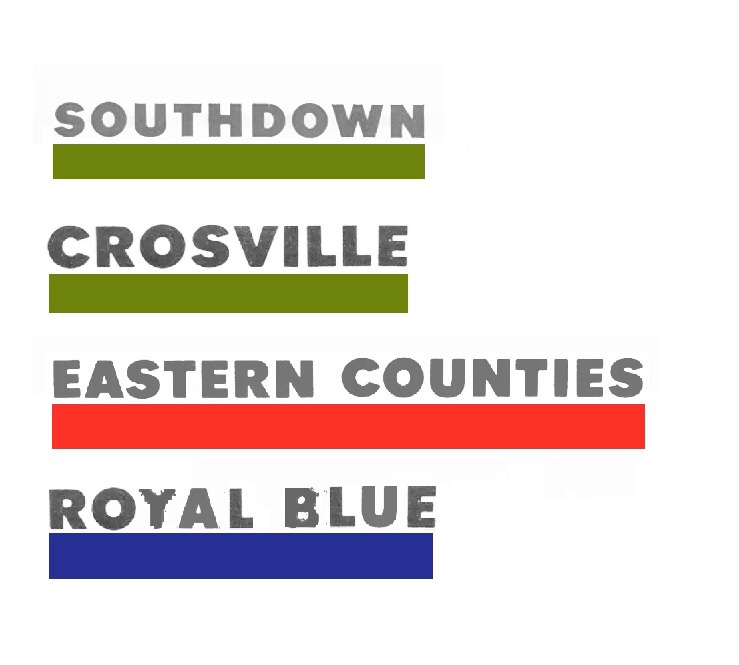
So Eastern Counties and United coaches had a small fleetname underlined in their corporate red; as did Standerwick, a coach-only business which adopted the bus colour of its parent company Ribble. Crossville, Southdown and Eastern National coaches meanwhile appeared with fleetnames underlined in green. Other non-bus coaching businesses were given latitude, so even though their historic colours were eliminated, Royal Blue used a blue line on their National coaches, while Black and White used black.
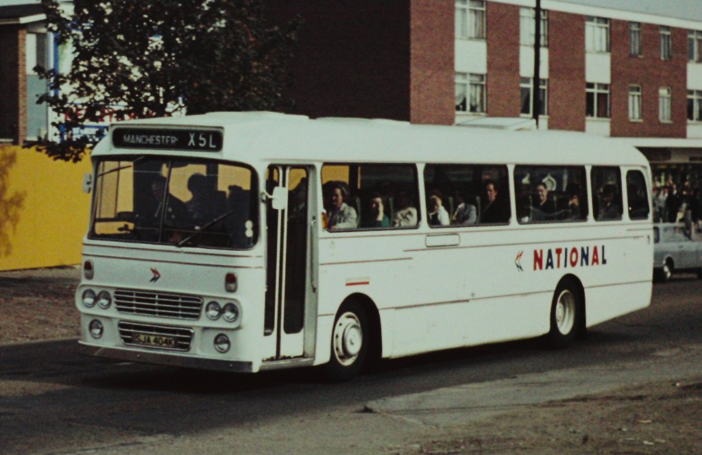
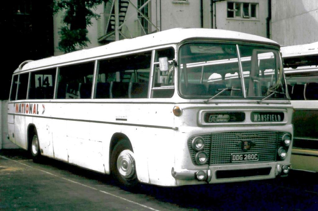
North Western’s Leyland Leopard SJA 404K is seen in Stockport in 1972 on an express service from London to Manchester via Birmingham, with a small fleetname underlined in National red.Eastern Counties’ CB845 – a Duple-bodied Bedford VAM70 at Great Yarmouth in 1972 – illustrating both the small operating company fleetname, underlined in poppy red, and displayed in the illuminated panel; and also the challenges of fitting the key elements of the new Corporate Identity around decorative chrome bodywork. Norman Wilson’s team were supplied by coachbuilders with hundreds of coach drawings as they tried to get a reasonably uniform application of the new identity across a huge variety of vehicles. (Photo: Bernard Watkin, Eastern Transport Collection Society).Uniquely, Black & White Motorways, having no standard bus colour, adopted black underlining for its fleetname. Here Black & White coach DDG 260C – a Duple Commander-bodied Leyland Leopard – shows off the early version of the white coach identity, in Cheltenham in 1973.Standerwick – the coaching branch of Ribble – operated the largest coaches of the era, a fleet of thirty Bristol VRLL double-decker coaches – providing an express service between Manchester, Birmingham and London making full use of the new national motorway network. Standerwick’s fleetname is underlined in the Ribble bus colour of poppy red, in a vast expanse of white. Photo: Tony Whitehouse, NBC Publicity.Southdown’s Leyland Leopard LCD 232F in February 1973, with a small fleetname underlined in National green, and a small ‘National’ logotype in the illuminated panel at the front. Photo: Richard Price Collection. Eastern Counties’ Bristol MW coach LS830 shown in April 1974 in the early National livery, with local fleetname underlined in poppy red. In the bus shortage of the early 1970s, front-line express coach LS830 has been pressed into service on a local Norwich city route. The clock tower of Norwich City Hall towers over the Bell Hotel in the background. (Photo: Bernard Watkin, Eastern Transport Collection Society).From the 1972 Corporate Identity Manual: these two illustrations show the appropriate positions of the NATIONAL logotype and the operating company fleetnames on two Bristol RE coaches with different decorative bodyside mouldings. Norman Wilson’s team worked through hundreds of coach body designs to work out how to get a consistent application of the new identity across a huge variety of different vehicles. Both United Counties and Crosville fleetnames would have been underlined with a bar in NBC green, the bus colour used by both companies. Source: NBC, The Bus Archive.
The result was a bit more colour and variation of appearance than Wilson had intended, and served to differentiate the coaches to some degree. It did not however last long. The small fleetnames and coloured bands were considered both untidy, and were too small to serve the purpose of making vehicles identifiable to customers. Wilson developed and implemented a tidier approach, more consistent with the uniform look he and Wood aimed for, while also going some way to placate the General Managers. From November 1972 a revised livery was adopted, overruling the instructions in the first Corporate Identity Manual issued in May, just a few months earlier. Regardless of the company colour, local operating company names were now to appear in National-red letters 3⁵/₈ inches tall without incorporating a coloured band, displayed more prominently between the wheel arch and the windows. A letter of 9 November 1972 to General Managers from Ron Whitehouse, NBC’s Group Public Relations Officer, formalised the change of approach: “a revision to the specification regarding the size of company name. The name of the operating company should appear over the front wheels in corporate style lettering 3⁵/₈ inches high in National red.”.
This gave much more prominence to the local businesses, but in a style which fitted more consistently with the overall uniformity of the National ‘white coach’. It was this look, rolled out widely through 1973, that was to become the standard for the next two decades, and which was reflected in the 1976 second edition of the NBC Corporate Identity Manual.
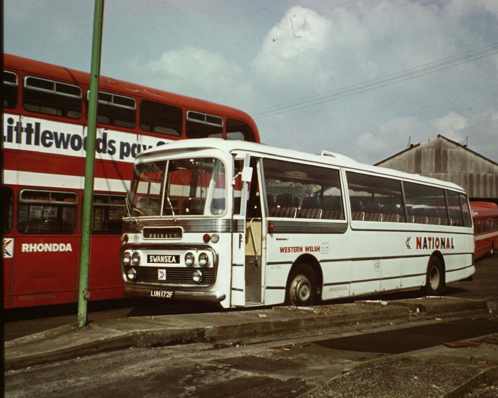
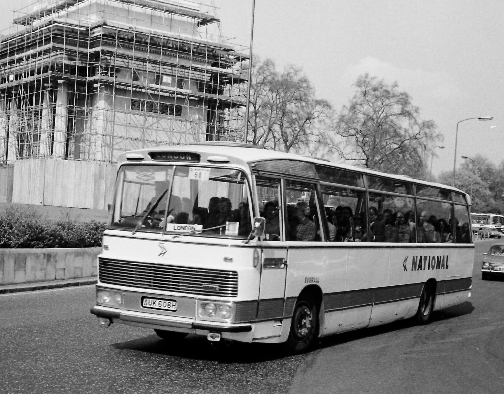
By the end of 1974, Eastern Counties had rebranded coach Bedford Duple-bodied CB845 to their Mascot National subsidiary by applying the new fleetname revised standard red 3⁵/₈ inch fleetname style, but without removing the 3½ inch Eastern Counties fleetname and band in the previous style. It is seen here on a relief service in Norwich in December 1974. Photo: Bernard Watkin, Eastern Transport Collection Society.Ron Whitehouse’s letter of November Sept 1972 specified a number of alternations to the initial white coach livery set out in the Corporate Identity Manual issued in May of that year. The revised operating company fleetnames – or ‘company identifiers’ – were enlarged to 3⁵/₈ inches, in Wilson’s National lettering, and were set in poppy red, regardless of the company colour. This gave a greater uniformity to the National coach fleet. Preserved Eastern Counties Bristol RE coach RLE747 illustrates the revised style of local company fleetname. Photo: Richard Price.Futura was the typeface used in Norman Wilson’s initial work on the NBC corporate identity late in 1971. A thickened version of a heavy weight of Futura was used in the mock-ups shown to the NBC Board at the start of 1972. Before the early trials on vehicles in April, however, Wilson had switched to Akzidenz-Grotesk, on which he based his National lettering, using a thickened version of a heavy weight as the base and incorporating elements of Futura. For most signage, standard Akzidenz-Grotesk was adopted and is specified in the 1972 Manual. Nevertheless, Futura was retained on vehicles throughout NBC for labelling, fleet numbers and the ‘legal lettering’ to show ownership, and is still widely used for these purposes today. Though the Manual specified only ‘lettering in steel-grey’, NBC supplied all companies with standard labels and lettering transfers set in Futura. Photo: Richard Price.In the revised white coach livery, with larger NBC-red operating company fleetnames: Western Welsh’s coach 172, a Plaxton Panorama-bodied Leyland Leopard, at subsidiary Rhondda Transport’s Porth depot in April 1978. This standard version of the NBC livery endured for more than a decade. Photo: Richard Price Collection.Uniformity was not quite achieved with the new approach. Interpretation was often needed to reflect the different shapes and mouldings of coach bodysides. The revised instructions were ambiguous on the precise positioning of the company name ‘above the wheel arch’ and local discretion was applied, bringing the occasional reprimand from NBC headquarters. This Everall Ford R226, seen at Marble Arch in 1976, unusually has the company name almost touching the wheel arch. Photo: Richard Price Collection.
At the start of 1972, in the early development of the Corporate Identity, Wood and Wilson focussed largely on the design and implementation of the white coach as the iconic representation of NBC on the roads, and the most urgent commercial challenge to address. Thoughts turned only later in the year to the application of the identity and roll-out to local buses and mixed-use coaches. In the next Corporate Identity Blog, we will look at the early implementation of the Corporate Identity to local buses, how this was described in the first Manual, teething troubles and oddities in the early roll-out.
Photographs from the Bernard Watkin collection appear by kind permission of the Eastern Transport Collection Society. Many thanks to The Bus Archive for access to NBC records and correspondence. This article draws on conversations with Jean Horsfall, John Oldfield and Anthony Dawson – to whom many thanks.
Did you experience the early years of the NBC Corporate Identity? Please post any comments or suggestions using the box below.
NBC’s televised corporate identity spectacular for Norwich Union left a bus fleet in disguise
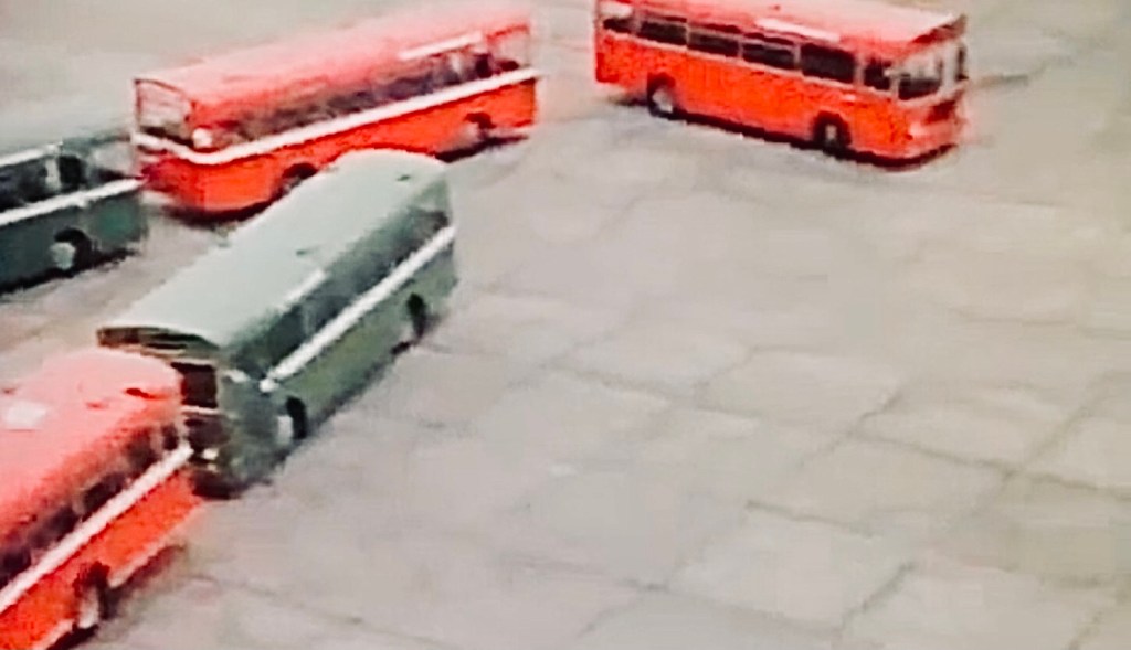
In 1974, NBC did their insurers a favour. Following their contract negotiation to insure vehicles across the whole company, NBC agreed to help Norwich Union to stage a spectacular advert for television. Produced by advertising agency McCann-Erickson, it featured buses from across the company’s local subsidiaries, showing off the new corporate identity green and red bus liveries, and then forming up into the outline of the insurer’s logo, based on the shape of Norwich cathedral. It’s not clear whose idea the advert was, so perhaps it was just a coincidence that the underwriters for the NBC’s policy occupied part of Norwich Union’s headquarters building with a perfect aerial view of Norwich’s busy Surrey Street Bus Station.
Our tidied-up version of NBC’s advert for Norwich Union, filmed on Sunday, 6 October 1974 at Norwich Airport.
David Slater tracked down a reference to the event in Buses magazine: “Several Bristol RLs, LHs and Leyland Nationals were used for filming a Norwich Union advert at Norwich Airport on 6 October 1974. A total of 50 buses were used, some of which were disguised as members of other NBC fleets such as Alder Valley, Hants and Dorset, United”. In fact, 39 vehicles are visible in the film, 20 red and 19 green. Eastern Counties provided the red buses, while neighbouring Lincolnshire and Eastern National supplied the green vehicles.
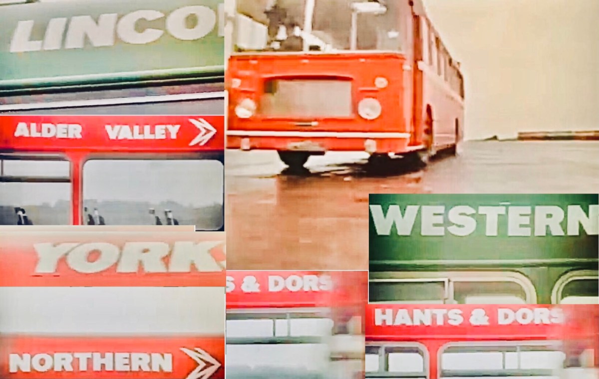
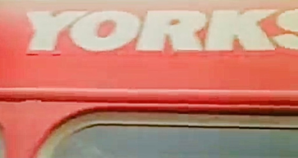
We recently tidied up the advert to restore the colours, sharpen it up, and provide a more contemporary (1971!) soundtrack. Taking a closer look at the sharper images, some of the red bus fleetnames show signs of having been stuck over something else. Look at the ‘Yorkshire’ illustration for example, where on close inspection the join is pretty clear.
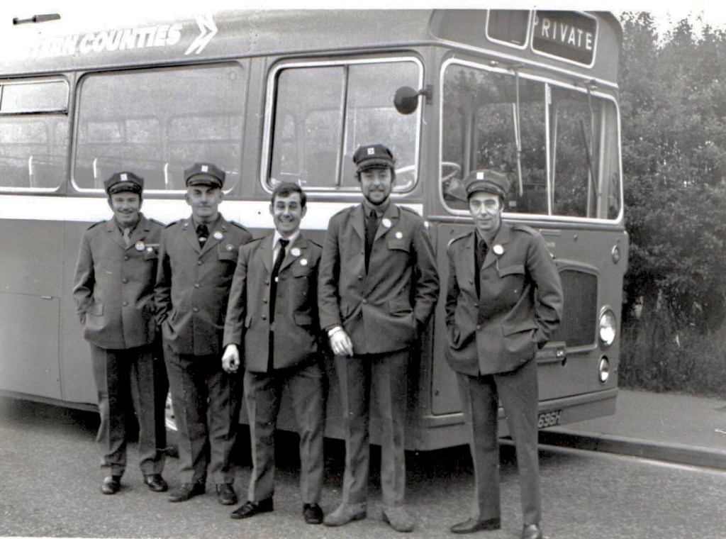
Several members of the Eastern Transport Collection Society have memories of Eastern Counties’ supplying the red buses for the event. Norman Steels remembers that a number of Norwich drivers including Clive Sansby were involved in ferrying vehicles to the airport, and then in the elaborately choreographed bus manoeuvres for the advert itself. All drivers were required to wear their newly-issued NBC corporate identity uniforms for the occasion, and you can make out the octagonal drivers’ hats in the interior shots.
Eastern Counties drivers sporting brand new corporate identity uniforms, with Bristol LHS LH696. On the left is Peter Fish of Cromer depot, Norwich’s Tony Tate is third from the left, and to his right, Tony Frost and Micky Dogget. Photo courtesy of Tony Tate, possibly taken by Clive Sansby.
As well as six Norwich drivers, Eastern Counties drew in drivers on Sunday extra-overtime rates from Cromer, King’s Lynn and Ipswich, and having driven them across the Fens, Lincolnshire drivers took charge of many of the green buses. Eastern National’s Alan Tebbit remembers that their Chelmsford depot provided six Leyland Nationals, with Bristol REs from Colchester, Clacton, Harwich and Kelvedon, meeting up outside Colchester before travelling in convoy to Norwich, led by Alan in a Leyland National.
Tony Tate, who joined Eastern Counties as a conductor in 1962, was the driver of the lead vehicle, a red Bristol RE, in the advert. Under and arrangement with the Transport and General Workers’ Union, Tony remembers that all of the ‘performing’ drivers participating in the film were compelled to join Equity, the actors’ union, for the day.
The film shaping up into the Norwich Union logo was actually done backwards. An article located by Adrian Tupper in his archive of National Bus News explains that “good as the National drivers are, it would have been asking too much to expect them to tear around the airfield and form themselves into a perfect shape. So the crucial part of the action was shot in reverse. In other words, the symbol was built first, and the buses driven out of it, one by one.”
Tony’s role was certainly hair-raising. “There was a cameraman laying on the runway with his camera, and I was told to drive straight at him” he recalls. “The director told me ‘drive straight at the camera’, and not to turn until he waved his arm. I had to drive at speed, and I must have been only 10 feet away when he waved for me to turn. You can see in the film, I had to pull hard on the steering, and that was a real sharp turn to avoid him!”
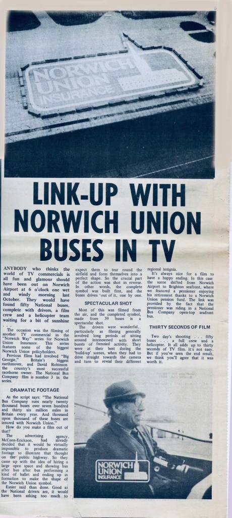
Tony recalls a long day at the airport, though crews were well looked after with first class catering, a substantial cooked breakfast and a big roast lunch. As National Bus News put it: “Two days’ shooting… fifty buses… a full crew and a helicopter. It all adds up to thirty seconds of TV film. It’s not easy. But if you’ve seen the end result, we think you’ll agree that it was worth it.”
Chris Dugdell recalls that it was much talked about at the time – and that ironically, even though the company’s RL734 is one of two buses actually identifiable in the film (along with Lincolnshire’s brand new LH 1033), the name ‘Eastern Counties’ does not actually appear in the advert at all!
Article in National Bus News, March 1975, courtesy of Adrian Tupper.