Fifty years ago, in August 1972, the new identity was being rolled out across England and Wales
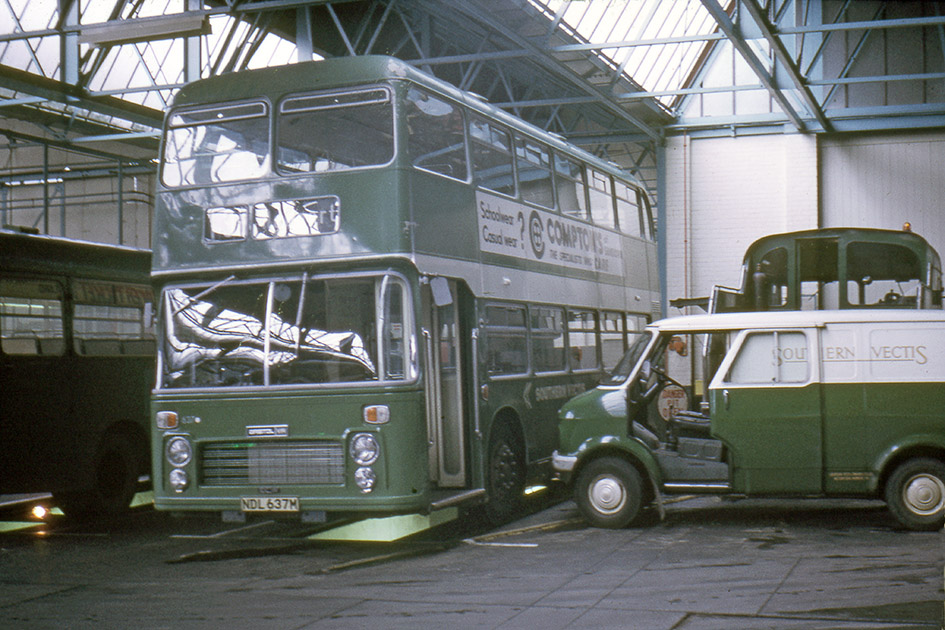
It’s a miserable week of weather at the start of August, with low temperatures across Britain and the odd spell of torrential rain. In depots across England and Wales, managers, engineers are already embroiled in the business of changing their vehicles over from their long-established, traditional colours to the new Corporate Identity.
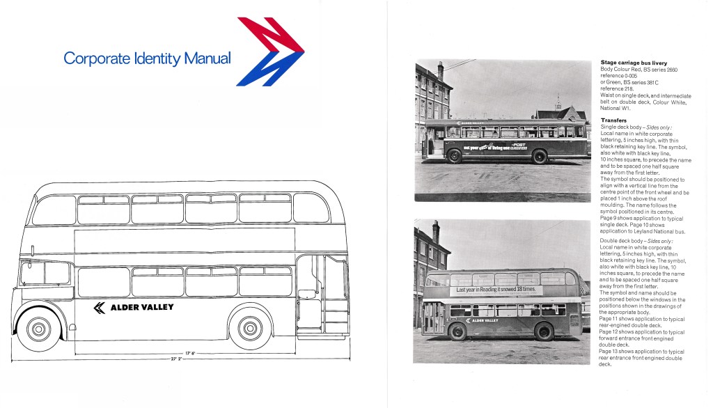
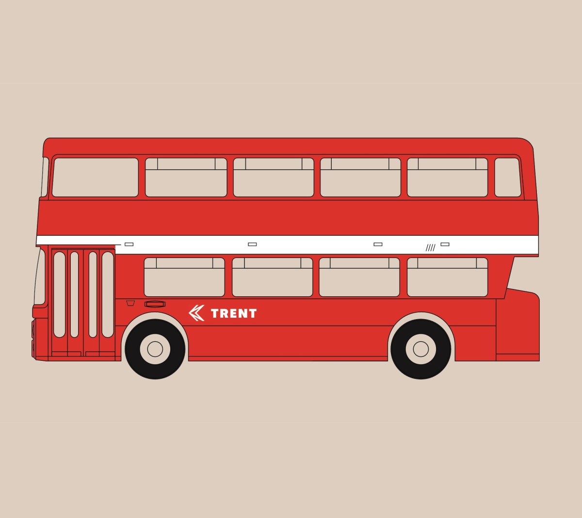
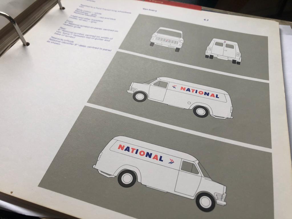
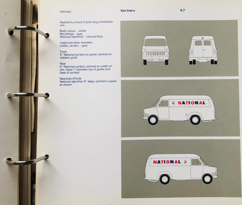
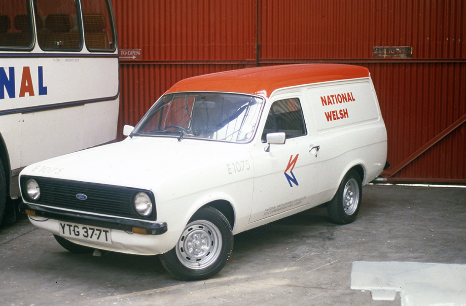
Since instructions and diagrams were sent to the local operating companies in June, the first pages of the new Corporate Identity Manual have been supplemented with detailed instructions on how to apply the new liveries, paint specifications and the precise configuration of the new symbol and company names. On 11 August, Ron Whitehouse, Group Public Relations Officer, writes to the General Managers of the 40 or so subsidiary companies issuing additional pages for the manual, the first in a series of drawings showing how the new identity should be applied, including the precise position of the new symbol and lettering, across a range of typical vehicles from venerable double-deckers to the brand new single-deck Leyland National, designed and manufactured as a joint venture between NBC and Leyland Vehicles.
Coaches are the priority as NBC seeks to capitalise on the growing recognition of the new ‘white coach’ express network. For buses, each company has been encouraged to paint a number of vehicles as soon as possible to make sure there is momentum behind a public campaign planned for the Autumn.
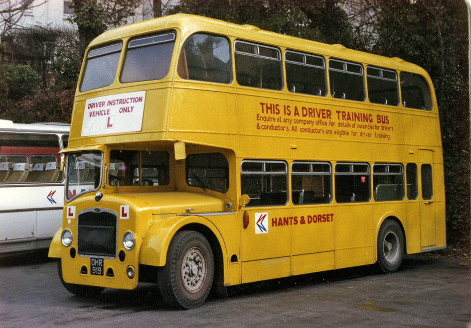
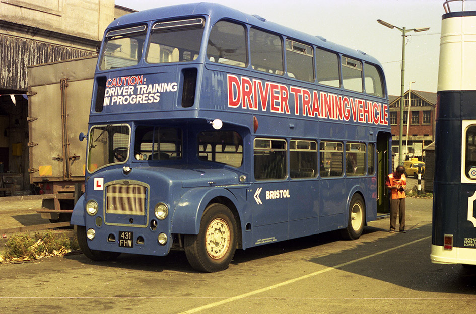
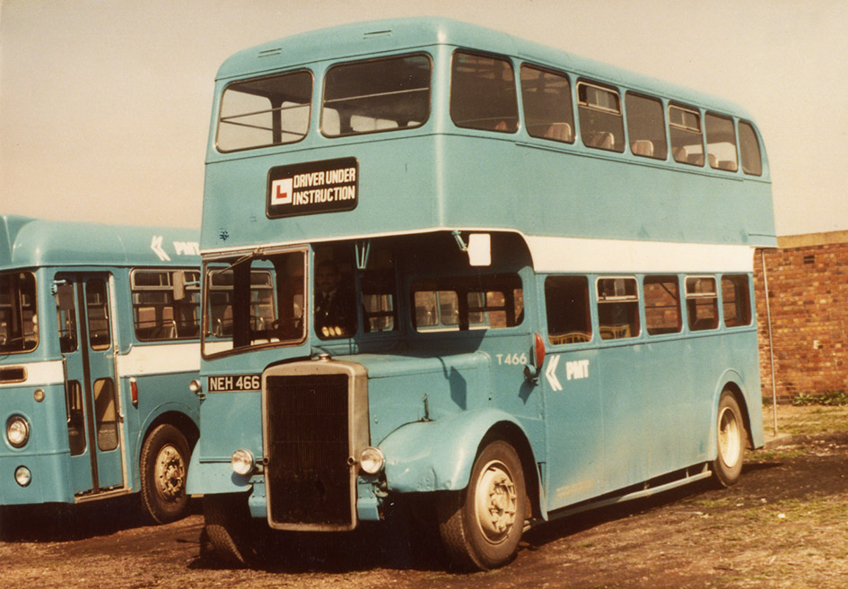
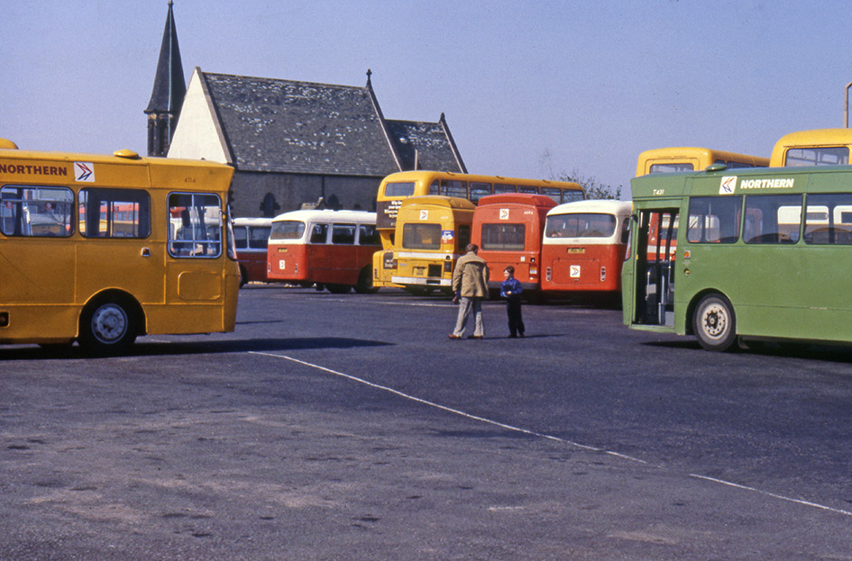
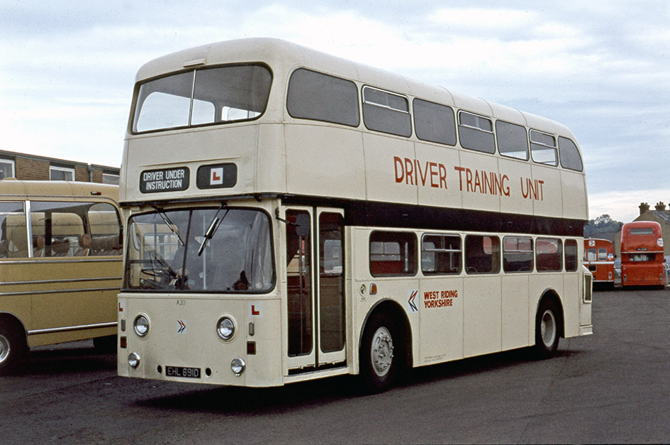
Local operating companies have also been encouraged to apply the identity in interim form, applying the new symbol and distinctive lettering to buses their traditional liveries so that it will gain recognition before proper repainting can be done.

By and large it’s going well. Coaches are being repainted into white at a rapid rate, while buses are reappearing in poppy red and leaf green as they complete routine overhauls. But there are a few areas which need attention.
First, both Norman Wilson, the design consultant responsible for the new identity, and the NBC’s HQ staff responsible for implementing it, are dissatisfied with the results of the ‘interim application’ using existing liveries and in many cases, cream-coloured lettering to match the old-style lining on buses. Whitehouse’s letter of 11 August suggests that companies “may find it economical to avoid the interim stage of ‘cream’ transfers and apply ‘white’ transfers immediately… For those fleets with waists or intermediate bands of cream, white transfer can be applied and the band painted white immediately without waiting for a total re-paint. For complicated liveries, eg cream window mouldings; more than one intermediate band, etc, this suggestion will not be practical.”
Preparing a bulk order of transfers of the monochrome NBC symbol and company names in Wilson’s new National lettering, Whitehouse asks General Managers to let him know how many white and how many cream transfers they will need for each fleets. An effect of this instruction is that only a few companies adopt the interim cream version of the new identity.

Second, the carefully-specified coach and bus liveries omit a whole category of vehicle, and across NBC company chief engineers are puzzled: Yorkshire Traction’s chief engineer exclaims on 8 August that “there appears to be a gap, in that we do not know what livery to paint our semi-coaches… and I have no instructions on this point.”
For express and tour services, and for local hire, the new National white coach livery is to be used. For local buses, it’s all-over red or green with white bands, depending on ‘the company’s tradition’. But the corporate identity does not yet cover the company’s many ‘semi-coach’ or ‘dual-purpose’ coaches and buses Equipped with coach seats, for many NBC subsidies these provide some of their higher-profile, higher-profit services such as regional express routes or express commuter services on regional routes into London, notably London Country’s Green Line routes.
Internal memos from Yorkshire Traction suggest using National white but substituting the local company’s name in Wilson’s new lettering for the ‘NATIONAL’ brand. “To my mind this is an advantage”, he argues, “as we could without too much trouble change vehicles into and out of national livery without a complete repaint.” In a letter to NBC HQ on 17 August, East Midland’s General Manager highlights the problem that “our… semi-coaches have to alternate on stage-carriage [bus] work because they are vehicles receiving bus grant… There is quite a variety of colour styles spread over the years, particularly with coaches … and the only suggestion I can make is that they are painted white with a green band” to differentiate them from ‘normal’ buses. “The semi-coaches will have to be done on a similar basis, although the quantity of green will be greater.”
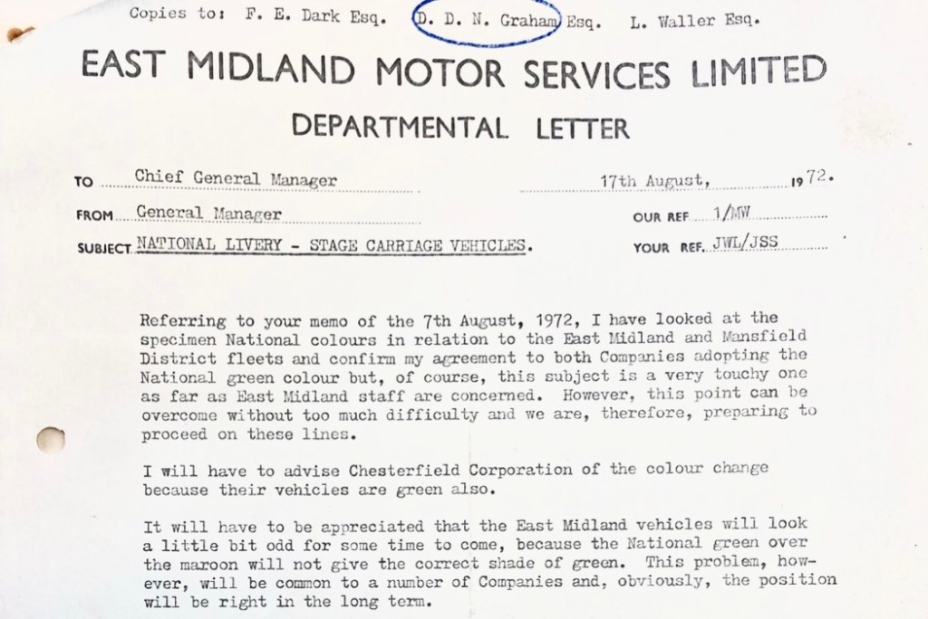
There’s also the question of what to do where the local company’s ‘traditional’ colour isn’t green or red – maroon, say, or blue. Maroon (or ‘dark red’) is generally replaced with NBC poppy red. But the joint companies of East Midland and Mansfield District – using maroon and green respectively – come under pressure to adopt the standard NBC green livery for all of their buses. Their General Manager responds to D Graham at NBC HQ on 17 August relenting: “I confirm my agreement to both Companies adopting the National green colour but, of course, the subject is a very touchy one as far as East Midland staff are concerned.” There are practical issues to deal with too: “I will have to advise the Chesterfield Corporation of the colour change because their vehicles are green also.” And moreover: “It will have to be appreciated that the East Midland vehicles will look a little bit odd for some time to come, because the National green over the maroon will not give the correct shade of green. This problem, however, will be common to a large number of companies and, obviously, the position will be right in the long run.”

To complicate things further, although the company is pressing ahead with the roll-out of the white coach – but “the re-painting of any vehicles cannot be properly undertaken immediately because… the only transfers we have are 50 East Midland suitable for coaches painted in the full National specification, but these have the red line under the Company’s name, whereas, in fact, we are proposing to adopt the National green.”
Anxieties and practical challenges over which colours to adopt will continue over the coming months. The next blog will look at why, for some reason, NBC HQ turns out to be less than decisive when it comes to the use of National blue.
Read more about how the modernist-inspired design of the NBC identity was shaped by Norman Wilson’s design influences, combining his three key elements: bold, uniform colours, his distinctive typeface, and a striking monochrome version of his NBC symbol, wordlessly conveying the nature of the business, all drawn together in a grid-based layout which brought a sense of uniformity and modernity across disparate companies and an enormous variety of vehicle types.
If you have recollections of the roll-out of the new livery, how it was managed, or remember your initial reaction to it, please let us know. We’d be happy to include these in a future blog, and perhaps in the Manual book itself. Get in touch using the form on this page, or the contact page here: https://nationalbusmanual.com/contact/
Sincere thanks to The Bus Archive for providing access to the NBC archive and the original papers on which this blog is based.
Look out for the forthcoming article in the modernist magazine by Richard Price looking at the career and impact of Norman Wilson, the graphic designer and typographer responsible for the NBC corporate identity,








![National Bus Company Service Vehicles 1972-1986 by [Michael Hitchen]](https://m.media-amazon.com/images/I/51LhcK7sOzL.jpg)