The Corporate Identity adopted bold, modern shades of the industry’s traditional green and red for local services. We crunch the numbers on the adoption of the new colours across the country.
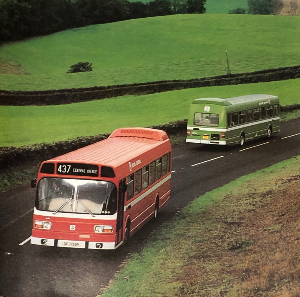
From NBC’s 1976 advert ‘The go between’, two of the company’s Leyland Nationals cross paths somewhere in the west country: a green vehicle from Western National, and a red Devon General bus. (Photo: Tony Whitehead, for NBC).
In 1972, the National Bus Company adopted Norman Wilson’s recommendation to standardise on two colours for its buses. Wilson had argued for a thorough reworking of NBC’s corporate identity, adopting the three key elements of a distinctive symbol (his ‘N’-and-shadow-arrow), distinctive typography (his bespoke National lettering), and disciplined use of bold corporate colours.
Red, blue and white had been chosen for the initial National branding early in 1972, reflected in that year’s first edition of the Corporate Identity Manual, developing the concept of the ‘white coach’ uniform national network. The approach to the identity for local buses, announced in July 1972, stretched Wilson’s disciplined colour scheme, adding green to the corporate palette.
Though the vibrant shades of red and green chosen were intended to signal a move towards a modern industry and away from the from the ‘drab’ darker colours previously used by local bus companies, green was retained as a nod to the companies’ traditions, intended to retain an element of pride and goodwill from staff and passengers alike. Adopting a single bus colour was thought to be too disruptive, and possibly confusing for passengers in parts of the country where NBC subsidiaries overlapped and provided services on different routes.
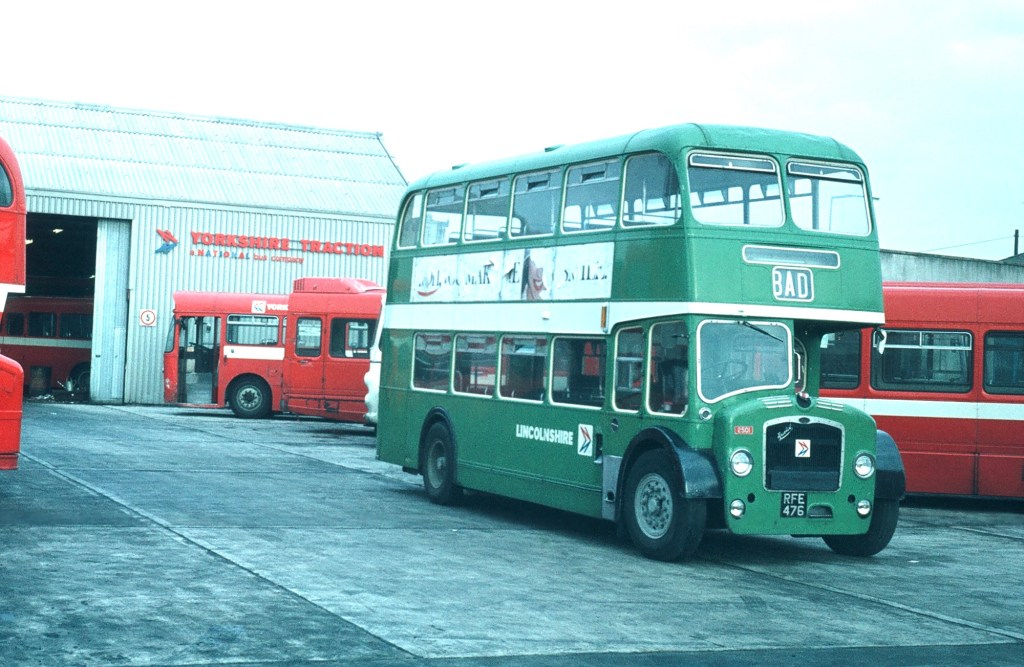
Visiting Lincolnshire Road Car green Lodekka 2501 in a sea of red at Yorkshire Traction’s Doncaster depot, in around 1979.
Blue, meanwhile, was used by relatively few local companies, so though it would have been a better fit with the National identity, it was argued that adopting it nationally would have required more upheaval. In practice, of course, the introduction of the new identity required all vehicles to be repainted in the new colours anyway, so whether switching to blue would have been more challenging logistically is a moot point.
Norman Wilson appears to have disapproved of the compromise to include green in the corporate identity so fiercely that the colour green does not appear on a single vehicle illustration in his otherwise comprehensive Corporate Identity Manual, even illustrating liveries for ‘green’ companies in red. (The reprint of the Manual will add in some green illustrations as extra pages.)
At Eastern National’s Chelmsford works, Fred Brewster applies the new corporate identity lettering and symbol transfers to a Leyland National in 1973. Read more in the blog on corporate disobedience. Picture: Tony Whitehead/NBC.
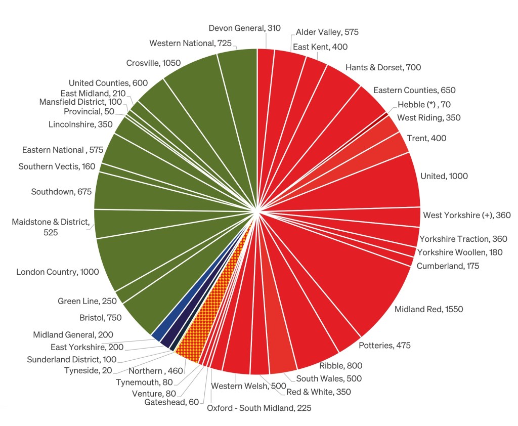
What proportions of NBC’s fleets went leaf green, and how many buses ended up in red? How many local fleets adopted other colours?
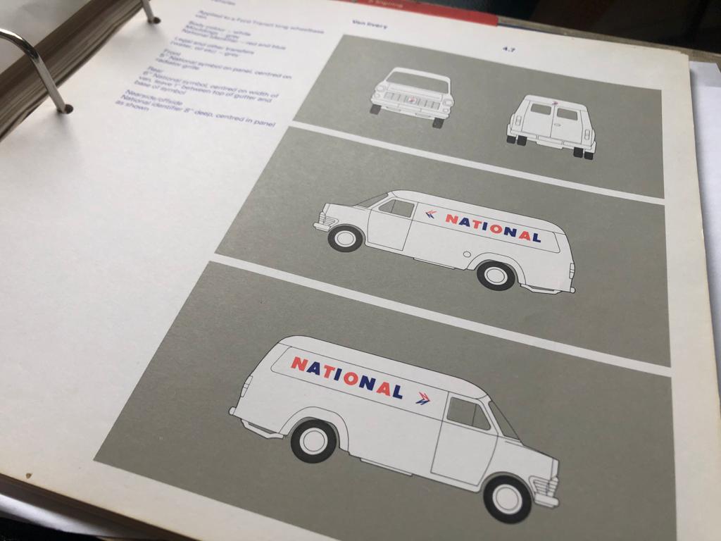
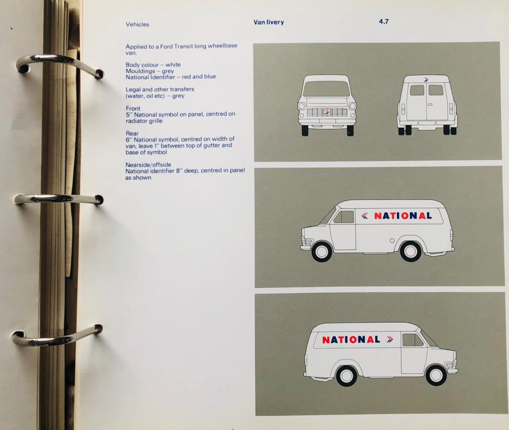
To answer this question we accessed the initial tenders for fleet name transfers in Wilson’s new National lettering, filed away in The Bus Archive. The tender calls for printed transfers for around 18,000 vehicles, consisting of 5” high fleet names and monochrome versions of the NBC symbol. The NBC symbol was ordered in a single version, as the monochrome version could be rotated to point left or right. The later 1976 colour panel bearing the NBC symbol had to be printed with separate versions facing left or right – each having the red ‘N’ on the top, and its shadow in blue below.
A tender document for the bulk purchase of NBC symbol and fleetname transfers, in preparation for the roll-out of the corporate identity, showing the numbers needed – roughly double the number of vehicles in each operating company’s fleet. The letter was sent to suppliers by A O Timms in NBC HQ’s purchasing department at New Street Square in London and is dated 25 July 1972, just a week after the new identity for local buses was announced. Source: The Bus Archive.
Initially NBC offered both symbol and fleetnames in the corporate identity standard white as well as a variant in cream to allow the new graphics to be applied – incongruously – to buses still in their traditional colours with lining in cream, without having to wait for a repaint. In practice few companies took up the cream option, preferring to adopt the new standard straight away.
Only a few local operating companies took up the offer of cream-coloured fleet names in Norman Wilson’s National lettering and NBC symbols. The thinking was that the identity could be rolled out faster by matching the new graphic design to the traditional liveries lined out in cream, rather than waiting for buses to be repainted. In practice the mix of Bauhaus-inspired graphic design with traditional liveries usually looked quite odd. In 1972, Alder Valley Loline III number 503 is undergoing its own transition from the green livery of Aldershot and District, into the new combined Alder Valley fleet, and will eventually end up in poppy red. Much later, in preservation, it will turn back into its traditional Aldershot and District colours, which it carries today. Picture: Richard Price collection.
These early tender documents from July 1972 indicate the numbers of fleet name transfers needed by each company, asking suppliers to quote for the transfers in either cream or white, but do not show which local bus companies have asked for the cream version, nor how many. The tender invitation also refers to the symbol and fleet name lettering “with black outline”. Originally Norman Wilson and colleagues thought that a thin black ‘keyline’ would be needed to allow a crisp edge to the graphics, and this was reflected in the Corporate Identity Manual of June 1972. However testing proved that the method of applying transfers to painted vehicles gave a sharp enough look, so in September a simplifying modification sheet was added in the Manual, stating that ‘transfers of name and symbol [will be] in one colour only. Contrary to page 8 the “thin black retaining key line” is deleted.’
This sheet showing fleet names prepared in Norman Wilson’s National lettering was circulated with the tender invitation letter to transfer suppliers. It includes Hebble, which by 1972 had lost most of its bus routes to adjacent NBC operating companies, the company becoming solely a coach operator until its absorption into National Travel (North East) in 1973. The Hebble fleet name was not used once the corporate identity was adopted, except as a coach brand, which in turn was dropped in 1973. Source: The Bus Archive.
The numbers shown in the chart don’t precisely match the fleet lists of the time, as there was some over-ordering of transfers (the breakdown for Northern’s subsidiaries uses the PSV Circle’s fleet listings for 1972). By halving the order numbers, we have an approximate number of local buses (stage and dual-purpose) in use in each local fleet in mid-1972, as the corporate identity was being rolled out.
These show that, on adoption of the corporate identity in 1972:
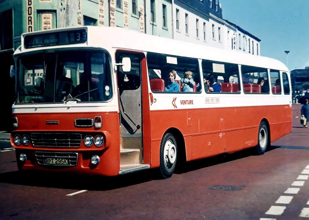
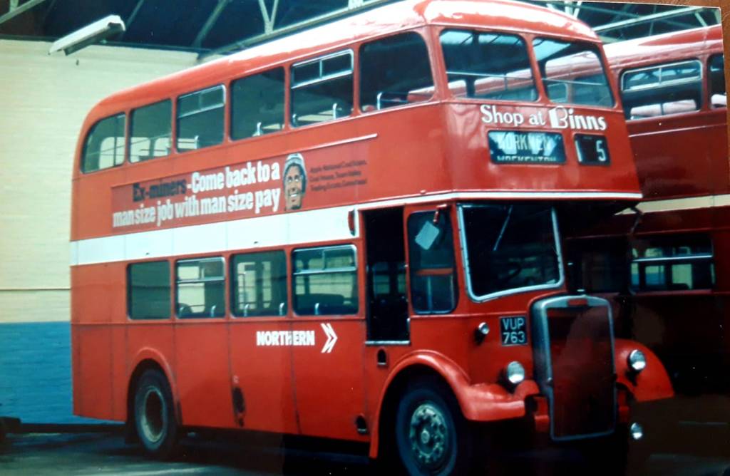
⁃ of 42 local bus companies, 24 adopted red as standard, and 14 green, while 3 retained one of the several shades of blue. Northern and its subsidiaries operated a mix of red and yellow fleets from the early 1970s, though on adoption of the new identity red was used except in Sunderland District which retained its ‘midnight blue’.
⁃ around 55% of buses were adopted the new poppy red, a bit less than 40% leaf green. Less than 3% retained blue, while large parts of Northern General’s fleet of around 500 vehicles, together with a smaller number of buses from Northern subsidiaries Tyneside and Tynemouth, later turned out in NBC yellow, complementing the cadmium yellow adopted by Tyne and Wear Passenger Transport Executive for its own buses.
The colours of NBC’s fleet of around 18,000 local buses on adoption of the corporate identity. Calculations of local bus allocations, based on fleet name orders from the July 1972 invitation to tender document.
Incidentally, the labels ‘poppy red’ and ‘leaf green’ – widely used by designers, enthusiasts, preservationists and staff across the industry – do not appear anywhere in the company’s documents, including the Manuals! The new colours are referred to simply as National red and green.
Instructions from the 1972 edition of the Corporate Identity Manual explain the specification and position of the fleetname and new NBC symbol. Source: NBC Manual Project.An outpost of NBC green in the north: on adopting the corporate identity, Northern General subsidiary Tyneside replaced its traditional dark shade of green with red, and then yellow as it operated within the Tyne and Wear PTE area. But briefly, some of its vehicles, still in green, had the NBC lettering and symbol applied. A rare picture of Tyneside Daimler Fleetline 93L en route to Newcastle in 1972. Photo: Michael Mccalla.
Read more about how the modernist-inspired design of the NBC identity was shaped by Norman Wilson’s design influences, combining his three key elements: bold, uniform colours, his distinctive typeface, and a striking monochrome version of his NBC symbol, wordlessly conveying the nature of the business, all drawn together in a grid-based layout which brought a sense of uniformity and modernity across disparate companies and an enormous variety of vehicle types.
If you have recollections of the roll-out of the new livery, how it was managed, or remember your initial reaction to it, please let us know. We’d be happy to include these in a future blog, and perhaps in the Manual book itself. Get in touch using the form on this page, or the contact page here: https://nationalbusmanual.com/contact/
Red, white and blue was at the core of NBC’s modern corporate identity. So why was the company strangely reluctant to use blue across its huge fleet of buses and coaches?
Many shades of blue. After battles over the use of ‘traditional’ green, blue was not adopted as a standard NBC bus colour as Norman Wilson and Freddie Wood had intended. Individual companies were give special dispensation to continue to use blue. But the lack of a standard approach meant a plethora of different shades emerged. Only Jones of Aberbeeg adopted the NBC standard blue, as intended. Picture: illustrations in the style of the Corporate Identity Manual; Martyn Cummins/Richard Price; typeface digitised by Nick Job.
In June 1972, the planning of NBC’s ambitious corporate identity programme was proceeding apace. Norman Wilson’s modern identity, inspired by Swiss design thinking and the Bauhaus, combined three elements – a striking geometric symbol; distinctive modern lettering; and the disciplined use of a narrow palette of bold colours to create a strikingly modern impression of the business and the industry. Red, white and blue were chosen as the ‘company colours’ for NBC as a whole and for the National express coach network. Red and blue lettering adorned the company’s trademark ‘white coach’, inspired by the extensive Greyhound network of silver coaches in the United States, and designed to be just as iconic.
Red, white and blue seemed a logical choice for a company branding itself as ‘National’. And it worked well, capturing the public’s attention through advertising campaigns to introduce the network, and through the sheer physical presence of the white coaches on the roads.
Blue is used extensively in the NBC corporate identity, including in the symbol and the logotype.
Developing a way to extend this approach to local bus services – making extensive striking use of the corporate colours – ought to have been easy. Indeed it seems that the original concept for the corporate identity was that buses would appear in one of two standard NBC colours: red, or blue. But there was a catch. Wilson and corporate identity champion, NBC chair Freddie Wood, ran into a groundswell of opposition from the NBC local subsidiaries’ General Managers who, fearful of a negative reaction from traditionalist staff, favoured incorporating another colour, green, into the corporate identity, reflecting strong industry traditions and the extensive use of green in local company liveries across England and Wales.
Wilson and Wood were modernisers, but they were pragmatists too. They relented in the interests of retaining the goodwill of the 50-or-so General Managers of NBC’s subsidiaries, an important part of the leadership on whom Wood depended to drive change through the business.
So the preponderance of green and red liveries led to an anomaly. In the interests of simple modern image, Wilson’s scheme restricted local buses to one of two colours. With the intervention of General Managers, green was added as an option, and companies chose red of green to reflect their previous traditions, using standardised shades specified in the Corporate Identity Manual.
There was a price to pay: the adoption of green effectively displaced the proposed use of blue as a standard colour, even though it had been championed by Wood and Wilson. Indeed the NBC identity was already based on red, white and blue, and a handful of existing bus fleets used blue as their livery colour. Wilson stuck to his guns on reducing the number of colour options to two, even though his design judgement was that green was at odds with the modern image of the identity.
So the experiments with design and early vehicle trials at Alder Valley and Crosville used red and green liveries. Norman Wilson did not like having to compromise on matters of design, particularly when he was convinced of the right answer. It is notable though that Wilson did not include a single green vehicle among the illustrations for the Manual: all of the vehicles in the Corporate Identity Manual are illustrated in red. (We will put this right when the Manual is reproduced by adding a few new pages.)
In the NBC collection at the Bus Archives, there are references to the work of the Corporate Identity Committee, attended by Norman Wilson. In the spring and summer of 1972, the committee had its hands full with the roll-out of and publicity for the ‘white coach’ network. They were also turning to consider Wilson’s proposals – within parameters already agreed by Wood – for applying the new bus liveries in green and red. The biggest challenge, as the operating companies’ General Managers saw it – was to address the logistics of getting this done quickly and consistently across 40-50 independently-minded subsidiaries. Faced with practical challenges such as how to paint over existing colours to get a consistent effect, how to apply the identity to existing colour schemes, and how to remove existing decoration and adornments, there was much lobbying from across the business for local exceptions and compromise. With Wood’s backing, and his characteristic bluntness, Wilson was having none of this, and saw little need to compromise on his designs and their rigorous application.
But reports from a meeting of the committee in July 1972 point to ongoing dithering on the question of blue buses.
Tony Whitehead, NBC HQ’s corporate communications manager, remembers that among the HQ Corporate Identity team, “the traditional blues were seen as being a bit dull – dark and old-fashioned”. But the advocates of blue were not easily silenced, particularly as they saw that the principle of blue as a corporate colour had already been established.
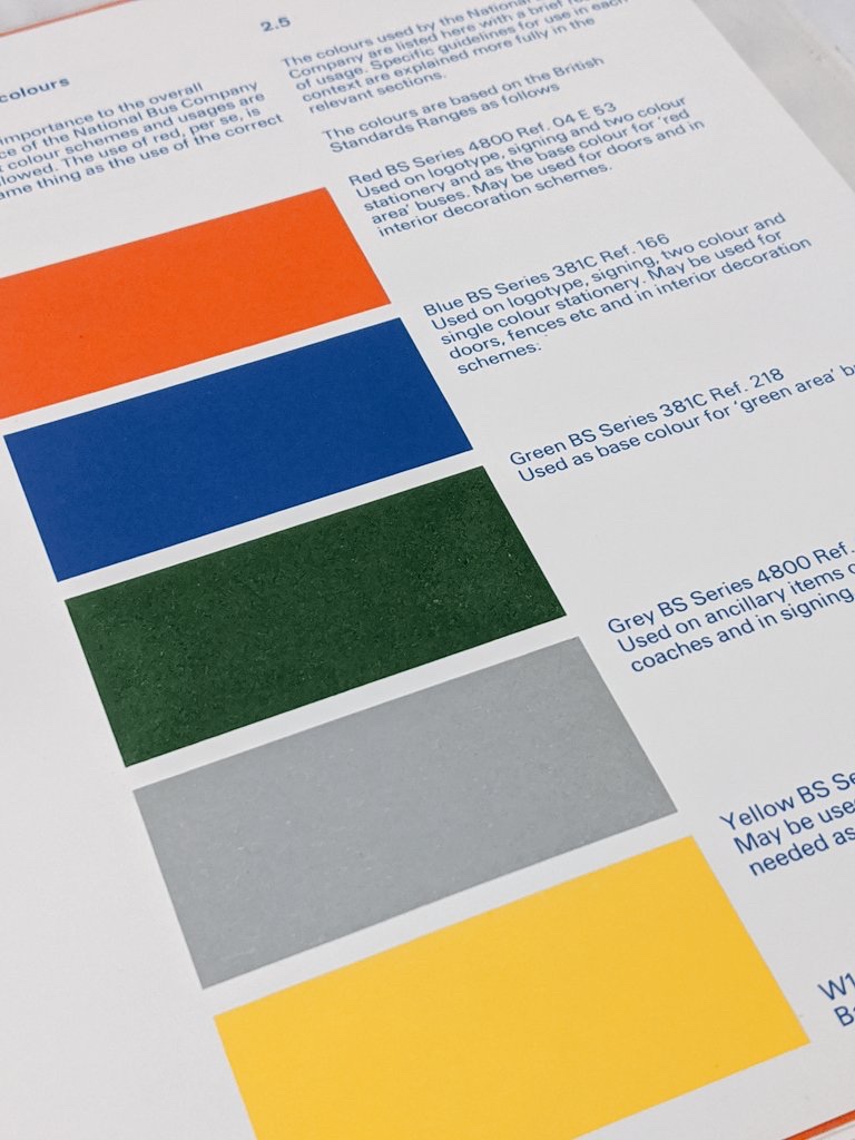
From the 1976 ringbound version of the Corporate IdentityManual, page 2.5 specifies the six standard NBC colours – only two of which, red and green, are intended for use on buses.
This led to an uncharacteristic fudge, reflected in a letter from Ron Whitehouse at NBC HQ to General Managers on 19 July 1972, summarising the outcome of the Corporate Identity Committee’s deliberations and subsequent management discussions:
“I write to advise you that, following discussion with regional directors, the Chairman and Chief Executive have decided upon a standard method of applying corporate identity to stage carriage buses together with rationalisation of livery colours…
“There will be three livery colours only (with certain temporary exemptions) being – Red (BS series 2660 ref. 0-005); Green (BS series 381C, ref. 218), White (National W1) for relief (waistbands, symbols and titles). Creams will be discontinued.
“The exemptions for the time being may be ‘blue’ bus fleets, and Regional Directors will be talking with Chief General Managers regarding the future of this colour.”
In its mid-blue livery, Midland General’s Leyland National 415 leaves Langley Mill garage, Derby, in 1974. Old photographs can be deceptive, but Midland General used a slightly darker shade of blue than that specified in the NBC Corporate Identity Manual. Picture: Richard Price Collection.
These changes to local liveries involved a sweeping away tradition to produce a striking visual impact, but it was common for staff and managers of the local companies to regret the changes, particularly where a radical departure from established colours was involved.
We don’t have records of all of the regional discussions, but at a meeting of the Eastern Regional Management Committee on 26 July 1972, Regional Director C D F Rawlinson asked his Chief General Managers “to recommend whether or not the existing blue liveries should be retained at Sunderland District, East Yorkshire and Midland General, and whether there would be any difficulty in changing the livery of Venture (Newcastle) to Standard Red (from yellow).”
Blue in preservation: for a few years after the adoption of the NBC corporate identity, East Yorkshire’s buses retained their traditional deep indigo colour, but applied in the format specified in the Corporate Identity Manual. A number of buses were built with a special roof profile, allowing them to access the town of Beverley through its arched gate, Beverley Bar. NBC gave special dispensation for these vehicles to be differentiated by retaining a roof-level white band. This preserved example, AEC Bridgemaster number 747, is owned by Graham Hobbins, who had the vehicle beautifully restored to the corporate identity version of indigo blue by Ashley and Kirstie Blackman and team at vehicle restoration specialists Revivist. To superb effect, they’ve followed the Corporate Identity Manual in precise detail. Picture: Graham Hobbins.
Following this up in a memo to General Managers J W Lawrence, Chief General Manager for the Midlands, asked “Can we give consideration to the Yorkshire Woollen District and East Midland fleet taking the National Red colour and eventually the Midland General fleet taking the in the National Red which would be the Trent colour. I know there may be difficulties and objections in certain areas to this, but I think we should examine this very closely.” Though it was hardly differentiated in a sea of red companies across the north, we know that Yorkshire Woollen resisted a switch to green. Meanwhile Midland General – although combined with Trent as a single business entity from 1972 under General Manager L Waller, retained its blue identity.
Serious consideration was given to switching Yorkshire Woollen’s company colour (previously maroon) to green, to distinguish the company from its sea of neighbouring red NBC subsidiaries across the north. It didn’t happen, so here we see Fleetline 693 in 1973, recently repainted in the red version of the new identity. Photo and copyright: I T Langhorn.
It’s not clear exactly what discussions occurred elsewhere between Regional Directors and Chief General Managers, but what is clear is that a blue persisted. It was applied in Corporate Identity form in Sunderland District, East Yorkshire, Midland General and at Jones of Aberbeeg. And though a colour code for standard blue was specified in the manual, the lack of clarity on how it related to vehicle liveries meant that no single shade of blue was adopted across NBC’s subsidiaries, with big variations between companies as they continued to use their existing supplies of paint. However, as these companies’ areas did not adjoin one another, these local differences were rarely noticeable in practice.
East Yorkshire’s traditional livery was a shade of deep indigo, with bands of primrose, as demonstrated by Bridgeliner 702 – still in the old livery but covered incongruously with NBC posters advertising the new identity. Indigo was carried over into NBC corporate identity form, white replacing the intermediate primrose band, and the others painted over in blue. This is illustrated by the Daimler Fleetline in the background, which has the new NBC version of the indigo livery, with new symbol and fleetnames. Though NBC HQ instructed that white roof bands were not permitted, EYMS received a dispensation under which buses profiled to drive through the narrow Beverley Bar retained a smart white band at roof level. Picture: Richard Price Collection. Further afield, East Yorkshire’s Leyland Leopard 881 in a Riviera blue version of NBC’s dual-purpose coach livery, negotiates the Waterloo Bridge roundabout in London in 1973. Riviera blue was carried over from the company’s previous coaching colours. When East Yorkshire switched away from both of its shades of blue from October 1973, 881 was later repainted into the red version of the same livery. Picture: Richard Price Collection.
So East Yorkshire retained their previous dark ‘indigo’ blue livery, though their primrose banding was lost in favour of the more modern-looking standard white. Unlike their buses, East Yorkshire’s coaches and semi-coaches had used a different, lighter shade called Riviera blue to relieve the primary colour of ‘buttermilk’ cream. While the company’s coaches went National white, Riviera blue was carried over into East Yorkshire’s version of NBC dual-purpose/semi-coach livery.[1]
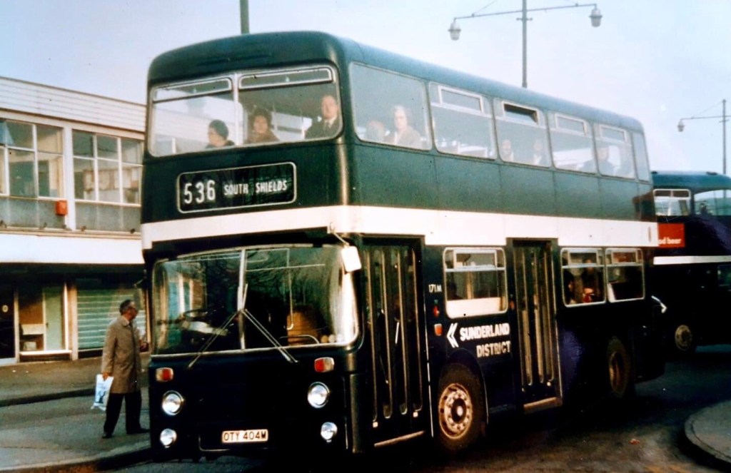
Sunderland also continued to apply their own shade of ‘midnight blue’, initially simply adding the NBC symbol and white lettering to the existing livery with a broad white band. Midland General used a mid-shade of blue, slightly darker than the version specified for the NBC symbol and National logotype, and looking particularly dark when applied to an entire vehicle rather than just the lettering.
Sunderland District Park Royal bodied Atlantean 171M is seen leaving Park Lane bus station, Sunderland, in its dark blue livery, painted to NBC corporate identity configuration. Photo: Michael Mccalla.
Another letter from Ron Whitehouse of 9 November 1972 put an end to another residual piece of blue livery, when Western National coaching subsidiary Royal Blue lost its blue fleetname underlining and – with the rest of the National White Coach fleet, adopted the new standard larger fleetname in red NBC lettering, without a bar representing the company colour.
Another residual aspect of blue livery was the tiny blue band under the Royal Blue fleetname on the early NBC White Coach livery, reflecting the company colour. This was a little contrived as Royal Blue had no buses, and was a coaching subsidiary of Western National, whose company colour was green. This started to be phased out as early as November 1972, with all fleetnames appearing in larger lettering in NBC red. Royal Blue coach-bodied Bristol REs visit Southend in 1972, 1472 in the new white livery, 2385 in traditional blue. Picture: Richard Price Collection.
In Wales, Jones of Aberbeeg was purchased by NBC in 1969, initially coming under the management of Red and White Services Ltd, but retaining its own identity and working practices as a separate depot unit, managed by a Jones family member. The Jones identity persisted into the 1980s as a result of local fare agreements: Jones typically offered lower fares than Red and White or Western Welsh, and the Traffic Commissioners insisted these fare advantages should be retained after Jones became part of the larger group. The company initially kept its blue-and-ivory livery as part of this arrangement, and this was applied to a number of Red and White buses transferred to Jones. Once the NBC Corporate Identity was introduced by NBC across the country, corporate blue was adopted for Jones of Aberbeeg. Quite quickly, Wilson’s rules for the layout of colours and bands, NBC fleetnames and symbols were applied. So NBC standard blue joined the range of existing shades already in use.
Jones of Aberbeeg adopted NBC’s standard blue colour, as specified in the Corporate Identity Manual. They give the best idea of how buses across England and Wales could have looked if Wood and Wilson had had their way and adopted blue instead of green as the second standard bus colour. In 1977, Jones’ Leyland Tiger U1264 awaits its next turn of duty at the company’s Warm Turn depot, Aberbeeg. Picture: Richard Price Collection.Jones of Aberbeeg’s dual-purpose livery looked particularly smart, giving a sense of how dual purpose vehicles would have looked nationally had standard NBC blue been adopted more widely. Bristol RE RD4872 collects passengers for Ebbw Vale and Pontypool at Newport Bus Station in 1978. Picture: Richard Price Collection.
Richard Morgan of the Cardiff Transport Preservation Group (CTPG) in Barry recalls that new Leyland Nationals for Jones were all delivered in poppy red, and had to be repainted in corporate blue before entering service. Tudor Thomas, former Advertising and Promotions Manager for National Welsh and now an active CTPG member, remembers that repainting into blue was done at Red and White’s Bulwark works near Chepstow, “probably one of the country’s best bus works – never a hint of anything slap-dash”. Colour variations emerged depending on how the painting was done, too. Inconsistencies could emerge if blue was applied directly onto a red base to get buses into traffic quickly, while others had blue primer applied before the final coat. For Jones’ new Leyland Nationals, Bulwark Works almost certainly adopted the latter approach.
In Jones’ standard bus livery, with an NBC symbol on its radiator grille, Bristol RE R3671 arrives at Newport Bus Station in 1975. Picture: Richard Price Collection.
Tudor recalls that “when buses eventually had the blue and red version of the ‘flying N’ symbol [from 1976] the blue shade in the symbol was exactly the same as the blue of the bus… this tends to support the theory that the basic blue paint [used for Jones’ buses] was the official blue version: certainly the blue in the symbol was not lighter.” So in the array of different shades, Jones’ Leyland Nationals from that era probably gave the clearest idea of what a Corporate Identity-compliant blue livery should have looked like. Two were painted in a smart blue version of the dual-purpose livery, for express services along the A48.
NBC HQ tightened the rules through the autumn of 1973, and on 2 January, Ron Whitehouse wrote to all subsidiaries’ General Managers reminding them that “stage carriage busses generally are to be painted either standard red or green, depending on the traditions of the company. There are some exceptions, usually where we are involved in working closely with local authorities and PTEs, but each such exception must have the approval of the Chief Executive, such approval being sought through the Regional Director.”
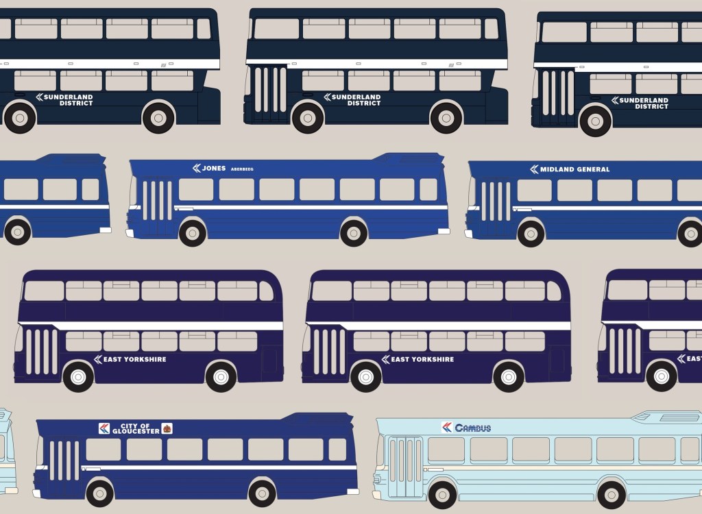
The six shades of blue used during the period of NBC’s corporate identity: NBC standard blue used by Jones of Aberbeeg; East Yorkshire’s indigo; Sunderland District’s midnight blue, also used by buses rebranded as Northern; Midland General’s mid-blue; City of Gloucester’s aircraft blue, and Cambus’s Cambridge blue. Picture: NBC Corporate Identity blog.
By this stage blue was already on the way out in the north east. Under pressure from NBC HQ and regional management, East Yorkshire abandoned its traditional dark blue in October 1973 and switched to red. Many of its vehicles went straight from their traditional livery to NBC red, without an intermediate spell in NBC blue. Sunderland District held out a bit longer. Its parent company Northern General adopted red as its main colour, but as we’ve seen it also made extensive use of NBC yellow, reflecting its work in partnership with the Tyne and Wear Passenger Transport Executive. With transitions to both red and yellow going on , Sunderland blue persisted for a while in the new Corporate Identity format, but was gradually phased out along with the separate identities of Northern’s constituent companies in 1975. It was gone before the 1976 amendments to the Corporate Identity, which saw among other things the monochrome NBC symbol replaced by a red and blue version on a white panel.
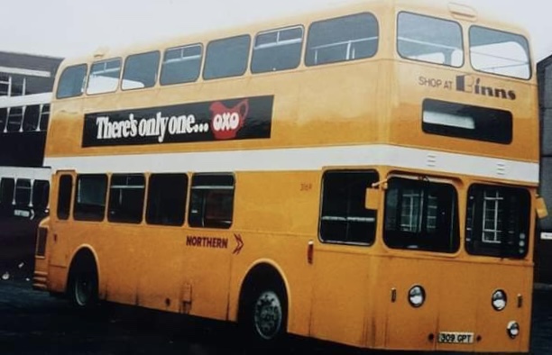
Northern’s Atlantean 309, after repaint from blue to yellow, with a sister vehicle in blue awaiting the same treatment. Michael Mccalla remembers: ‘I had the privilege of painting the very first Sunderland District blue vehicle into NBC yellow in around 1974 or 75. It was Roe-bodied Atlantean number 309. We had to hand-paint it which proved not to be good as it needed three coats of gloss to make it even look yellow – it kept looking greenish. On this basis the decision was taken that all blue vehicles would be spray-painted into yellow – it was faster and gave better coverage – while those going into red were hand-painted.’ Picture: Michael Mccalla
As we have seen, the Midland General blue identity was initially retained, though it was steadily replaced with red through the mid-1970s, the last blue bus leaving service in 1978 when the company was finally fully merged into Trent.[2]
By 1976, East Yorkshire’s blue identity seemed a distant memory. The company’s 830, a Daimler Fleetline like the one shown in blue in the background of the picture above, is shown in full NBC red, with the addition of the colour version of the symbol introduced in 1976. Though this bus has the profile needed to access the Beverley Bar, buses used the new, by the time blue was phased out, the Bar had been bypassed, so a distinguishing white roof band for vehicles which could use it was no longer needed. Picture: Richard Price Collection.
The funding arrangements with local government meant that Jones managed to retain its identity and blue livery a little longer – well into National Welsh ownership, during which the new red-and-blue NBC symbols were applied in 1976 to bring the blue livery into the new instructions from NBC HQ. Jones was eventually subsumed into National Welsh in 1980. [3]
Blue would however make a small revival in Gloucester. A resurgence of local identities following NBC’s Market Analysis Project, which among other things launched new local networks with their own identities. Most subsidiaries applied route or local sub-brands, but the Bristol Omnibus Company chose to launch local semi-independent and separately-branded operations based on towns and cities in its area, and in 1983 split off its services covering Cheltenham, Gloucester, Stroud and Swindon into the separate Cheltenham and Gloucester Omnibus Company in readiness for privatisation.
A 1983 publicity shot of City of Gloucester’s VR 212, still badged as Bristol’s G5120, displaying its new ‘Aviation Blue’ colours at, appropriately, Gloucestershire Airport. Picture: Cheltenham and Gloucester Omnibus Company.
Asserting its newly independent identity, the new company switched from Bristol’s green to adopt NBC red as its standard colour; but within a few months began applying new colours to distinguish its local operations. For its City of Gloucester network, it switched to blue, adopting a rich, dark shade known as ‘Gloucester Aircraft Blue’ in reference to the City’s aviation history.[4] Stroud Valleys meanwhile retained Bristol’s green colour.
In the east, in contrast, a much lighter shade – Cambridge blue – was adopted by Cambus, a new NBC subsidiary formed in 1984 by splitting off parts of Eastern Counties’ western area in preparation for privatisation, under the leadership of MD Paul Merryweather. Initially applying the company’s new logotype, believed to have been designed by Cambridge designer Antonia Galloway and departed from Wilson’s National lettering, with the NBC symbol onto its share of Eastern Counties’ red buses, Cambus rapidly applied its new local livery. Initially this was a straightforward application of a Cambridge light-blue and cream version of the livery configuration specified in the Corporate Identity manual. A two-tone light and dark blue ‘venetian blind’ striped livery was adopted for dual-purpose buses used on long-distance routes. Finally, a two-tone blue and white livery was adopted on privatisation, combing Cambridge blue and Aircraft blue.
Cambus’ Bristol VR number 725 collects passengers at Cambridge’s Drummer Street bus station in the spring of 1987. Picture: Bernard Watkin, courtesy of the Eastern Transport Collection Society.
If you can add to the story of the blues, have any recollections of the abolition or adoption of NBC’s shades of blue, or own one of the restored examples in reservation, please get in touch!
Blue in preservation: Midland General’s Leyland National number 415 has been restored into NBC blue livery using the configuration specified in the Manual. Midland General’s shade of blue was slightly darker than the standard NBC shade, reflecting the company’s previous liveries. It’s seen here at the Midland General centenary event at the company’s former Langley Mill depot in May 2013. Picture: Martin Isles, showbus.com
If you have recollections of the roll-out of the corporate identity, how it was managed, or remember your initial reaction to it, please let us know. Comments and corrections are also very welcome. We’d be happy to include these in a future blog, and perhaps in the Manual book itself. Get in touch using the form on this page, or the contact page here: https://nationalbusmanual.com/contact/
Sources and references
[1] Many thanks to Stephen Allcroft and Philip Rushworth for information on East Yorkshire’s coaching colours.
The designs for the NBC corporate identity were a hit in Czechoslovakia in 1978.
NBC’s corporate identity went global in 1978. Norman Wilson’s work had a history of gaining international recognition, one of the highlights being awarded a certificate of merit at the pathbreaking Typomundus 20 exhibition in 1966 for his graphic designs for Croda, playing with a creative combination of photography and type.
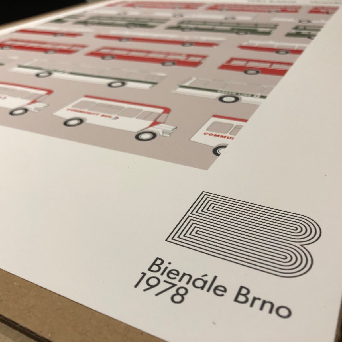
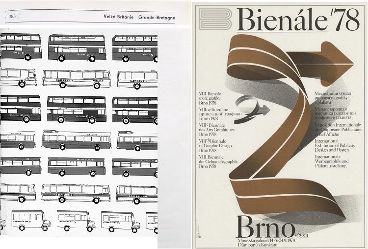
Norman Wilson’s catalogue page from the 1978 Brno Biennial, reproduced in colour for this project.
A decade later, Wilson was asked by NBC to refresh his original 1972 corporate identity designs, making more use of the two-colour version of his N-and-shadow symbol; expanding its coverage to uniforms, built environment and signage. The whole thing was consolidated into a sturdy ring-bound folder, which would be added to over time, and would be more durable in garages and workshops than the slim-bound A4 sheets released as the original Corporate Identity Manual in 1972.
It was this more substantial Corporate Identity Manual which Wilson decided to submit for exhibition at another international festival of graphic design, the Brno Biennale, in 1978. Sponsored by the Ministry of Culture of the Czechoslovak Socialist Republic, the Biennale had been launched in 1963, holding lively events every two years with an exhibition at the Moravian Gallery in Brno, and by the mid-70s had established itself as a prestigious fixture on the graphic design calendar. At the time it was a rare cultural event, attracting interest and exhibitors from both sides of the iron curtain.
The 1976, ring-bound edition of the NBC Corporate Identity Manual, the contents of which were exhibited in Brno in 1978.
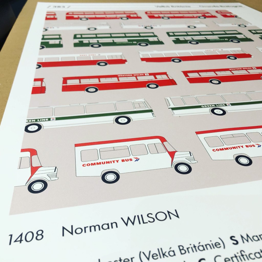
Wilson submitted the NBC manual, which was accepted as one of the leading examples of recent British design. The illustration used for the catalogue showed a selection of livery diagrams, some of which also appeared in different forms in the manual. A smaller version was used for the cover of the 1976 NBC Annual Report.
The original page and cover of the 1978 Brno Biennial catalogue.
It shows a selection of typical NBC vehicles in different colours, showing the variety of services the company provided, and to emphasise its national coverage, fleetnames included Northern for the north, Southdown for the south, East Kent representing the east, Western Welsh for the west and Wales, and Midland Red for the centre.
The recreated Brno catalogue page, now available to order.
The catalogue pages were produced in black and white, but after 44 years we’ve reproduced it as a colour poster, probably a bit crisper than the original. It’s available to order now via e-bay, in A2 and A3 sizes. Please allow around 7 days for delivery. Follow this link for more details and to order.Click here if you want A3 size.
Huge thanks to Jean Horsfall, Martyn Cummins and Nick Job for their enormous help with this reproduction.
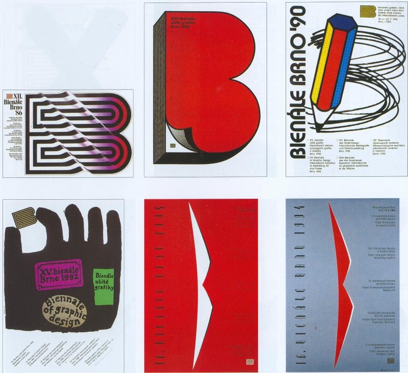
Save the Brno Bienále!
Launched in 1963 as a cultural bridge between east and west Europe, the Brno International Biennial of Graphic Design has provided a major international platform for exhibitions, discussions, and educational programmes in graphic design for the last six decades.
Brno Bienale, Moravian Gallery, 2018, photo: arttalk.cz
Until now, the Biennial has continued to run every two years, attracting designers and visitors from all over the world helping to influence and inspire whole generations of graphic designers.
Brno Bienale, Moravian Gallery, 2018, photo: 28.bienalebrno.org.
Read more about how the modernist-inspired design of the NBC identity was shaped by Norman Wilson’s design influences, combining his three key elements: bold, uniform colours, his distinctive typeface, and a striking monochrome version of his NBC symbol, wordlessly conveying the nature of the business, all drawn together in a grid-based layout which brought a sense of uniformity and modernity across disparate companies and an enormous variety of vehicle types.
If you have recollections of the roll-out of the new livery, how it was managed, or remember your initial reaction to it, please let us know. We’d be happy to include these in a future blog, and perhaps in the Manual book itself. Get in touch using the form on this page, or the contact page here: https://nationalbusmanual.com/contact/
Local companies adapted the NBC corporate identity to service vehicles, producing some interesting (and occasionally wild) innovations.
Michael Hitchen, author of the leading book on the subject (see links at the end), presents a guest blog on the way NBC’s corporate identity guidelines were adapted (and widely ignored!) for local companies’ service vehicles.
Although the National Bus Company had existed since 1969 it would not be until 1972 that detailed Corporate identity instruction were issued. These included every facet of the organisation activities, including livery instruction on the Service Fleet, a mixed range of vehicles from vans, lorries, recovery vehicles, trainer vehicles and a range of miscellaneous types.
The 1975 NBC manual had only this to say on applying the corporate identity to service vehicles. Local company identities were not envisaged.
Reference to the appropriate page shows a medium size van as an example for the prescribed application. Unlike PSV vehicles where interpretation was relatively restricted, the Service Fleet was far more varied and the NBC allowed this one illustration to guide all other types of vehicle. This should have been straightforward as basically it was a variation on the Central Activities Group (CAG) coach livery, all-over white with red/blue NATIONAL lettering. Oddly, apart from the small legal lettering, there was no advice for the fleetname, which for CAG coaches initially had been a very small ‘company identifier’ underlined in the local company’s bus fleet colour, so if followed as per the manual, these vehicles would have been left anonymous across the NBC fleet.
Image 1 Trent A30 AEC Militant, as per corporate guidance, apart from the inclusion of Trent in red.
While that was the official guidance, in practice each fleet choose its own interpretation. A few did follow guidelines to a certain extent: Trent was a good example of compliance, with white applied to most of its ancillary fleet apart from its tree-lopper, which received all over yellow.
Image 2 Trent A55, again in the mid-1970s Trent followed the manual closely. A55 was a Bristol LD Driver training vehicle.
Ribble followed for its Trainers and some Breakdown lorries. East Kent and Alder Valley also had white vans, though Alder Valley replaced NATIONAL with its fleet name, as did Oxford South Midland.
The rest of the fleet contained a huge variety, rule of thumb was the use of the fleets base colour, ie Grass Green or Poppy Red, though I have no evidence of NBC Blue being used on Service Vehicles.
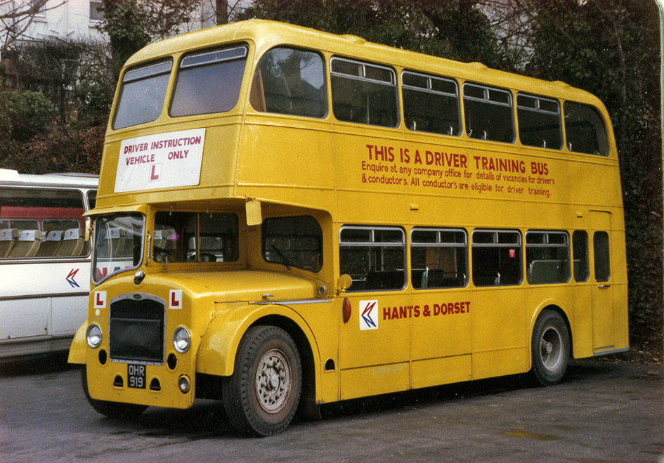
Image 3 Hants & Dorset 9092, apart from the corporate fleet name, Hants & Dorset applied carried this livery over in 1972, with a recruitment message along with the lettering stating the bus’s use.
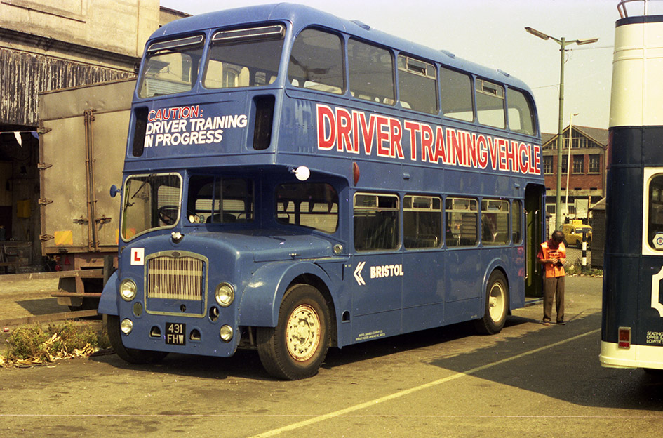
Variation of this application depended on the company, Crosville choose unrelieved Green on its vans and lorries and a dual-purpose livery for its recovery vehicles including it impressive AEC Matador Heavy Recovery Vehicle. National Welsh treated its vans in dual-purpose red/white but used yellow for its Recovery and training vehicles. South Wales often used red or yellow but with no fleet name. With these vehicles, variation was the running theme across the corporate NBC! The livery of Training vehicles depended on the fleet, Western National, Maidstone, Hants & Dorset, Eastern Counties use all over yellow, with variations on lettering; Eastern National and latterly Bristol, had used all over dark blue, Crosville applied a broad white band between the decks, as did Lincolnshire.
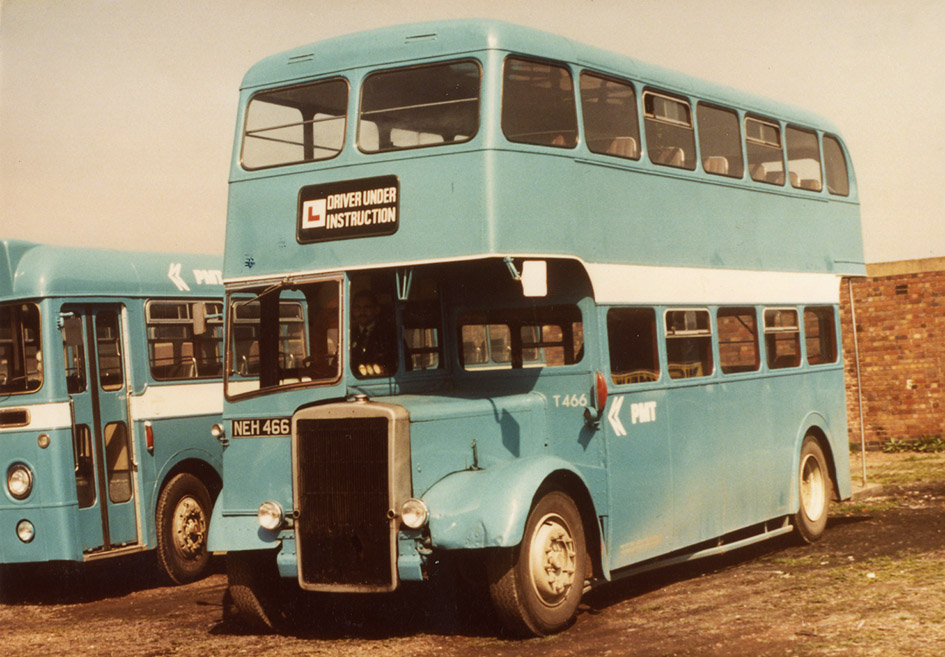
Image 4 Bristol W160, after years of using cream with an orange band, Bristol adopted the same livery for trainers as Eastern National. Image 5 PMT T466. Potteries trainer T466 display the unique non-standard blue in use in the mid-1970s, letter it used yellow.
Occasionally this lack of strict abidance would see the discreet way of continuing pre-corporate practices, initially Bristol applied Orange/Cream to much of its SV fleet, Southern Vectis applied underlined gold serif fleet names on its dual-purpose liveried van for a time and West Yorkshire perpetuated its use of non-standard green to the majority of it service fleet (apart from Trainers) throughout the 1970s!
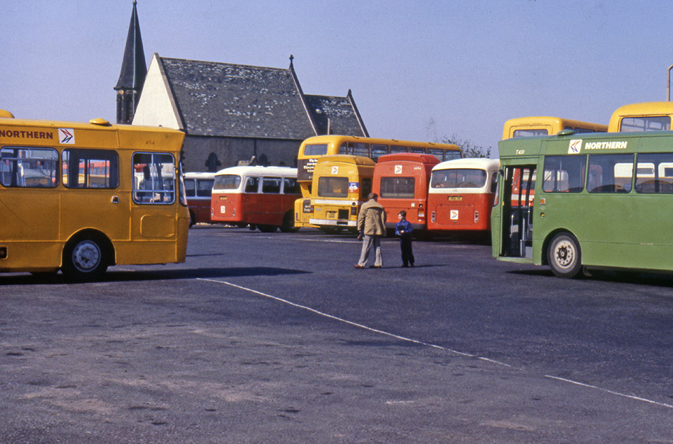
Image 6 East Midlands T2. For its small fleet of trainers East Midland was another company to adopt a unique non-standard livery, this time a shade of dark red Image 7 Northern T431. Northern General was unique with the NBC in using yellow for its service buses, where they were in cooperation with Tyne & Wear PTE, therefore it changed to green for it Training vehicles, to avoid confusion with its buses. This photo illustrates the reasoning for this colour!
It would not be possible to list the huge variety of interpretation that companies used, many changing within the corporate period! As time progressed particularly into the 1980s livery guidance changed as well, yellow became the standard livery for Heavy Recovery lorries, possibly because of legislation, vans could be seen carrying adverts to promote commercial activities, and vans could be seen in standard factory colours, possibly a cost saving measure, or just white as they where meant to be from the start!
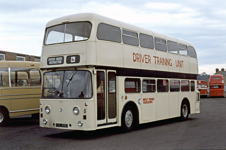
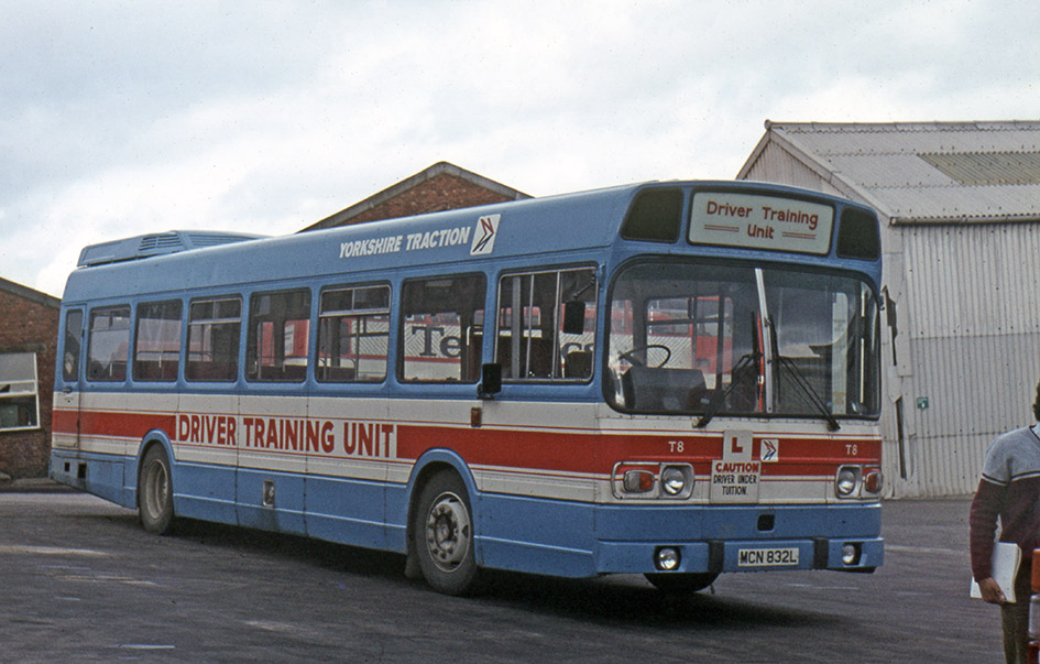
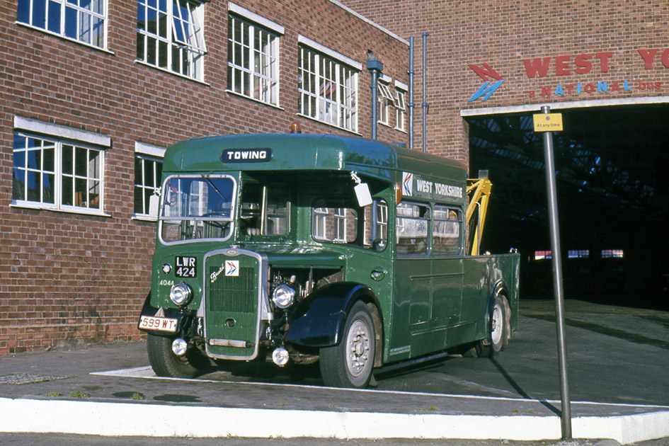
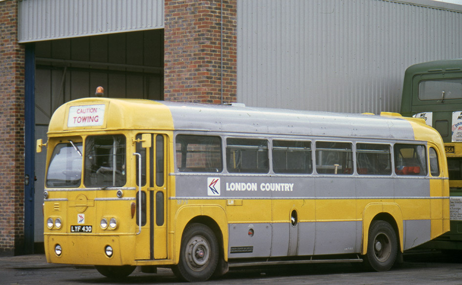
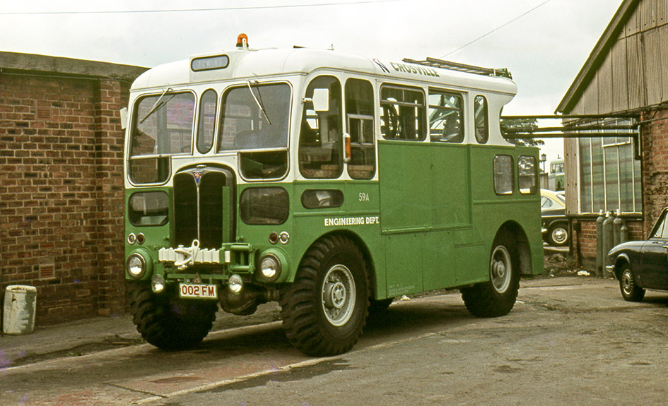
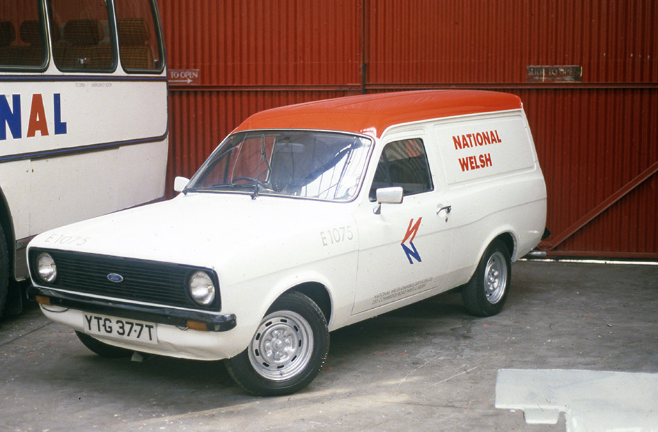
Image 8 West Riding A20. West Riding applied cream and black to its trainers, along with some bespoke signwriting which would have attracted the disapproval of NBC’s central projects team. Yorkshire Traction did also use similar livery for some of its training fleet. Image 9 Yorkshire Traction T8, in the mid-1970s YTC changed to this distinct Red, White and Blue livery for its driver trainers, latterly this livery could be found on some West Riding/Yorkshire trainers. Image 10 National Welsh E8. The Western Welsh group favoured all over yellow for its recovery and training fleet from 1972 onwards, Bristol MW E8 is typical of its application. Image 11 Bristol W144. Bristol had used Orange/Cream prior to 1972 and perpetuated this into the corporate era for a number of service vehicles, though this Bristol MW conversion has white in place of the cream. Image 12 West Yorkshire 4044. West Yorkshire a Poppy Red company continued using green for the majority of its service fleet throughout the 1970s. Bradford’s’ attractive recovery vehicle 4044 survives in preservation in this livery. Image 13 London Country RF79. LCBS converted three AEC RFs into Towing vehicles, all receiving variations on the yellow and grey livery. LCBS was formerly part of London Transport, which used grey for many service vehicles. Image 14 Crosville 59A. After 1972 Crosville used only NBC green (some with white) for all its service vehicle, only in the 1980s did other colours appear, AEC Matador 59A, seen here, eventually received all over yellow. Image 15. Western National RV8. Western National group, including Devon General, used all-over yellow from 1972 for all its heavy recovery lorries, AEC Matador RV8, looks superb with its company-built bodywork. Image 16. Southern Vectis 011. Southern Vectis Bedford CF van number 011 clearly show the use of pre-corporate lettering applied to the fleet’s vans in the 1970s. Image 17. National Welsh E1075. Yet more variety, Ford Escort Mk2 van carries white with a red roof. Later the company painted its small vans in a version of dual-purpose livery. Image 18. Crosville G759. For other duties companies adopted bespoke liveries, Crosville’s Information bus G759 a Seddon Pennine, gained and orange and red stripe to the NBC green, other companies ‘MAP’ buses received a range of bespoke liveries.
Many thanks to Michael Hitchen for providing this guest blog, including the photographs from his own collection. Michael is an authority on NBC’s liveries, and his book on NBC’s service vehicles is available from Amberley Books here: National Bus Company Service Vehicles 1972-1986 – Amberley Publishing ; and also from Amazon in hard copy or Kindle format.
Northern General went beyond the usual red and green, stretching NBC’s corporate identity in the streets of the north east with a vibrant mix of colours.
The NBC years are remembered for their uniformity, with leaf green and poppy red dominating bus fleets across almost all of England and Wales. They are remembered with a mix of fondness for bold modernity thrust upon cities, towns and villages still shaking off the decay of the post-war years, and resentment from those with strong attachments to the variety of semi-independent bus companies with their roots in the local community.
Northern Routemaster 2087 with hastily added NBC style fleetnames while still in BET Red, seen here at Hartlepool bus station. (Photo: Michael Mccalla)
While leaf green and poppy red dominated, there were a few parts of the NBC empire which were able to go their own way. Perhaps the most striking of these was Northern. There, managers connived with the new Passenger Transport Executive to strike out in an independent approach. The Tyne and Wear PTE had taken over municipal bus services across much of the north east of England – notably in Newcastle, Sunderland and Gateshead – and its own modernisation applied a livery of bright ‘cadmium yellow’ and cream, derived from the colours which had previously adorned Newcastle Corporation’s trams, trolleys and buses. Northern aimed to break away from the uniform red bus livery it had applied across its buses, suggesting initially to adopt the same Tyne and Wear PTE colours on its routes mainly within the PTE area.
As custodians of the corporate identity, NBC headquarters initially objected strongly. But at the same time NBC was trying to shape a new relationship with the PTEs as powerful arbiters – and major funders – of urban transport, including issuing subsidies and service contracts to NBC itself. So a compromise was struck. Northern could apply a yellow livery to the fleet for its urban routes, but not the PTE’s yellow. It had to be an NBC yellow livery, using the yellow specified in the Corporate Identity Manual, generally reserved for auxiliary and training vehicles. In all other respects the livery was to follow the manual – from the shape of the white bands to the position of the company identifiers, though these (and initially the NBC logo) were uniquely displayed in red, particularly striking on a yellow background.
Northern Routemaster 3071, recently painted into NBC yellow, accompanied by a Leyland Atlantean in poppy red, outside its home depot of Park Lane, Sunderland, early 1970s. (Michael Mccalla)
To liven things up even more, Sunderland and District Omnibus – which had been a subsidiary of Northern General since 1931– had retained a separate identity with a blue livery, initially continuing to use its existing non-NBC dark blue. During a transition, Sunderland buses ran in their blue colours with a white band, with National-style company identifiers and double arrow applied.
Sunderland’s Roe-bodied Leyland Atlantean 3174, in Sunderland and District’s blue and white livery, with NBC symbol and rebranded to Northern. Sunderland District Park Royal bodied Atlantean 171M is seen leaving Park Lane bus station, Sunderland, in its dark blue livery, painted to NBC corporate identity configuration. Photo: Michael Mccalla
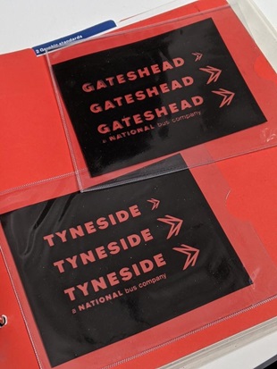
So during the early 1970s, Northern General’s buses were divided into red, yellow and blue fleets; and branded with separate NBC fleetnames for the metropolitan areas of Sunderland, Gateshead, Tyneside and Tynemouth. Venture Transport, based on the Consett area and taken over by Northern in the 1970s, also initially retained its own identity in NBC corporate style, adopting poppy red. Northern’s other subsidiary – Wakefields – was phased out as a separate company in 1969, prior to the NBC corporate identity period.
Venture’s Alexander-bodied Leyland Leopard no 295 in the standard NBC dual-purpose livery, departing Newcastle’s Marlborough Crescent bus station. Photo: Michael Mccalla.Tynemouth adopted NBC red as its main livery colour, but like the rest of Northern General, used yellow for services mainly within the urban PTE area. This is Tynemouth 2863 at North Shields on a service to Tynemouth, a former United Lodekka FLF. Photo: Michael Mccalla
All this made life much more interesting for depot staff than their NBC counterparts elsewhere, and nowhere more so than in the paintshop. Michael Mccalla was a coachpainter at Northern’s Bensham works between the 1970s and 1990s. His job was applying the company’s multiple liveries, while sticking to the rules set out in the NBC Manual. Fortunately for all of us, he also kept a photographic record of a lot of his work.
“The first vehicle I worked on and helped paint as an apprentice coachpainter at Northern Central Works, Bensham, was Sunderland District’s Leyland Leopard 346”, recalls Michael, “in an NBC-style livery but using Sunderland’s old ‘Midnight Blue’, a much darker shade than NBC’s own approved blue”.
Michael’s first vehicle: Sunderland District’s 36’ Leyland Leopard 346, freshly painted byMichael Mccalla and colleagues at Northern’s Bensham works, in 1972. Photo: Michael Mccalla.
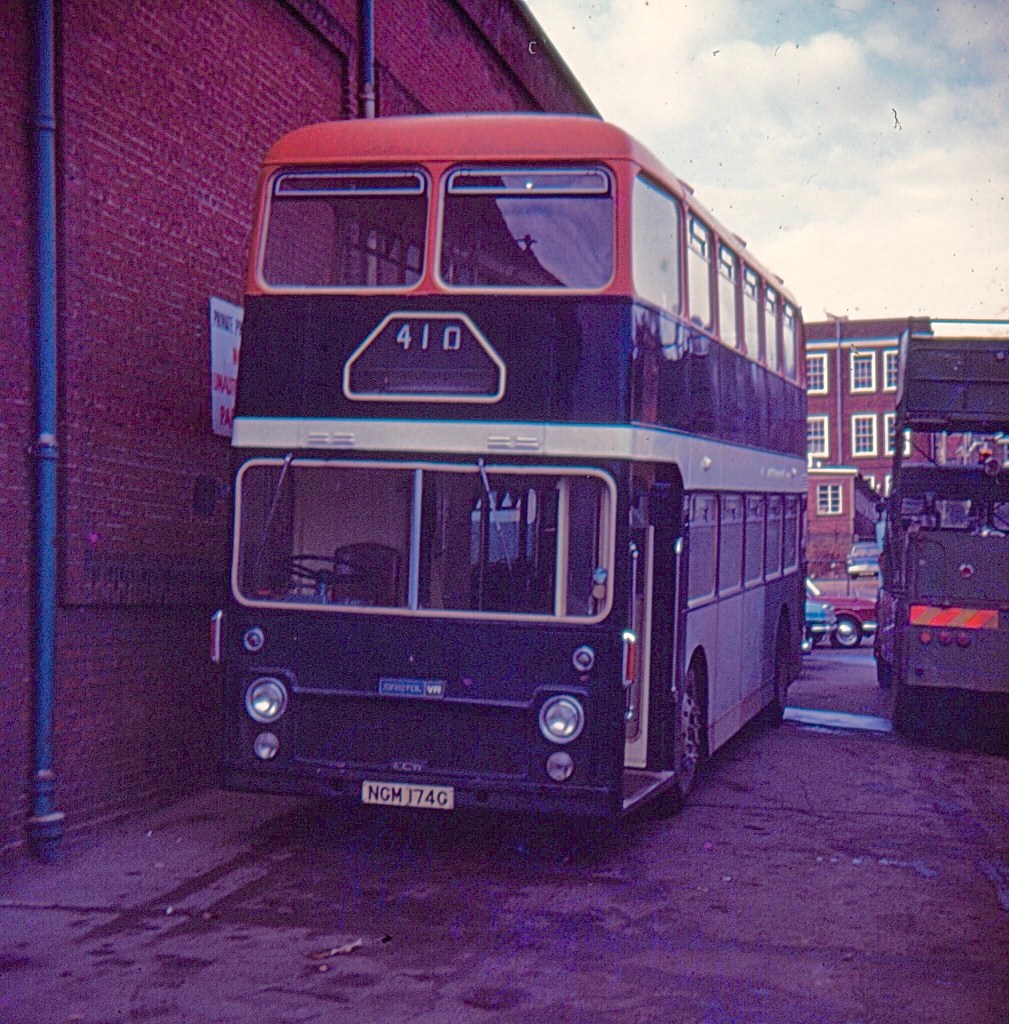
“It looked great at the time.” says Michael, “The problems came later. The blue was a nightmare to paint over when Poppy Red and Yellow were introduced.” Along with the other Northern subsidiary companies, Sunderland and District lost its identity in January 1975, requiring the whole dark-blue fleet to be gradually repainted, though many were rebranded ‘Northern’ and stayed in blue for many years. There were also transfers to other NBC operating companies: Eastern Counties (see photo) was one of the companies faced with the tricky challenge of painting a standard livery over hard-to-cover midnight blue.
Eastern Counties bore the brunt of the challenging dark-blue-to-poppy-red repaint on the transfer of Bristol VR series 1 NGM 174G, which started life at Central SMT and was one of the vehicles involved in the complicated swaps of VRs and Lodekkas between the NBC and SBG in 1974. The bus arrived in Norwich as Eastern Counties VR319 – but not before a brief stay on Tyneside where Northern’s Michael Mccalla started to paint it into the NBC version of Sunderland’s midnight blue livery. Here it is awaiting its next repaint into poppy red at Eastern Counties’ Main Works, Cremorne Lane, Norwich. (Photo: Tim Moore’s collection)
But when they were reliveried into Northern’s standard Poppy red, or urban yellow, they were very striking on the streets of the north east. Michael was responsible for a number of the repaints, as well as painting Northern’s red Leyland Nationals into urban-area NBC yellow. “I must admit when newly painted these did look decent” Michael remembers.
Northern MK1 National 4609 in NBC Yellow livery complete with white relief. Photo: Michael Mccalla.Recently re-branded from Gateshead, and with the post-1976 NBC symbol in a white panel, Northern’s Roe-bodied Leyland Atlantean no 0191 is seen on a cross-Tyne service in Newcastle. (Photo: Michael Mccalla)
Uniquely, the yellow livery featured company identifiers in dark red. As for all operating companies, company identifiers were supplied from NBC headquarters, using the bespoke National typeface, as photographic negatives, which were enlarged and reproduced locally. These were issued with the Corporate Identity Manual, with pages including wallets to hold the negatives, along with ‘sign-out/sign-in’ sheets to keep track of them. The use of pre-prepared negatives avoided any risk of the wrong typeface being used, and avoided inconsistent letter spacing. Northern General’s copies were unusual in coming with negatives for the many different fleetnames in use – Tyneside, Tynemouth, Sunderland & District, Gateshead, Venture, and Northern itself.
From the Corporate Identity Manual itself: each operating company’s copy of the Manual included wallets for photographic negatives of the ‘National symbol’ (the double-N arrow) and the relevant local ‘company identifiers’ (the fleetnames). Photo: Matt Harrison.
Like its buses, Northern General’s coaches came in a variety of liveries, with PTE, urban and non-urban dual-purpose, and full-coach National variants. There were even some variants that shouldn’t really have happened – such as the Bristol RE in a unique PTE dual-purpose livery. Michael Mccalla recalls: “I managed to get away with painting Bristol RE 4882 into Tyne and Wear PTE livery when it should have been all-over yellow. But this is what happens when the foreman is on holiday and you’re put in charge”.
For an era when public transport on the roads came in green, red or white in most of England and Wales, Northern’s flexible take on the NBC corporate identity added some colour and variety to the streets of the north east.
Special thanks to Northern coachpainter Michael Mccalla for his help with this article, and for providing the fascinating pictures of Northern’s colourful vehicles – many of them his own handiwork.
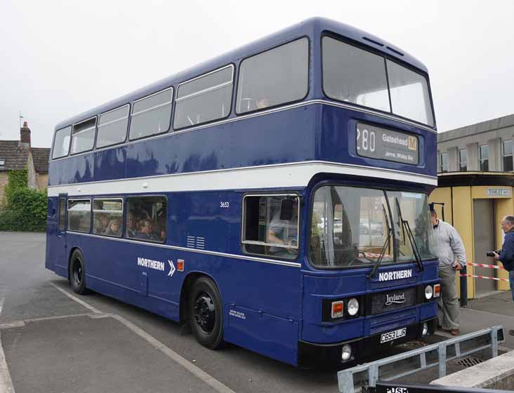
Former Venture Alexander bodied AEC Y-Type 266 seen straight out the paintshop in NBC yellow at the High Spen depot. 266 has Northern company identifiers in red, but with the later style of red-and-blue NBC logo on a white panel, introduced from 1976. Photo: Michael Mccalla. At Heworth bus station, ECW-bodied Bristol RE no 4882, shortly after Michael Mccalla’s rogue repaint into a dual-purpose version of TWPTE’s cadmium yellow. Photo (and livery): Michael Mccalla.One of only two white National coaches carrying the Sunderland name, this is Plaxton-bodied Bristol RE no 122L, in Sunderland. Photo: Michael Mccalla.Leyland PD2 no 1763 was the only one of its type to be painted in NBC poppy red, seen here at Chester le Street depot in the early 1970. Photo: Michael MccallaVenture Transport’s Leyland National 167M, later Northern’s 4501, in NBC poppy red without white bands, in around 1972. Photo: Geoff Coxon.The NBC-blue version of Northern’s distinctive liveries has featured in preservation. Leyland Olympian 3653, seen here at an enthusiasts’ event, appears in a lighter shade than the ‘midnight blue’ used on Sunderland and Northern vehicles in the 1970s, though closer to the ‘authorised’ colour used by other NBC subsidiaries. Many former Sunderland buses were rebranded ‘Northern’ in the mid-1970s when Northern General’s sub-brands were phased out. As a relatively new bus, new to Northern in 1985, 3653 would not have worn this precise livery, with the pre-1976 monochrome double-arrow, in service – but wears it well in preservation nonetheless. Photo: Martin Isles, showbus.com


![National Bus Company Service Vehicles 1972-1986 by [Michael Hitchen]](https://m.media-amazon.com/images/I/51LhcK7sOzL.jpg)